Contemplative 3D typography – day and night

What is this project about?
(Best viewed on a larger computer screen).
A few months ago, I commented on David Samuel Oluwadamilare's Kidag Font Behance page that I thought it would look great in 3D. David kindly offered to do a joint project so I could use his font and do 3D renderings with them, hence this joint project.
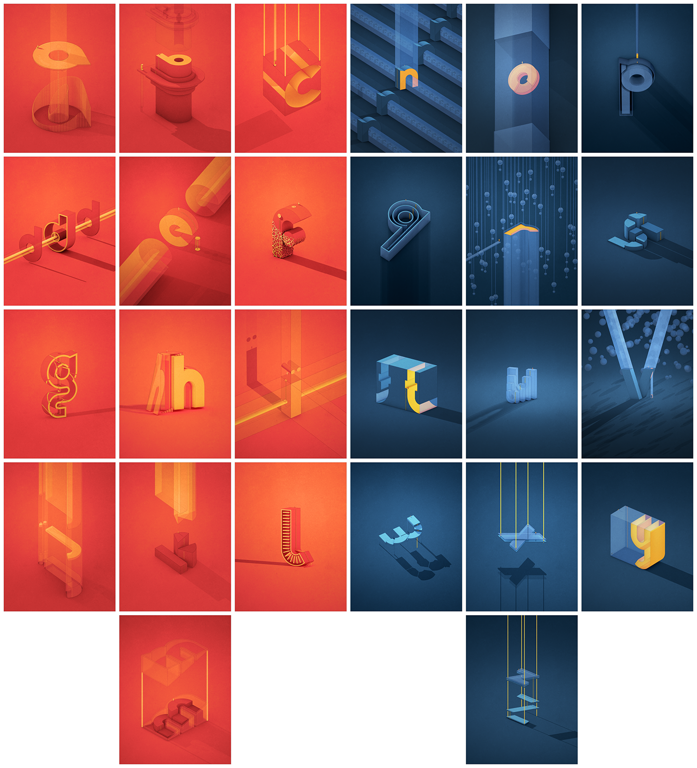
Thumbnails of the 3D renderings of the Kidag font glyphs

David's Kidag Font
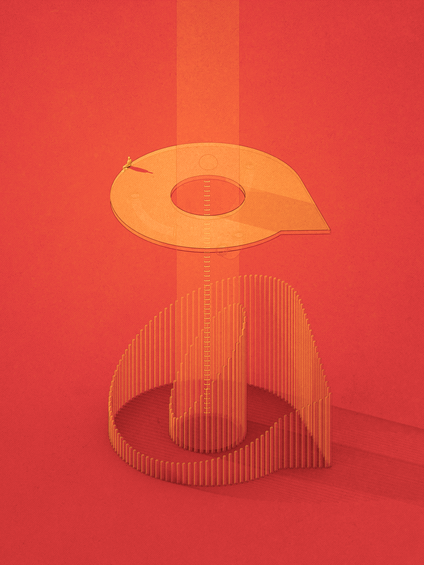
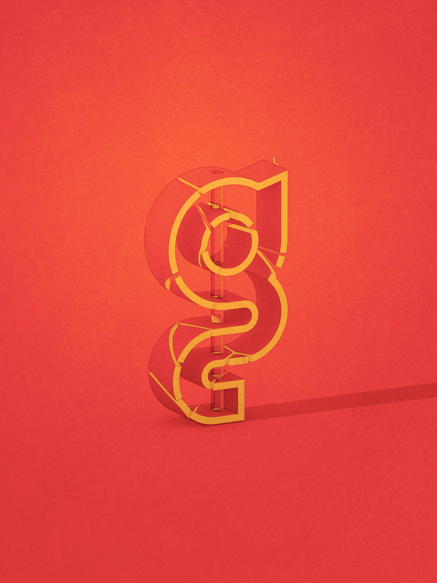
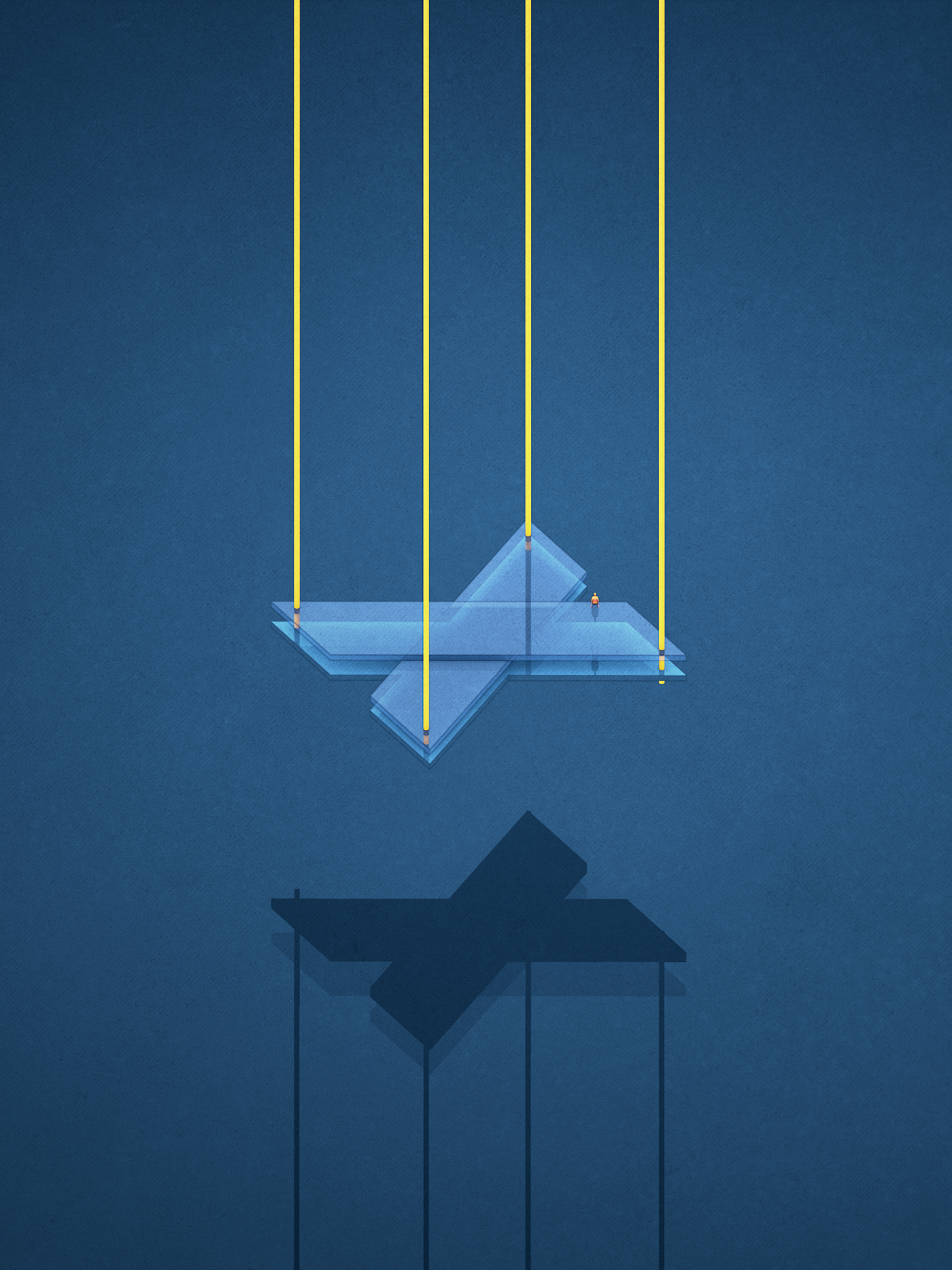
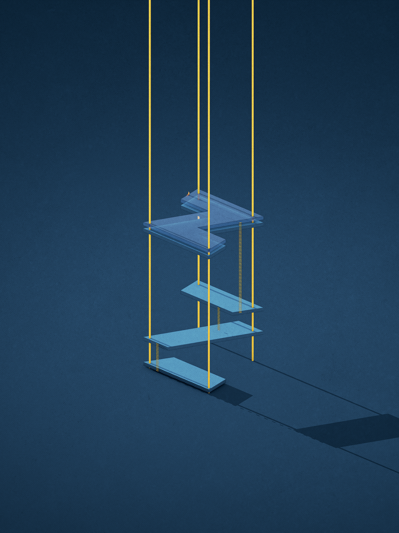
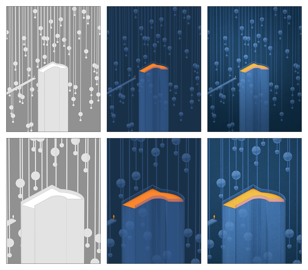
After experimenting and getting feedback, I settled on the concept of monumental typography and futuristic architecture. To provide a sense of the type scale, I used a reference (the tiny silhouette of a man) to provide a known reference to the viewer and make the letters appear monumental.
The project was to complete the alphabet. I settled on two styles, one evocative of daylight, in the tones of the Blade Runner 2049 movie and the other of the Golden City European graphic novel series.
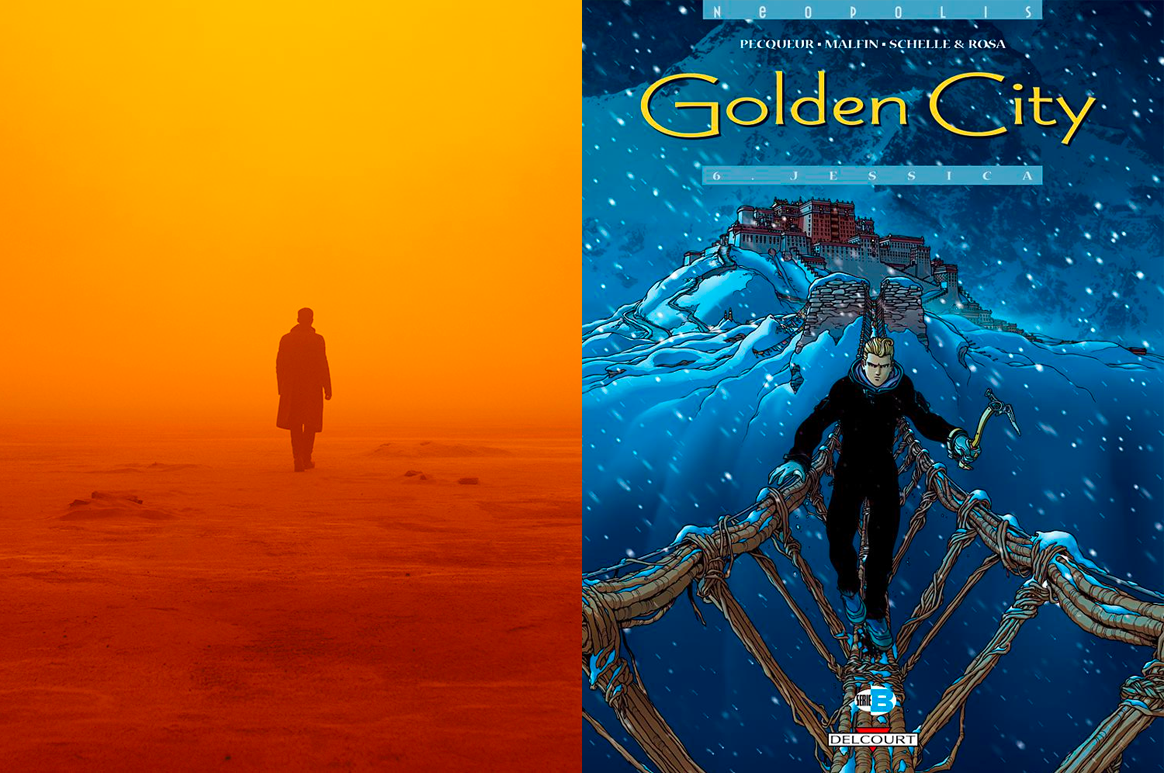
Source of inspiration for the color schemes used in this project
Playful typography
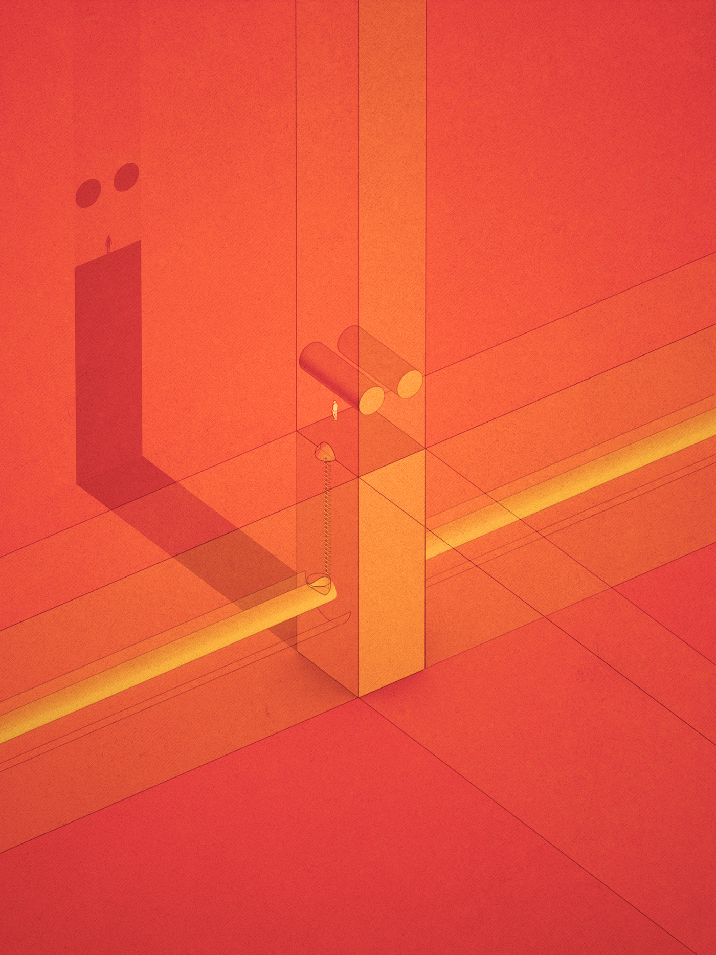
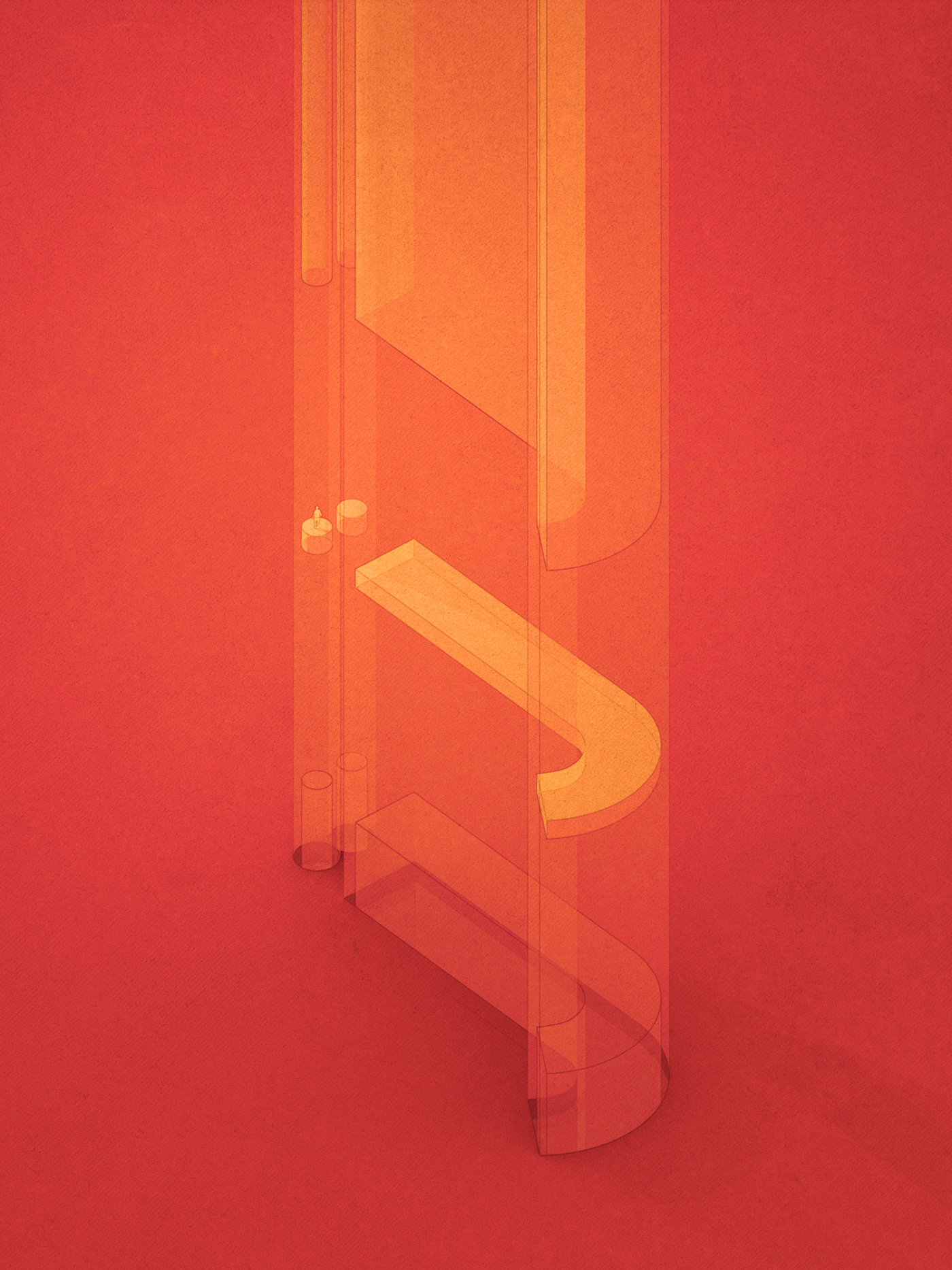
The main theme for this project was to do something fun and light. So I played with the fonts and imagined different buildings or abstract monumental shapes, sometimes made of glass. The little reference character that is on each image needed a way to move around the structure. So for most of the images there is a ladder or a sort of elevator that helped him get to where he sits or stands.
I affectionately call this character Jon – a reference to a friend and mentor as I reused a lot of the same technique applied in this project.
Below, you will find:
- a short description of the technique used,
- a sheet with thumbnail of details,
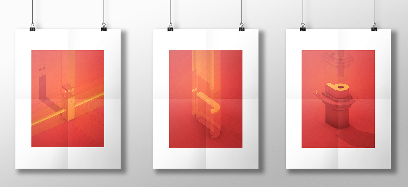
- examples of how it would look if printed as posters
- a full blow version of each letter
Comments and thoughts welcome below!
Thanks
Many thanks to David for collaborating with me on this project and for letting me use his font!
Technique
All the images in this project are created with Cinema 4D for the core renderings. However, final texturing and image adjustments are done in Photoshop. I also used Adobe XD to create the thumbnail sheets below as its repeat-grid feature makes it so easy to create something like that.
For the Cinema 4D geeks
Cinema 4D never ceases to amaze me with its powers. In this project I used cell shaders exclusively, in the luminance channel. I like how this allows me to control the shading on an object exactly the way I want it.
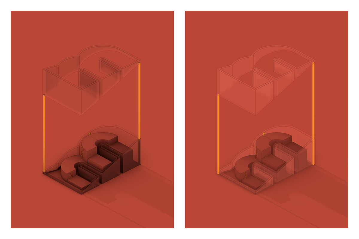
Another useful tool is the Ambient Occlusion (AO) shader which allows me to fine tune the use of AO on a per-object basis (have AO at all, control its strength or its color). For example, in the rendering of the 'M' glyph, there is AO on the bottom geometry (reduced compared to the default, project wide setting), but not on the top one to reduce the contrast of the generated graphic.
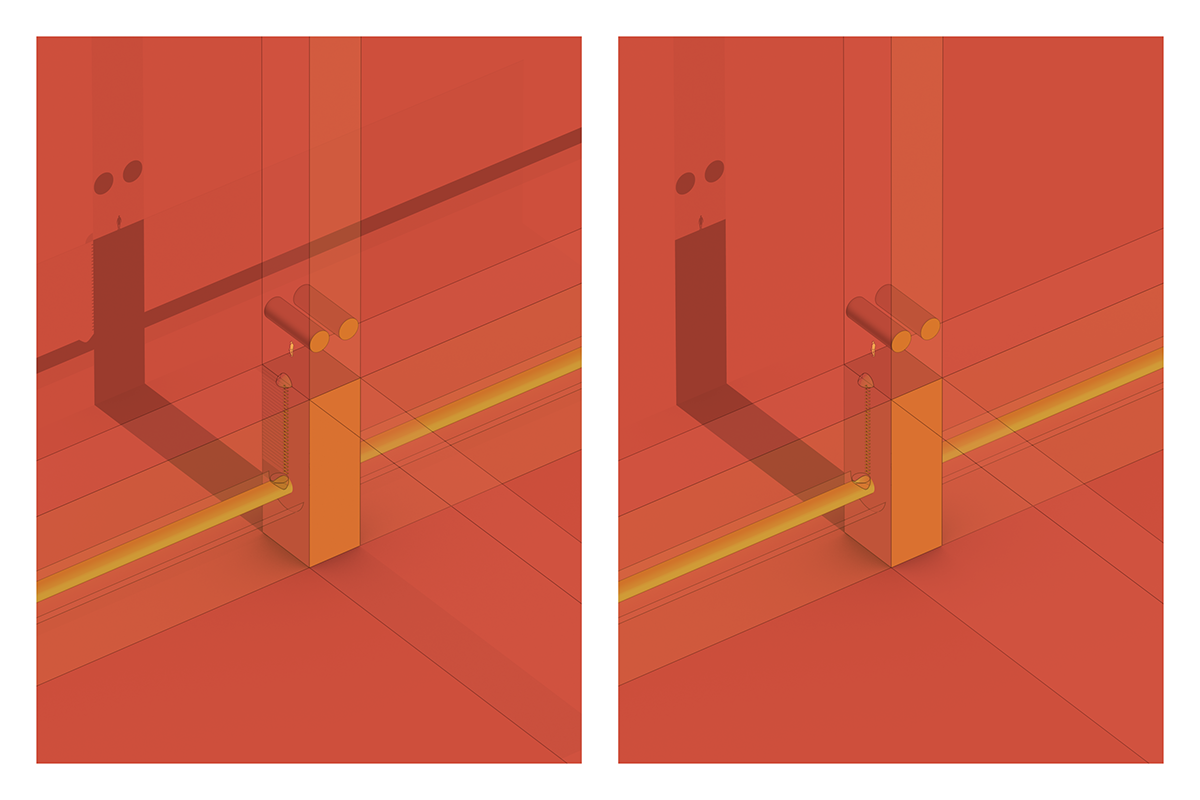
Finally, the compositing tag is an equally per-object tool I use a lot to select objects that generate shadows or contribute to AO computations. For example, you will notice in the 'I' glyph rendering, that the central tube that goes through the glyphs does not generate shadows (they were distracting). What gets lost in realism, provides better legibility, particular in this example where the shadow itself needs to be clear and show the glyph and the character's own shadow.
To learn more about these techniques, you can turn to Eyedesyn and Grayscale Gorilla as usual.
Posters – Night

Posters – Day
Details

Individual Glyphs