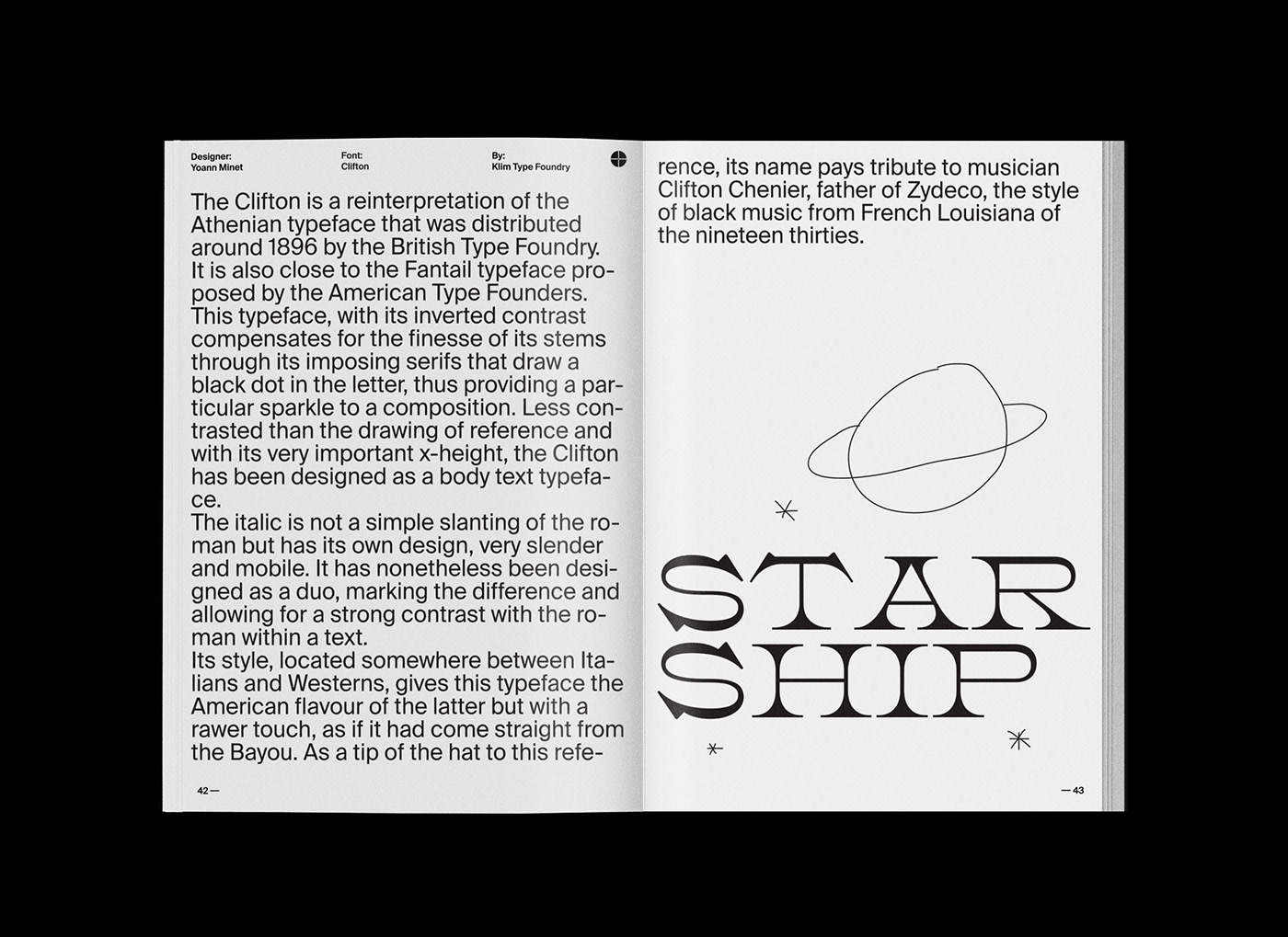
In the past, painters, typographers and then the first “graphic designers” used typefaces as a form of art. Not only giant drop caps but entire words or phrases written using strong characters, most of the times created from scratch.
Then came the Futurism and they also tried to free typography, not to make art, but to communicate in a more striking ways ideas that a single serif font could not express.
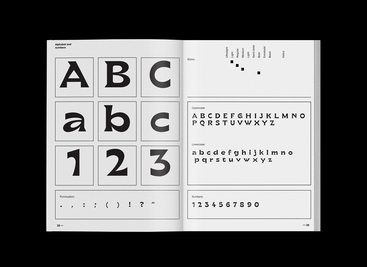
What we see nowadays is a flattened use of typography. Same sans or serifs are used in fashion, food, erotic magazines and music covers. Seems like we lost the ability (or the courage) to use letters in an unconventional way.
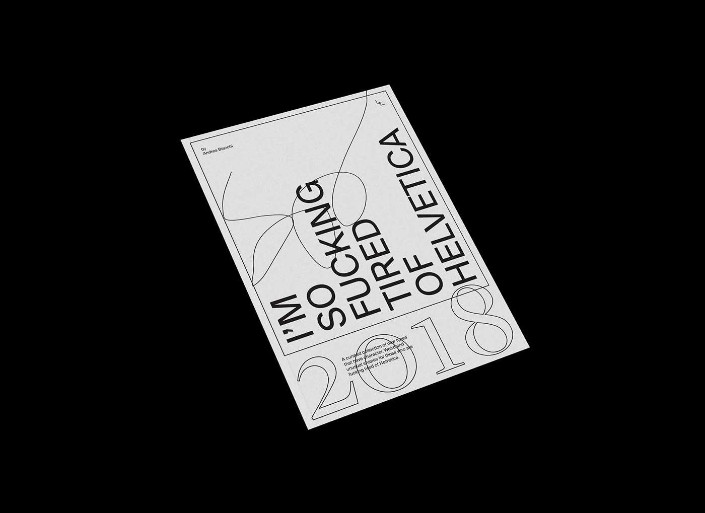
At the same time, never like before we see new typefaces made by new foundries. As many of them are childish or nonsense, there are some that are excellent and unique. Inspired by this controversial situation I decided to assemble this little book. (free download)
Here are the main reasons:
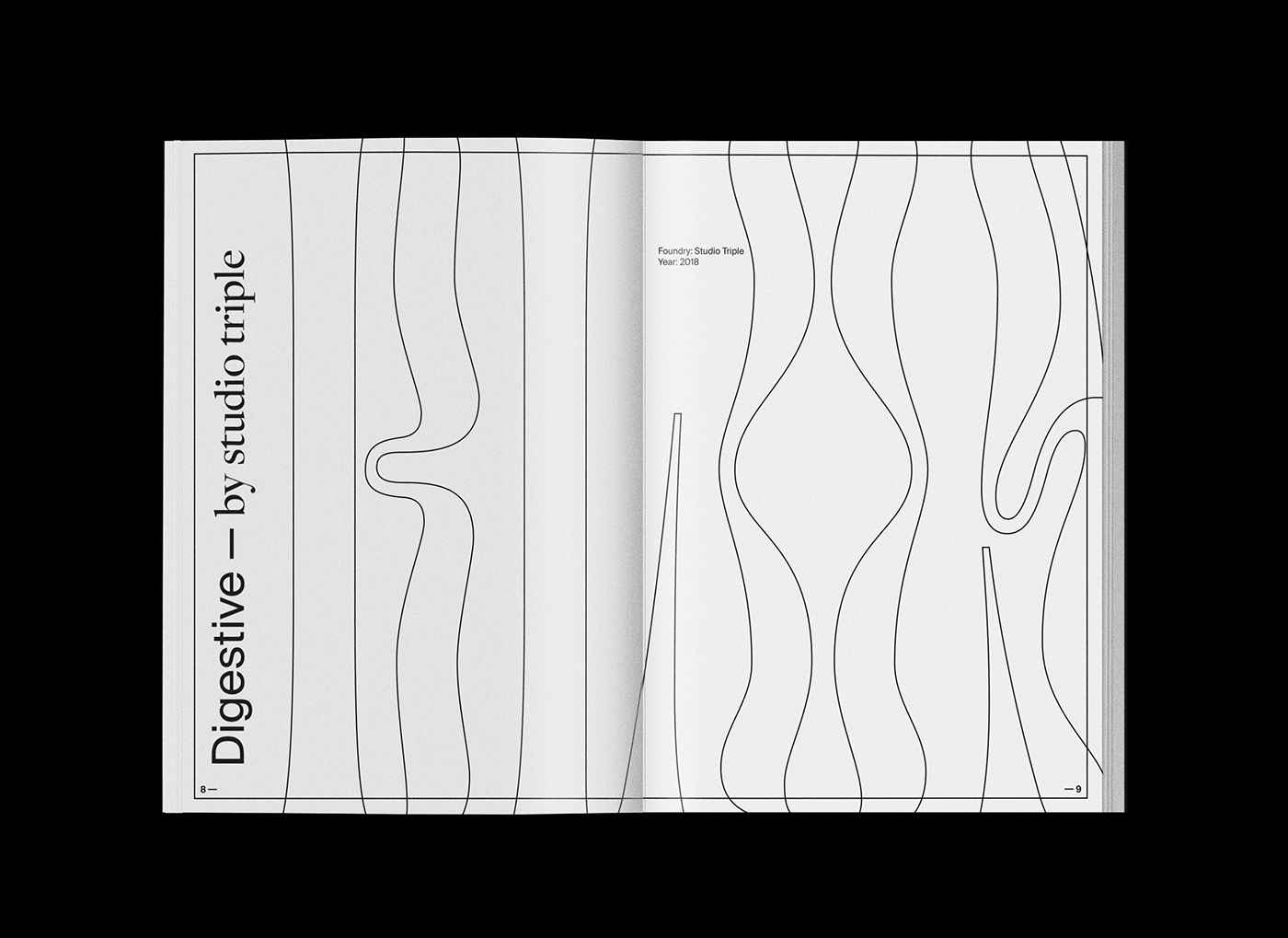
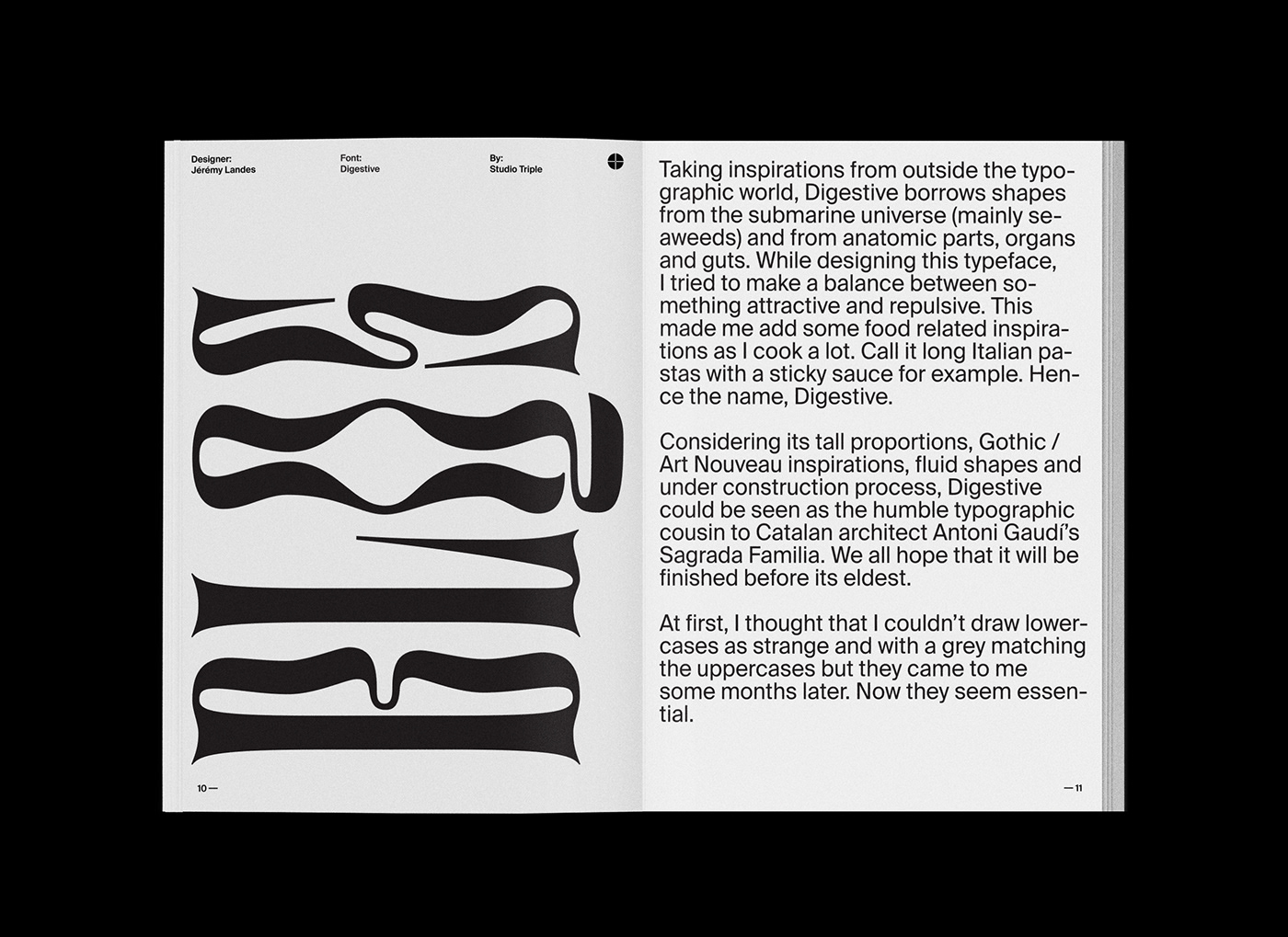
To collect the unconventional typefaces I like the most.
To fight the flattened use of typography.
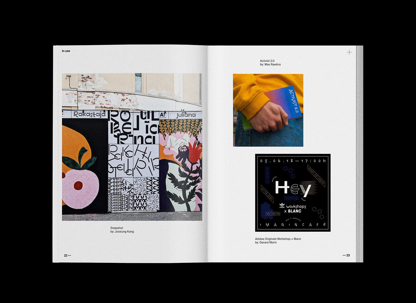
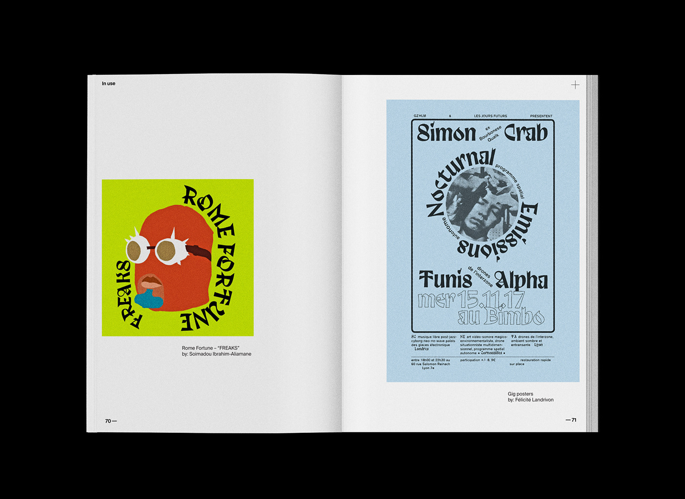
To show that also unconventional typefaces can be used in commercial projects.