Client: Overland Park First Assembly of God
Opportunity: Overland Park First Assembly of God has been an established church in the community of Overland Park, KS, for several decades. A change in leadership ushered in a need for refocusing. I approached the leadership with a proposal to completely rebrand the church. After several initial meetings, everyone was on board. The previous church brand was dated, ineffective, and inconsistent. The church brand needed to reflect it's purpose: to be committed to God and, then, to be committed to the surrounding community.
Solution: The decision was made to create a logo that would incorporate a specific typeface and a symbol. The box can be viewed as either an olive branch (religious symbol, representing the church's commitment to God) or a wheat stalk (the church is located in Kansas...the wheat state). The type is styled in such a way as to mirror the logo of the city of Overland Park, KS (opkansas.com). This represents the church's commitment to it's surrounding community.
As the project continued, the identity of the church started to naturally emerge. A clean, focused, effective brand was born.
Results: As a result of this rebranding project, the church is becoming a recognizable staple of the community. The congregation is taking ownership of this brand and the church has a professional, organized, and focus appearance to visitors and long-time member, alike.

Primary logo

Primary colors

Primary typeface

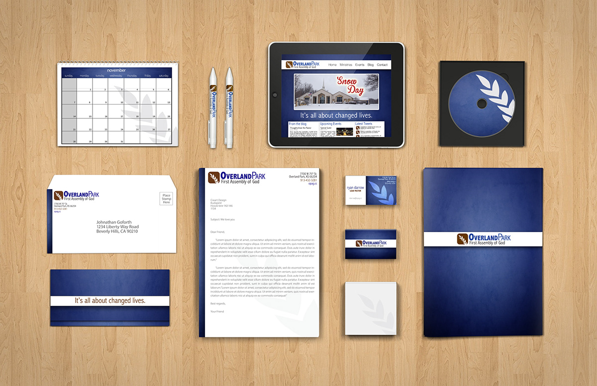
Full identity package

Letterhead & Envelope
When the letterhead is folded for the envelope, the church mission "It's all about changed lives." appears.

Business Card

Business Card details

Mug to be given away to first-time visitors

Outdoor signs to direct traffic and point people toward the main entrance

Large outdoor sign displayed at the front of the church

Room signage

Office name signage

Directional signage


