School
Kristiania University College, Oslo
Kristiania University College, Oslo
Assignment
Festival visual identity redesign of "Norsk Rakfiskfestival"
Festival visual identity redesign of "Norsk Rakfiskfestival"
History and reason behind Norsk Rakfiskfestival?
the festival was established in 1933, and is to this day a large arena for people to gather around Norwegian food culture. People from all over Norway and other nationalities come together to the small town of Fagernes, where Rakfisk has had an enormous historical impact for this part of the country.
"Raking" is a very old method of conserving and store fish for a long duration of time. It has been particularly important in the inner fjords and mountainous areas of Southern Norway.
Idea behind the concept
Fagernes is a small town with an estimate of 1800 inhabitants, but during the festival attract somewhere between 30-40.000 visitors over these 3 days! "Room for more" is a concept that bases itself of the values the festival brings out in people. The festival becomes a place for sharing knowledge, love, traditions, great food and music.
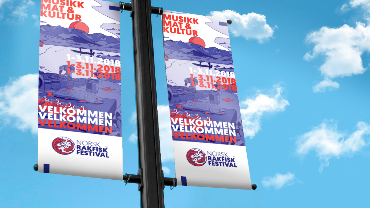
The new visual identity uses history, illustrations, colors and so on to capture the feelings the festival brings out. By using overlapping design elements, I wanted to show that even though Fagernes is a small town, they are welcoming and they make room for more people when they need to.

Existing logo and the new logo
By using local symbols and fitting colors, this new logo is more fitting to the festivals values and overall tone of voice.


Thank you for viewing!


