
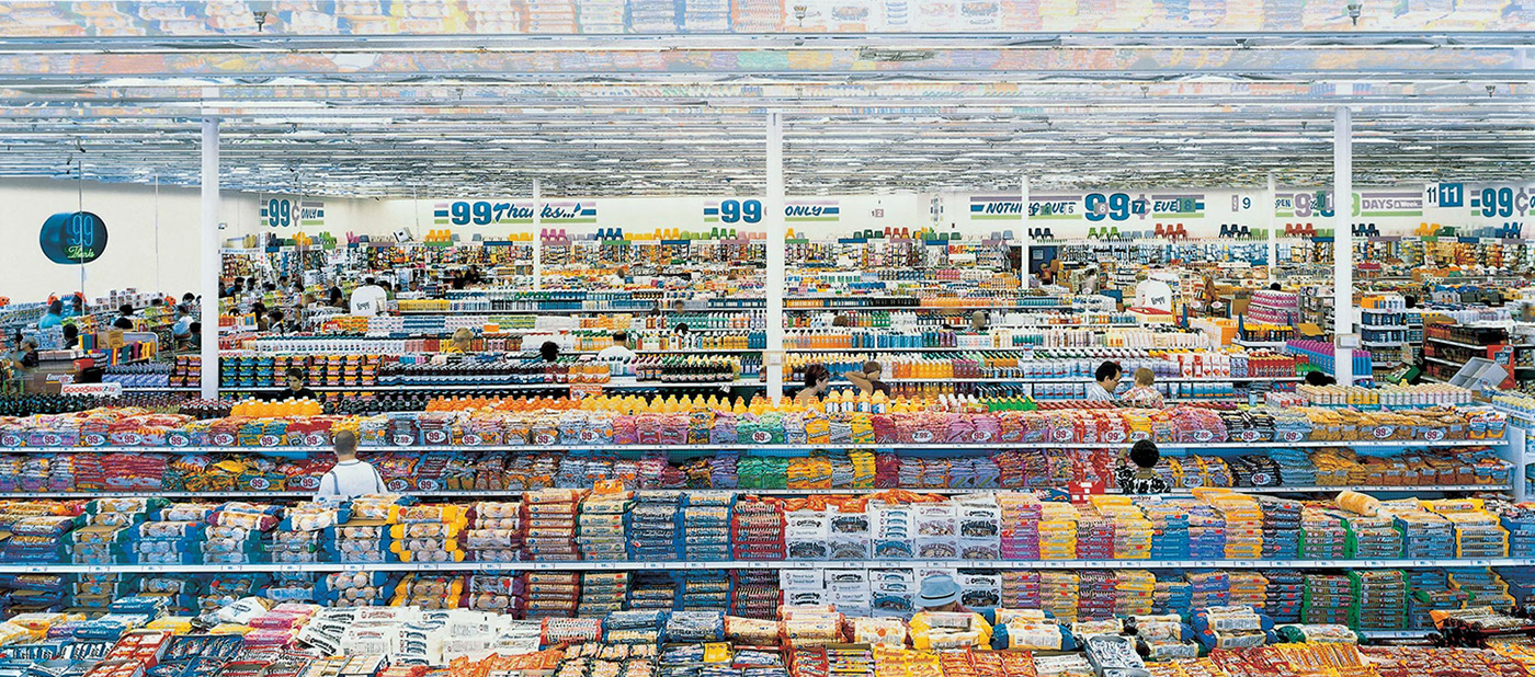
One Small Step for the Next Level
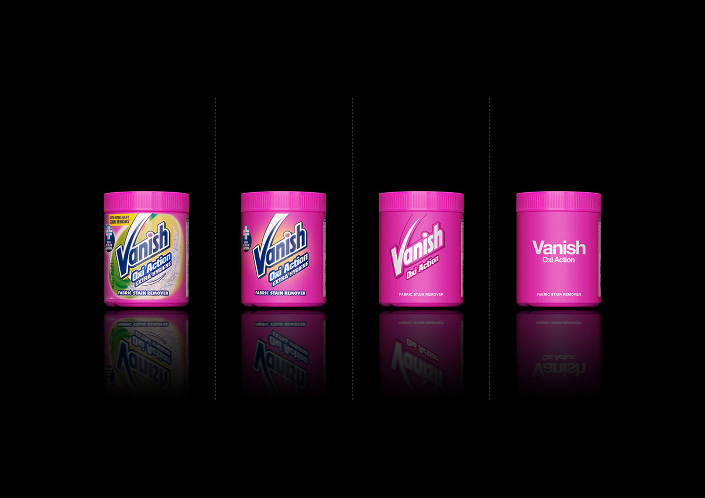
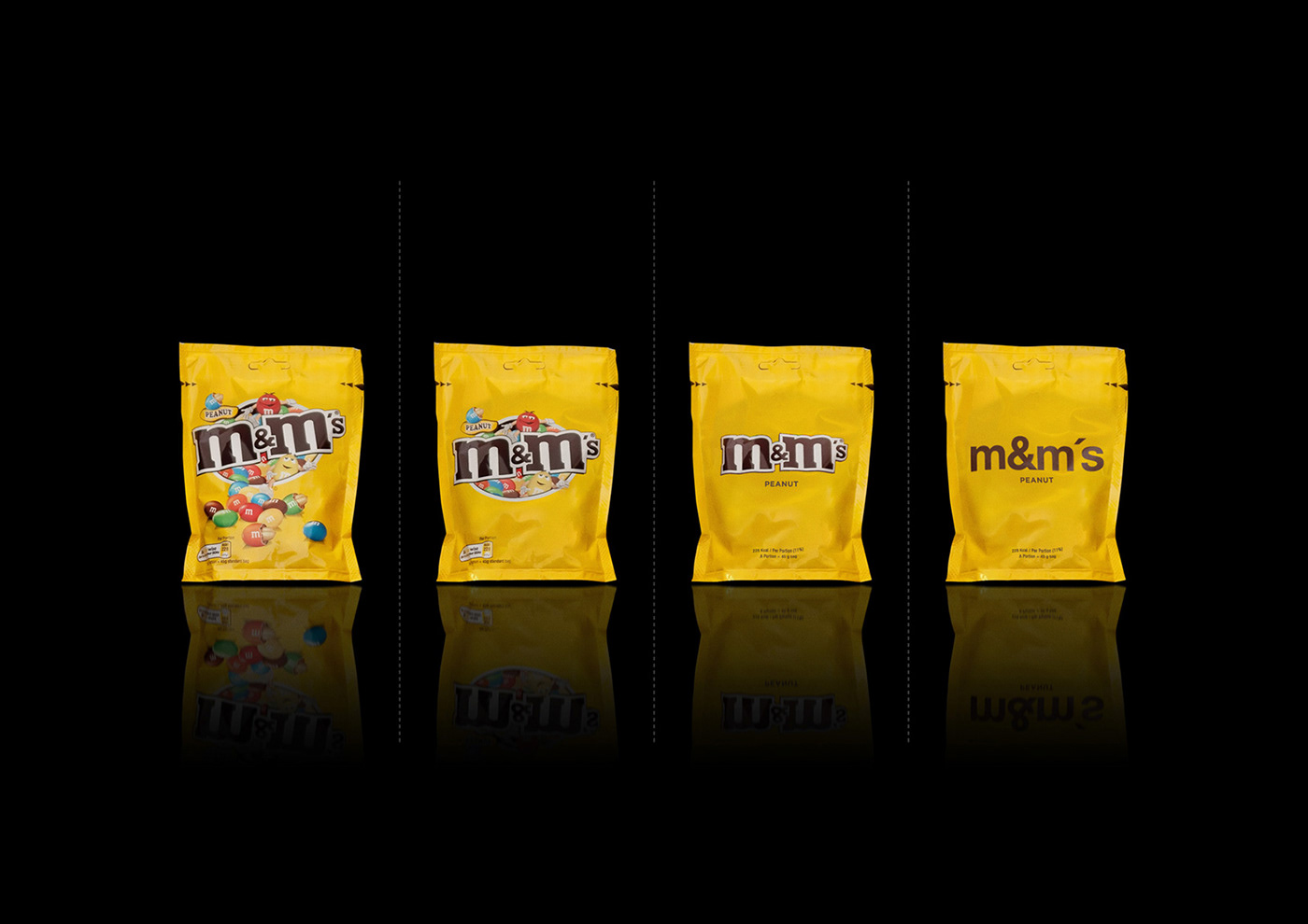
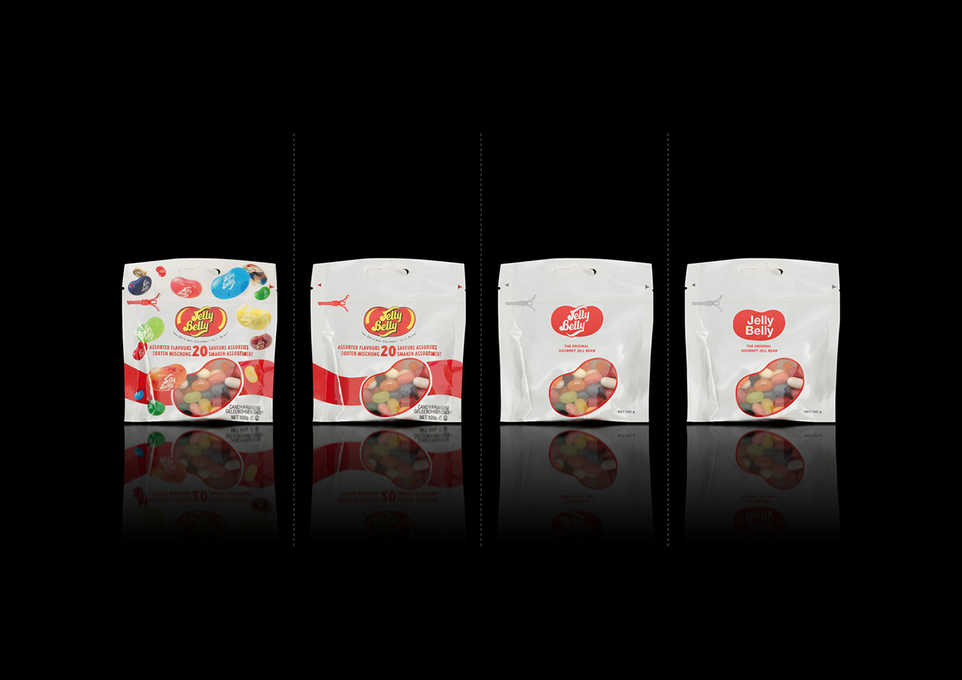
When we went to the supermarket in London, we've noticed that, "Our packaging project could go to next level". This second edition has one more variation and now, we are showing all brand names with simple text & same font, without logo or corporate sign on it. The font is Helvetica Neu Bold. Our question is similar with the question in our first project!
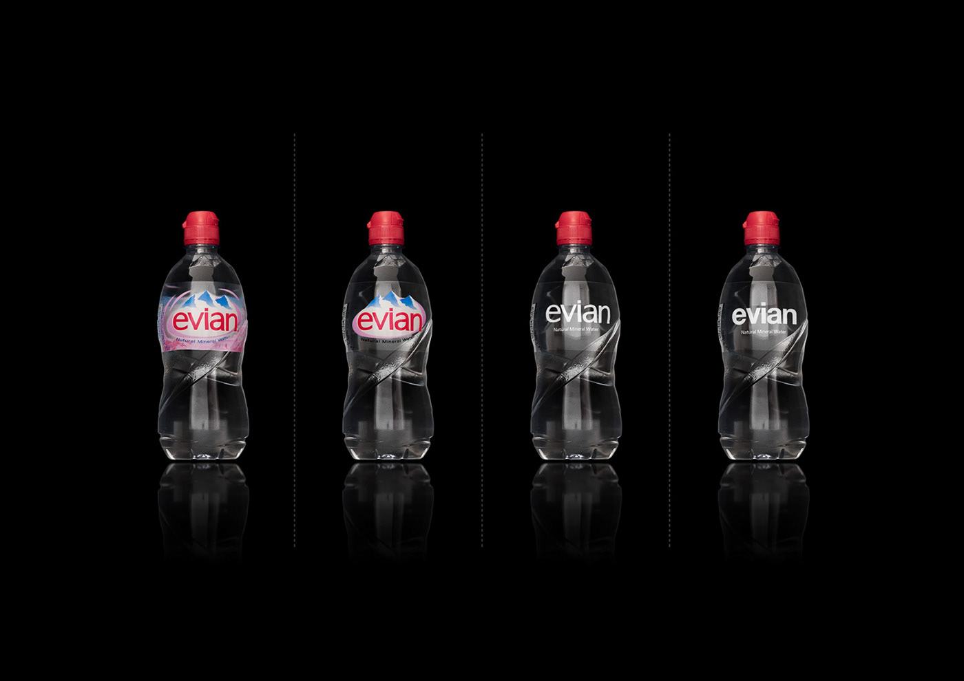
What is your choice in these 4 different variations?
1. Original variation
2. Simple variation
3. More simple variation
4. No logo variation
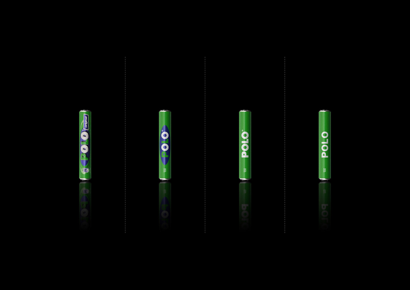
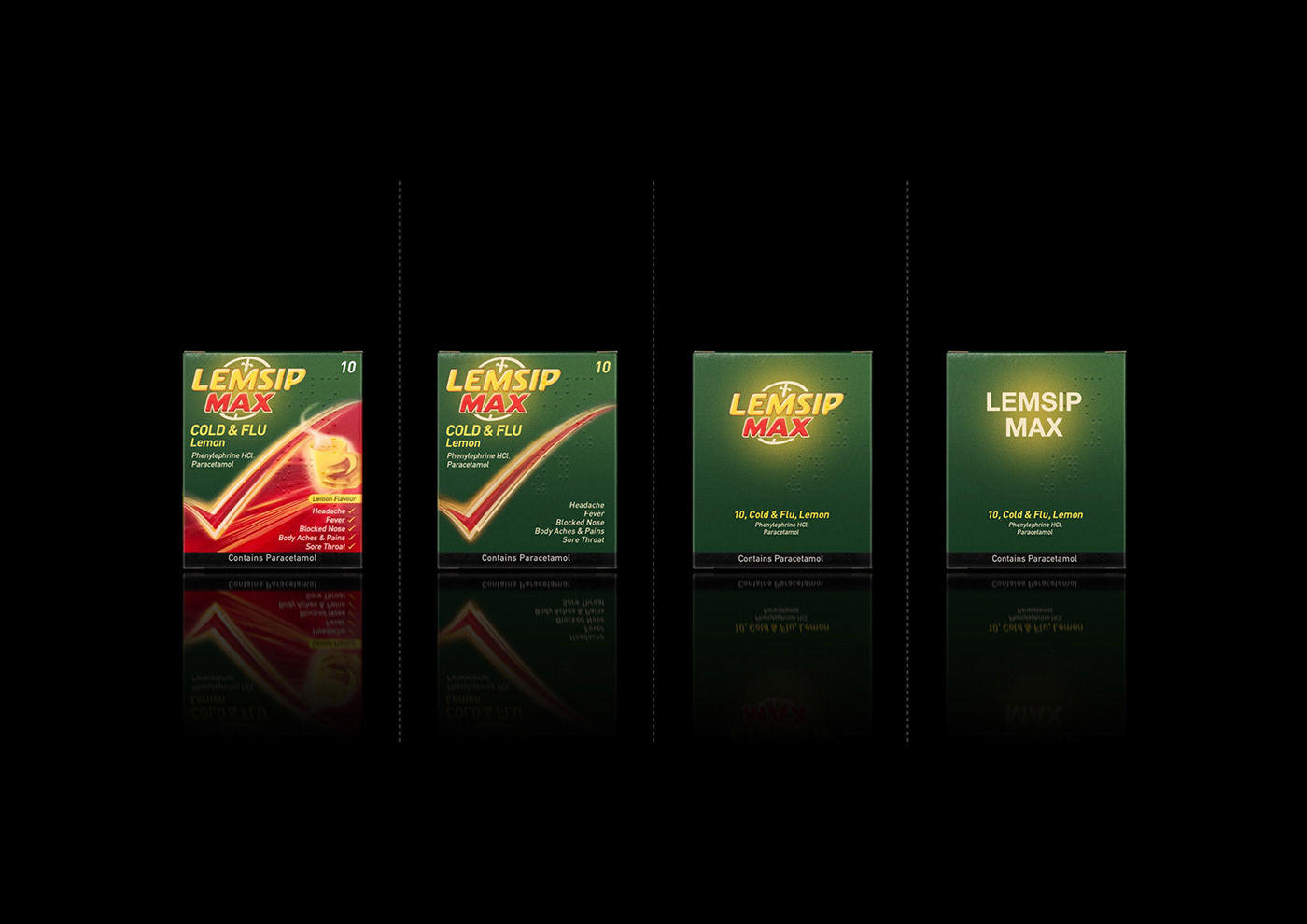
1. Original variation
2. Simple variation
3. More simple variation
4. No logo variation
-


Legal Disclaimer: Copyright of featured background images and photographs are the intellectual property of their respective owners. This project is only a design practice for showing minimal feeling of some international samples. It is an article about unnecessary items on the global brands, any of them, second, third or fourth variations are not new packaging proposals!
-


