
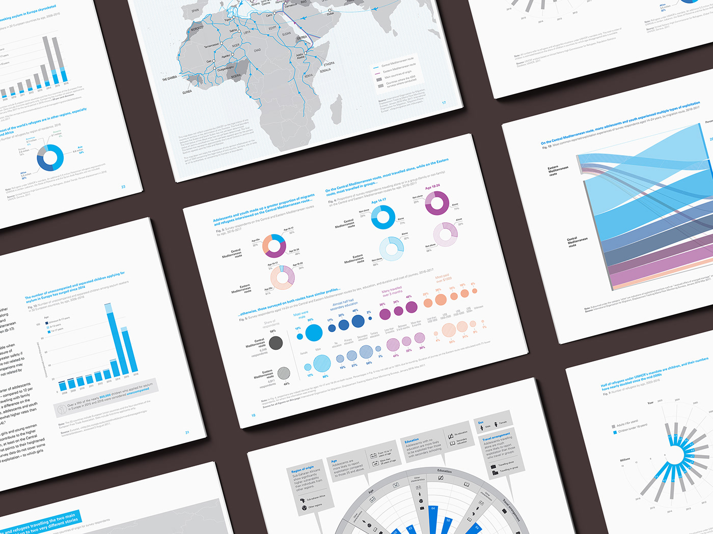
By using visual elements like charts, infographics, and maps, data visualization is an effective to convey non-profit organization's message and ideas. With the purpose of education and storytelling, the infographics in reports can help the audiences quickly understand the background information, and remove the noise from data and highlighting the useful information. Meanwhile, high-quality data visualization helps the non-profit organization to attract more attentions from the public. It helps the organization to promote themselves and influence more people.
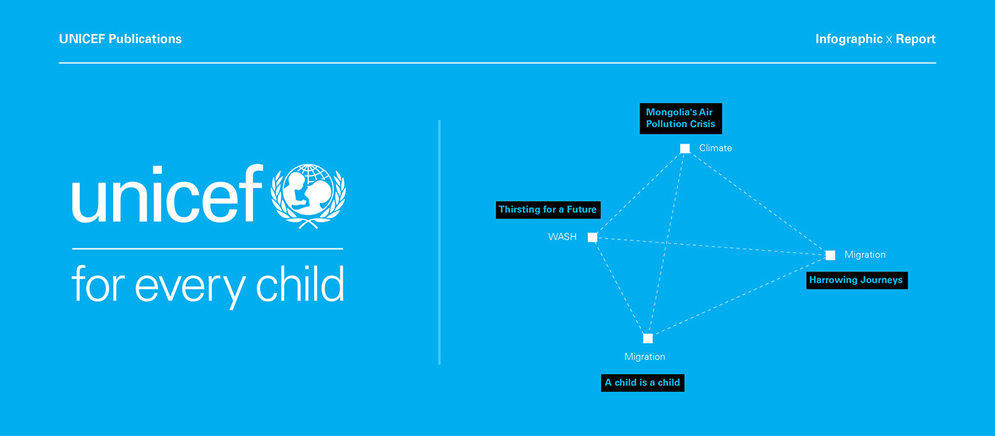
This collection includes four Unicef reports:
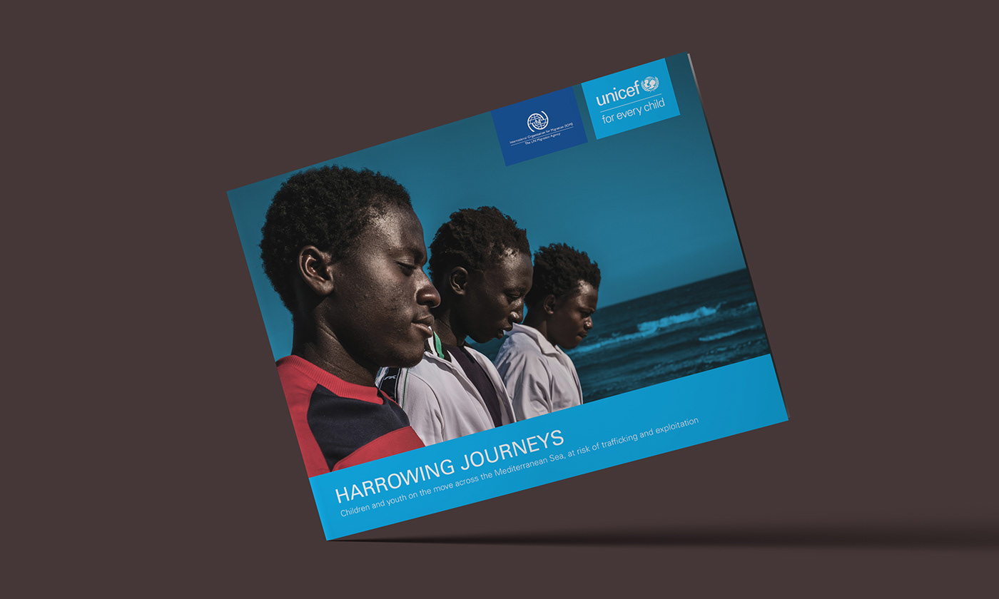
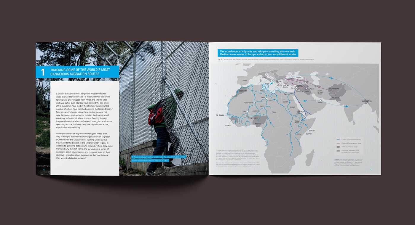
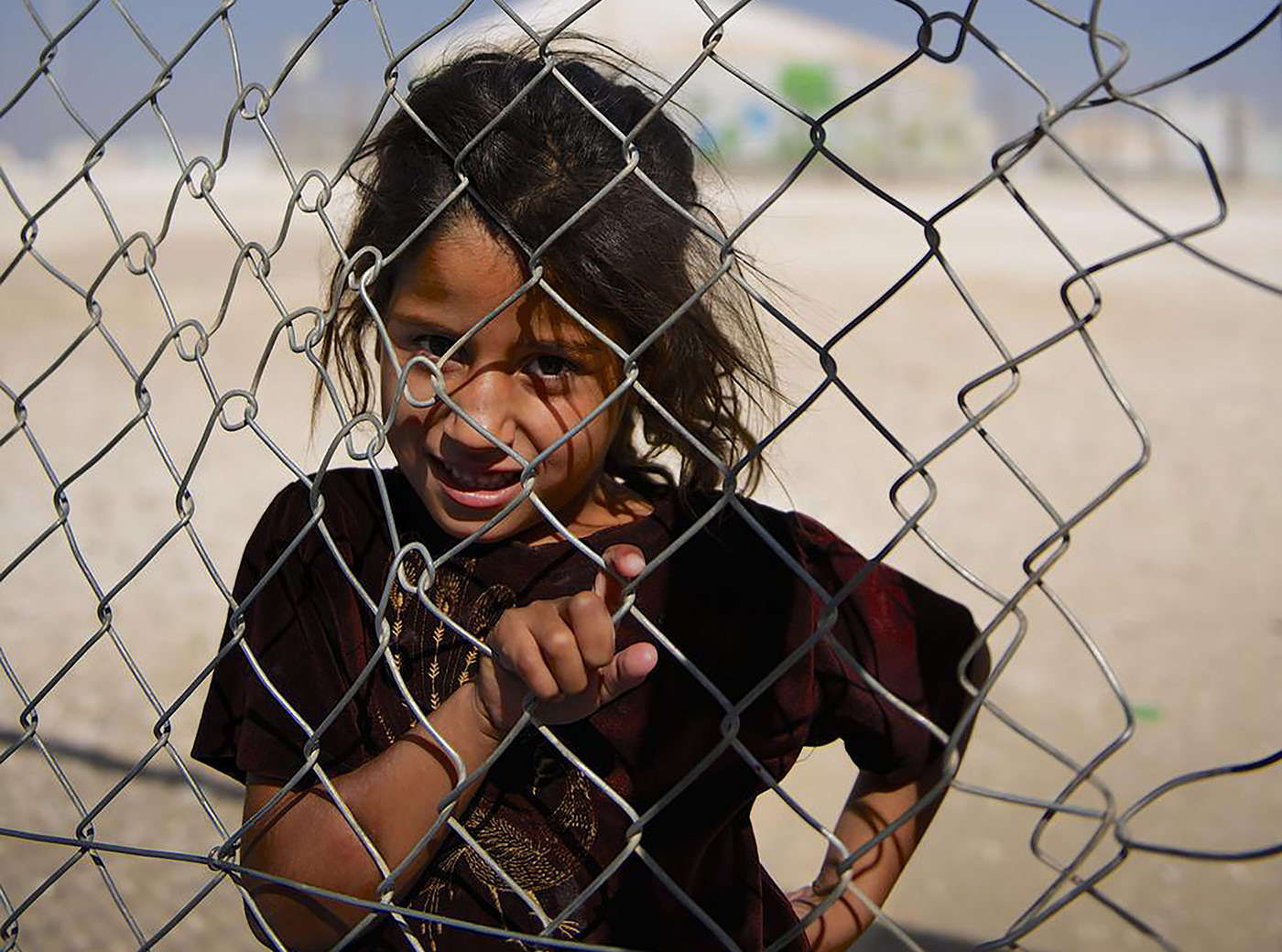
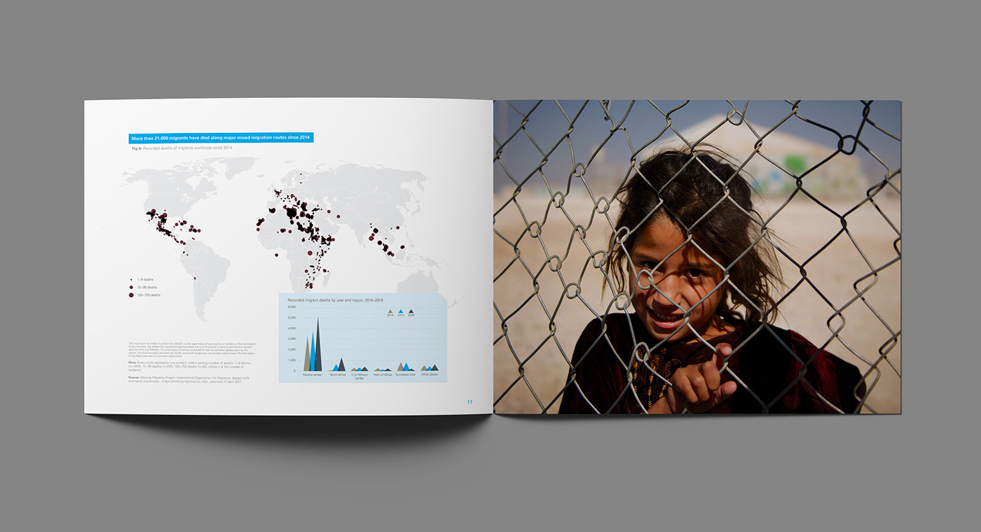
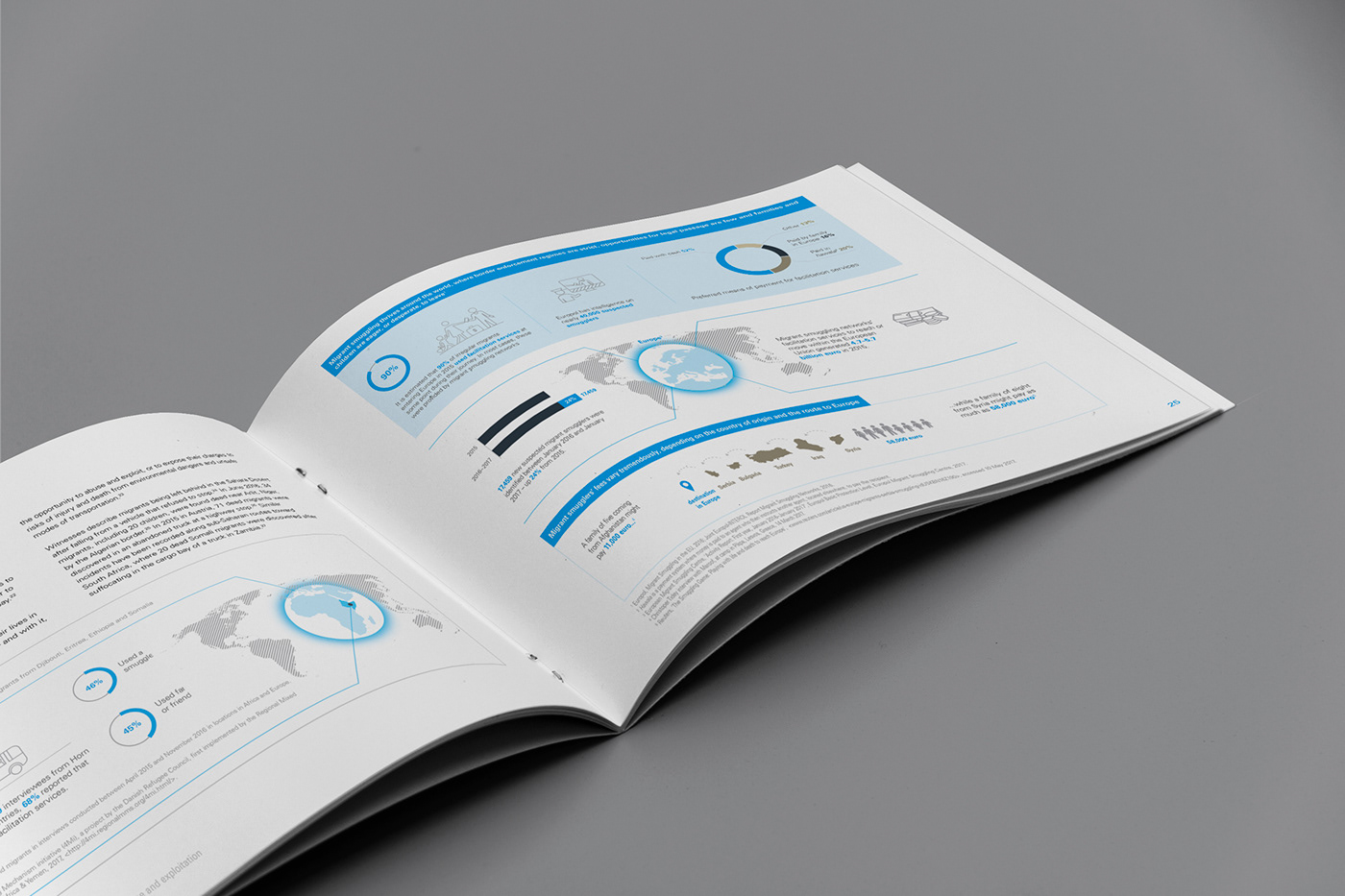
1. Harrowing Journeys
2. A child is a child
3. Thirsting for a Future
4. Mongolia's Air Pollutions Crisis


If you like the work, please appreciate it. We spent months created it:)
↓