Story
Burcak Tolan is a jewelry designer, she was raised in Istanbul, a city that is considered to be the cultural melting pot of the World. A unique place where east meets the west and for centuries art, design and craftsmanship advanced itself by the countless cultures, and civilizations that lived in it.

Designing the Logo
We focused on heritage, craftsmanship, and elegance when exploring and designing the visual identity for the brand. After a long discovery process we decided on the iconic bridge that connects Europe to Asia in Istanbul as a symbol to go after.

Bosphorus Bridge in Istanbul. One side of the bridge is Europe and the other side is Asia, where this bridge connects the two continents.
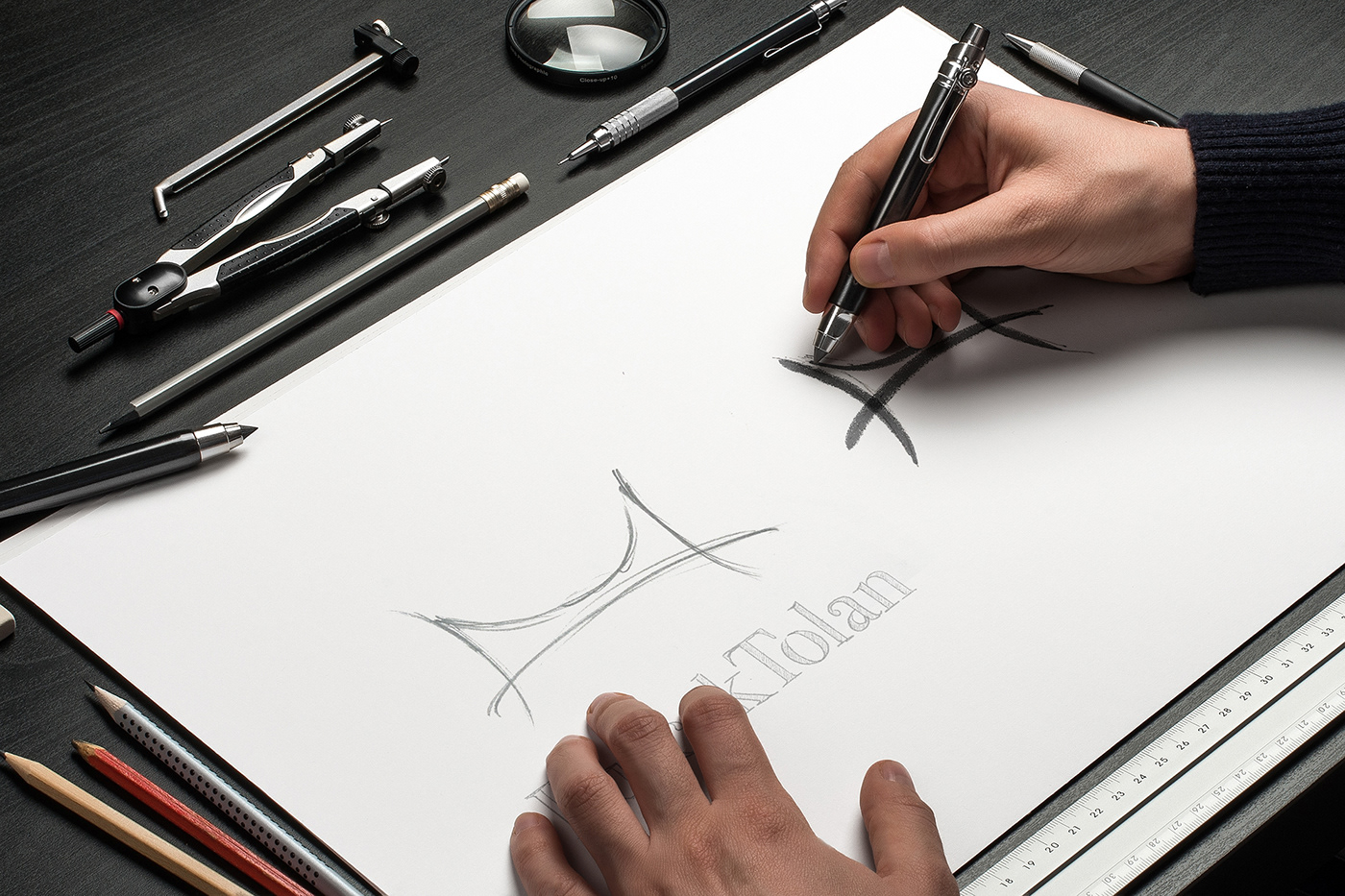
At Hota we start and identity design or brand look exploration with pencil and paper. There is something magical that happens each time the mind, the pencil and paper meet and flow freely.
Colors
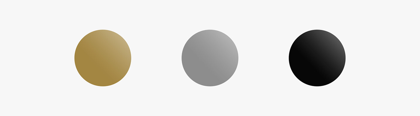
In defining the color system for the brand we got inspired by the commonly used materials in jewelry making such as Gold, Silver and the color of elegance and strength, Black.

Process of Designing the Branding Elements & Applications
We went to Istanbul to experience the space, place and the design and production process of these pieces. The elegance, intricacy and meticulously detailed craftsmanship of the pieces in mind, we worked hard to design a branding that can carry the weight of these pieces with subtle details that ties the two together.
We used gold as a border for the Envelopes, Thank you cards and on Business cards. We designed the envelopes with a Turkish/Ottoman Pattern on them as a varnish, which gave a little bit of a raise and texture to the material. Clients who bought jewelry from BT received these envelopes along with a handwritten thank you note specific to them. Great responses to this experience and the envelope keeps coming, making us happy as creators.


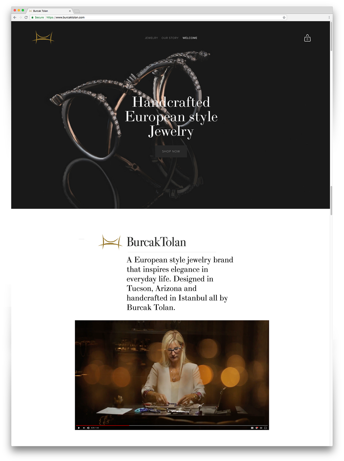
Website | burcaktolan.com
Photography
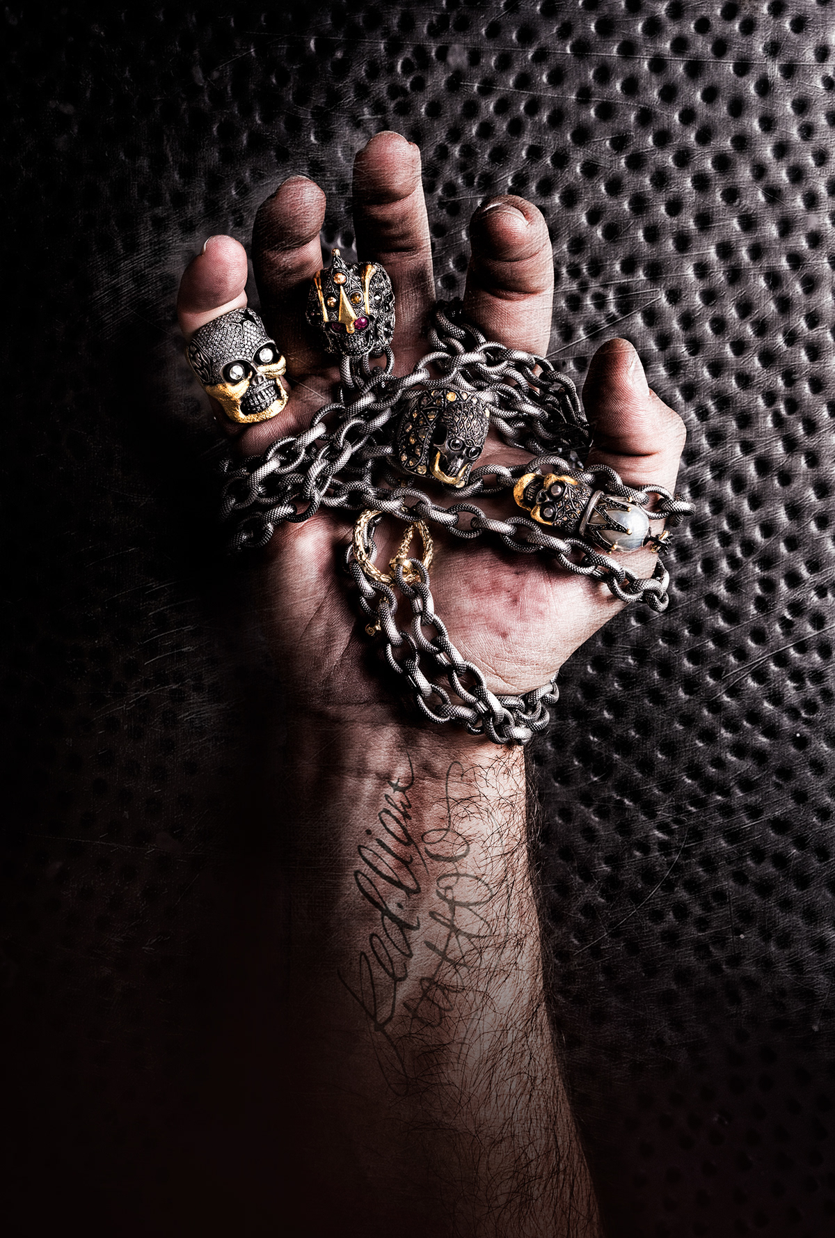
We used a technique called focus-stacking when shooting each jewelry. Focus-Stacking is similar to a cat-scan. Camera is set to move in mm's at at time and takes a photo, when the process is done the full collection of photos gets stacked/stitched together to create a single all-in-focus image. After that process a long retouching and color process starts.


Thank you for viewing - Follow us for more and we will do the same.