Packaging design for 'Well Bean' craft chocolate.
A compound name is consonant with 'well-being' which givesthe product a positive attitude.
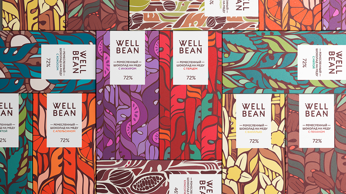
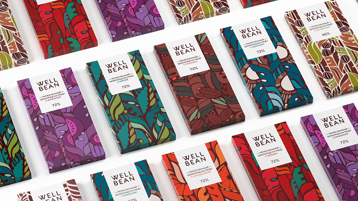
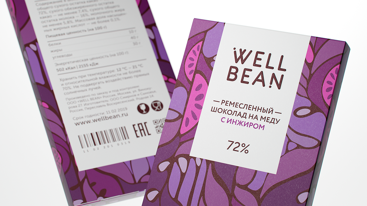
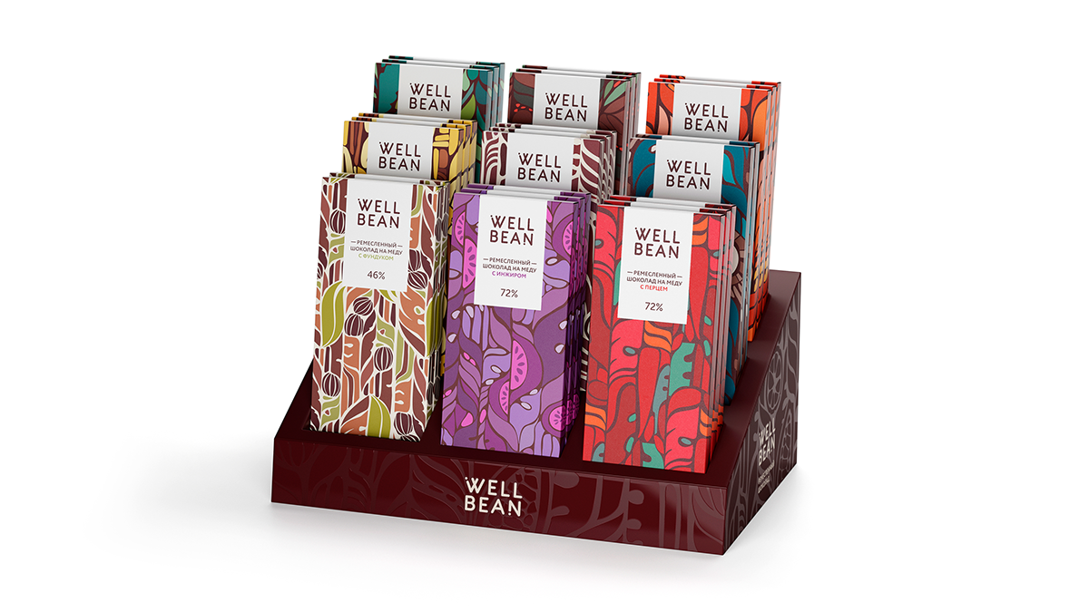
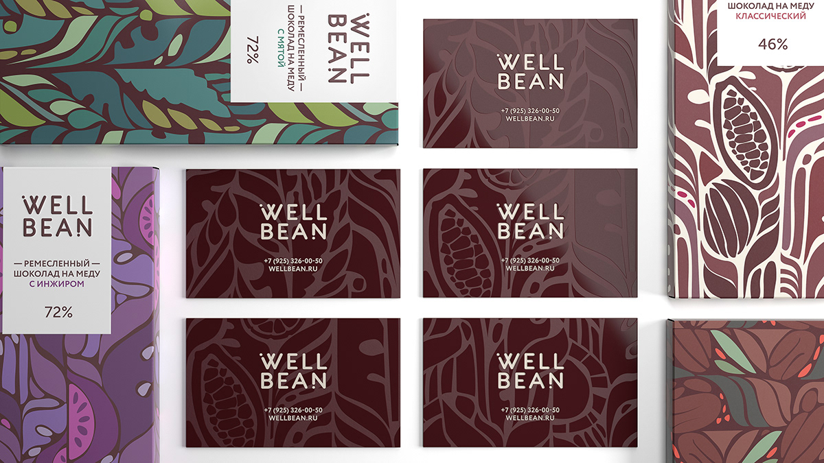
The chocolate belongs to a healthy food segment, because it is produced using honey instead of sugar. Bright floral ornament emphasizes the wild nature of the ingredients.
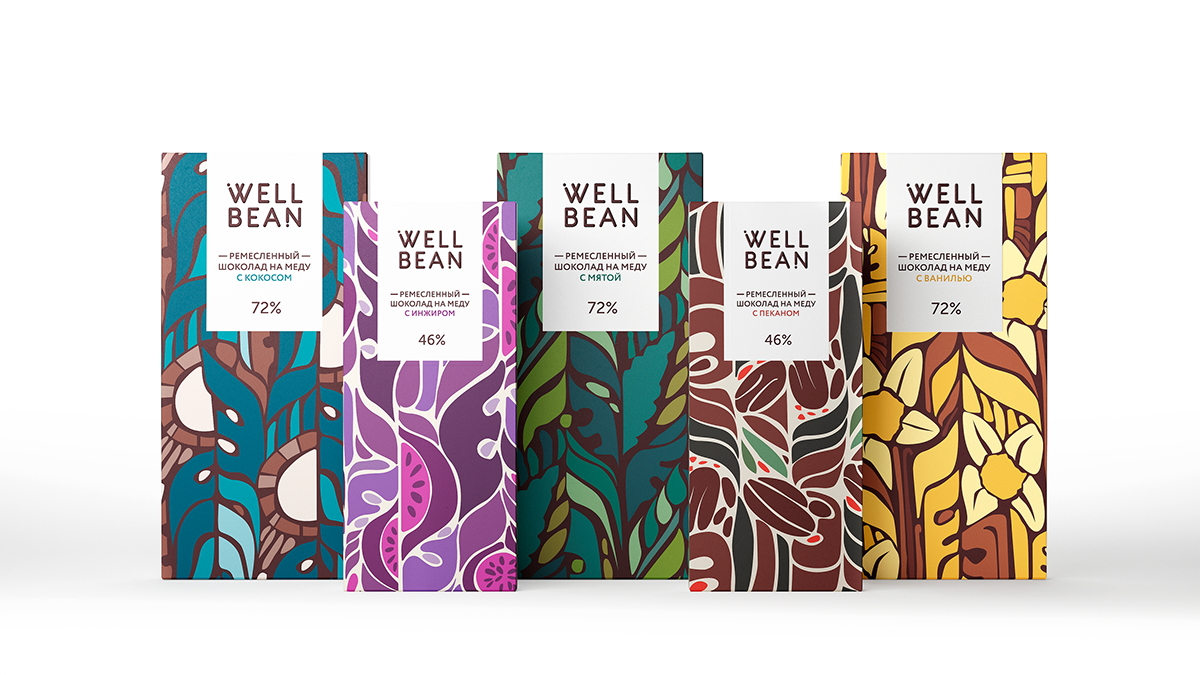
The color scheme was chosen taking the taste range into account. Each taste is encoded with its own color, which makes it easy to distinguish them.
The color scheme was chosen taking the taste range into account. Each taste is encoded with its own color, which makes it easy to distinguish them.
Дизайн упаковки ремесленного шоколада Well Bean.
Для нейминга использовано составное название, где Well — хорошо, а Bean — производное от cocoa bean (какао боб). Созвучно английскому well-being — позитивный настрой и благополучие.
Шоколад без сахара, на меду. Яркий растительный орнамент на упаковке подчеркивает натуральность ингредиентов.
Цветовая гамма подобрана с учетом вкусовой линейки. Для каждого вкуса используется свой цветовой дескриптор, который позволяет легко их различать.
Шоколад без сахара, на меду. Яркий растительный орнамент на упаковке подчеркивает натуральность ингредиентов.
Цветовая гамма подобрана с учетом вкусовой линейки. Для каждого вкуса используется свой цветовой дескриптор, который позволяет легко их различать.