Ecad (Escritório Central de Arrecadação e Distribuição) is the national copyright collection agency in Brazil. With a strategic but little perceived role in the production chain of music and a scope of action far beyond copyright collection, in 2016 Ecad felt the need to undergo a thorough brand repositioning.
Building value for the Ecad brand while making it relevant in a context where the way we produce, distribute and consume music evolves every day was the challenge embraced by our team at Tátil.
Building value for the Ecad brand while making it relevant in a context where the way we produce, distribute and consume music evolves every day was the challenge embraced by our team at Tátil.


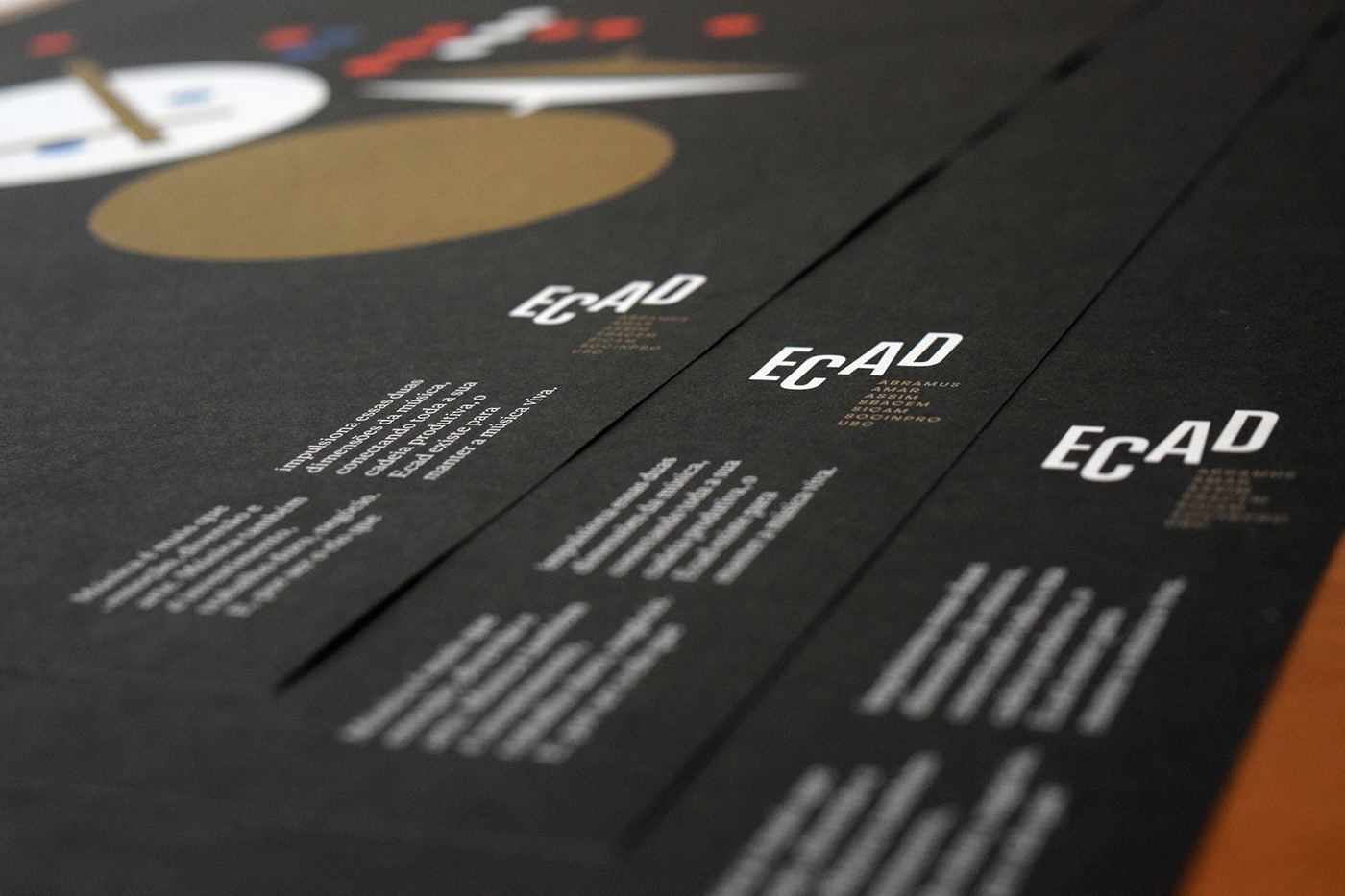
Excerpts from the Brand book: Creative Concept (in Portuguese).
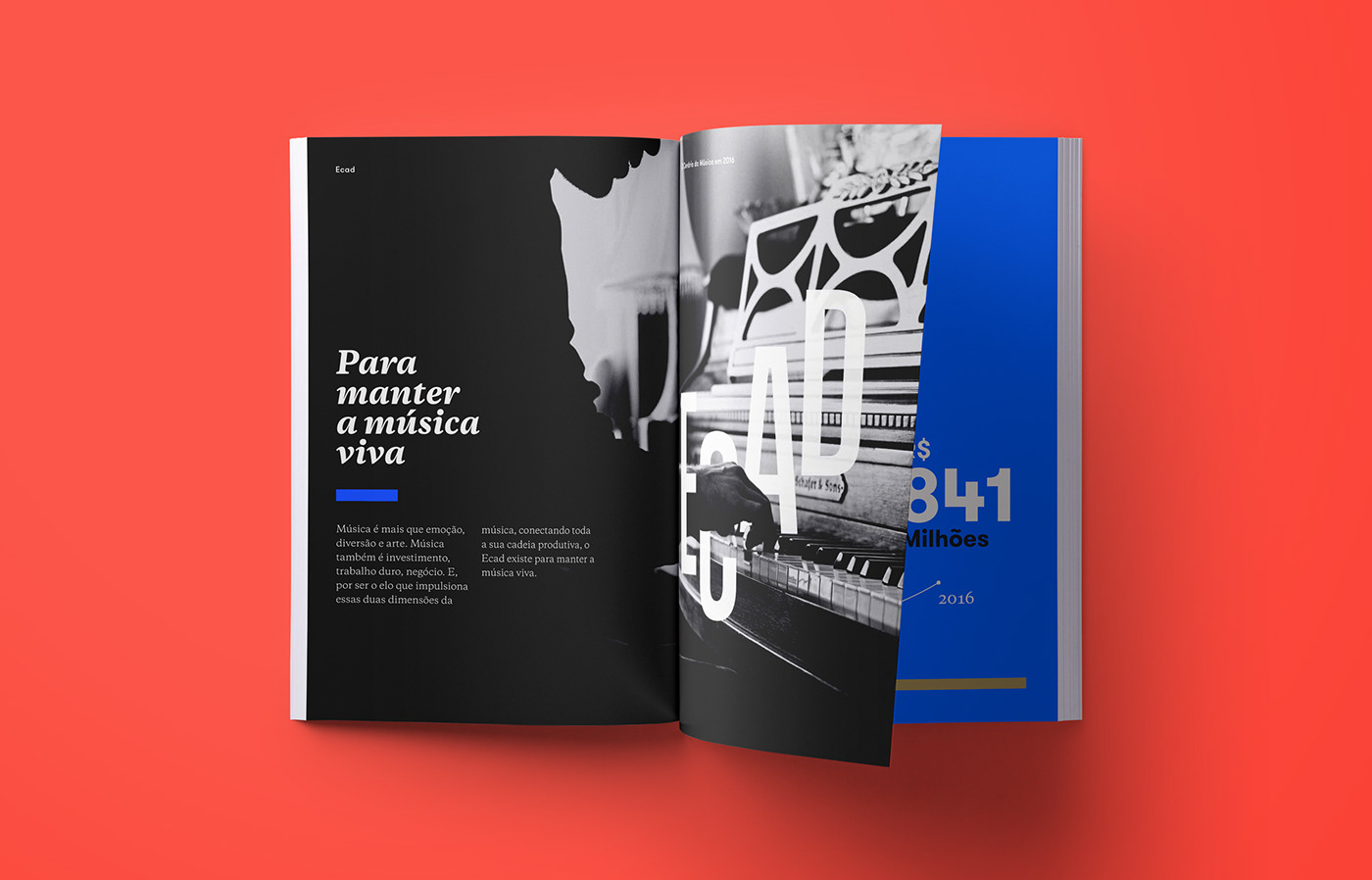
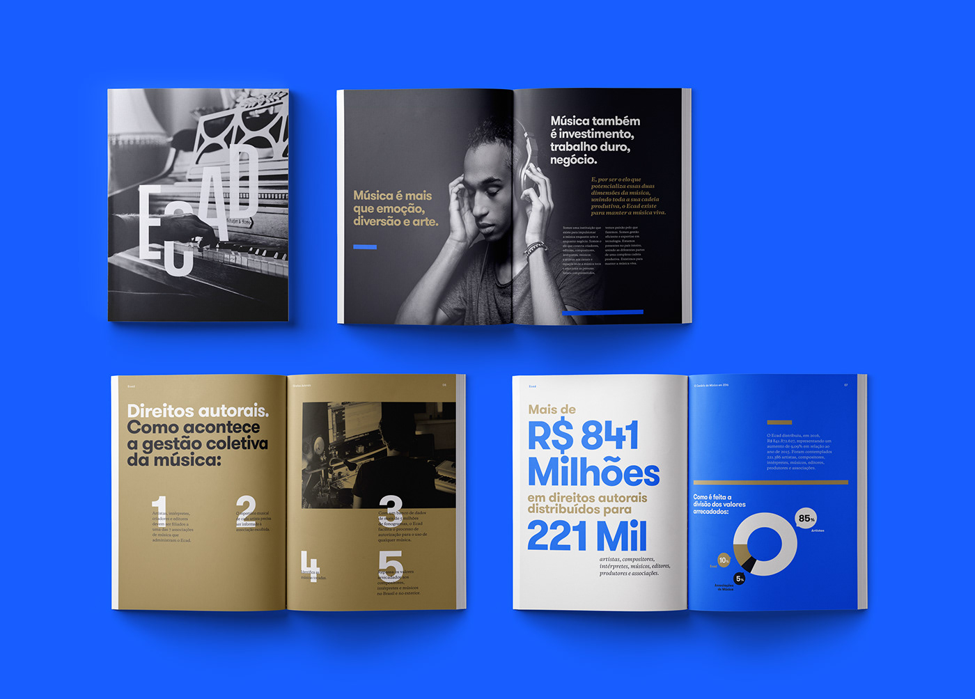
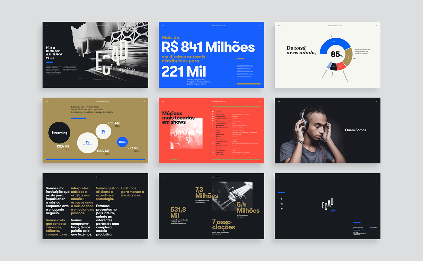
Music is more than emotion, entertainment and art.
Music is also investment, hard work, business.
And being the link that propels these two dimensions of music,
connecting its entire creative chain, Ecad exists to keep music alive.
And being the link that propels these two dimensions of music,
connecting its entire creative chain, Ecad exists to keep music alive.
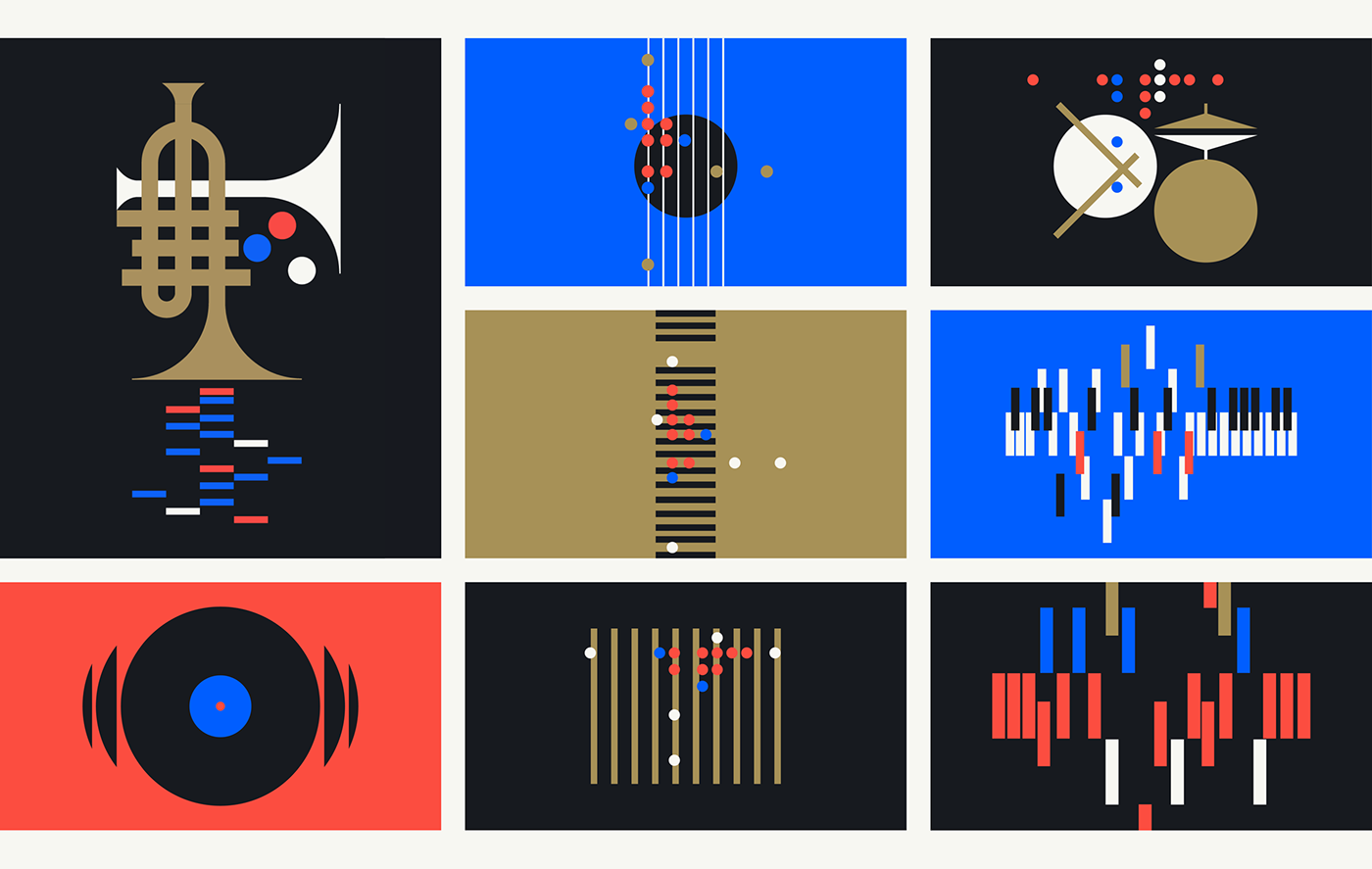
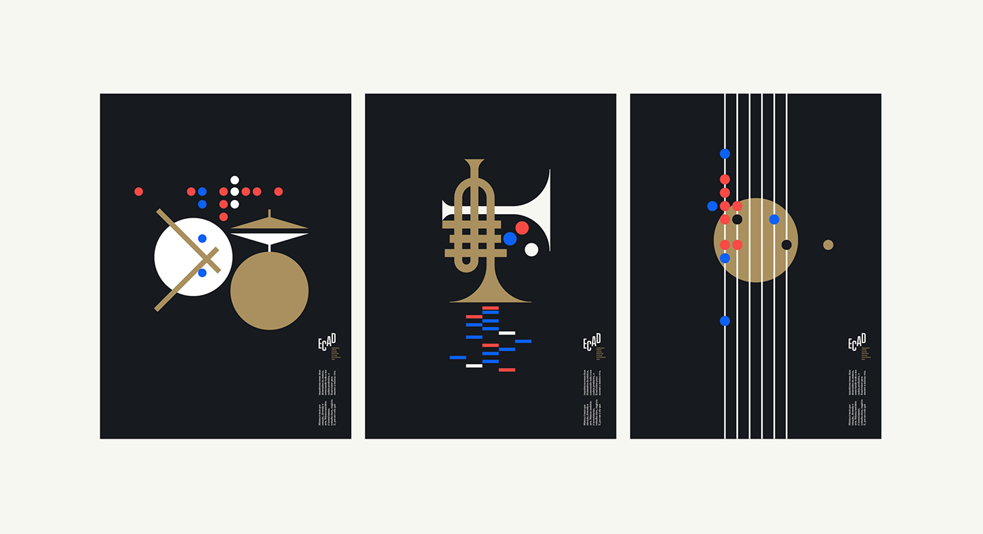
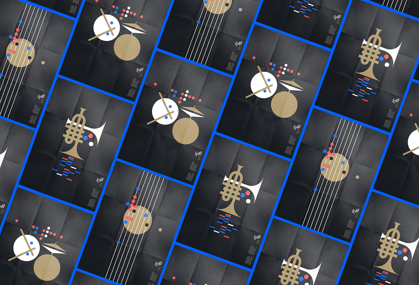
This concept insight allowed us to view and treat this project much more into the music universe as a whole, which was key to revitalizing the brand and creating a fresh, unifying & compelling system – something that had been somewhat lost in previous brand management efforts. It then seeped into every aspect of our work, from logo design to visual & verbal languages, in the form of musical composition principles such as rhythm, scale, articulation, harmony.

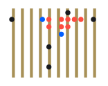
Early explorations of an idea
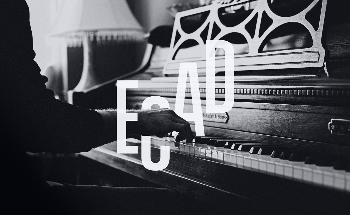
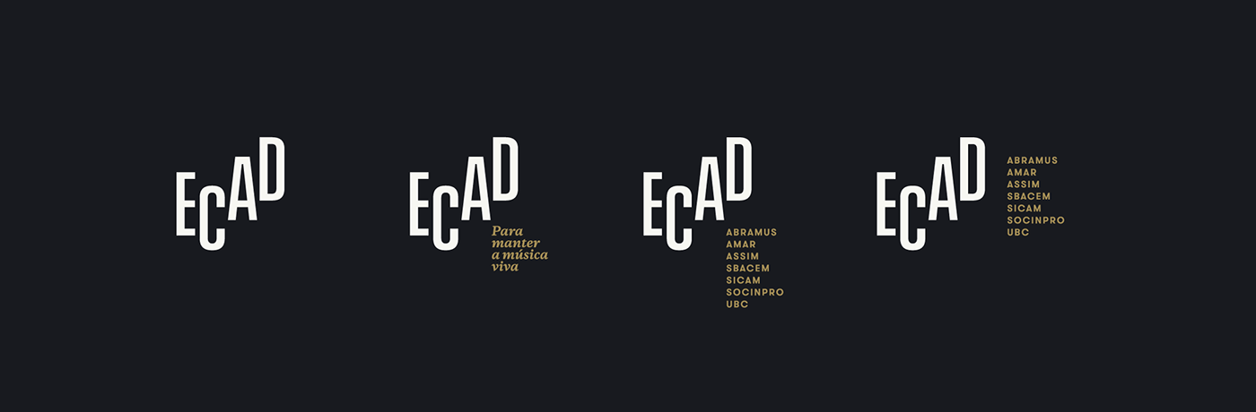
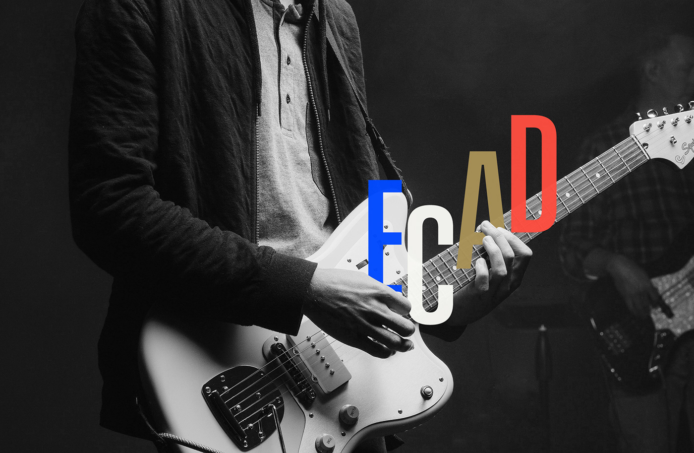
The new logo was born from a somewhat coincidental insight: that its four letters were actual equivalent to musical notes, something that could give us not only sound, but form. It was one of those rare a-ha moments for logo design (when first presented this pitch, board members, many of whom are musicians themselves, wondered how they hadn’t thought of it before).
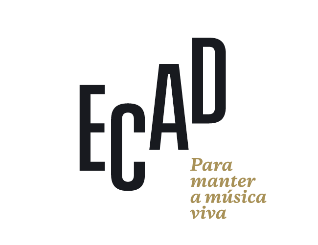
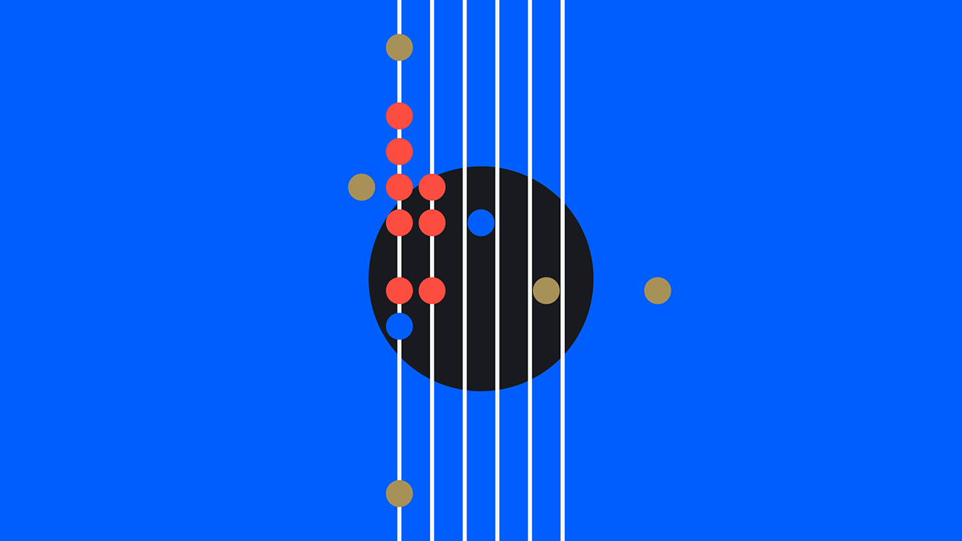
Modularity and movement. Articulation and rhythm. The new logo takes advantage of the most inspiring dimension of music to represent Ecad as the element that unites the different parts of an ecosystem, generating connection and balance. It connects and inspires empathy, materializing Ecad’s purpose of being an instrument that exists to keep music alive.


Brand launch video (in Portuguese)
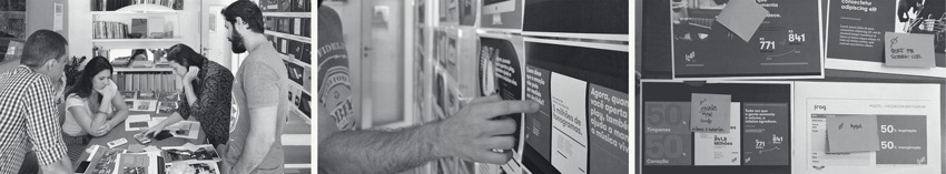
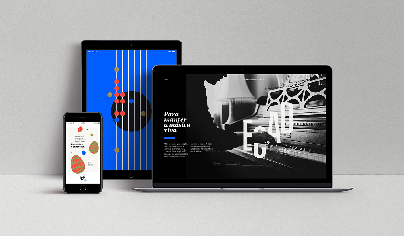
After this rebrand, Tátil took over a 9 months communication fee with the aim of bringing consistency to all following brand expressions and defining a unique strategic and creative territory for the Ecad brand.
–––
My role as lead designer on this project spanned from creative concept discussions to logo design, visual identity elements, their behavior and a thorough brand book. Being a musician myself allowed me to look at it from an interesting perspective which, hopefully, resulted in a strong prevalence of musical Gestalt — harmony, scale, balance, rhythm — in the visual identity system as a whole.
Tátil Design
Creative Director: Ricardo Bezerra
Copywriter: Ana Cunha
Designer: Daniel Escudeiro
Strategy: Tania Savaget & team
Website: O Grito
Communication fee rollout: Ana Martino (Design), Gustavo Feyer (Copywriter)
Awards
13ª Bienal Brasileira de Design Gráfico [Brazilian Biennale] · 2019
Brasil Design Awards — Silver (Branding) · 2018
Brasil Design Awards — Silver (Branding) · 2018