
The underlying idea behind this design was to create a visually rich and appealing letter (print) to be sent to schools all around the country. The main design requirement was to create a 'folded' letter with half of the page dedicated to visual while the other half to be used for information.
I decided to create three different designs with the material at hand, and a look-n-feel close to company's homepage. The icons and illustrations are pre-designed by another freelancer.
The first design (which was eventually picked to be used), was a portrait letter design dominated with curved background elements and shades of blue (which is company's main marketing color). My approach here was to focus on what is to be appealing for an audience (school admins) who have never heard about the brand, and its services. What would would matter here was clear-cut to-the-point introduction of the main features, accompanied by short and concise headlines and taglines to be visible at the first sight.

I also created two alternative designs that followed a more minimalistic approach to the design. Here, the focus was more on the information presented on the second fold, while using a clear reference to platform's main colours, and essentially informing the audience about the clear differences that this platform would make with its competitors in terms of visuals and look-n-feel that people are used to (in working with the legacy systems).

A third design was an alteration of the second design, where I used a landscape format instead. With this design, I tried to make it possible for later decisions to be made over the print format (a horizontally folded A4 vs. a double-sided A5). This would also give better chances to for the to focus on what matters the most (i.e. the description).
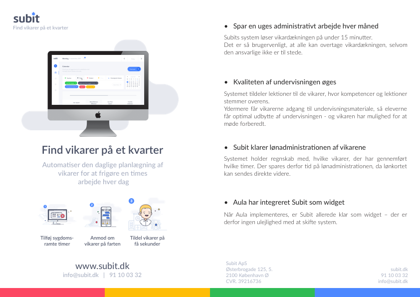
The first design was also used on the back of the Skole magazine sent to schools.


