JAIEL
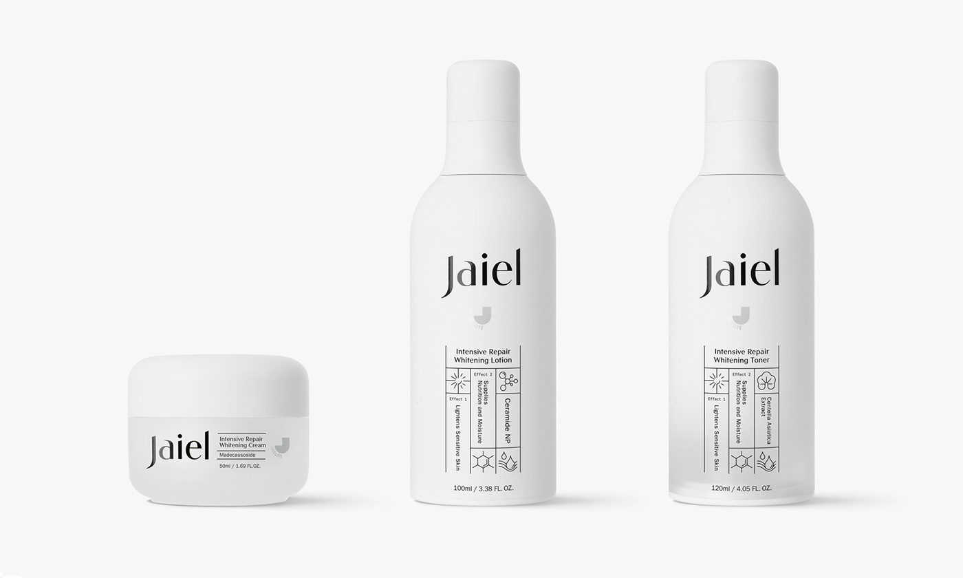
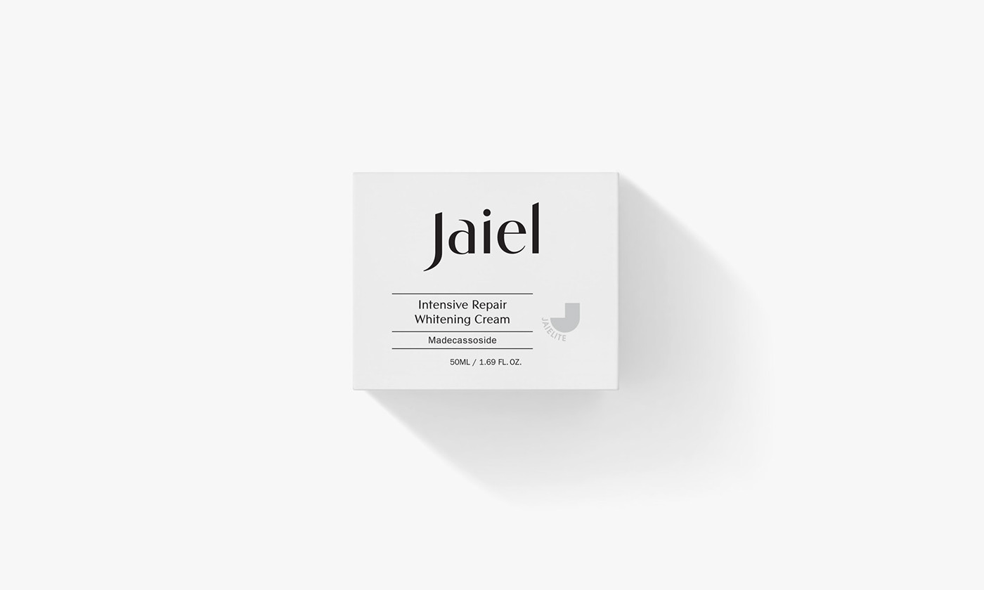
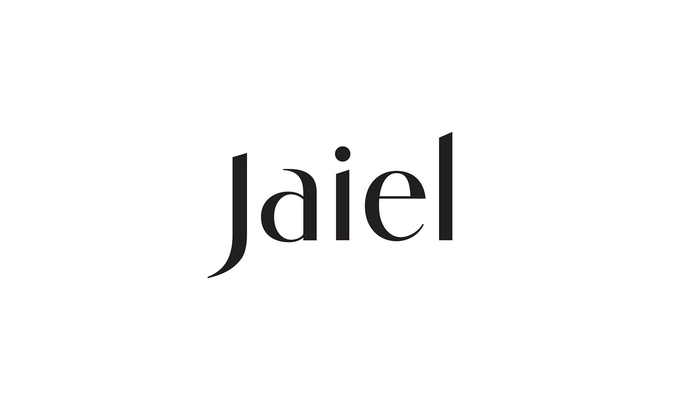
We designed the identity, certification mark, and package of Jaiel, a cosmetic made from Jielite, an antibacterial material. Jaiel's logotype was crafted with Vincenza Display, a font that stands out in harmony with straight lines and curves, to express the meeting of cutting-edge technology and beauty, and the certification mark pursued a geometric shape by focusing on a more technology-intensive image. Icons are designed and applied on the front of the product container and box so that consumers can intuitively understand the product functions.
Identity & Packaging Design | Service Plan Korea | 2018