


Art direction, branding, digital experience
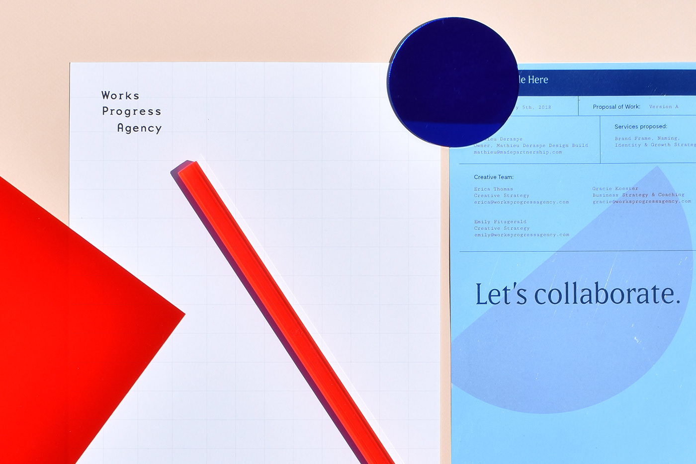
Works Progress Agency is a Portland based feminist business consultancy that brings art to work & work to art. They help to strategize the role art plays in corporate settings, as well as advise & aid artists in making their art practice sustainable as a livelihood. They needed an identity that meshed these ideas, as well as made some reference to the original Works Progress Administration, an institution that provided work & public art during the Great Depression.

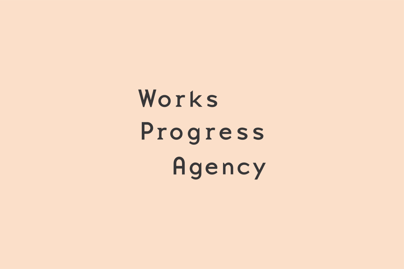
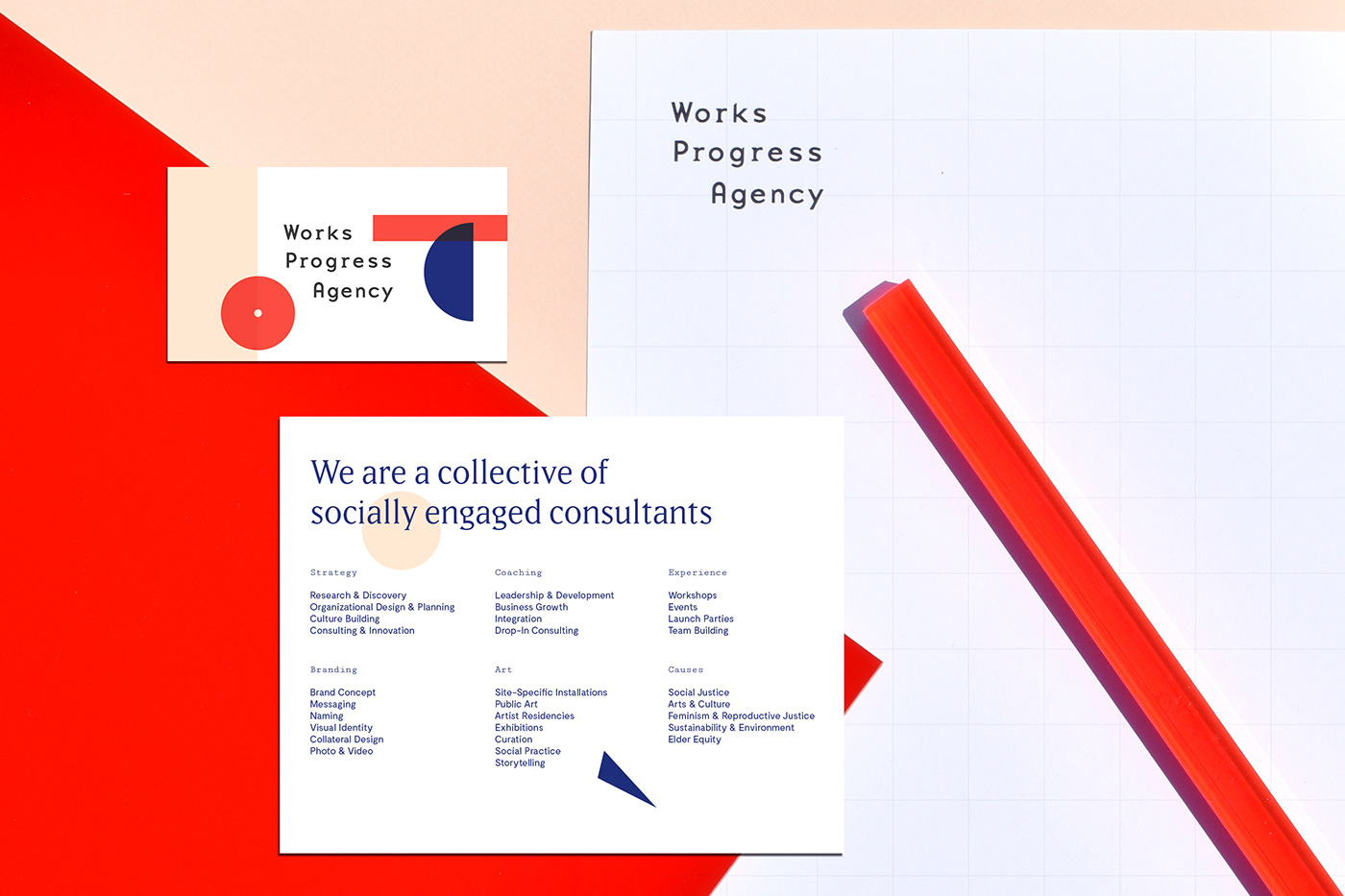
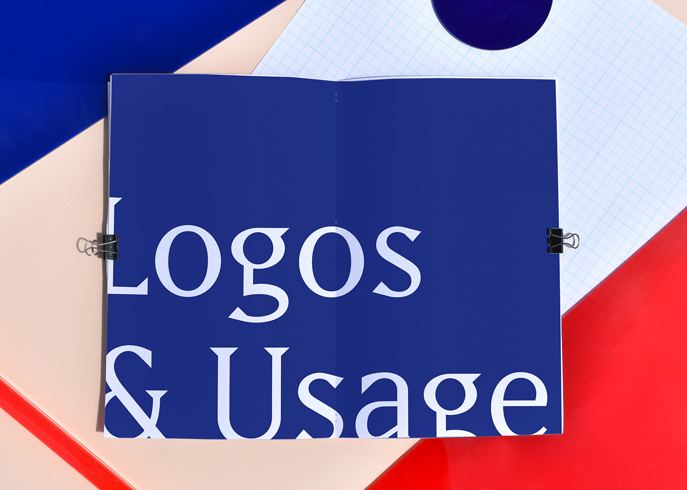
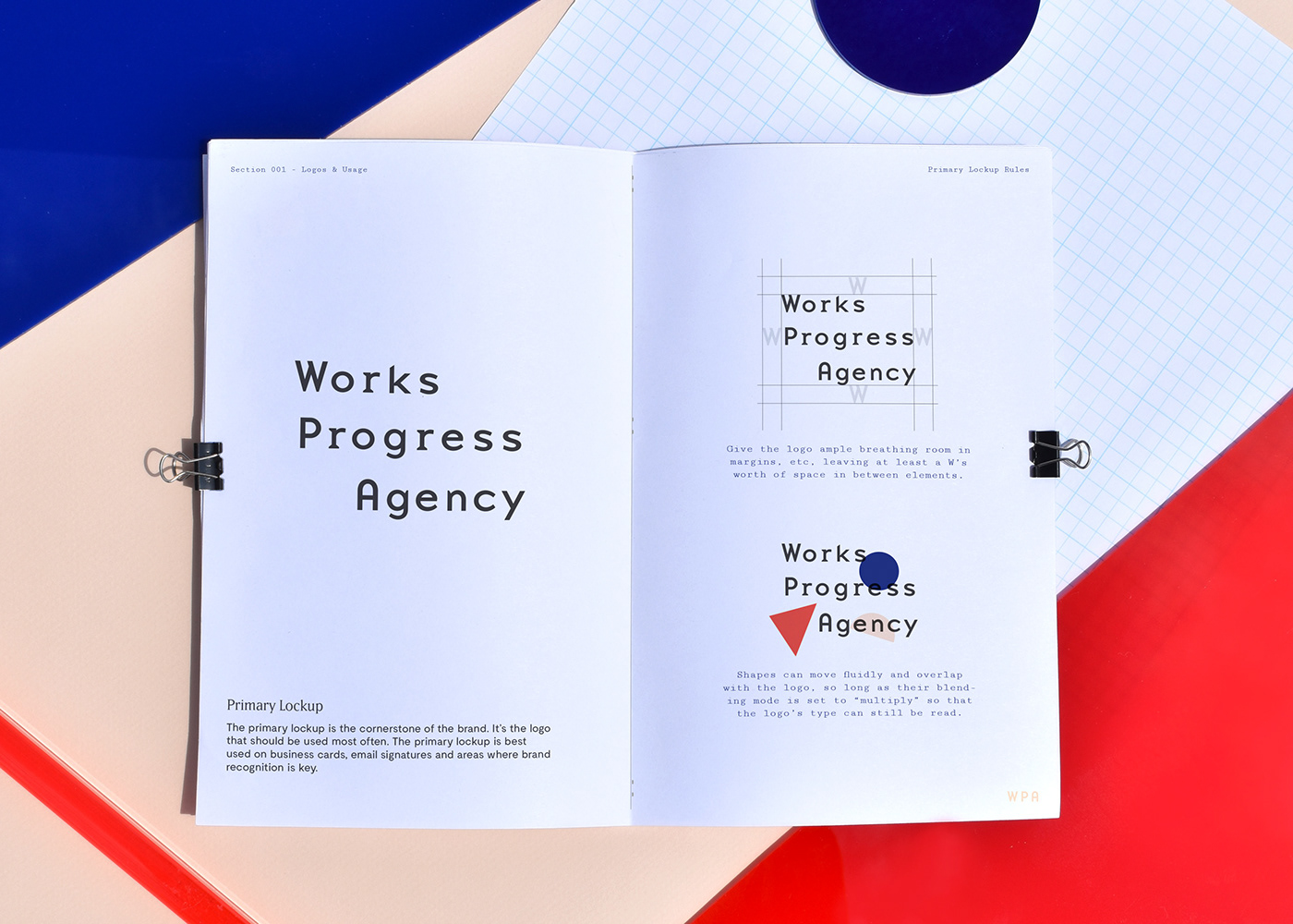
The logo system is entirely typographic, appearing in three main formations which provide flexibility dependent on context. The typography itself shares a similar language to the historical WPA typography, yet reinvents it for this century.

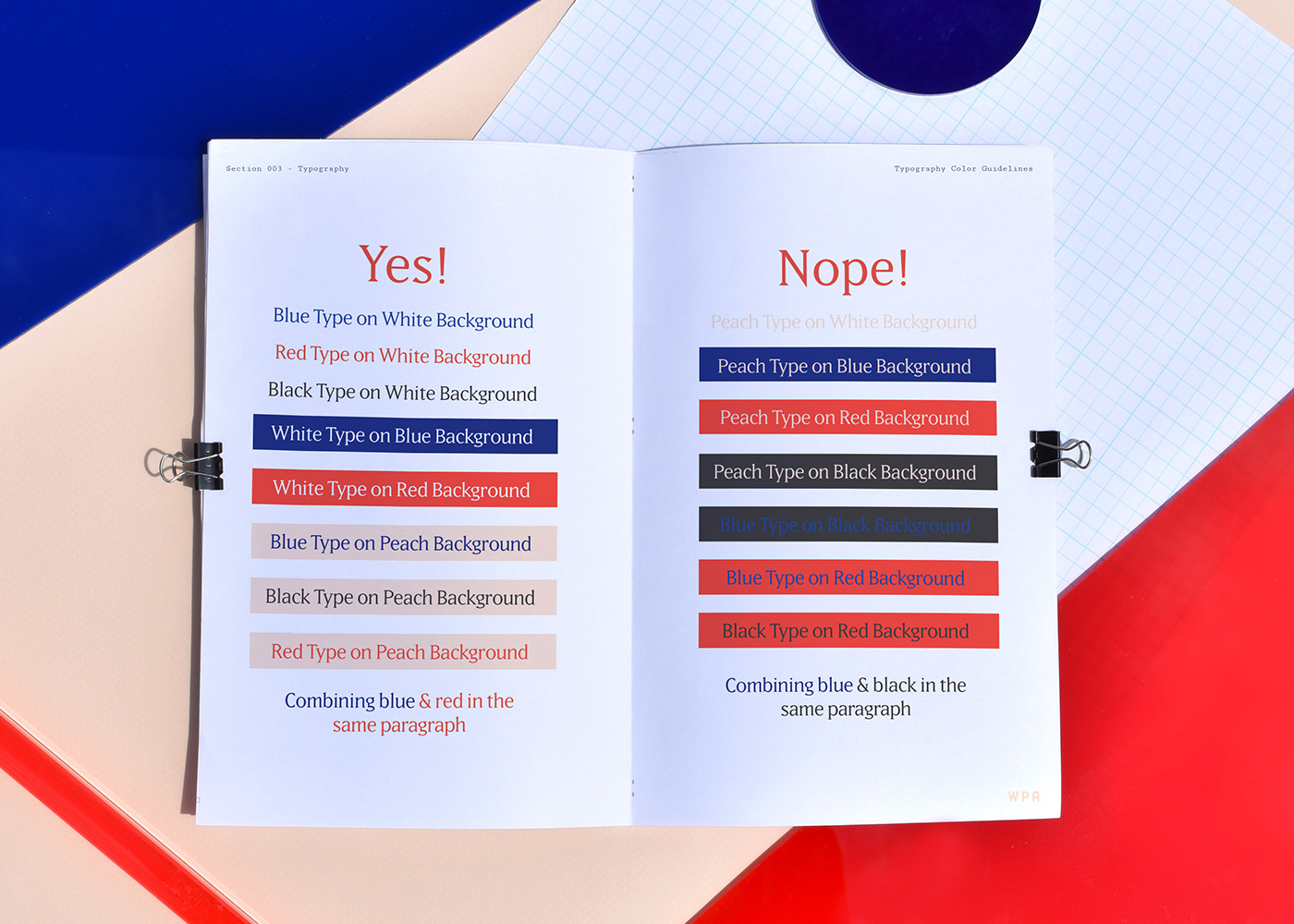
The brand's typography palette is a delightful blend of modern faces with vernacular references.
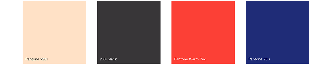
The colors are high-contrast, yet create interesting multiplication when overlapped.
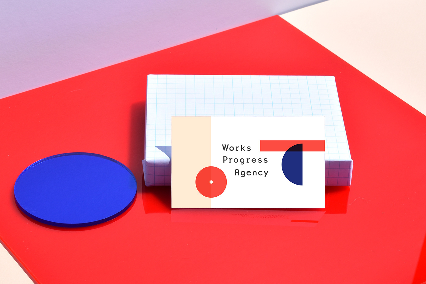
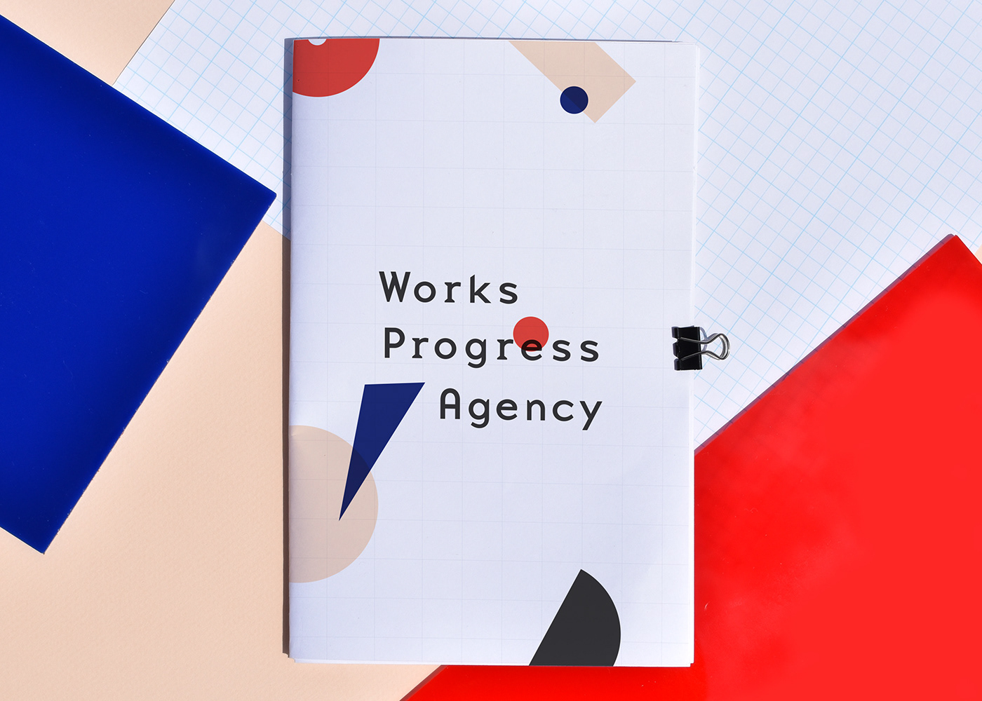
Studio HMVD created a flexible identity where shapes could overlap
to take on new forms, as well as disrupt the gridded boundaries they’re placed within. We reference history the use of the form– an age old administrative structure– disrupted by the shapes to create a sense of play within structure.
to take on new forms, as well as disrupt the gridded boundaries they’re placed within. We reference history the use of the form– an age old administrative structure– disrupted by the shapes to create a sense of play within structure.


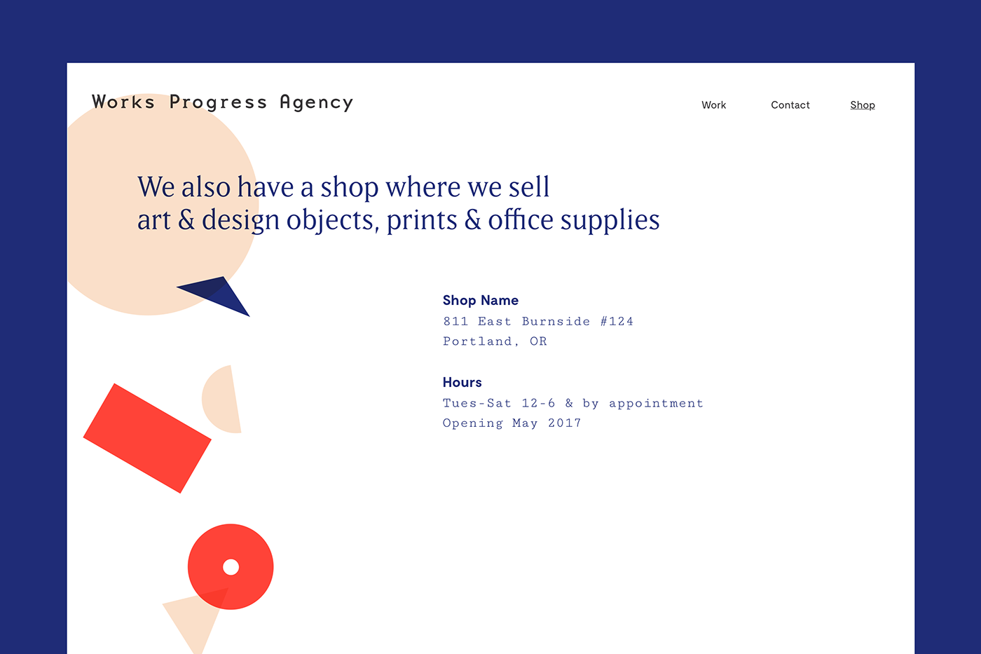
We created a set of web templates that WPA could use to further modify and keep up
their site with. We also provided a comprehensive style guide which they could refer back to as the brand grew & developed.

Thanks for looking! Please check out more of our work at studiohmvd.com
and follow us on Instagram at @studiohmvd


