
Defining The Challenge
Online learning has exploded in popularity in the past 5 years. Most online courses (sometimes referred to as “Massive Open Online Courses” or MOOCs) follow a similar format: watch a video lecture, and complete some sort of a knowledge check. However, the statistics speak for themselves, as MOOCs have a less than 6% completion rate. We’ve all been there – we get excited about a subject, find an awesome course taught by a highly credentialed lecturer, begin the course, and then….life gets in the way. Working professionals are most likely to fall into this trap, often having to choose between investing in their professional growth and actually performing their job.
I designed Startship to give professionals a better way to build new skills by leveraging the power of active learning. The courses (called Journeys) also help organizations build a culture of innovation and intrapreneurship within their ranks. Although I could wax poetic on the state of education, all the research around experiential learning, and my vision, I’m going to focus this case study on how I built and launched the platform.
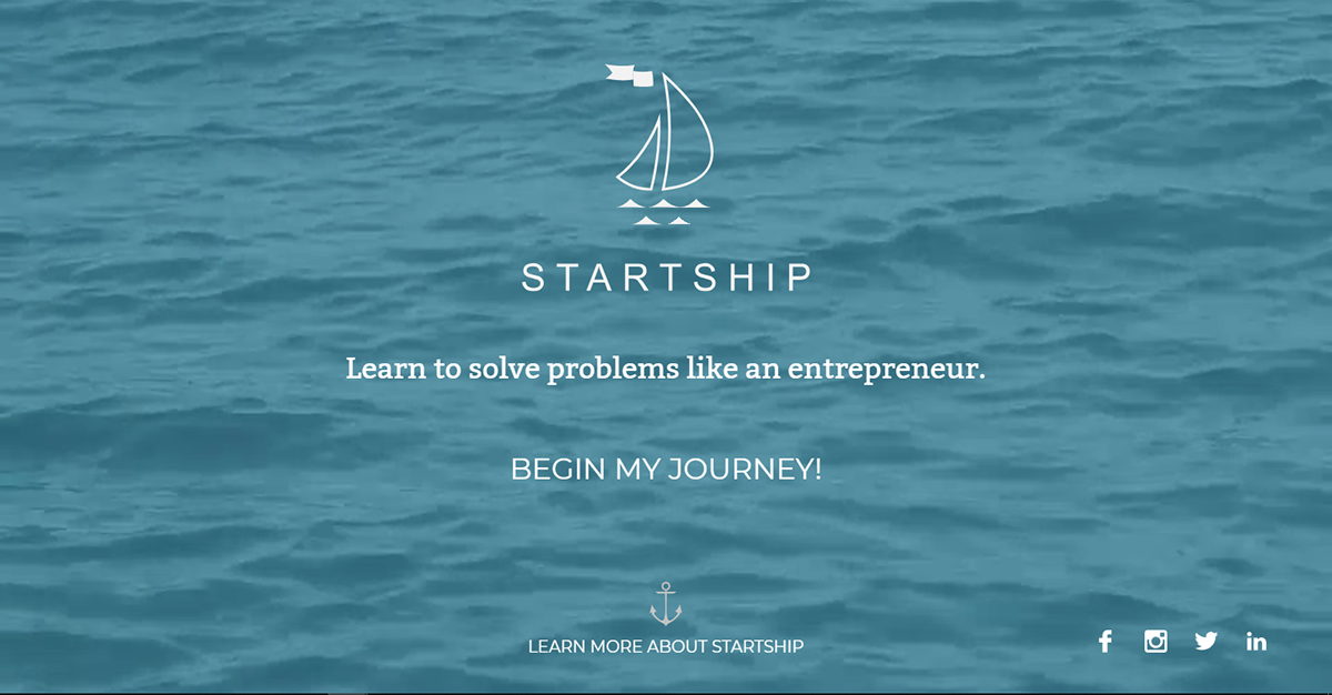
Live site landing page from June 2018.
Startship is in many ways the manifestation of my learning and teaching style. I based the content and format on the courses I have taught at the university level these past 6 years. To build the product, I once again collaborated with Alexey and his crew at Dev-Better to build and maintain this product. Startship was my primary focus between January 2017 and June 2018.

Gathering Information
Startship was born while speaking to a friend during the Summer of 2015. My friend mentioned that he had 3 primary options for professional learning: MOOCs, workshops/certification courses, and conferences. I talked to many (70+) other individuals over the next six months, and found that the major drawbacks of these options were a lack of engagement, the poor time-to-knowledge ratio, and a frustrating user experience. I dove into the competitors’ products, and noticed that outside of coding, no other platforms were activity driven (i.e. experiential). This gave me the idea to build an active learning experience specifically for professional learners that taught skills related to product development.
The first iteration of Startship was put together by a few students from Croatia I connected with through a forum. They wanted to do some work to build their portfolio, and were willing to take a stab at designing and coding a first iteration of Startship. What they put together worked as a rough prototype, and helped me solicit feedback. They also laid the foundations for the brand identity, which I would later overhaul.
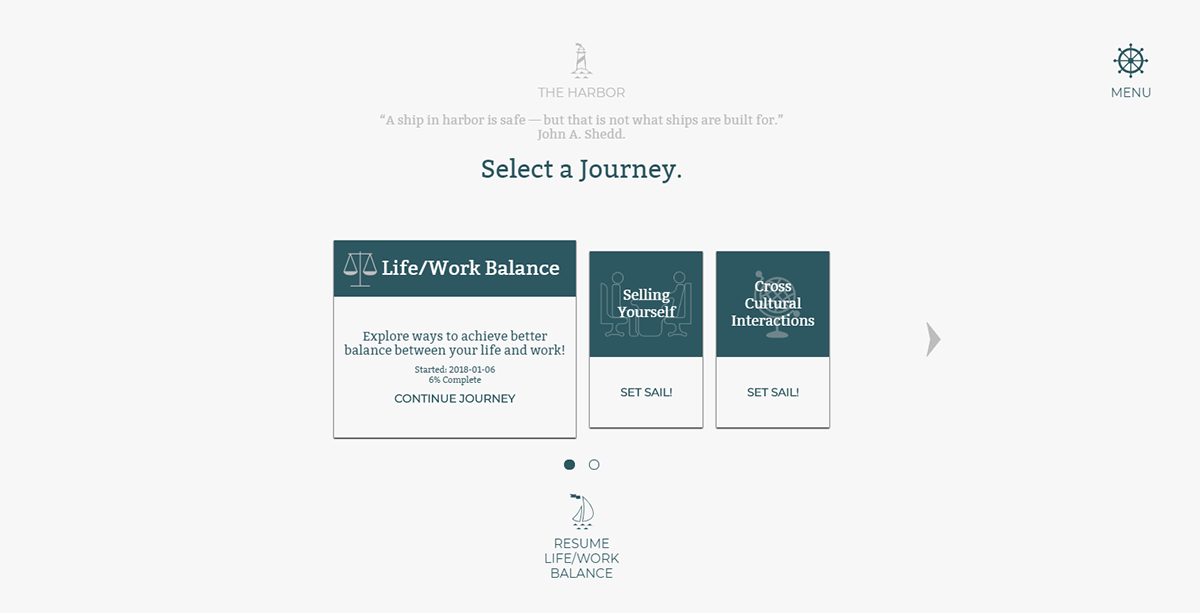
Screenshot of the Harbor i.e. the Journey selection screen
Laying Out The Plan
Based on user reactions to the rough prototype, as well as my competitive research (online learning has a LOT of players), I decided to design Startship for working professionals between 22 and 35 years old working at companies with at least 100 employees in some sort of a technology enabled field. While the product certainly didn’t exclude older or younger learners, this demographic most readily embraced the idea. These professionals also tend to invest in personal growth and value building new professional skills. I found that this user group prioritized knowledge retention, a frustration-free user experience, and strong content.

Help sections were under 250 words, and aimed to help users build frameworks rather than simply presenting them with knowledge. Links to external resources appear under "Dive Deeper."
Creating The Startship Identity
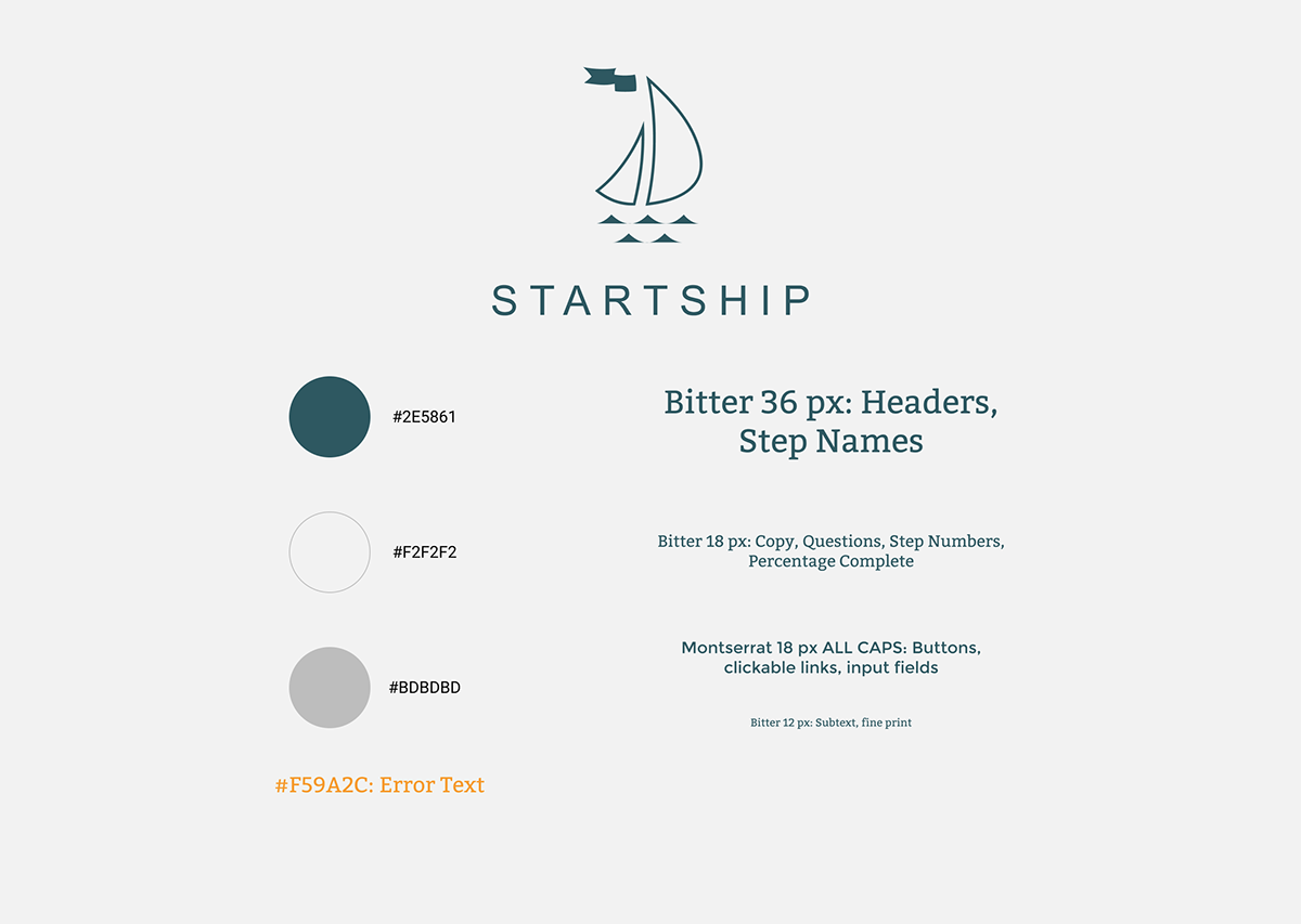
Startship gave me a chance to build a fun identity since I had 100% creative control. I wanted the identity to go beyond a simple brand package and embody the qualities I admired as an entrepreneur and designer. I also used this as an opportunity to set the groundwork for a larger story, and establish a “world” around Startship. The name “Startship” lent itself to many interpretations, allowing me to play with ideas like a rocket ship motif and an old-school airship theme. In the end, I decided to go with a nautical theme as I felt that was the most approachable way to look at the process of product development. I liked one of the logos proposed while creating the prototype, and decided to iterate on it for simplicity. In the end, I settled on a clean sailboat logo. I paired this with a simple capitalized, wide-letter spaced Montserrat word mark.

For the colors, I drew inspiration from the sea. A muted sea-green and an off white would serve as the primary colors. I used shades of gray for accents, and an orange for error text. This is the most minimal color palette I have used to date, and it really helped me keep design decisions simple and clean.
Once I had my Logo and Colors, I chose fonts. I knew I wanted to play with a serif/san-serif combination, as I wanted the age of the nautical adventure to be indeterminate. The “world” of Startship isn’t the high seas of the 17th century, or the age of sea-liners in the 1920s – it’s intentionally an anachronism stew. I chose Bitter, a serif font that hearkens to old maritime adventures, as my primary body font. For headers and buttons, I chose Montserrat – a san-serif digital font. I used these different fonts to distinguish between interactive and expository elements throughout the product. While I still stand by this design decision, it was met with some derision.
Building the Platform
The Startship prototype communicated the fundamental product experience of 1 question per screen. I established the general “navigation” scheme, but past that, it was a glorified slideshow. In retrospect, it might have been faster to have mocked the product up in Typeform or Google Forms first, as those platforms would have focused user feedback on the content rather than the design. Regardless, the prototype exposed a lot of what was wrong with my initial logic, and also showed me what worked well.
For V1.0, I went back to the drawing board. I knew that users would need some sort of an account, and a way to track their progress. I also decided that Startship wouldn’t be just 1 massive course – it would be a collection of shorter courses. Additionally, I simplified the design of the slides, and doubled down on the navigational control. I established a custom grid to restrict the number of elements per screen. Finally, rather than making a standard output format for all Journeys, I decided to create unique outputs for each Journey. This required the creation of a basic admin panel.
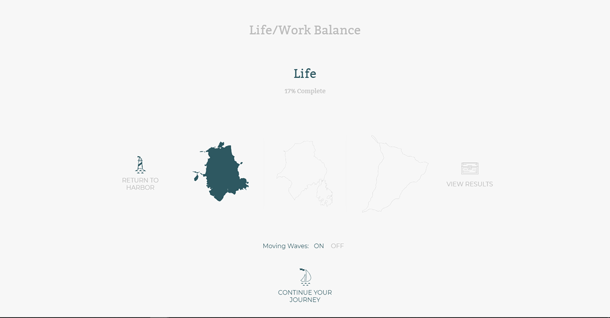
The "Assess Your Journey" screen ie "Top" screen gives you an overview of where you are in your Journey using a map-like interface

The Grid system I designed which dictated the placement of elements on all screens. By naturally shrinking my working area, I avoided cluttering any one screen.
I launched V1.0 in February 2017, and solicited a lot of great feedback. I signed up to debut my v2.0 at the Virginia Venture Summit in April 2017, so I had 8 (intense) weeks to compile user feedback and interviews, turn that data into design revisions, and build the new features. Thanks to Alexey, Sergii, and the Dev-Better Team, we were able to pull it off in time and launch Startship V2.0, which I consider this version the “release” version of the product.
Version 2.0 continued to evolve, as we introduced more user controls and administrative functionality. The most recent version was V2.34. While the core product experience has remained relatively consistent since V2.0, there have been a lot of usability improvements, and a total overhaul of the Journey selection screen (called the Harbor). To view all the changes, you can check out the version log here.

Overview of the Mobile Screens. Not exactly a "mobile first" experience, but these views cleaned up the site for the rare mobile viewer.
Startship requires a lot of typing, and all of our users interacted with the platform via desktop computers. However, I made the decision to adapt the V2.0 product as a responsive mobile experience just in case users decided to use their phone to access their learning materials. I also wanted to lay the foundation for a future mobile app. After V2.1, the mobile version started to fall apart. Although fully functional from a technical standpoint, I would characterize the mobile version “broken” from a design standpoint. My hope is to revise this experience in the future V3.0.

Launching Startship
Startship launched in April 2017, and is available at https://startship.co. Over the past 12 months, we found that 85% of users love it and 15% of users hate it. I’m proud of this divisiveness, as I believe it accurately represents my intent with this product: to take a stand on how I believe online learning should work.
Most of the criticism was directed towards the layout and design. Other users found the courses to be frustrating, as the “guided inquiry” style of questions are fairly open ended. However, the content itself stood out to the vast majority of users who praised how Journeys incrementally built knowledge rather than presenting it all at once. Finally, target users lauded (i.e. employees) the inclusion of discussion guides to discussions around Journeys. However, these did not see the level of use we were hoping for.

Consistent design and iconography really helped set Startship apart from the rest of the products out there, and served to guide users along their Journey.
Final Thoughts and the Future of Startship
Startship failed to gain traction within our target markets. I made an egregious mistake: I didn’t position the product properly for my customers. Although I stress the importance of separately testing customers and users with all of my clients, I fell into this common pitfall. I focused too much on building the product experience for my end users and (falsely) assumed that employees would convince their managers/HR directors to buy Startship for their organizations. However, HR professionals and managers at these organizations didn’t see Startship as an essential investment. This was partially because I failed to effectively quantify the impact to their bottom line, and also because my value proposition focused too much on the superior employee experience.

I designed Startship (both as a product and a business) around these core values.
Despite this failure on the business side, I still love this product. I sincerely believe Startship is a better alternative to any other learning experience out there, and it has the potential to help organizations innovate more effectively. Although I ran out of runway and have to sunset Startship, I have decided to keep the platform live for at least another 12 months. I have made some of the most popular courses free (you can sign up at https://startship.co), and I plan to intermittently launch courses on subjects I find interesting. I’d love to update the platform down the road, and relaunch it to a new market once the time is right.


