Fordistas Un-Branding
The prompt that created this brand is deceptively simple: reimagine Fordistas. Break it, bend it, color it, change it… make it yours. Full control. One month. Fordistas itself was the mystery of the known-unknown: a shape-shifting multi-platform art-plus-[x] project based out of Miami. On first contact, it was tough to pin down what it was. In retrospect the conversation both the invitation and the management of the project are all truly what the brand is about. If the purpose of art is, as James Baldwin says, to “lay bare the questions that have been hidden by the answers”, then this project started off by trying to answer to “what is Fordistas about?”
In form and in process— the invisible layers that circumscribe the content of this book—it became clear that they’re about becoming a stage, a spotlight, a microphone. As a designer, the core ritual of branding lies in discovering the identity of ideas. Projects, companies, organizations, bake sales, itinerant galleries all have a soul to discover, extract and condense into their truest form. This exploration started much in the same way, with one crucial difference: it’s up to the designer to invent this new reality.
Process
Untethered by the obligation to a brand agenda, Alexander Wright started with context. He began with Miami: all pink, sunset, neon, sun-baked and art deco.
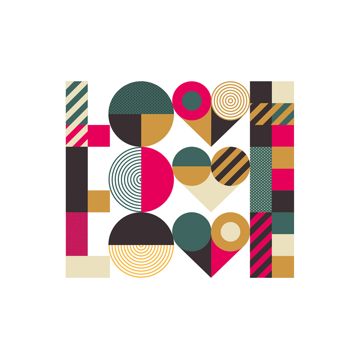
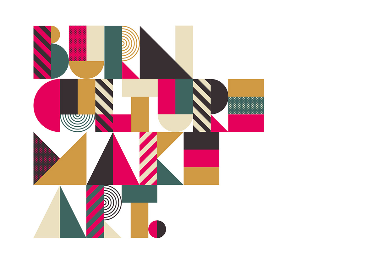
The first experiments were color tests. Soon, dirtier, earthier hues replaced powdery, sun-baked pastels. Pink became magenta in a palette otherwise unconcerned with what’s bright and shiny.
For a designer and artist well known for his clean geometric compositions, shapes suddenly became a roadblock. If the identity is now yours to invent, who should you be? What were the expectations of the work on the other side? Surely there must be some expectations—every designer has been burned by unkept promises of creative freedom.
But with no real check ins to speak of, the freedom at times became oppressive.
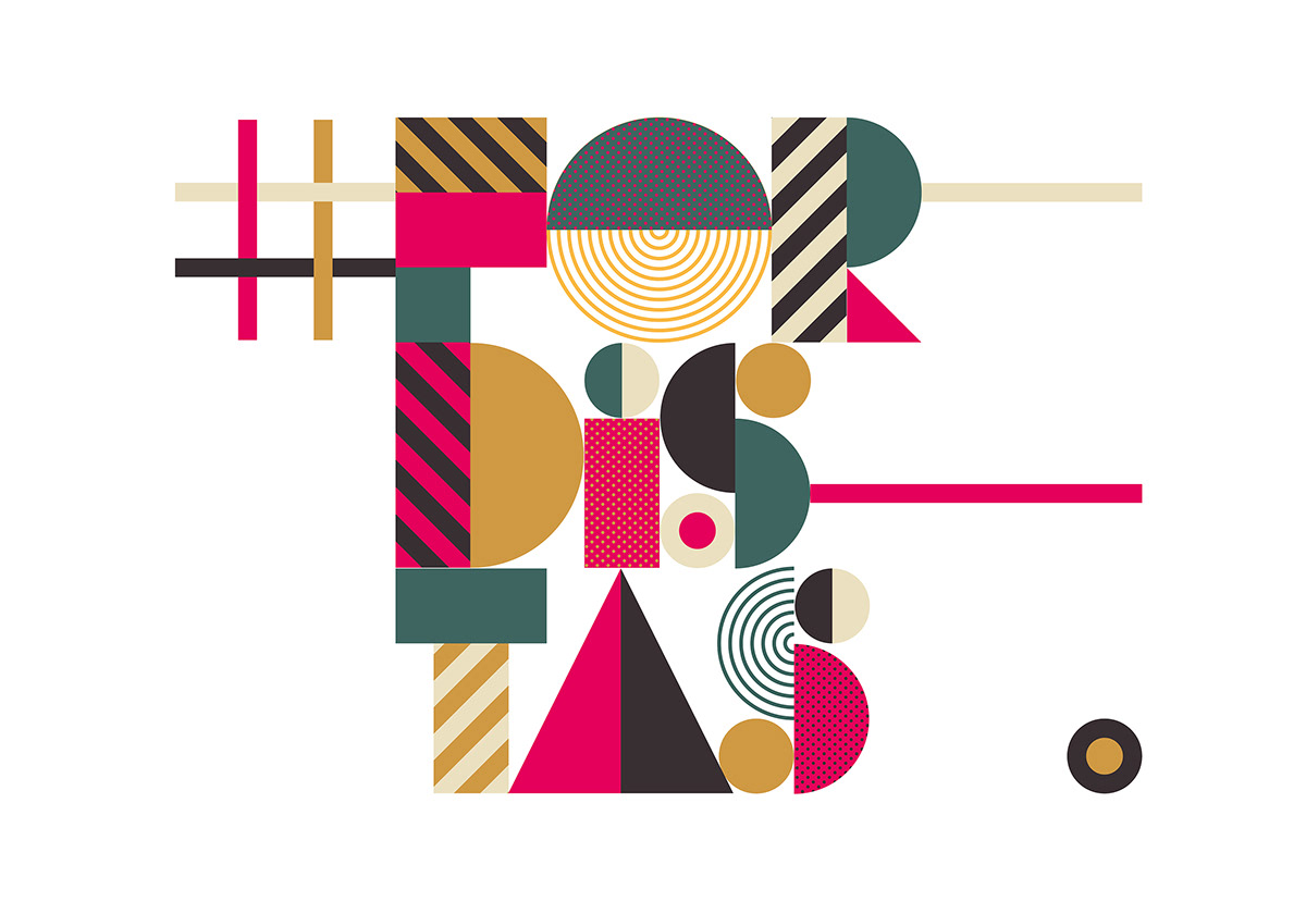
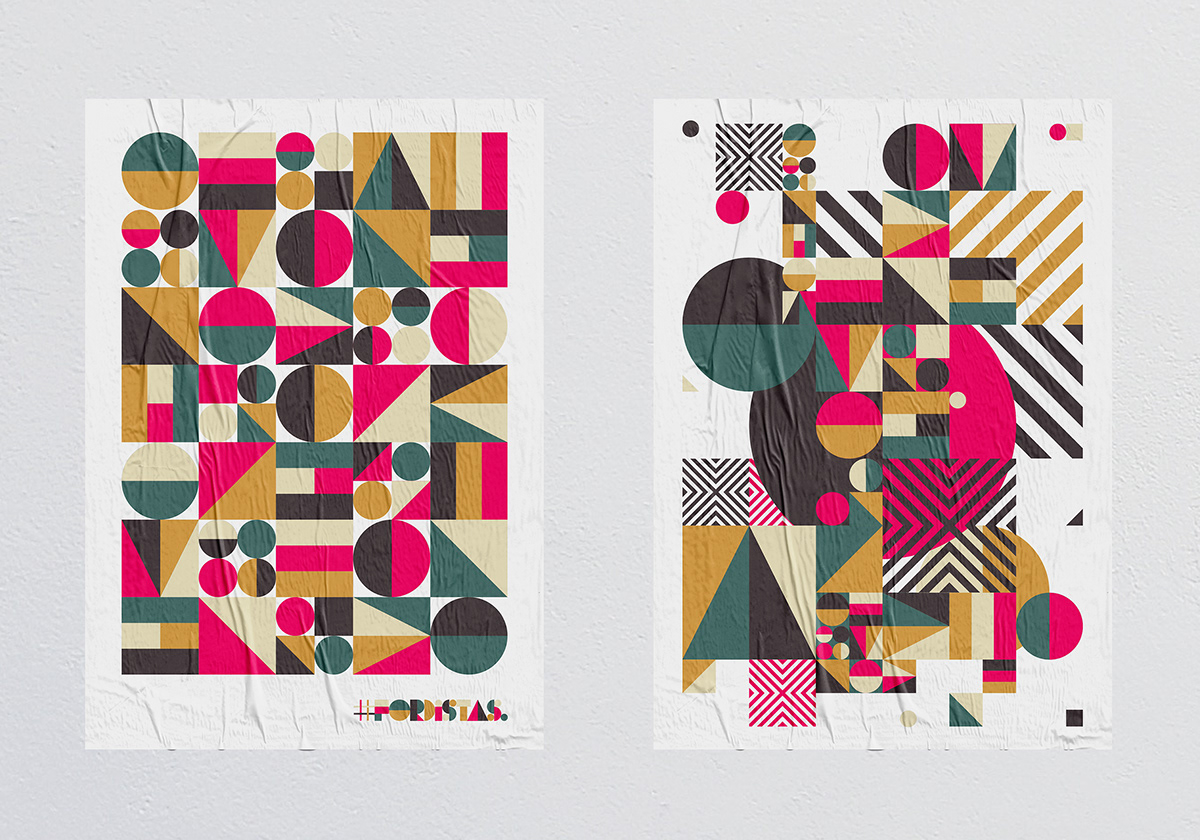
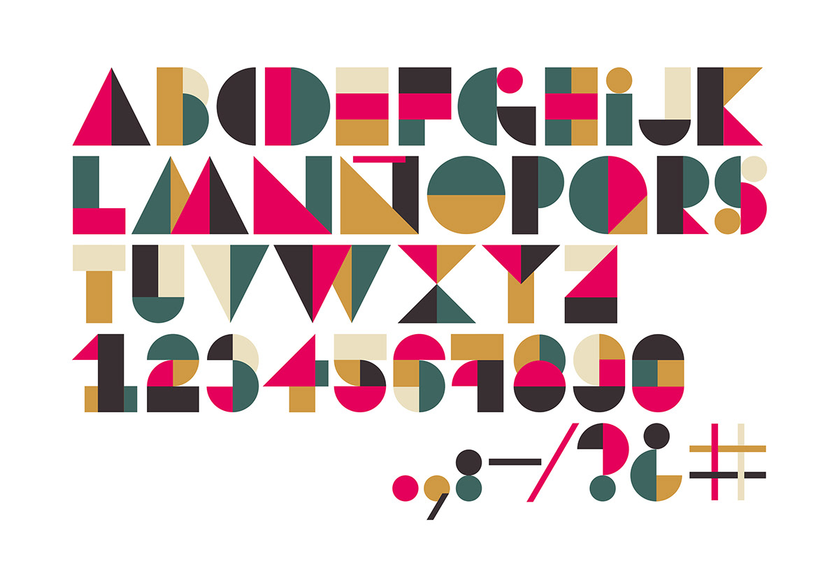
Geometric explorations took familiar paths, justified by art deco and supported by a Bauhaus sensibility. Shapes were bold, clean, sparse, repetitive, formal. Tests with words and letters and typesetting happened in tandem. With an open field to explore, new ideas began with small variations. Borders. Volumes. Patterns and textures. Eventually, those little tweaks here and there started to gather strength and confidence. Open spaces became crowded compositions. Flat and clean opened the door to texture overlays, balanced chaos, intuitive geometry, experimental typesetting. By the end, this universe was even opened to conceptual collaboration.


Results
Color, shape and composition are the visible components of the new, bold, geometric, modular, perfectly unbalanced identity you see here today. But it is the result of iterative sameness, failure, and self doubt transformed by time. “Spending a month looking at the same elements, moving them around, working insistently on them each day” enabled a personal artistic breakthrough. The result is a modular visual language that feels true to its author and to the moment. It’s adaptable and open to change, but in the end, gravitating
to primary geometric systems is an act of freedom: succinct and portable, a visual ethos that travels well.
to primary geometric systems is an act of freedom: succinct and portable, a visual ethos that travels well.
Fordistas was the gift of time and (mental) space to discover the humanity and art within the designer. Behind this book and this brand is a project that makes way for emergence; a brand that’s colorful, bold and can visibly champion the work it supports.