
Goal
Short task description:
"Carry out a project / model of the window interface for a mobile game based on the Fishing Clash style.Window theme: Fast battles!"
Animated version

Final version
Scrolled version
It took 25 hours to design and render this screen.
Thanks for icondrawer.com for flags images.
Thanks kisspng.com for pretty fish bait image.
Pre-production
Before start I asked a number of questions to clarify the task but unfortunately I got the answers to late, when I almost finished the layout and graphic, so I design the screen based on a championship screen that includes elements mentioned in the full test task description.
Visual Patterns
Because the task requires me to follow the current style of the game, I analyzed visual patterns of the game and made a list of rules:
1. Rounded rectangles;
2. Bevel edge lines;
3. Glossiness;
4. Dark area on each window;
5. UPPER CASE ITALIC EVERYWHERE except nicknames;
6. Distinguishable headers;
2. Bevel edge lines;
3. Glossiness;
4. Dark area on each window;
5. UPPER CASE ITALIC EVERYWHERE except nicknames;
6. Distinguishable headers;


I followed these patterns to create an atmosphere of the same game.
However, I didn’t copied UI elements, moreover I intentionally tried to modernize them and reduce mistakes that was collected through the long maintain process.
Production
Timelapse
Font size
I always start the production part from setting the game fonts the same size as a system font sizes.
Usually I use two font sizes: Normal and Small and fulfill the layout with required typefaces and tints.
Float sections
Most of the original game screens separate a content using stacked sections (like a table). However, float elements provide much more intuitive hierarchy — that's what Material Design about.
Also, I used space separation instead of lines separation where possible.
Promotion block
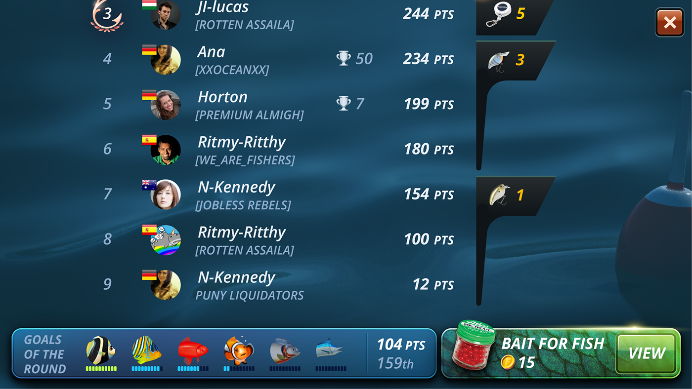
I placed item promotion near the context. A player tries to catch as much target fishes as possible, and promotion items should be able to help the player with that.
To make the promo block more visible I chose warm colors for background, to make it more appealing in the cold environment, and break the block grid with the item icon to focus player's attention there.
Close button
Original close button is round and blue. However, the round elements are never used in the original game, so I made the button shape more sequenced rect shape.
The blue color is not very distinguishable in the blue environment, and player expect to see the close button as a red spot. Made the button red to decrease cognitive load.
Clean typography
Well organized data – is a key for it understanding.
I display competition information with two columns: a column with participant and a column with a reward.
Italic text support
In the original game the only thing that has a skew angle is the italic text. I supported this angle with reward backgrounds, icons angle and waves direction.
Thanks for watching!


