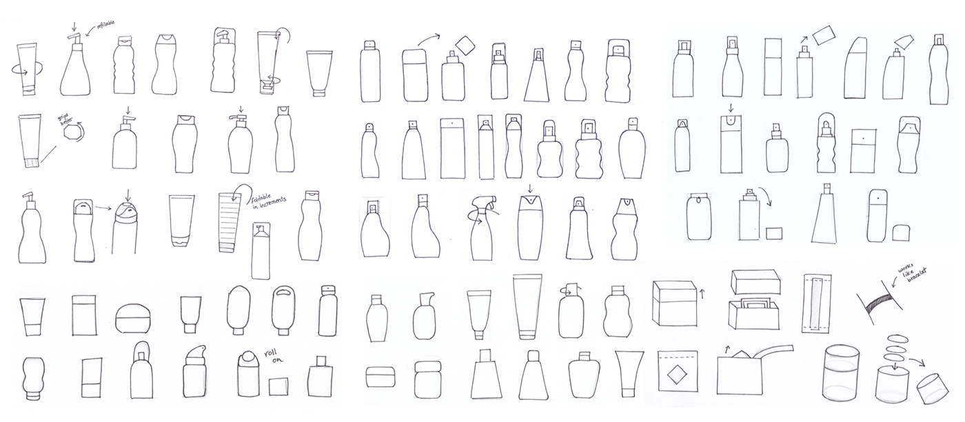
Coppertone Redesign
Packaging and identity redesign for sunscreen brand Coppertone. Originally launched as a tanning product in the forties, the brand’s identity felt inconsistent with its mission to protect skin from sun damage. Based on research and interviews, it became clear that millennials felt a disconnect with the brand. The goal of this redesign is to create a visual language that resonates with a new generation of consumers who seek to protect their skin daily.
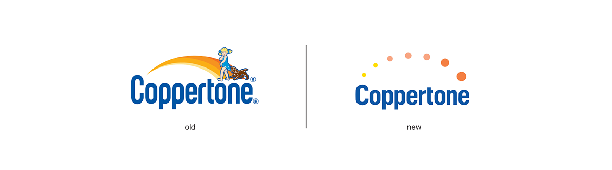
The new logo retains Coppertone's old color palette and a similar typeface but eliminates the brand's mascot.
Based on interviews conducted with millennials, younger consumers felt a disconnect with the mascot. For one it wasn't
inclusive to all audiences and secondly the mascot no longer resonated with the brand's mission to provide sun protection.

The product line uses three different colors to differentiate between SPF levels. The blue category is the
specialty product category which consists of a UV hair spray and a wearable UV sensor patch which tracks sun exposure.


Part of the redesign is a smartphone app that works specifically with the wearable UV sensor patch. The idea is that the UV patch changes color to indicate different levels of UV radiation. The patch is scannable and shows an analysis of a person's sun exposure that helps determine how to best protect themselves. This technology already exists and is being used by brands such as L'Oréal. Since the goal is to target millennials, the smartphone app and the wearable UV patch help integrate sun protection into the busy lifestyles of younger consumers.