Written by our friends and long-time collaborators Jeff Leitner and Andrew Benedict-Nelson, and designed by me and the Foossa team, See Think Solve is a simple guide to difficult problems.
Originally developed for a social work PhD program at the University of Southern California, it is written in an easy-to-read, jargon-free style for anyone interested in better understanding human behavior and how to design products, services, and programs that shift collective norms and culture. The ideas in the book have really shaped our consulting and teaching practice.
In addition to designing the See Think Solve brand and books (ebook, paperback, and hardcover), we designed the See Think Solve website and produced the trailer video below.
From the Introduction to See Think Solve:
“The main reason problems are hard to solve is that they involve people. People are funny. They don’t always believe the things they say they believe or do the things they say they are going to do. They can act one way in one situation and act completely differently in another situation. No one has ever completely figured this out. We call this the ‘mystery of human behavior.’
The mystery of human behavior shapes almost every problem worth solving. That’s the bad news. But there’s good news too. The mystery of human behavior also helps us see problems in new ways. By paying attention to people, we can discover new aspects of problems that help us solve them more effectively.
The nine steps in See Think Solve are designed to do just that. They will help you make sense of the mystery of human behavior that surrounds all tough problems.
- The first six steps are about seeing — each of them shows you a new thing to look for in human behavior.
- The next two steps are about thinking — each one is a tool you can use to better understand the human behaviors you have observed.
- The last step is about solving — it describes what you can accomplish with your newfound knowledge.”
About the Design
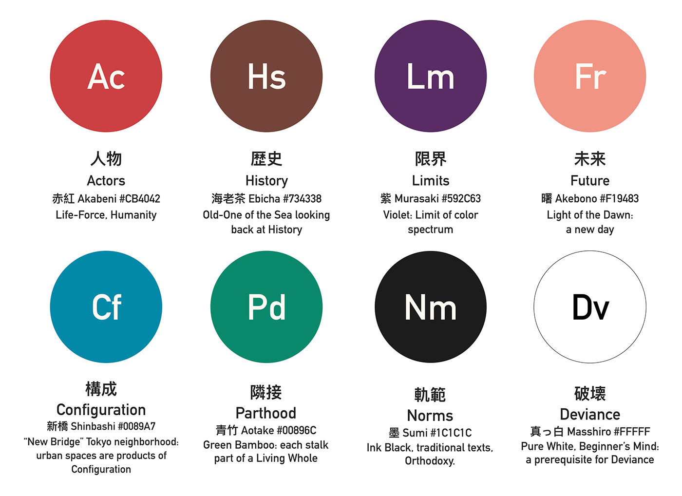
When planning the design for the book, we wanted to communicate both "simplicity" and "humanity." The book is meant to be a simple guide to difficult social problems. To reflect this intention, we created an iconography that references both the periodic table of elements and the New York City Subway signage system by Massimo Vignelli and Bob Noorda. The icons serve as a kind of wayfinding for readers of the book and help them remember each of the steps in the See Think Solve process. To bring a more humanistic feel to the visuals, we chose a color palette derived from traditional Japanese art and design. The book cover also features subtle curves on a dark grey background, which are meant to evoke a topographical map or electromagnetic waves.