

My Role: User-Experience Design Intern at DocuSign. (June 2010 - March 2011)
Work Profile: I worked as a sole UX Designer within the company. My work required collaboration with product management, SDE and QA team to design and manage their web-based client-facing and internal applications. I was a primary liaison between the company and the external design consultancy firm named UEVision based in San Francisco.
Responsibilities: Gather requirements, develop wireframes using Visio/Axure, design visual mock-ups, define IA and solve complex interactions, develop low/high fidelity prototypes using Axure, conduct review cycles with internal teams and user-tests with clients, create storyboards and sitemaps, document use-cases, flow diagrams and functional requirements for SDE/QA teams. Overall, coordinate launch of new product and feature releases.
I along with UEVision designed DocuSign's core product - electronic signing experience, DocuSign ID Card, Login Screen as updated in its Winter '11 release. I was involved with this project start-to-finish which began in June 2010 and ended in January 2011. More information about the release: Spring'11 Release.
Other product features I workin on include envelope sending process, dashboards, address book, account settings page, advanced and global search, feedback forms and forums, other internal and partner brand-able applications. All the prototyped designs went live with Spring '11 and subsequent releases with slight modifications while implementation.
About Company: DocuSign Inc. is a market leader and global standard for electronic signature and contract execution services through its SAAS-based platform. It possessed more than 70% of the market share for SAAS e-signatures, as of 2009. Recent industry distinctions include - WTIA Commercial Product of the Year 2010, Red Herring's 2009 top 100 private technology companies in North America, Washington's top 10 best companies to work for and many others.
----------------------------------------------------------------------------------------------------------------------------------------------------------------------------------
Electronic Signing Experience

Context - Signer receives this email via DocuSign from the sender. On clicking 'Review and Sign' button, the signer is taken to DocuSign system to initiate the signing process.
Design considerations (from top to bottom) - 1. Bold title indicating action required, 2. Highlighted section to differentiate DocuSign's default text from sender's message, 3. Bold button indicating most important action to proceed to next step, 4. Help sections for novice users, and 5. The footer (diminished for lesser valuable instructions).
Design considerations (from top to bottom) - 1. Bold title indicating action required, 2. Highlighted section to differentiate DocuSign's default text from sender's message, 3. Bold button indicating most important action to proceed to next step, 4. Help sections for novice users, and 5. The footer (diminished for lesser valuable instructions).

Context - The email (Img.1) directs the recipient to this screen. This is the first step in the signing process.
Design Considerations - 1. User is presented a modal screen; document is in the background (feel-good factor for users), 2. Document names requiring signature, 3. Step-wise instructions of the process (Other alternative considered - elaborate the instructions and make this step as a separate page), 4. Three bold numerals (indicating just a short 1-2-3 step procedure), 5. Distinguished Consumer Disclosure (part of legal obligation) step, 6. Highlighted step with navigation Start arrow to indicate next step to proceed, 7. Small font sized other options to diminish their importance (business need of making user to sign rather than consider other options), 8. Color Scheme and use of Icons.
Design Considerations - 1. User is presented a modal screen; document is in the background (feel-good factor for users), 2. Document names requiring signature, 3. Step-wise instructions of the process (Other alternative considered - elaborate the instructions and make this step as a separate page), 4. Three bold numerals (indicating just a short 1-2-3 step procedure), 5. Distinguished Consumer Disclosure (part of legal obligation) step, 6. Highlighted step with navigation Start arrow to indicate next step to proceed, 7. Small font sized other options to diminish their importance (business need of making user to sign rather than consider other options), 8. Color Scheme and use of Icons.

Context - This step allows user to review the document before adopting signature.
Design Considerations - 1. Breadcrumbs on the top (other alternatives considered - show at the bottom or at top and bottom both or no show) to show current and future steps (visibility of system status), 2. Start Navigation (guide novice users), 3. Progress bar (no significance but a feel good factor), 4. Floating toolbars for other options and zoom control (other alternatives considered - affixed toolbars on top or both - top and bottom), 5. Smaller thumbnails contracting panel with different visual cues according to pages (other alternatives considered - bigger thumbnails, panel on the left, pagination on the top), 6. Color Schemes and use of Icons.
Design Considerations - 1. Breadcrumbs on the top (other alternatives considered - show at the bottom or at top and bottom both or no show) to show current and future steps (visibility of system status), 2. Start Navigation (guide novice users), 3. Progress bar (no significance but a feel good factor), 4. Floating toolbars for other options and zoom control (other alternatives considered - affixed toolbars on top or both - top and bottom), 5. Smaller thumbnails contracting panel with different visual cues according to pages (other alternatives considered - bigger thumbnails, panel on the left, pagination on the top), 6. Color Schemes and use of Icons.
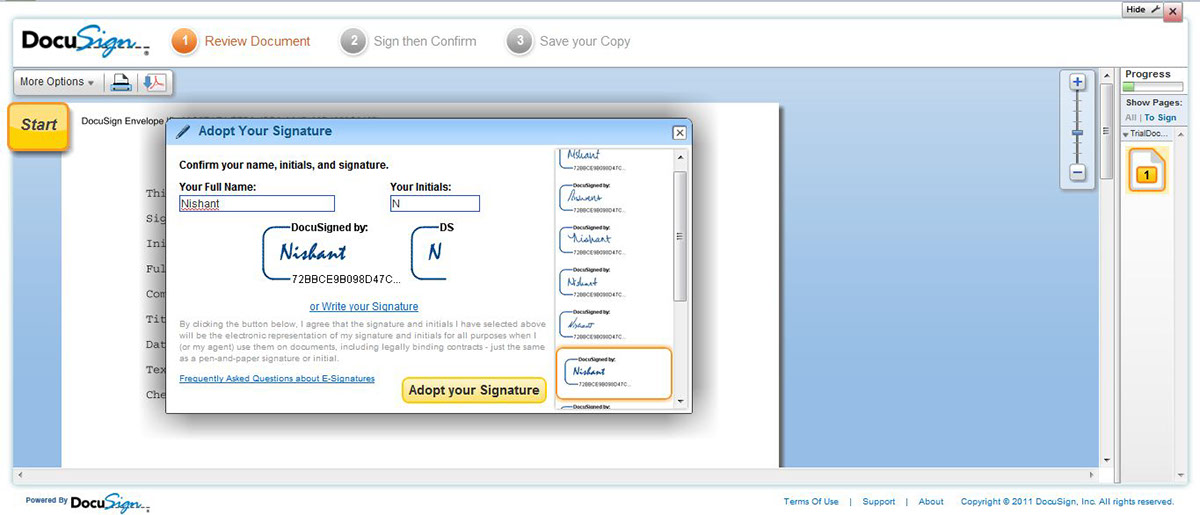
Context - Signature clicks on Sign tab on the document (shown in Img 3). On clicking, Signer is presented a dialog to adopt the signature.
Design Considerations: 1. Variety of DocuSign offered font-styles using vertical scrolling in right panel (other alternatives considered - carousel, radio buttons, links, fonat names with a preview space), 2. User can also draw his signature by clicking on 'Write your signature" link (other alternative considered - section, tabs, accordions), 3. Color Scheme.
Design Considerations: 1. Variety of DocuSign offered font-styles using vertical scrolling in right panel (other alternatives considered - carousel, radio buttons, links, fonat names with a preview space), 2. User can also draw his signature by clicking on 'Write your signature" link (other alternative considered - section, tabs, accordions), 3. Color Scheme.

Context - User gets an acknowledgement of process completion.
Design Considerations - 1. Filled up form for quicker registration, 2. Download options (alternatives considered - buttons, download link with a dialog), 3. Space for viral marketing, 4. A 'close' button (a placebo button as user has already successfully finished the process), 5. Color Scheme and use of Icons.
Design Considerations - 1. Filled up form for quicker registration, 2. Download options (alternatives considered - buttons, download link with a dialog), 3. Space for viral marketing, 4. A 'close' button (a placebo button as user has already successfully finished the process), 5. Color Scheme and use of Icons.
Login Screen

Context - User lands on this page when he clicks either on 1. Login button on the Home Page or 2. Signer has a DocuSign account and he clicks on 'Review and Sign' button in email (Img 1).
Design Considerations - 1. A separate page (other alternatives considered - a roll-over dialog in the Home Page but user has many ways to login other than from Home Page), 2. Login Form on the top left,
3. Maintenance or other administrative notice section below, 4. Large space for marketing or advertisement,
5. Color Scheme.
DocuSign ID Card
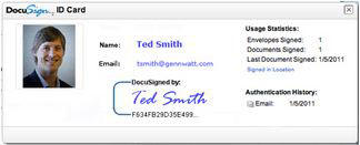
Context - Recipient opens the signed document and clicks on signature to authenticate credentials of the signer.
Design Considerations - 1. Vertical Card (other alternatives considered - Horizontal or Square), 2. Picture on the left (greatest authentication factor - hence placed first), 3. Neatly sectioned the information (made use of white space as not all had titles to differentiate using lines, colors, or an accordion), 4. Color scheme.
Design Considerations - 1. Vertical Card (other alternatives considered - Horizontal or Square), 2. Picture on the left (greatest authentication factor - hence placed first), 3. Neatly sectioned the information (made use of white space as not all had titles to differentiate using lines, colors, or an accordion), 4. Color scheme.
Electronic Document Sending Experience
Following are the designs illustrating electronic document sending workflow –

Img 8. Sender uploads documents to be sent which requires signatures

Img 9. Sender adds signers details and the workflow for signatures - linear and flowchart views

Img 10. Sender composes common email and individual notes for each recipient in the workflow
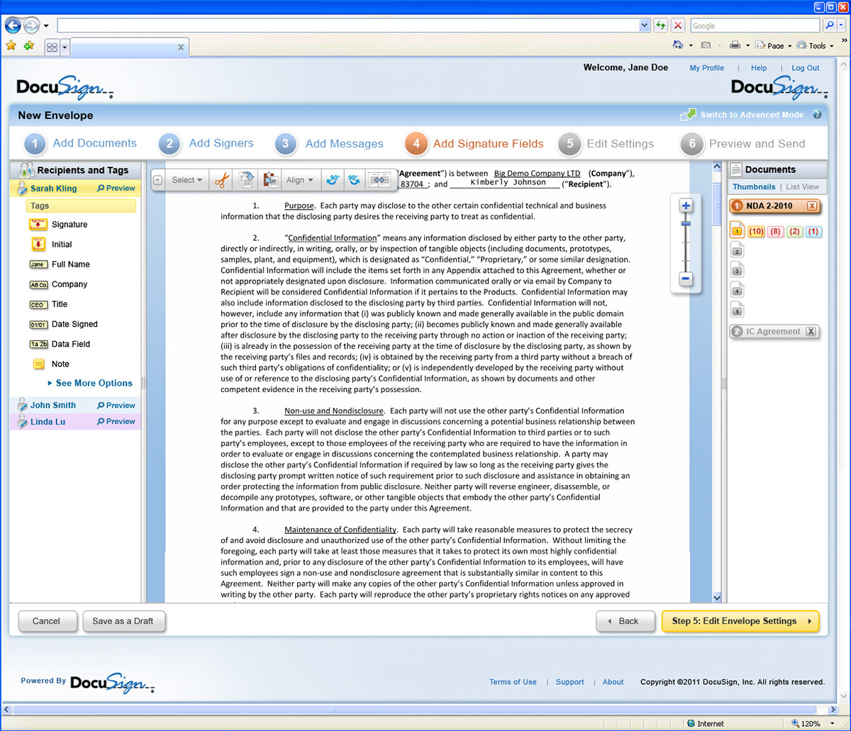
Img 11. Sender assigns locations where each recipient's signatures are required on different documents
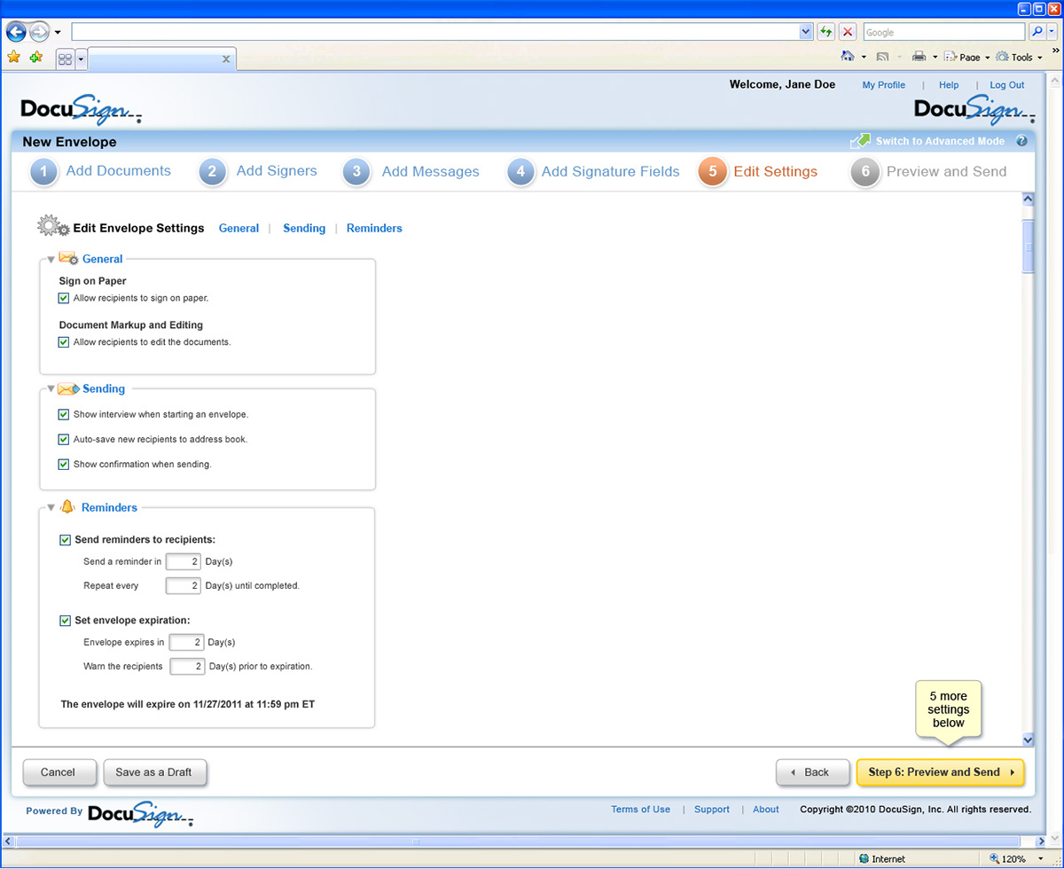
Img 12. Sender sets settings for the envelope (documents with required signature fields)

Img 13. Before sending (irreversible step), preview step allows sender to verify the details of entire envelope
Dashboards
Different versions of Dashboards were designed to cater to varied requirements by different types of audiences –

Img 14. Original version of Dashboard for guests, general users (or clients)

Img 15. Dashboard for Administrators (To view activities of different user accounts under him)

Img 16. Dashboard for Sales Managers (To quickly access sales reports, success and failure matrices)
My Envelopes
My Envelopes Tab shows the users all the envelopes that he has sent / received / composed / trashed etc. (Similar to email client).

Img 17. User accesses all envelopes of his account through My Envelope (alias Inbox) tab
Global Search
Global Search screen allows users to search for any envelope / user contact details / users group details / saved or received forms / saved templates using a keyword search.

Img 19. Global Search system with faceted navigation within user account
Address Book
Address Book – a collection of records used for storing / editing contact details, authentication credentials, and history of transactions of users

Img 19. Address Book to save / edit contact details


