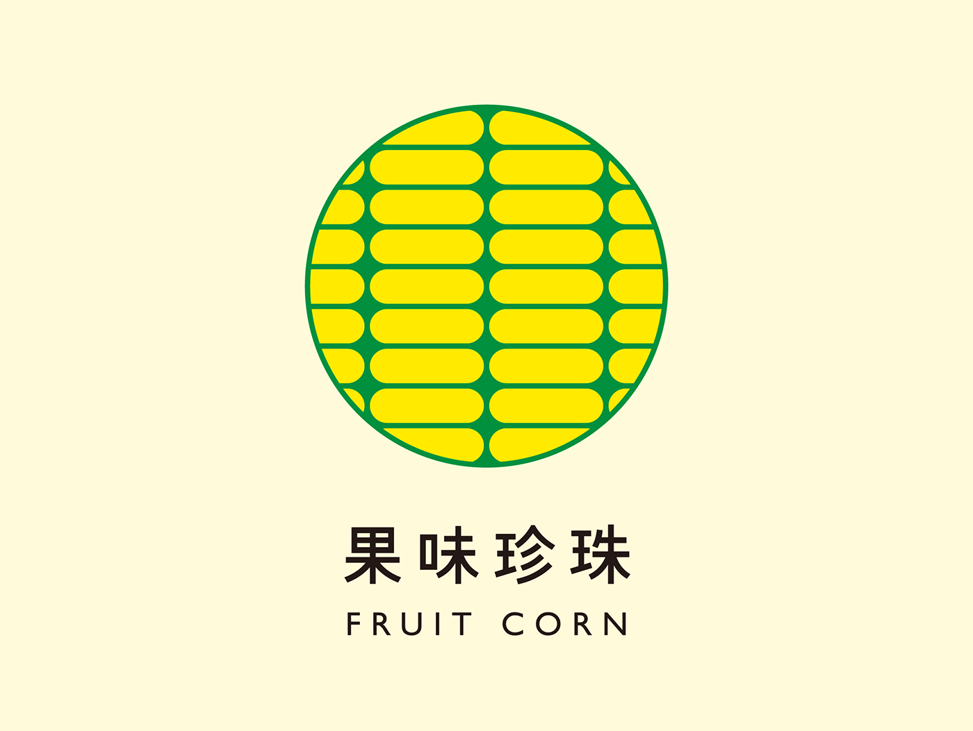
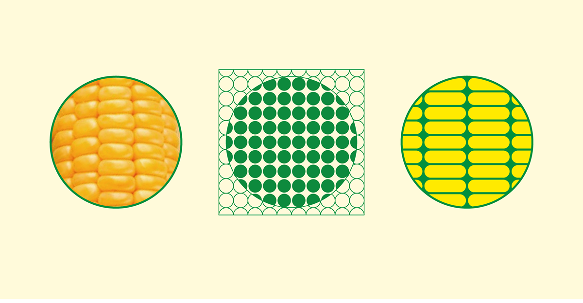
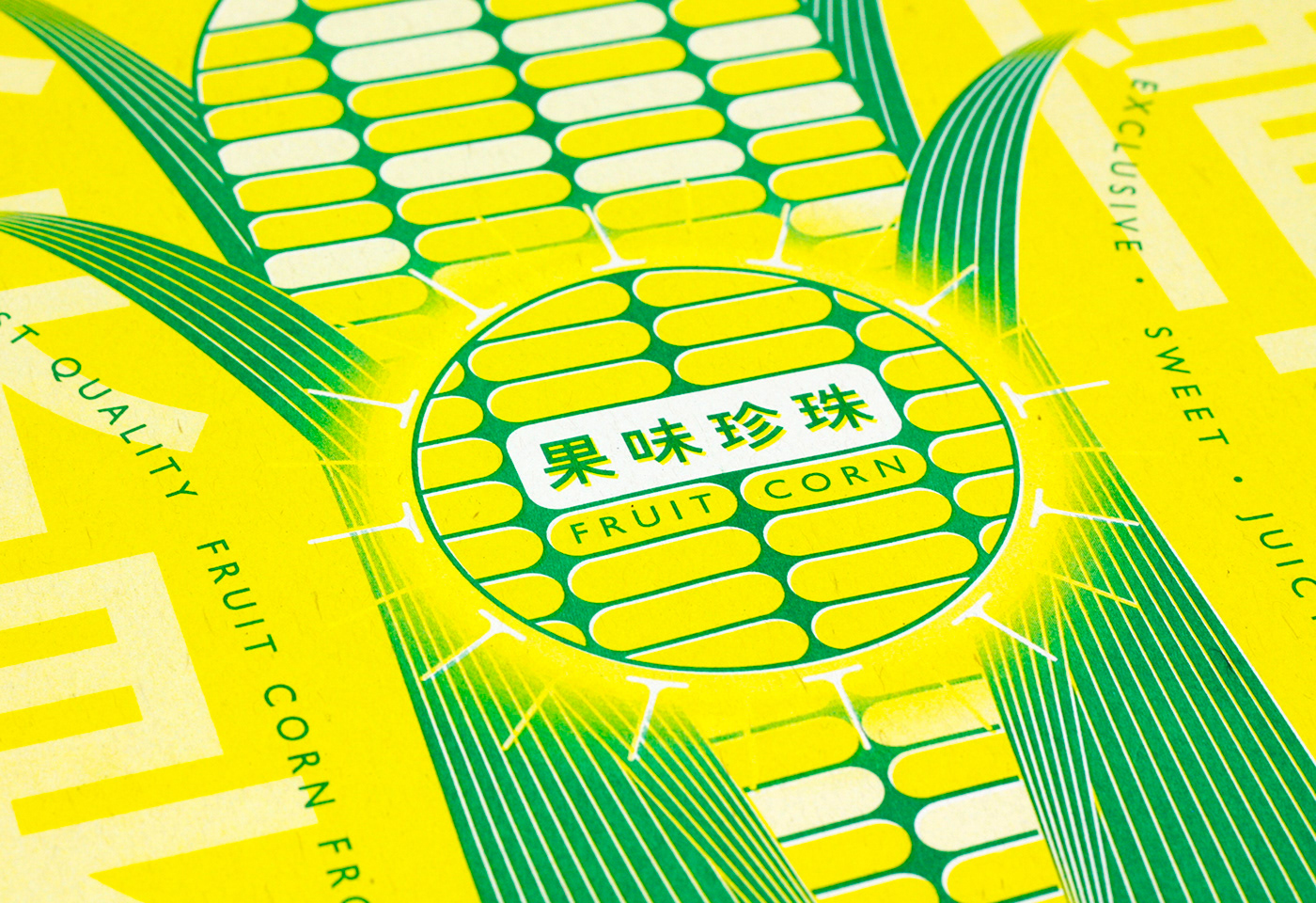
Seeing the logo only, people might think that the logo looks familiar but they could’t tell what it is. The product’s Chinese name means “the pearl with fruit flavor” and that’s why I used a circle, the shape of pearl, to cut the part image of corn. My aim is to create a metaphorical impression of corn. After seeing the key visions, people would smile knowingly. The product is launched at Shanghai, China.
果味珍珠是為一個新品種的高品質玉米打造的品牌,玉米經過嚴格挑選及各種品質檢測後真空包裝,銷往中國;光看這個標誌會讓人感到很眼熟卻又說不出它是什麼,再看到主視覺後,使人感到會心一笑。

The poster of the product is printed by risograph printing to create an nostalgic atmosphere.

The actual product of 果味珍珠。

The first sample of the packages, printed on transparent plastic.
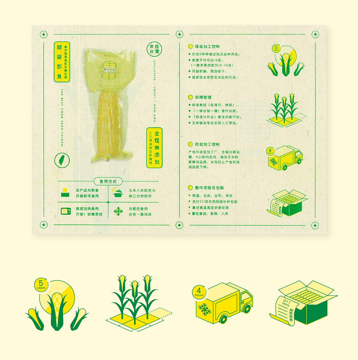
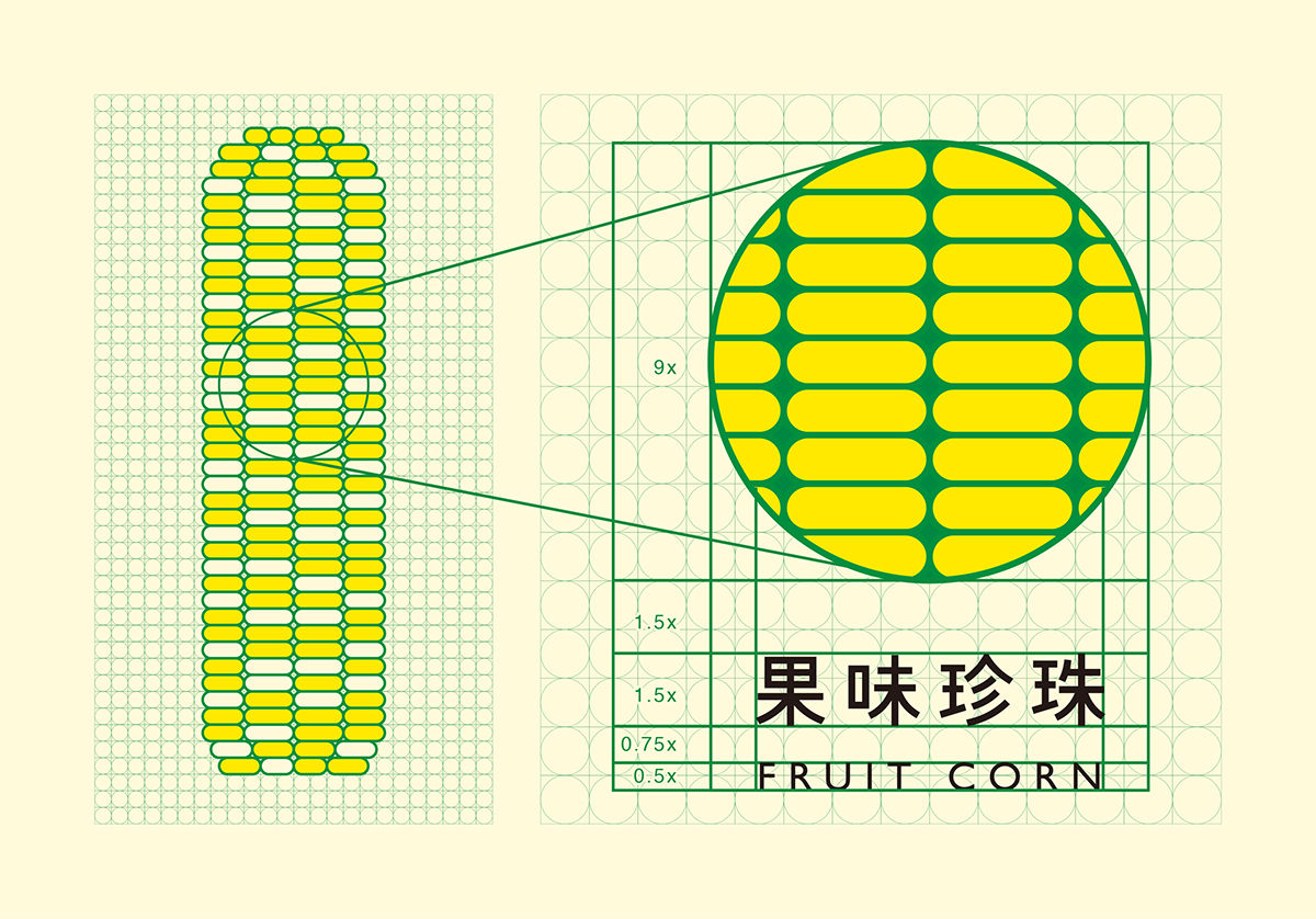
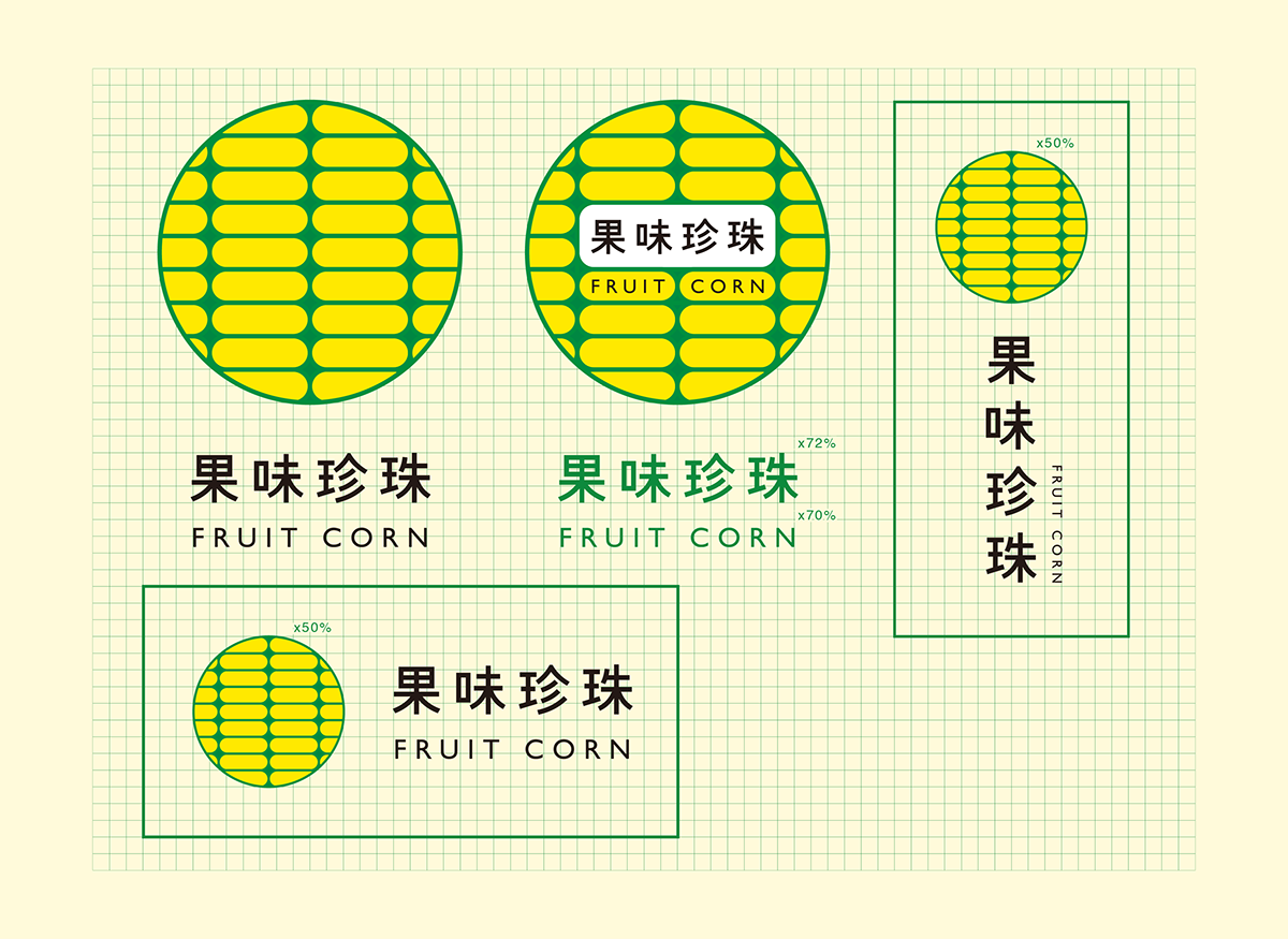
The orientation and the graphics designed for the product.
Thanks for taking a look!