Center for the Arts Spijkenisse (NL)
corporate identity concept
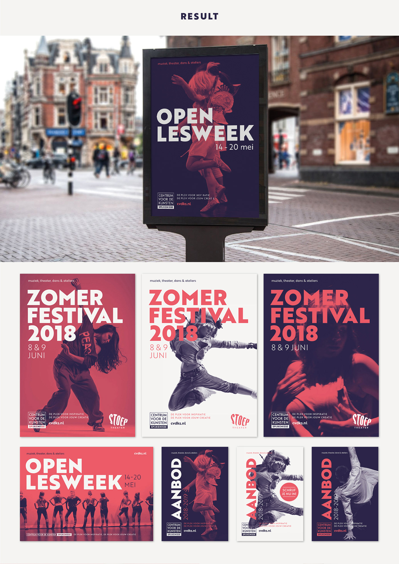
I was asked to pitch a concept for a new corporate identity for Centrum Voor De Kunsten Spijkenisse (Center for the Arts Spijkenisse). Unfortunately they decided not to use it. You win some, you lose some. Nevertheless I'm quite content with the designs and I would like to share them with you.
I was not familiar with the organization, but their website and Google helped me out a bit. They mainly provide classes to develop skills in the fields of music, theater, dance and visual art. I found several means of communication that did not quite show a consistent design. After some searching, trial and error, I decided to limit the amount of elements to 3 colors and only 1 font. Which would make it helpful and easier for them to realize a more efficient and recognizable identity.
They wanted to keep their logo, but I couldn't resist to tweak it a bit to a more logical and complimenting design. Some of the photos I used are theirs, some are stock. Either way, I wanted to show that by using the same photo editing with the new corporate colors you get a more distinguished and constant design.