
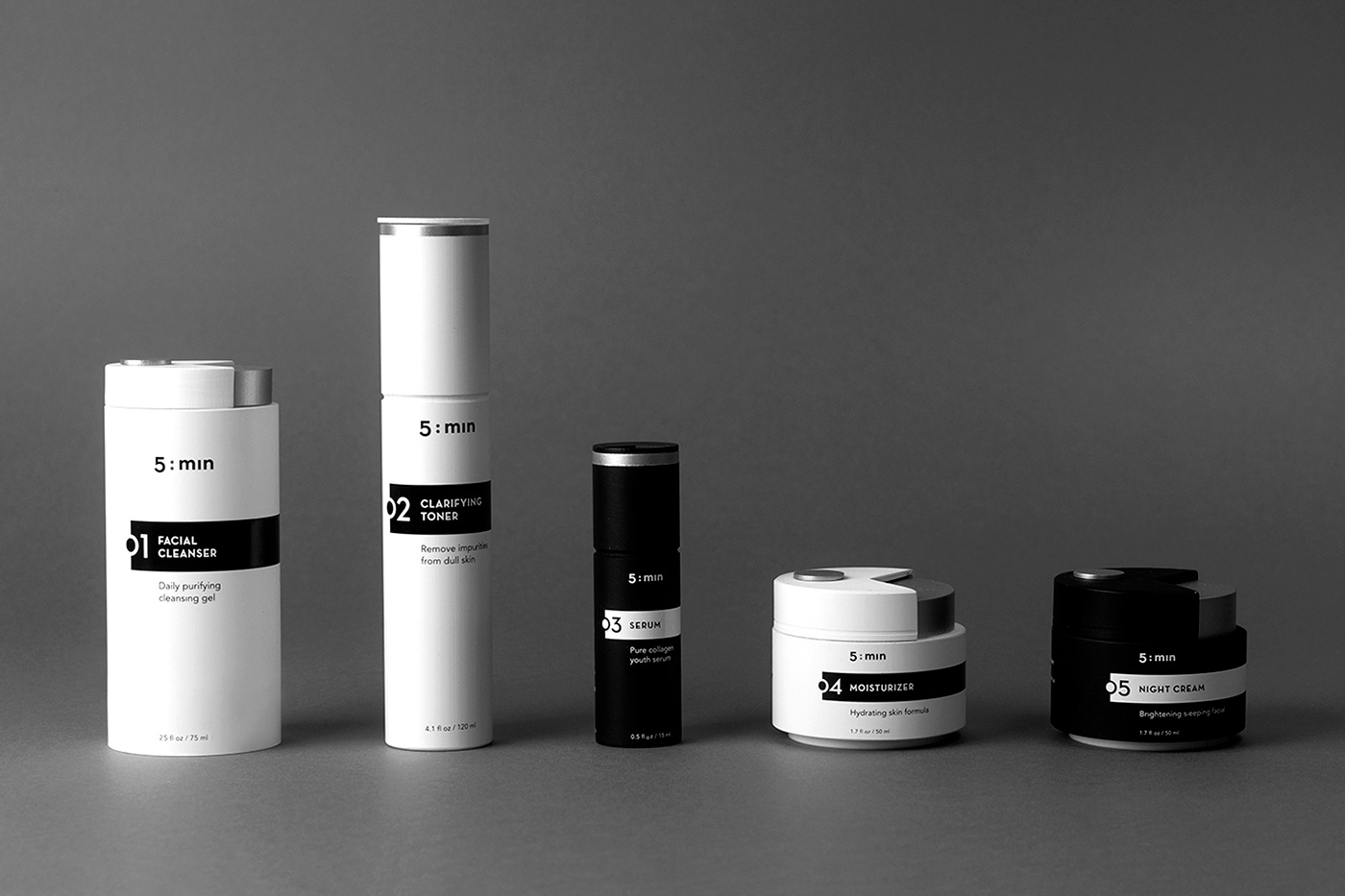
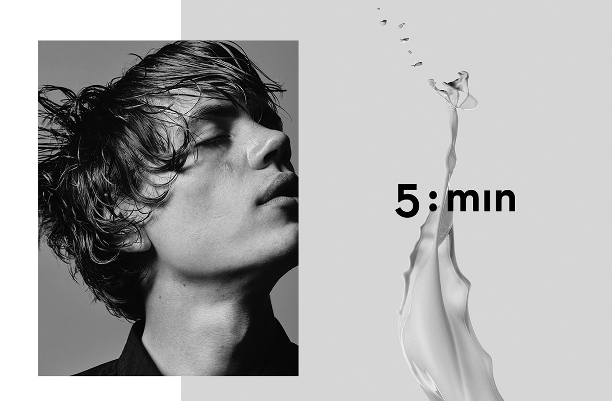
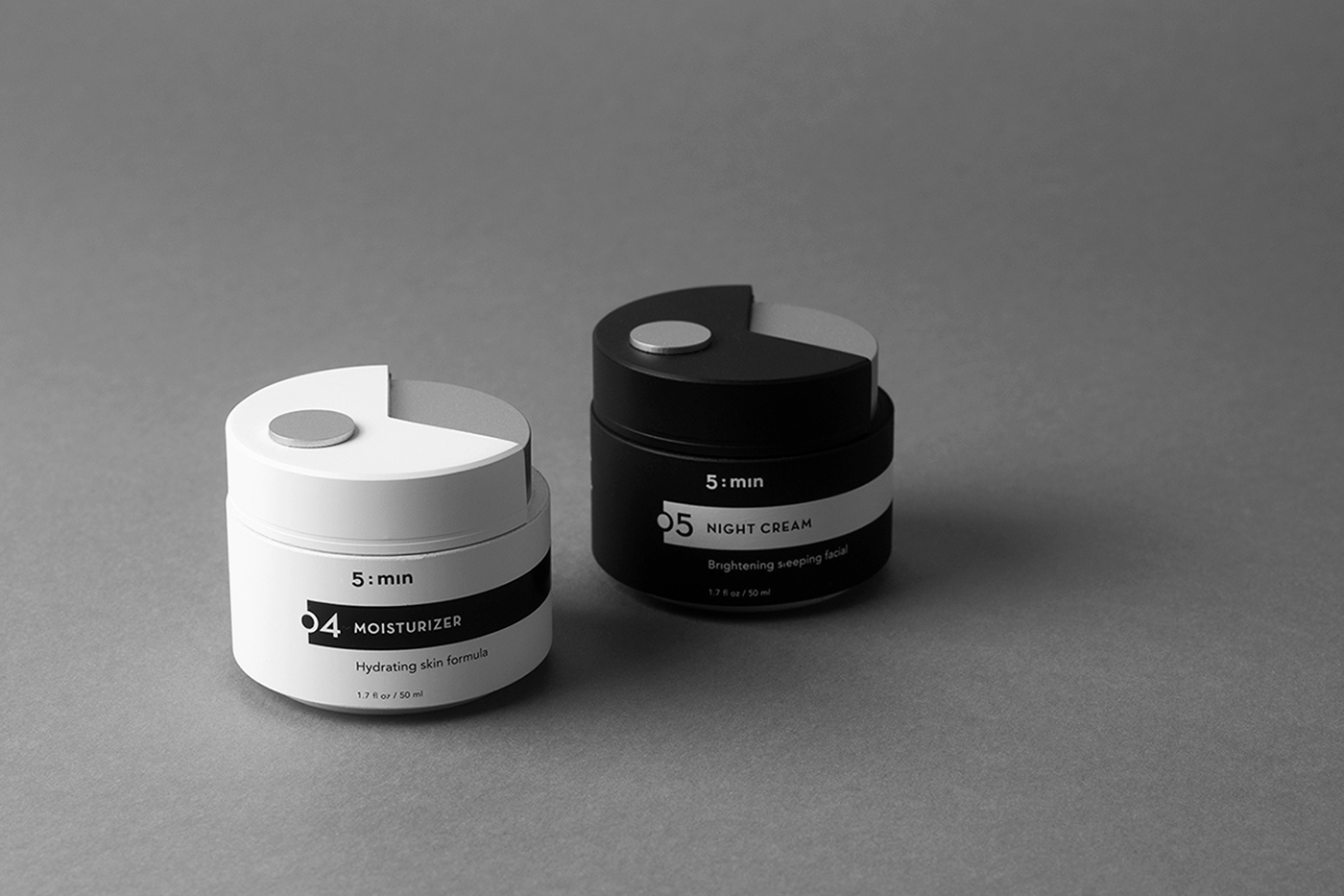


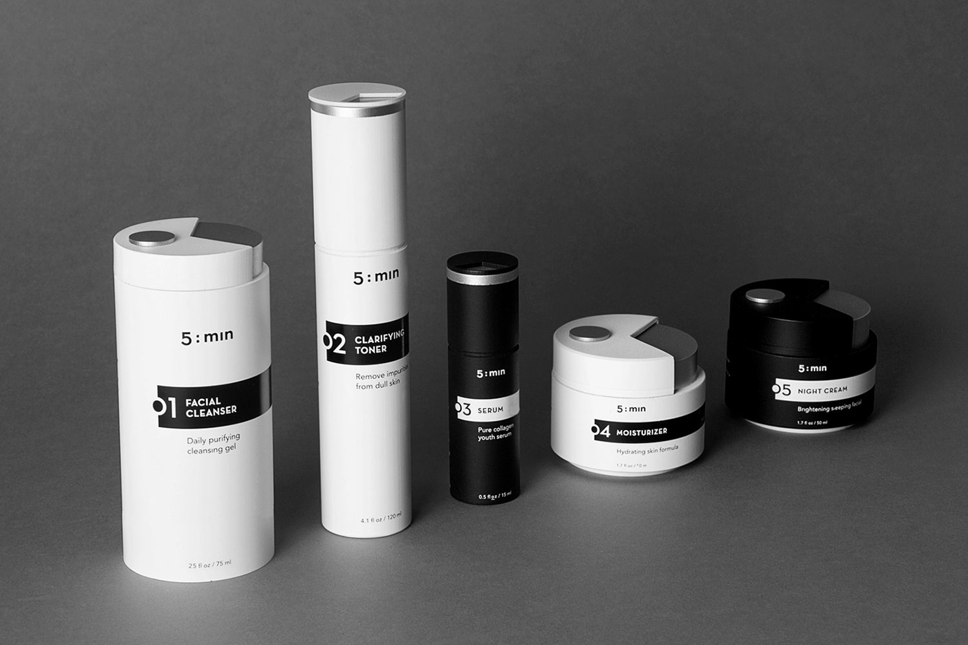

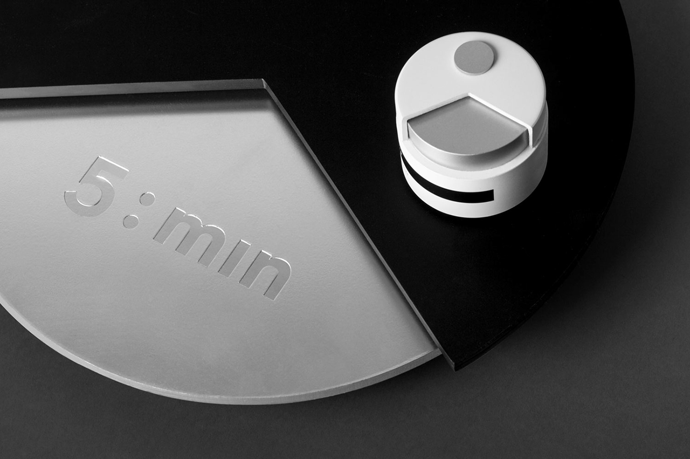
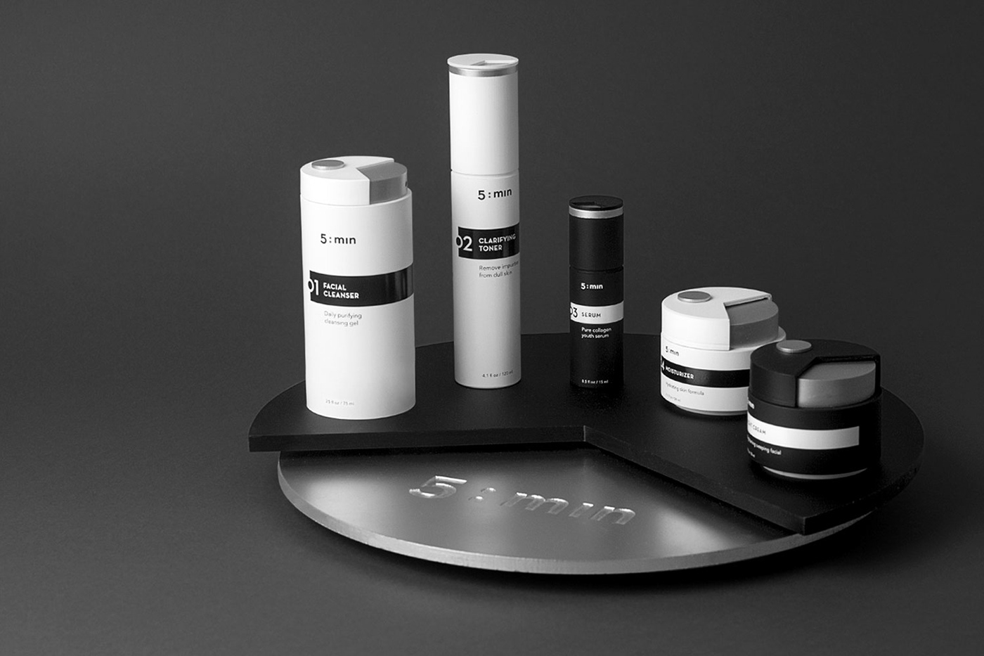
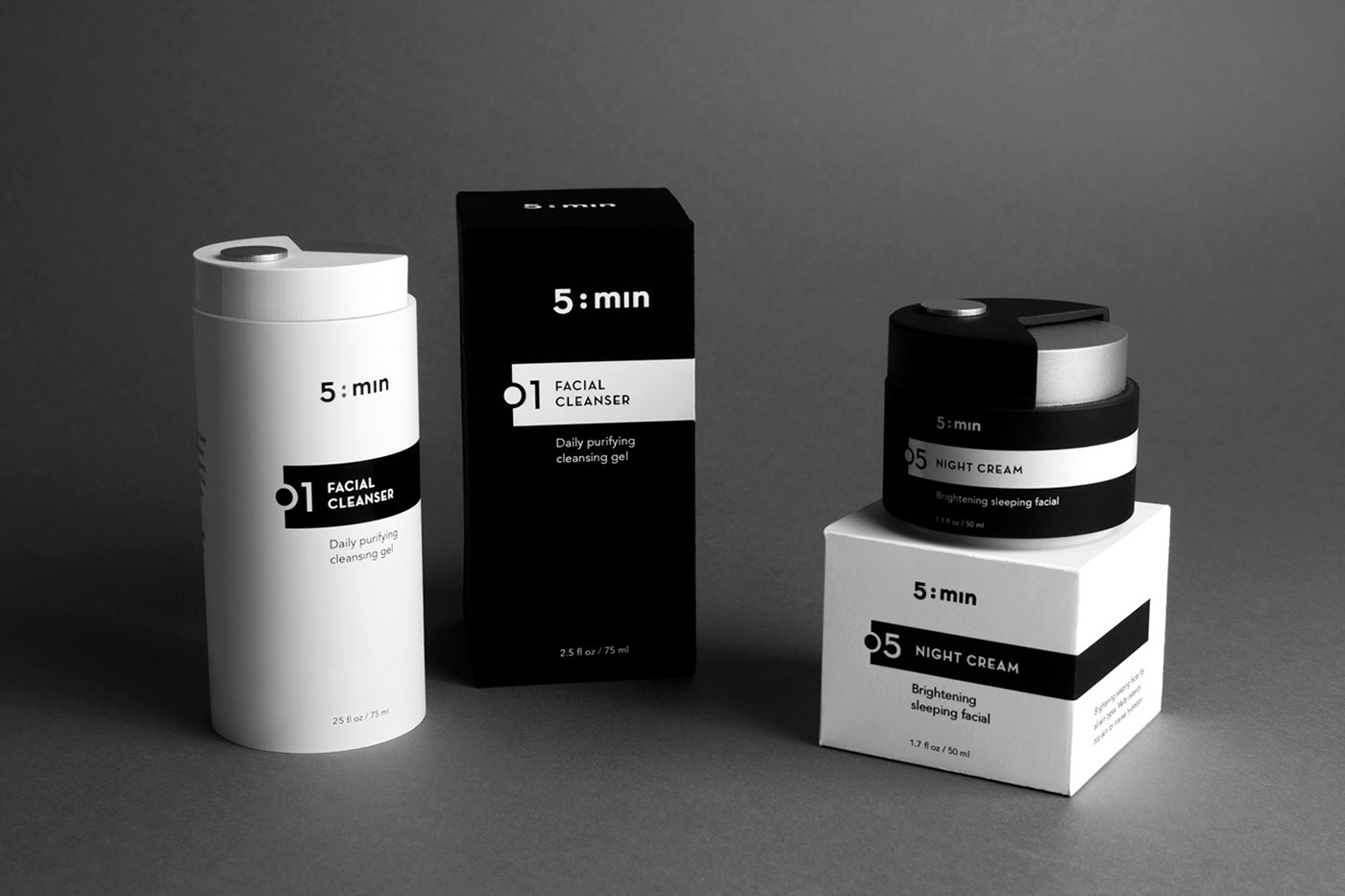
5:min represents an effective skin treatment that stands for time-efficiency. Time and clock are the main metaphors that guide the overall brand identity and package design development. A simple shape structure portrayed through the shape of a traditional clock. The typeface geometric typeface is used to express the contemporary and purist values the brand upholds. Monochromatic colors, such as black, white, and gray, are used to ensure brand longevity.


