


Dare to Run is a nonpartisan organization whose mission is to teach women the skills to run for office at the local, state, and national level of government.
After starting the nonprofit, Dare to Run wasn’t quite sure how to express their vision with branding. They came to Ben Loiz Studio to develop a logo and identity package that represented them well to the public and communicated being bold and daring enough to run.
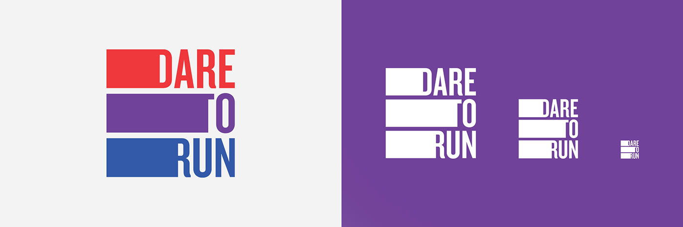
The stripes and colors represent the United States flag. An addition of purple suggests vision and authority. As an intermediate color between blue and red, purple also points to non-partisanship. The right aligned text and bars following each word express the motion of running a race.
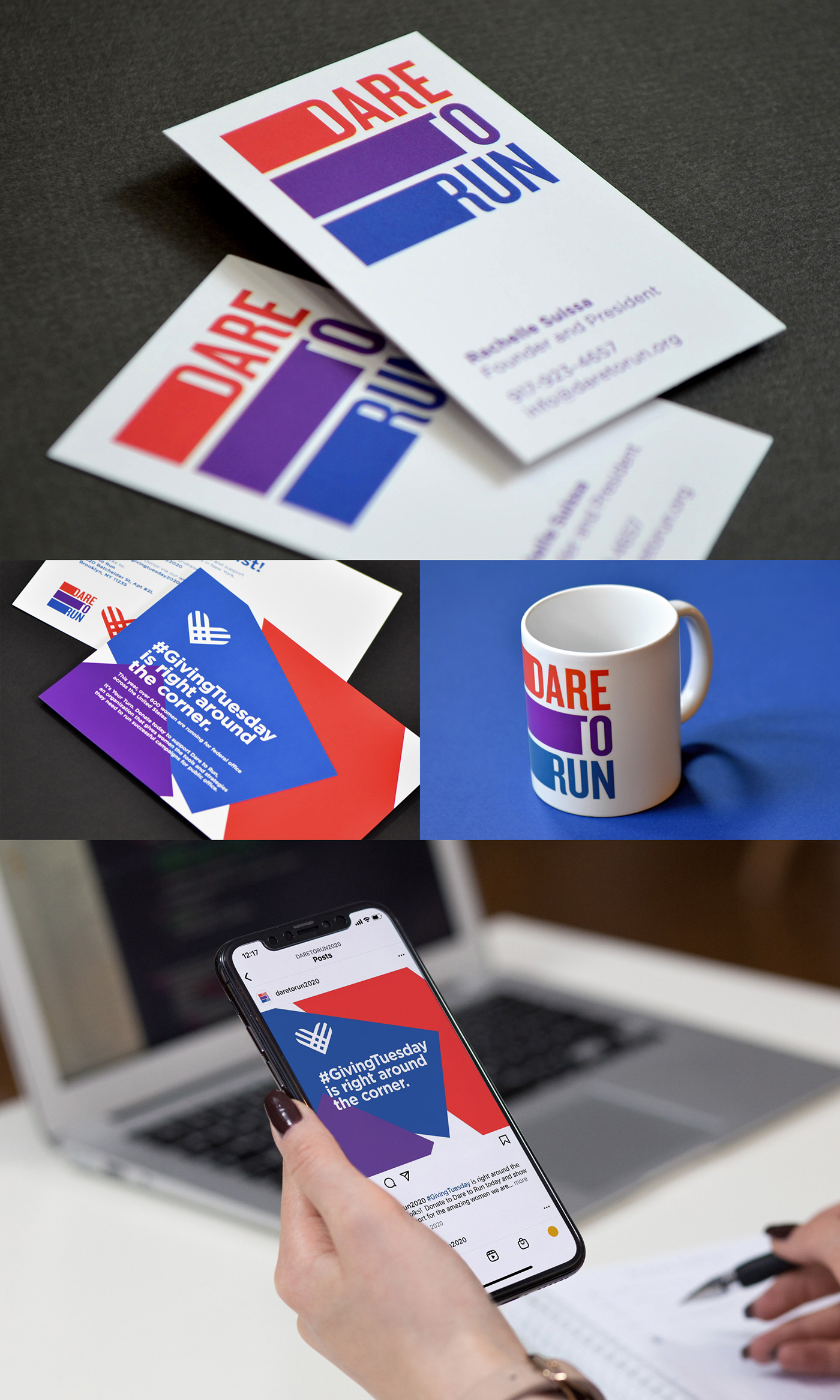
The logo is versatile, as it also communicates clearly in one color and at both large and small sizes. An identity package was developed including a brand usage guide, business cards, and social channel designs.
After a successful launch of the new brand identity, an in-depth article on the design process was published in Photoshop User Magazine.
Working with Ben has been an eye-opening, and wonderful experience. From the moment we started working together, I knew it would be a very significant relationship for our organization. On the day he did the presentation for us, I was blown away. I couldn’t believe the extraordinary use of color, shapes, and even the perfect font to convey the essential message for Dare to Run. Ben was able to work with us to communicate our vision and brand our organization the right way. —Rachelle Suissa, Dare to Run


