Leaves Book & Tea Shop Visual Identity
Leaves Book and Tea Shop exists to provide a space for the community to refresh and restore both body and mind. It offers a peaceful respite from the pace of life. You are invited in to enjoy a welcoming space, a great cup of tea and engage with quality literature.


Challenge
To establish a visual identity and brand story for Leaves that is artful and eclectic.
Leaves Book & Tea are early adopters in a new, upscale development in Ft. Worth, Texas. To develop a space for customers to feel invited into the space that is restorative and educational. Surrounded by urban housing, Leaves is a place of peaceful escape.

Approach
Pair a calming and inviting visual identity as paring tea and literature.
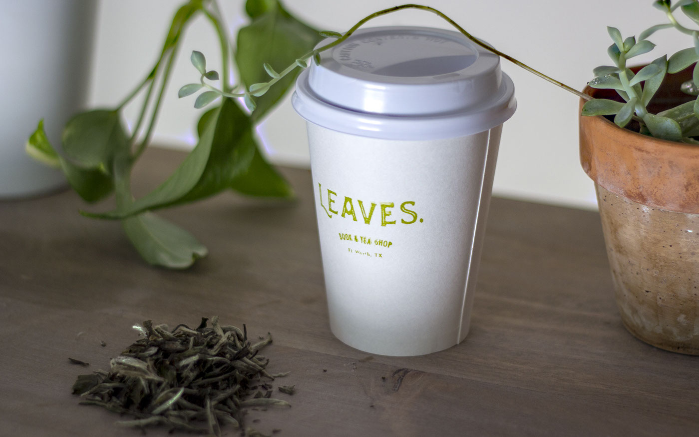
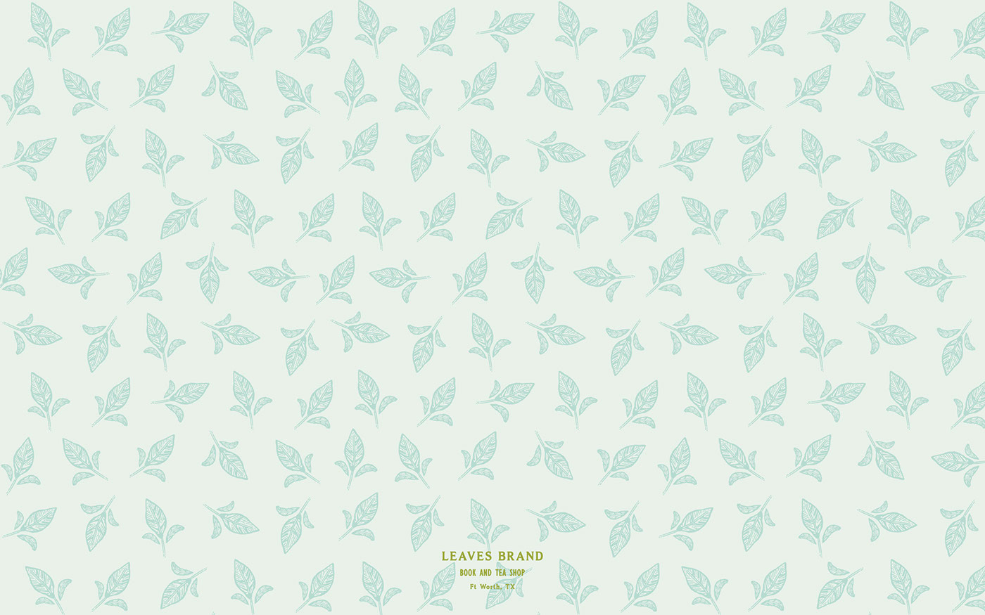
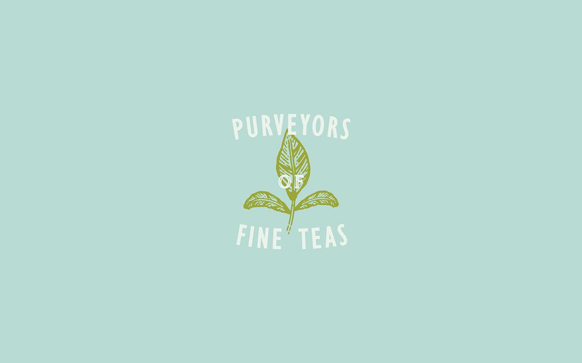
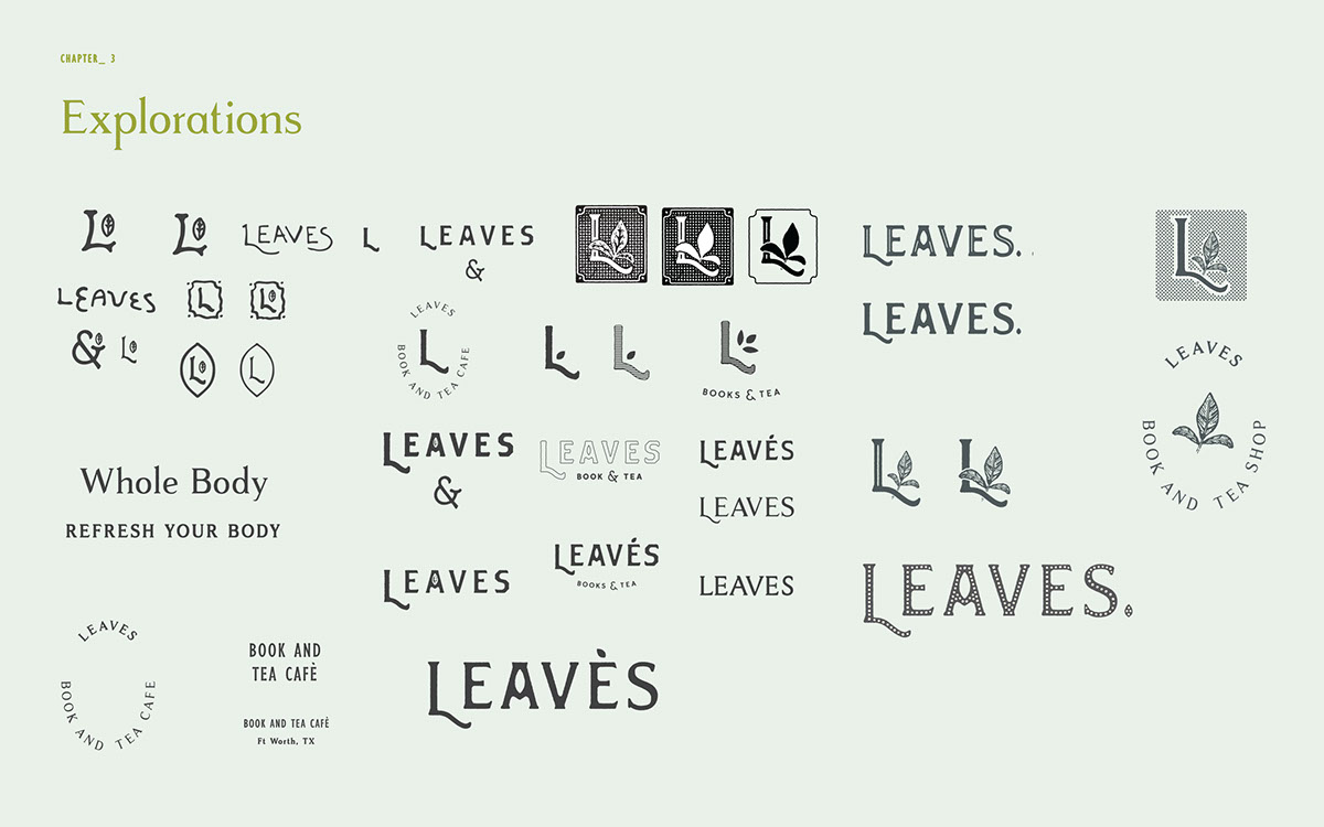
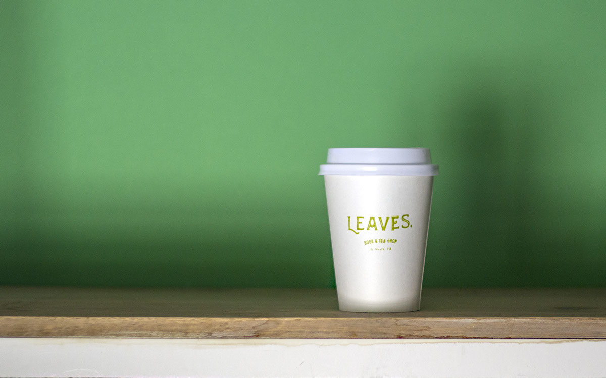
Leaves is a calm and relaxing space to come and refresh your body and engage your mind. It has a unique but a approachable quality to it. You come in to learn and taste quality teas and be recommended books to read. The essence of the brand evokes victorian style with a simple modern blend. Allowing the brand to be engaging with a soft line illustration style and strong organic type.

Solution
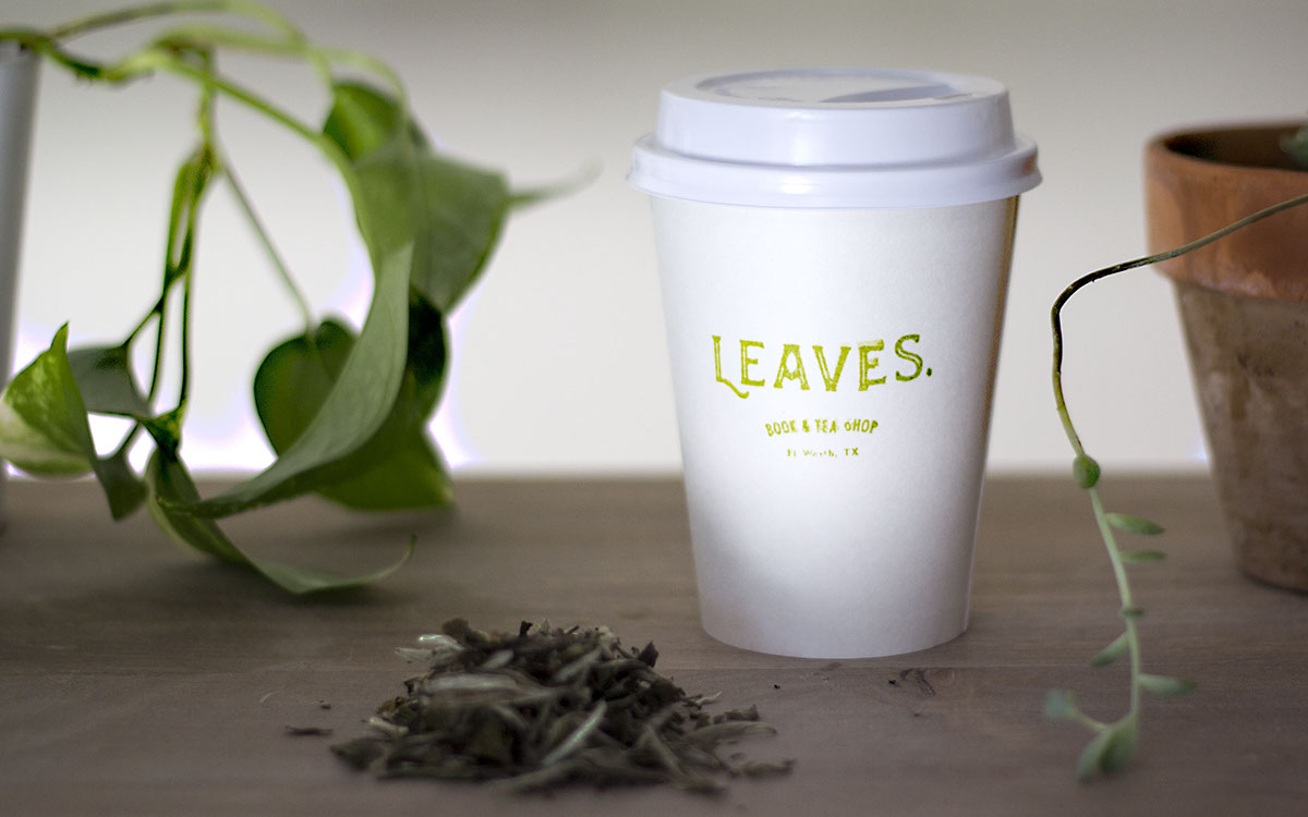
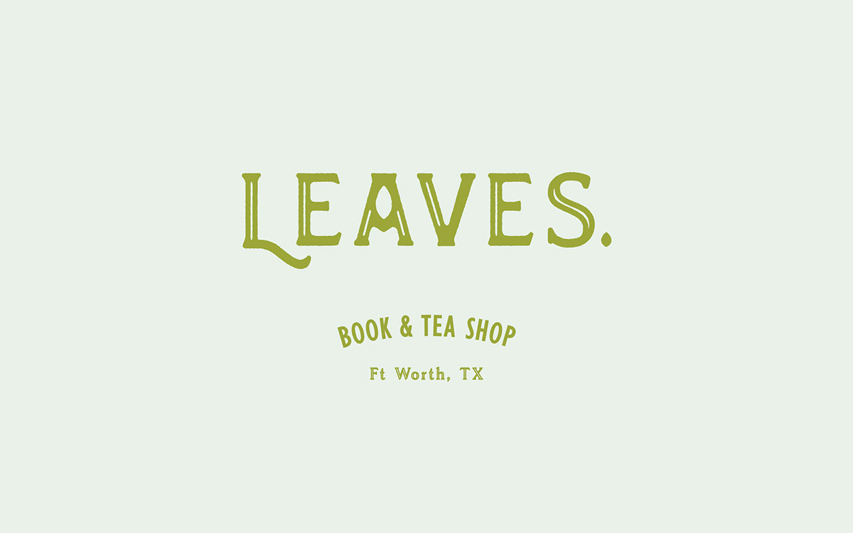
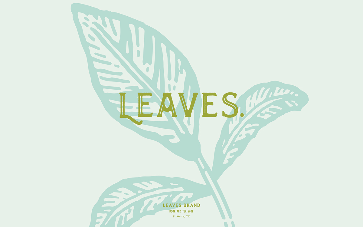
Restore the mind. Refresh the body.
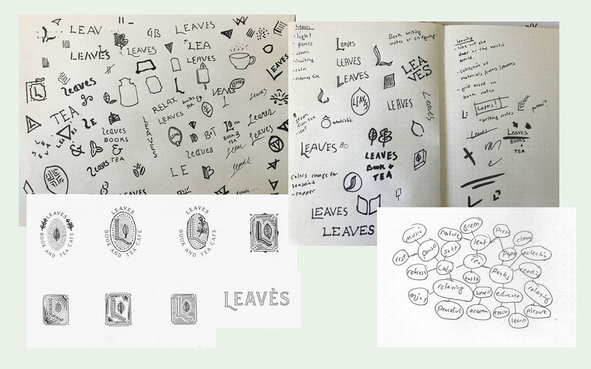
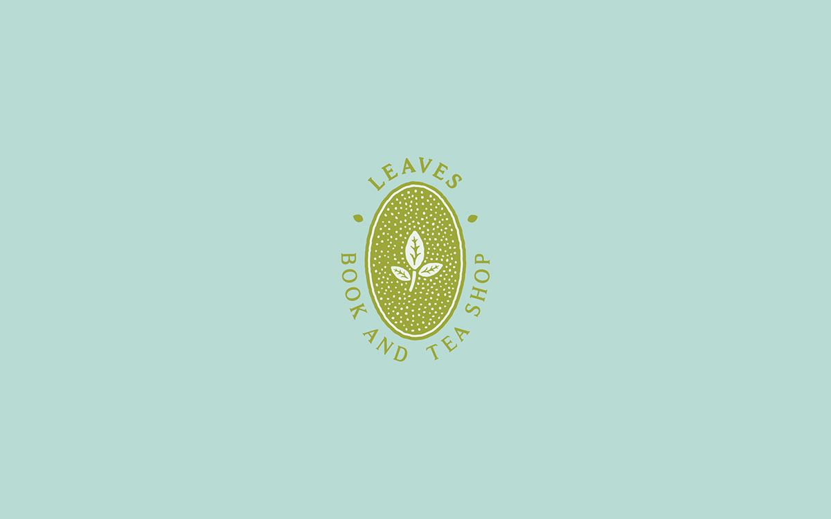
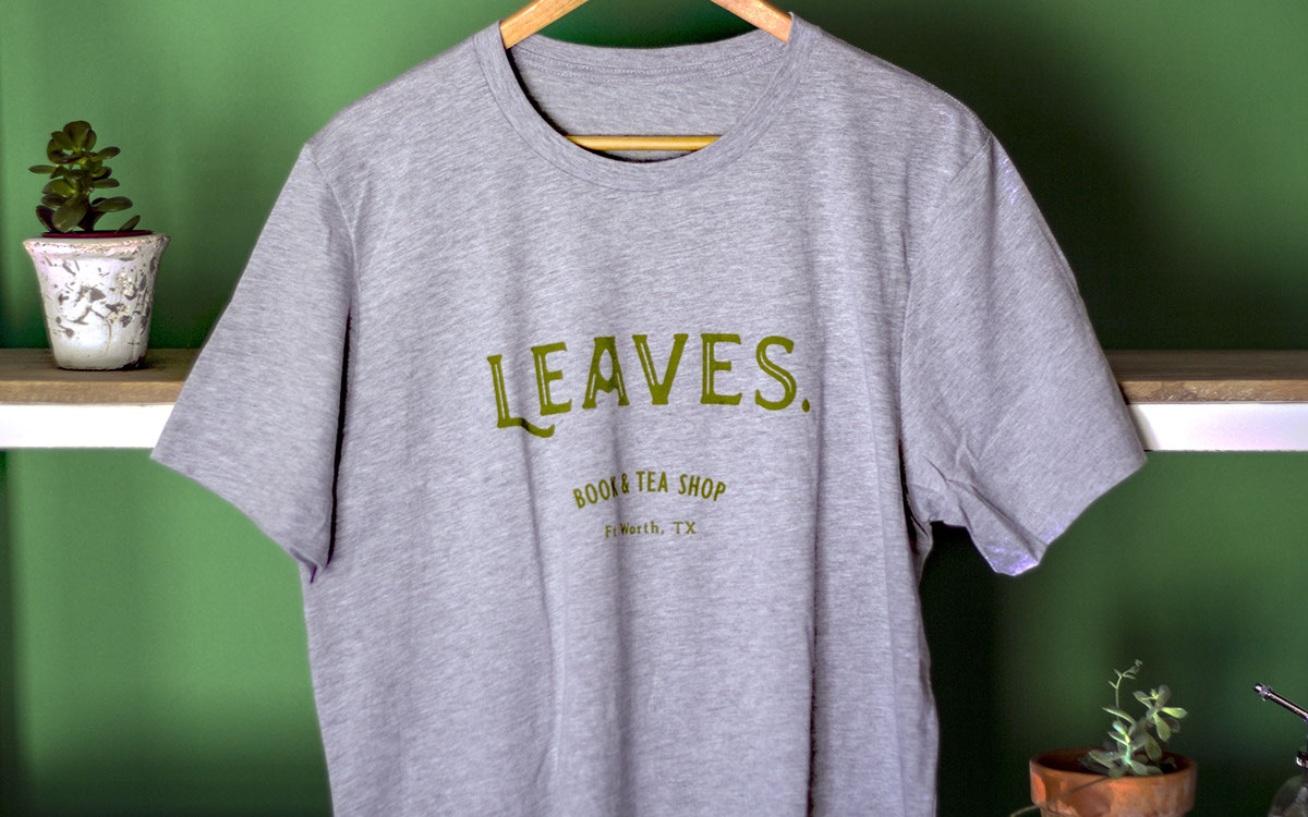
The Leaves brand is based on two main points. The first is visually representing the break offered to customers. The leaf type mark is inspired by vintage book covers and bookended by a ‘tea leaf period,’ which in literature means to provide a break or take a breath. The second is the icon, which is an illustration initial cap. It is used in literature as a marker for a new section and helps readers ‘find their place.’


Results
"We constantly receive compliments on our branding from friends and strangers alike. Seriously, we couldn’t be more pleased."
- Tina Howard, Owner
- Tina Howard, Owner


