Kosmo's Q Visual Identity Refresh
Kosmo's Q began in 2009 as a competition BBQ team creating original rubs, sauces, injections and brines because products existing in the market did not live up to their standards of taste or quality.
Today, they have established themselves as a primary player in the competition bbq scene, winning top honors at the World Steak Championship and many other contests. They have developed unique, high-quality products sold in specialty stores and online world wide.


Challenge
To redefine and reignite Kosmo's Q’s Visual Identity to reflect their growth and evolving brand.
Bring the flavor and quality of competition barbecuing to the backyard.
The Kosmo's Q brand organically evolved from Darian Khosravi’s need to find the right combination and balance of flavors to win barbecue competitions across the nation. His winning rubs, injections and sauces have become a staple of the professional grill master.
The Kosmo's Q brand organically evolved from Darian Khosravi’s need to find the right combination and balance of flavors to win barbecue competitions across the nation. His winning rubs, injections and sauces have become a staple of the professional grill master.
The high quality, well tested products remained unknown to the backyard barbecuer. The Kosmo's Q brand grew into inconsistency and brand confusion with packaging that lacked education for the casual grill hobbiest.
Approach
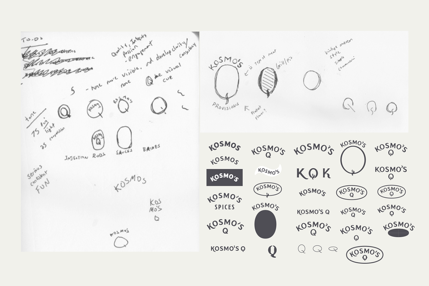
Previous Kosmos Q identities have had issues with legibility causing problems with duplication in print, embroidery and screen print applications that has created inconsistency with the overall identity. They were great at attracting BBQ pit-masters, but would not appeal to the casual or semi-avid backyard users.
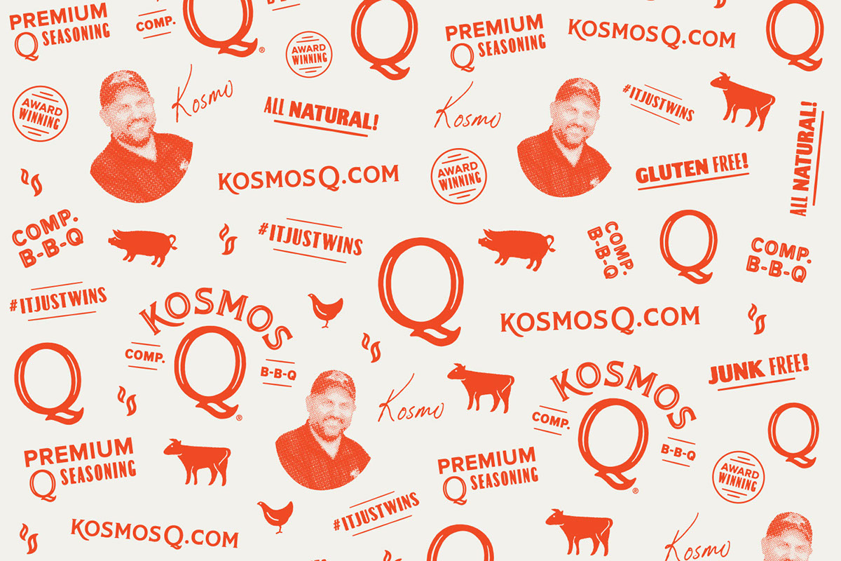
Refine messaging for uniqueness and consistency. The single identifier that truly highlights the Kosmos Q difference is winning. The company doubled in size after the winning the World Barbecue and World Steak Championships in 2015. With a lock on the competition market, Kosmos Q is poised to elevate the casual griller and tailgater. It just wins!


Solution
Clarifying and simplifying the visual identity by bringing it back to its stompin’ grounds.
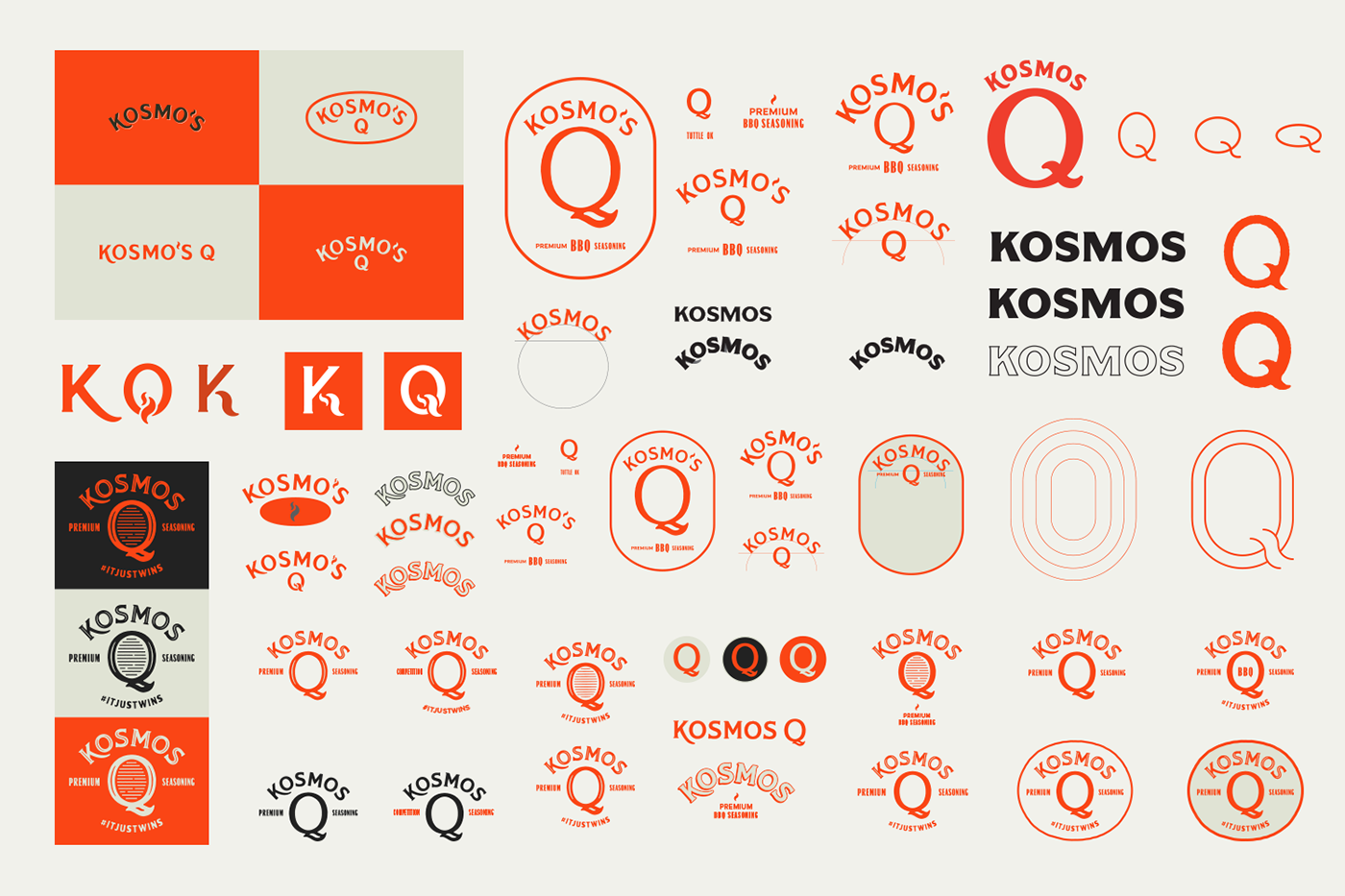
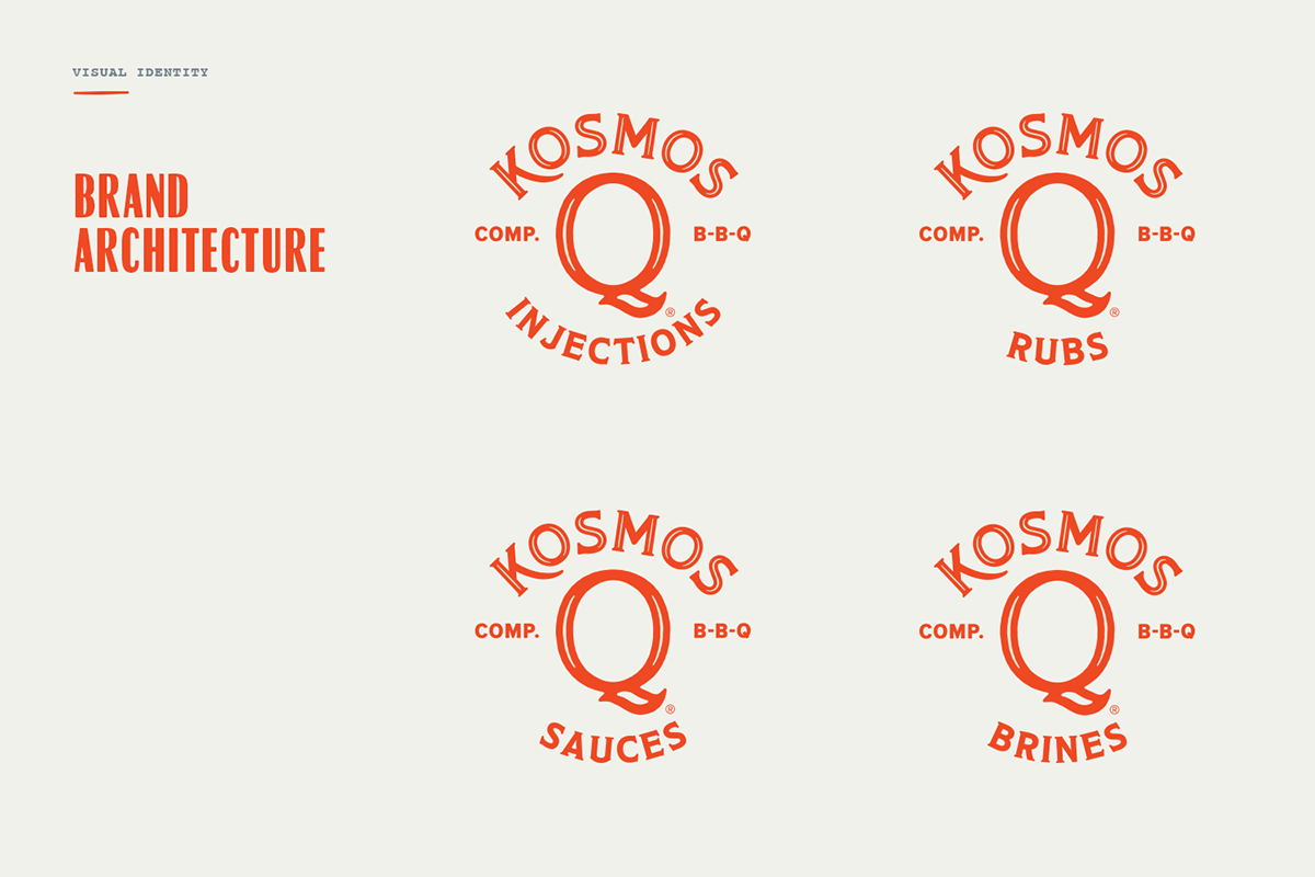
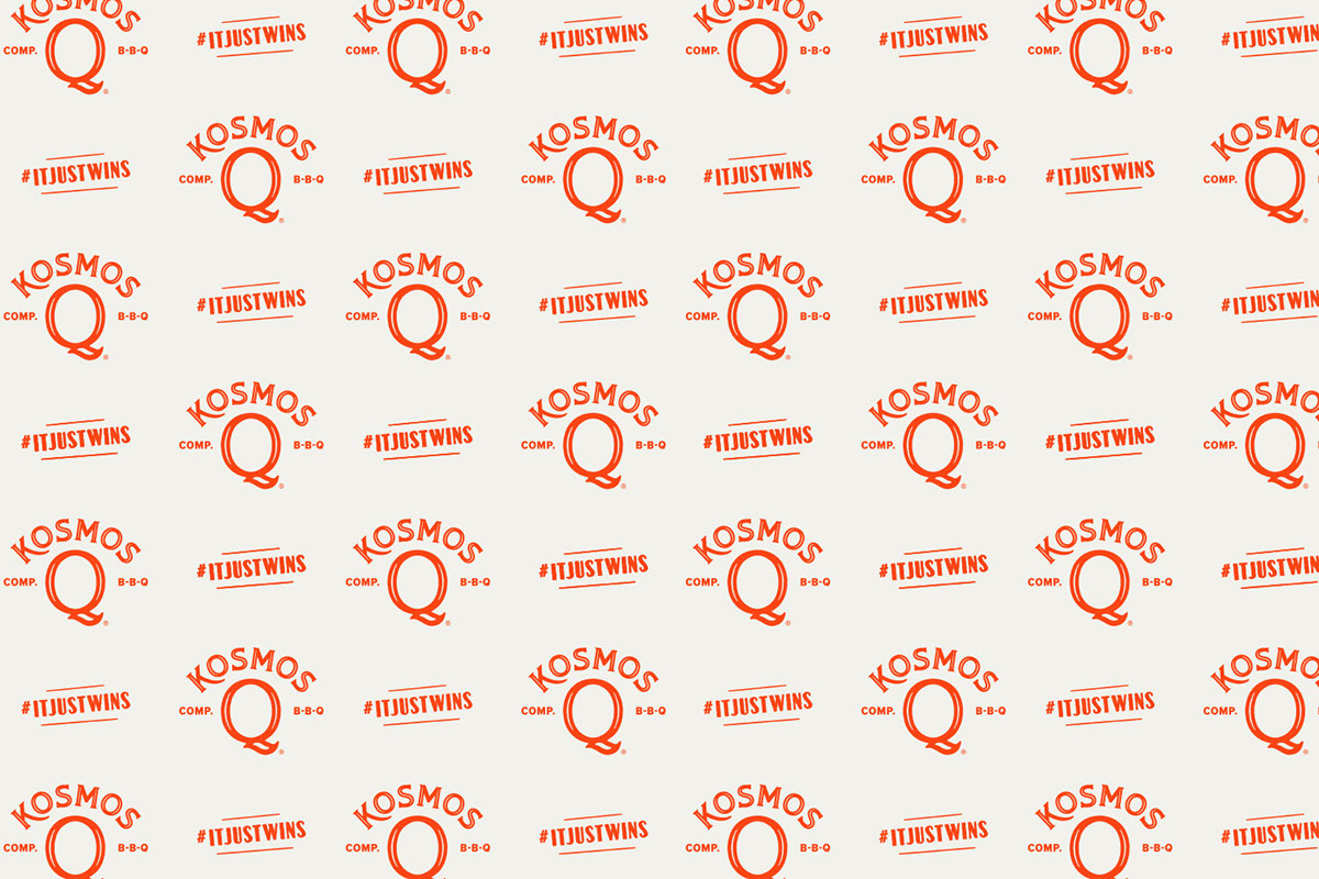
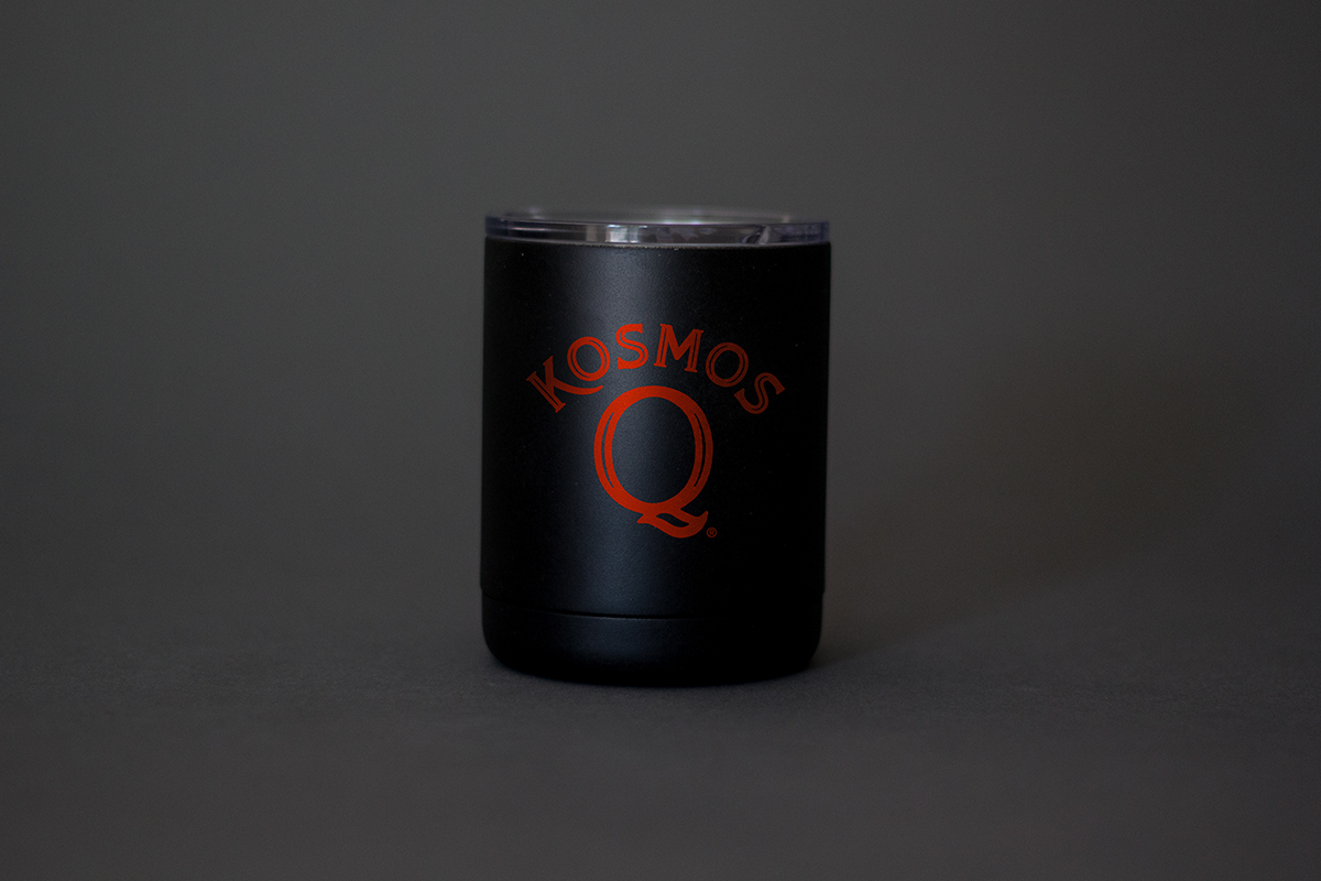
Connecting the brand back to its provenance by establishing the large “Q” as the most recognizable element. The primary goal was to make it the center of the visual identity. All things Kosmos revolves around the “Q” for clarity and consistency.
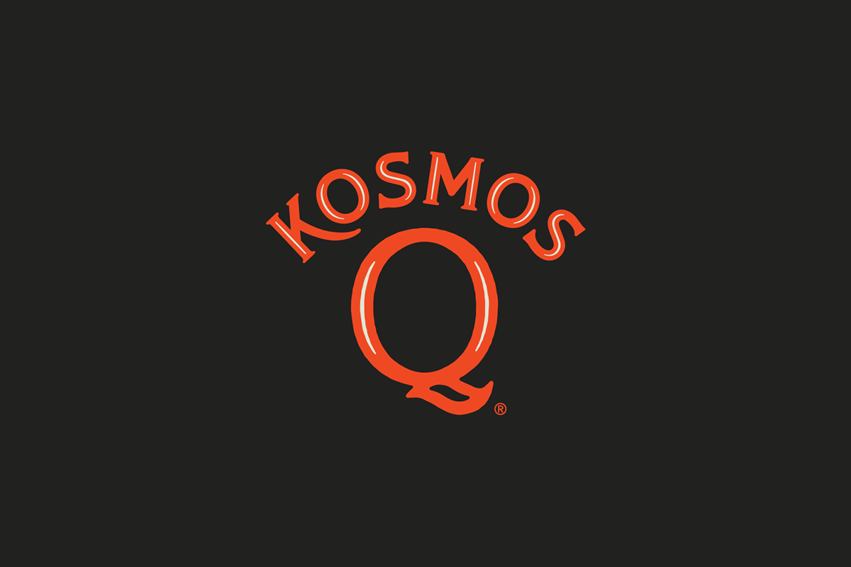
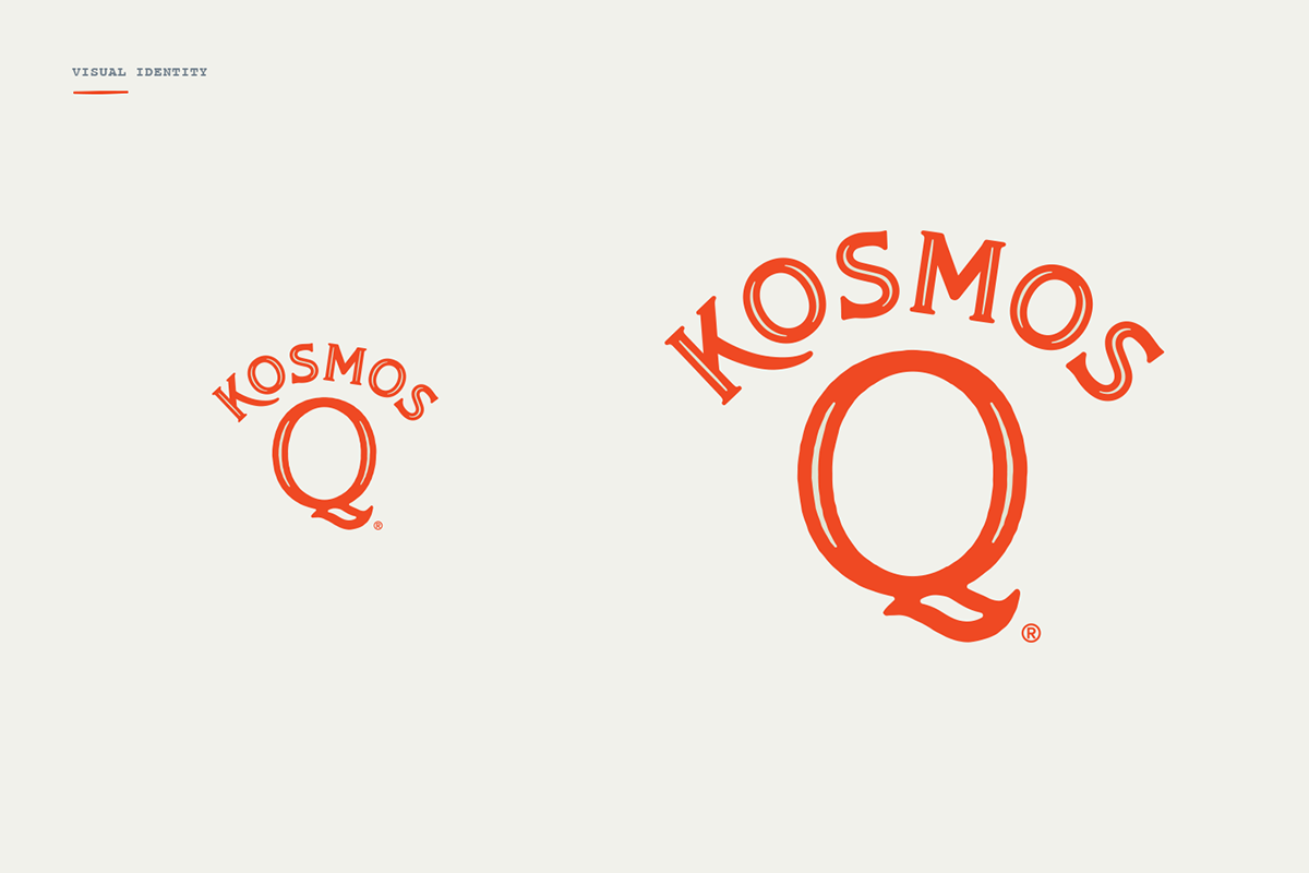

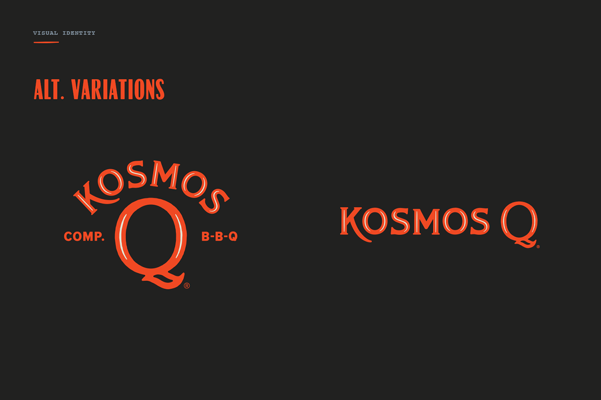
Primary Logotype
The logotype is the cornerstone of the visual identity. It creates immediate brand recognition and builds equity with every impression newly designed to be easily reproduced across all platforms from printed package labels to embroidered shirts to screen printed aprons.

The "Q" Mark
The “Q” mark is the foundation of the brand. It has strong durability being the core identity element since the beginning of the organization. Utilizing the "Q" mark consistently creates more clarity for consumers and strengthens brand loyalty.


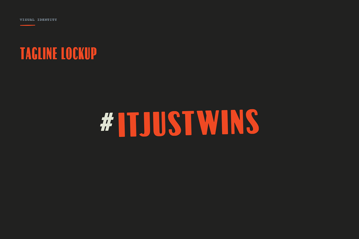
Tagline
Kosmo's Q’s tone is that of fun/lighthearted and strong/competitive. “It Just Wins” accomplishes them both while already being implemented to the masses. It will help customers recognize the brand while launching the new identity. It is short, differentiated from competitors, unique, captures brand essence/positioning and evokes an emotional response.
Results
Logotype maintains familiarity with the curved Kosmo's and primary Q of previous identities. It is easily legible and duplicable, modern with personality and depth, while being unique.
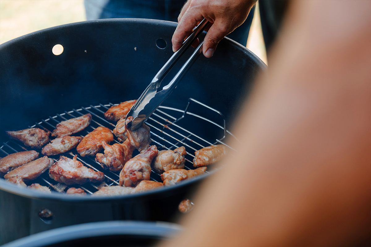
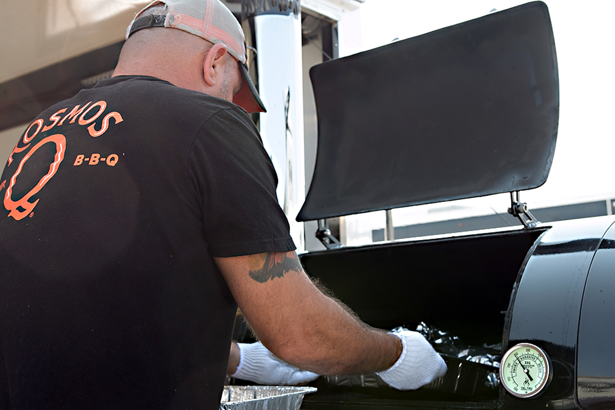
Kosmo's Q sponsored grill master teams continue to criss-cross the country treating the palettes of competition judges everywhere.


