Brief
Create a typeface based on one of Erik Spiekermann's principles/ values and create a visual product to present the typeface. The typeface is to be designed with no more than 6 modules, which are not to be skewed or changed in any way in form throughout the typeface.
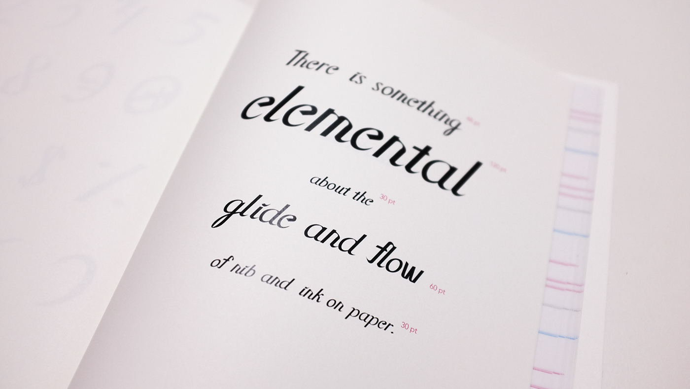
Quartet: A typeface based on the rhythm of handwriting
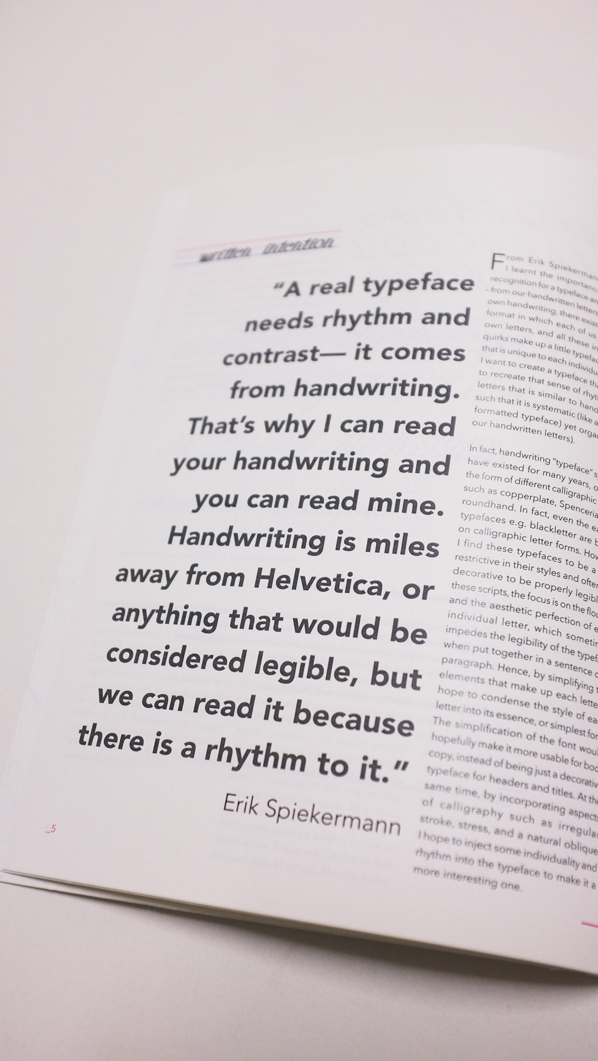
As a very prolific typographer, Erik Spiekermann has made many comments on design and typography, but one of the ones that was the most striking to me was how "a real typeface needs rhythm and contrast...from handwriting". That was something that came as a surprise for me from someone who designed extremely orderly and formal typefaces. Hence, I decided to create a typeface based on my own handwriting.
With the forms of handwriting in mind, I created a total of 4 modules - 2 straight and 2 curved to manipulate and piece together to form the different glyphs. This was the hardest part of the project due to the nature of my typeface - to preserve the handwritten nature of the typeface, I had to vary line weight and add flourishes while still keeping to a limited number of modules.
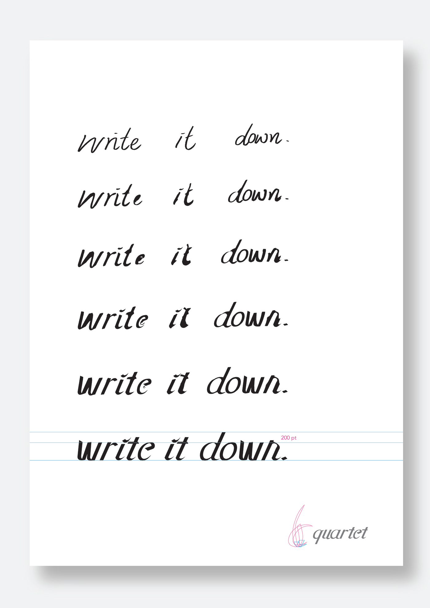
Keeping in line with the intention of my typeface, I created a calligraphy workbook set to showcase the typeface - with tracing paper pages, a guided on the structure of the typeface, a poster and a series of postcards to showcase the typeface, and a nib pen for the user.
Quartet
Category: Script
Classification: Calligraphic
Designer: Amy Ong


The four modules used to created the typeface - they were flipped, rotated and scaled but not skewed.
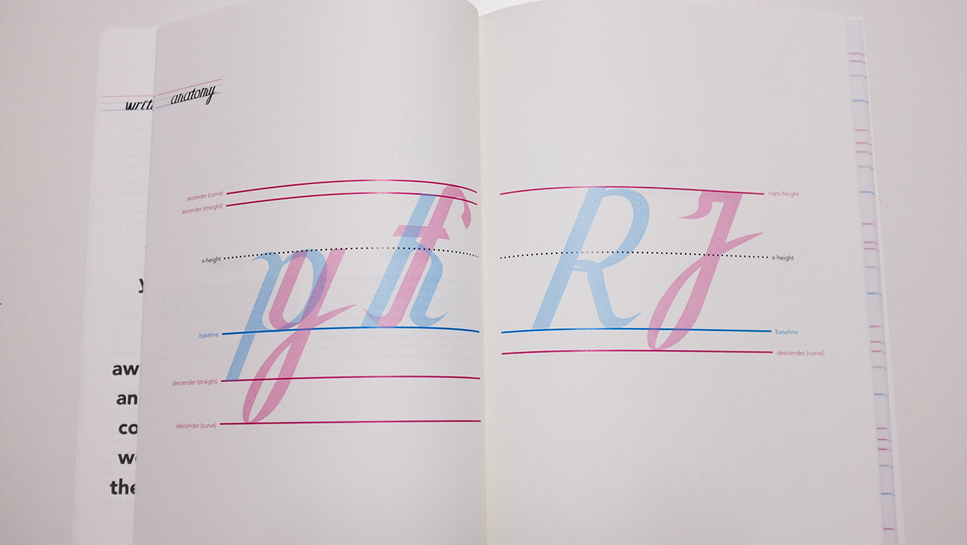
Comparing the different structures of the typeface - separated descender and ascender lines had to be created due to the nature of the flourishes.