


Run on a Mission
Branding
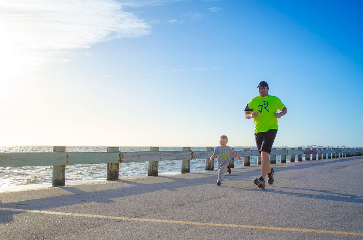
Run on a Mission (ROAM) is a brand that encourages schools, adults and the whole community to participate on virtual runs that raise funds for a particular cause. ROAM strives to instill fun, health and community throughout the nation. The typography has a sense of movement as if it was running. “On a Mission” uses a different font so that “RUN” maintains a emphasis on the action.
CLIENT: Run on a Mission (ROAM)
PROJECT COMPONENTS: Brandmark, business card, mailer, signage and brand guidelines
PROJECT COMPONENTS: Brandmark, business card, mailer, signage and brand guidelines
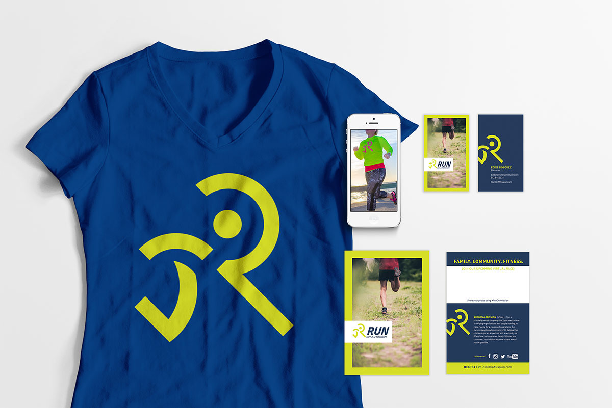
Our branding approach incorporated various elements to support their mission. The icon created is a symbol that incorporates an R along with a stylized symbol of a person running. The shapes in the icon support a fun and action-forward feeling. This icon has a balance of simple, yet clearly defining the underlying intention of ROAM. The color palette infuses a balance of fun and strength. Instead of using a pure yellow, we selected a yellow-green (chartreuse). This allowed us to create a feeling of fun (yellow) in nature (green). And since all the events are conducted outdoors, it was a perfect combination to the strong and confident blue.


