The goal of Dig In is to explore the benefits of home gardening and use that information to convince people that gardening is a valuable and accessible activity to engage with. Our world today is filled with things that demand our directed attention, but we have a finite ability to uphold these levels of attention and when that capacity runs out people often feel tired, distracted, and irritable. People have many ways they have found to deal with this situation, some might read or take a nap, but this project will focus on the therapeutic benefits of gardening as a way to improve both the mental and physical state of the gardener.
Dig In draws upon history and research on both the tangible benefits of gardening and learning theories to create a deeper understanding and better develop the outcomes of the project to reach the target audience. We all need an escape sometimes, and gardening is the perfect opportunity. Through learning more about the benefits and how gardening has helped others, as well as dispelling the illusion that gardening has to be a time consuming and complicated process, it will be possible to change people’s views on gardening and encourage them to try it themselves.
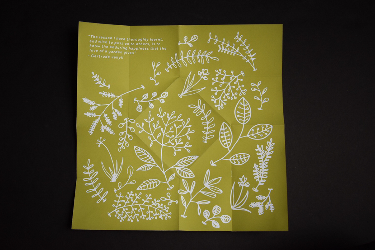
As part of Dig In looks at the influence of the modern world on our relation to nature and gardening, I wanted the logo to combine both feelings. I played around with the idea of hand done type with geometric shapes or lines around it, but in the sketches it felt very out of place. After a variety of styles and several pages of sketching I decided on all caps for the text, combined with a more natural feeling shape around it. I chose a sans serif type, but created a hand drawn version of it to help increase the tactile feel of the project. To complement the idea of digging in, I set the type over an oval with a slight texture to it.

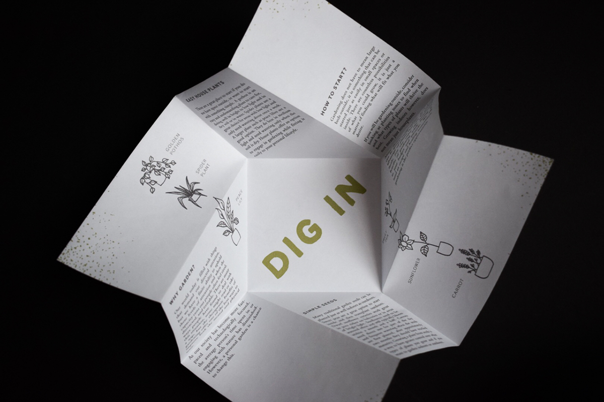
For Dig In several deliverables were created, a website, poster, and cards. The main goal of the website is to convince young adults that gardening is a valuable and worthwhile thing to spend their time doing. To do this the design will start by identifying some of the reasons why there is a need for gardening in the modern world. These reasons include the increased stress levels and constant interconnectedness we experience in the technological era we live in. The first main section will have a short question or quote that then has a link to an overlay page that will popup with more technical and factual information and link to outside studies. The secondary main section will focus on the historical value and application of gardening. After the historical section there will be a section on the tangible benefits people can have from spending time gardening. This section could also have popup overlays that have more in-depth research and studies that back up the general information. The final main sections are calls to action to begin gardening. There would be links to outside resources such as gardening clubs or groups and information on how to begin gardening either inside or outside depending on where the reader lives and what they want. Information accessibility is key to any campaign, while booklets and other small handouts promote to more targeted audiences, a website is easily shareable and accessible to people who would be unable to attend the places or events that the physical deliverables would be handed out at.

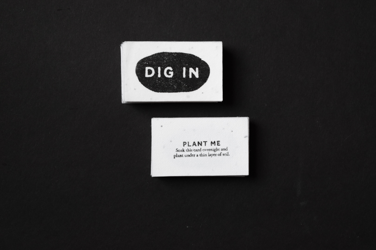
There are two main physical handouts that could be given out at events and meeting places. The first of these is a small business card that would be made on seeded paper. They would have the logo as well as a short set of instructions on how to plant the card. The goal of these is to give people something right away that they can plant after looking at the website or reading through the booklet. It hopefully would remove some of the reasons the audience might not begin to garden immediately, such as not having access to seeds or the time to go out and buy supplies.
The poster that could be handed out would target people who are more resistant to the idea of gardening. It would offer an overview of the benefits and the need for gardening today. Because Dig In is trying to create a new habit and behavior, having a tangible benefit and desire to begin gardening is important to give it a sense of seriousness. The primary goal of physical handouts is to reach young adults who might not come across the website on their own while offering guidance and inspiring intrinsic motivation rather than cookie cutter solutions.

The design strategy of Dig In displays facts and short bits of information to create situational interest and inspire the audience to take action. The educational aspect of the design will offer facts and research to create a balance between the informational and emotional arguments of the campaign. Crafting factual and more technical information in a way that will appeal to busy young adults is vital, it should be accessible and inviting while also commanding attention. In order to connect to the audience the design must make arguments that they are able to relate to on a personal level, such as the feeling of stress and constant connection to the world. The design must communicate the importance of gardening and learning to garden, without talking down to the audience for not knowing how, but to empower them. The identity of Dig In with welcoming colors, engaging language and visuals will sustain the attention of young adults in order to communicate the value of gardening, make them consider its potential importance in their personal life, and convince them to take the first step to create their own garden.
Explore the whole process book and research: