
About Charlie Tango:
At Charlie Tango we transform brands by delivering coherent customer experiences, combining strategy, creativity and technology.
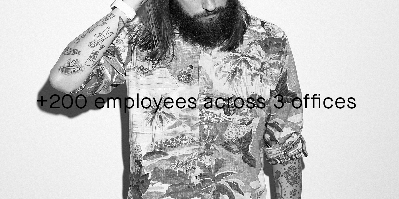
With a highly diversified team of 200 specialists, at Charlie Tango, we master the full digital lifecycle process from digital strategy development and innovation, over creative and technological engineering and services.
How we came to be:
Charlie Tango is a result of a merger of three leading agencies into one Nordic digital powerhouse, backed by one of the largest IT solutions and services groups in the Nordics.
We want to be Creative and master Technology.
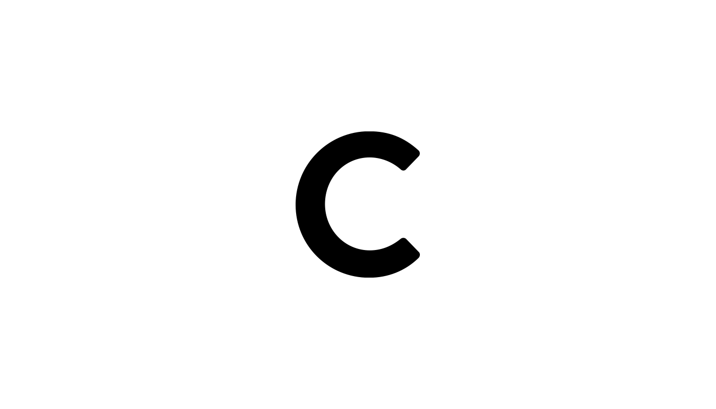
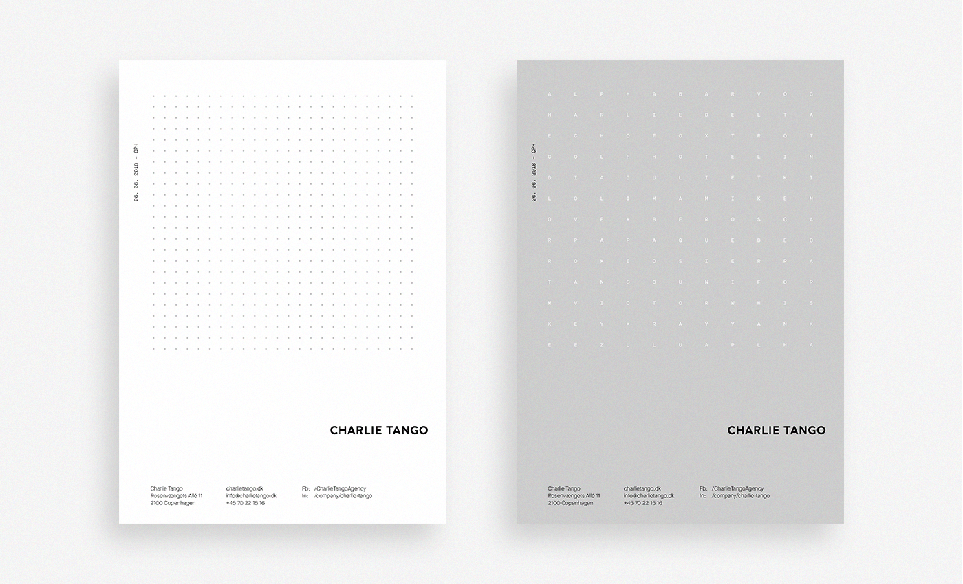
That is how the name Charlie Tango came to be. It originates from the letters C and T in NATO's phonetic alphabet. The letter C stands for Creativity and the letter T stands for Technology.
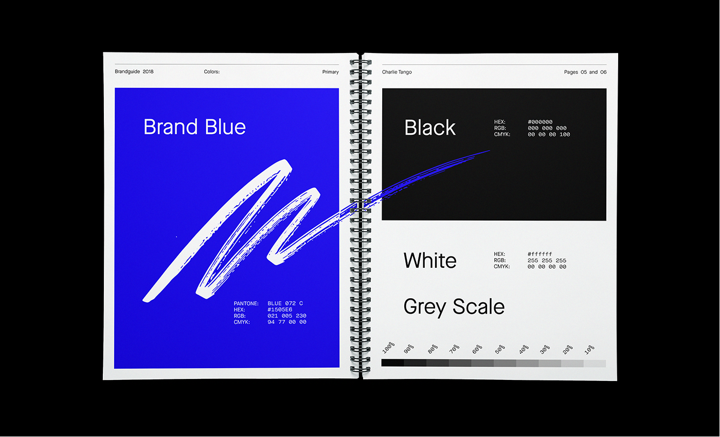
Visual expression:
A simple and clean look with a robust and modern typeface, a corporate color scheme for the main stationary products, such as business cards, flyers, brochures and general paper line. It is timeless and robust logotype in all caps. The name CHARLIE TANGO is created from the typeface Brandon Grotesque and then modified to achieve the desired expression.
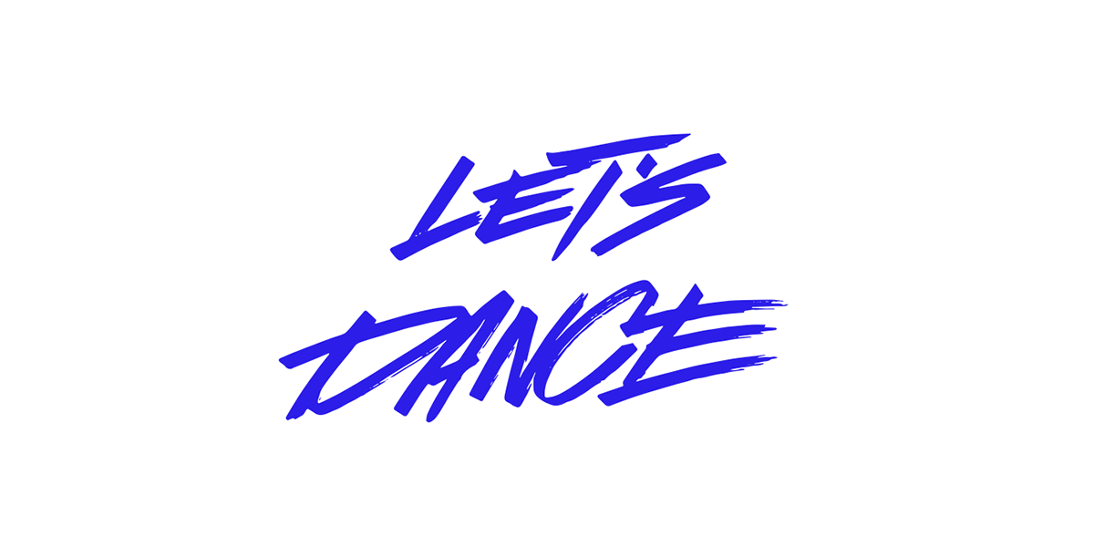
To give it all a bit of edge, we also use a large selection of secondary colors, handwriting, patterns, and brushstrokes. These can be seen across all of our social media profiles.


Credits:
Employee pictures by:
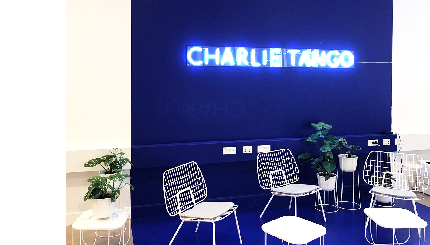
Main office:
© 2018 Charlie Tango