


The Oak Glen Christian Conference Center is a camp that has been operating for over 30 years located on the Western slope of the San Bernardino Mountains, just above Yucaipa, California.
After coming under new ownership, OGCCC desired to establish a fresh identity that conveyed the new vision and direction for the camp. Ben Loiz Studio was asked to clarify the brand story and develop a logo and identity to carry them into the new era.
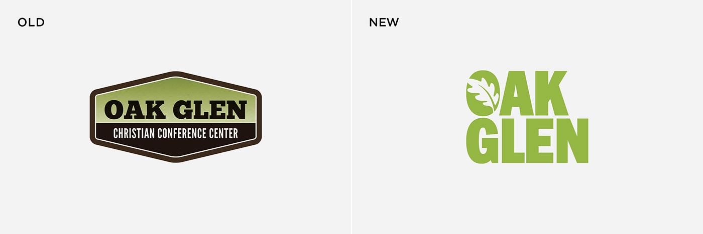
The Bible records a conversation between God and Abraham that took place by the oaks of Mamre, in Hebron. This influenced the new identity to be centered on the idea of friendship and fellowship with God under the shade of Oak Glen. The letter O serves as a symbol emblazoned with an oak leaf, and the colors were inspired by one of the native Southern California oaks.
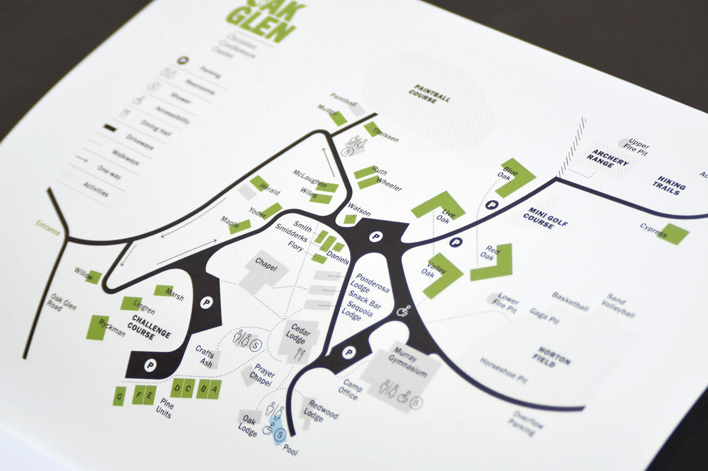
One of the challenges of a 30-year-old camp nestled in the woods is orienting yourself to find your way around the expansive grounds. The map that had been in use was difficult to follow and had no clear hierarchy as to what structures were important and what was less important.
We developed a new icon set and map that responds to the needs of a new visitor using a three-tier hierarchy based on color and pattern. Roads with parking lots and guest cabins are highlighted as the most prominent providing clarity upon arrival. Next, walkways and main building structures are specified. Lastly, recreation and activity locations are clearly indicated. The new map has helped countless visitors to the camp each year.
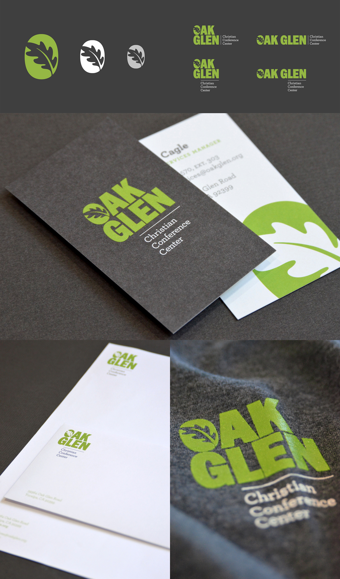
An identity style guide was designed for the camp staff along with signage, a new stationery set, employee apparel, promotional brochures, and various merchandise for the camp gift shop. The identity continues to grow as campsite developments are being made each season.


