

/ CHALLENGE /
THE CORE Create a visual identity and logo for Köksbordet by Hörte Brygga, a small restaurant located in the Hörte harbour in South of Sweden, and apply that onto a number of brand touchpoints. Emma and Martin, the founders of Köksbordet, also runs the well-thought-of (mentioned by New York Times in places to go and part of the White Guide) and award-winning restaurant Hörte Brygga. Since both restaurants are located on the same address, but operates during different parts of the year, the founders Emma and Martin wants to make it easier to differentiate the two of them by giving them different visual concepts. In the summer the restaurant is called Hörte Brygga and is mainly a lunch restaurant with drop-in (without the possibility to book in advance). Köksbordet is open during the rest of the year and is only open for prebooked guests with longer sittings in the evening.
CUSTOMERS & COMPETITION The primary customers for Köksbordet are genuinely food and beverage interested people with an open mind. The typical customer is a affluent person, likely from the Malmö-Copenhagen area, with a design interest that eats out a lot. Emma & Martin do not see other restaurants as competitors, they see them more like colleagues and sources for inspiration.
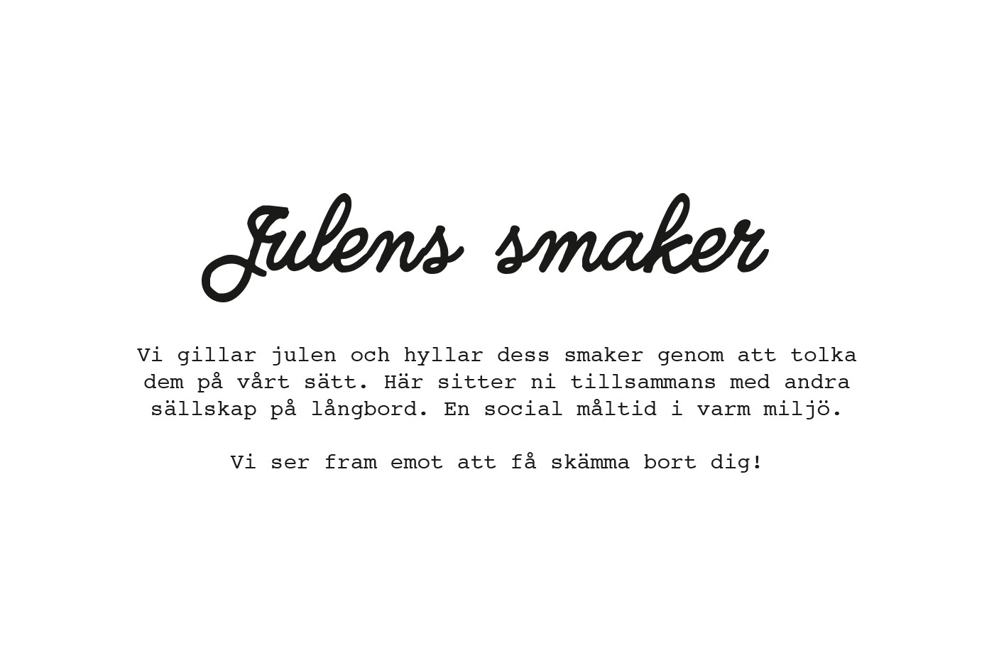
THE BRAND In short a visit at Köksbordet shall feel like the kitchen-hangout on a great home party. Key words for Köksbordet are Craftsmanship, Natural ingredients, Locally produced, Small-scale, Relaxed atmosphere, Quality, Fun and Inspiring.
THE BRAND In short a visit at Köksbordet shall feel like the kitchen-hangout on a great home party. Key words for Köksbordet are Craftsmanship, Natural ingredients, Locally produced, Small-scale, Relaxed atmosphere, Quality, Fun and Inspiring.
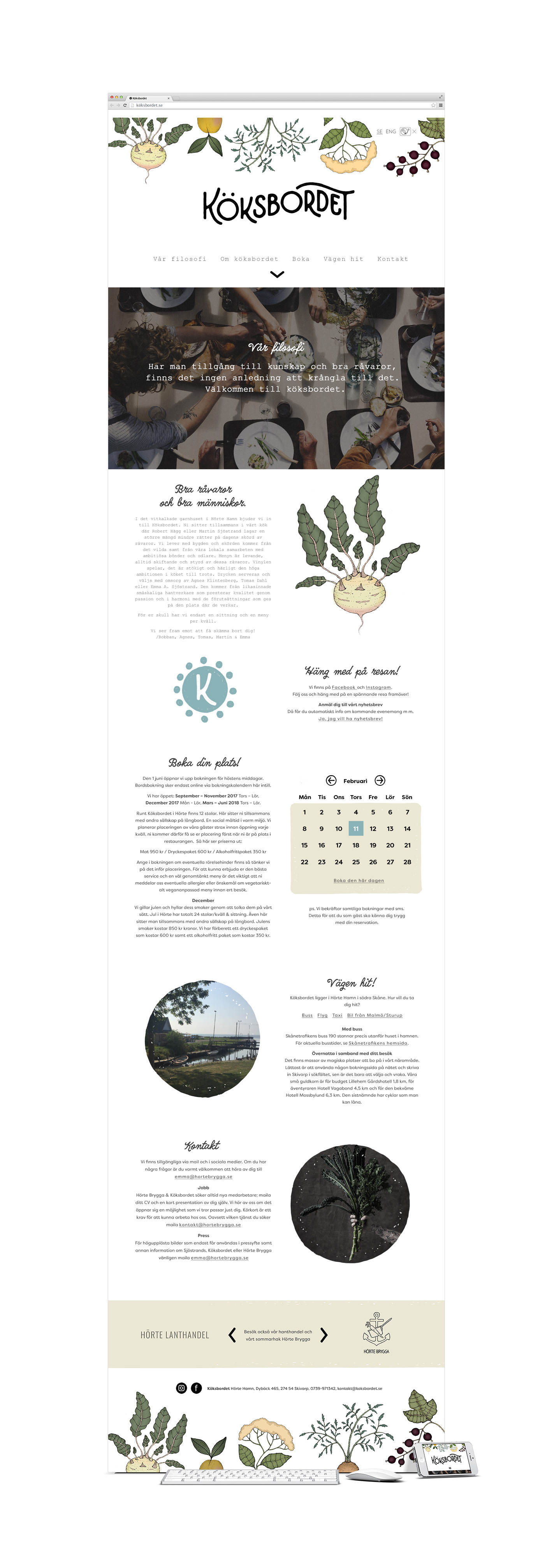
USAGE The logo and identity will be used on business cards, gift cards, clothing, web site, menus and email-newsletters.
FRIENDS The development of the website has been made by Peter Anderhagen, illustrations has been created by Fanny Schultz and main imagery photographed by Christian Gustavsson.
/ SOLUTION /
/ SOLUTION /
NO NEED TO GET COMPLICATED Emma & Martins philosophy "If you have access to great knowledge and ingredients there are no need to get complicated" sort of concluded everything for me. I wanted the visual identity to go hand in hand with this. Simplistic, but also a feeling of hand-made and human. The restaurants´ location by the sea can be felt through the wavy baseline of the logotype.
SYMBOLIC The word Köksbordet means Kitchen table in English and every sitting has room for 12 people. Based on that I created a simplified logo version for social media e t c that uses the symbolism behind that.
SYMBOLIC The word Köksbordet means Kitchen table in English and every sitting has room for 12 people. Based on that I created a simplified logo version for social media e t c that uses the symbolism behind that.
NATURAL COLOR SCHEME The colors are subdued and are all found in nature and in the locally produced ingredients that Emma & Martin use a lot in their cooking. The base sand color signals nature, sand and close-to-sea.
FITS IN BUT STANDS OUT I have worked hard to create a identity that works well with Hörte Bryggas existing visual identity and at the same time stand on its on feet and differentiate it.
EASY TO USE The identity visual identity is relaxed, natural, hand-crafted, warm and inviting. As every well-crafted logo shall be, the logo for Köksbordet is easy to recognize and remember, even in cost-effective one color print.
EASY TO USE The identity visual identity is relaxed, natural, hand-crafted, warm and inviting. As every well-crafted logo shall be, the logo for Köksbordet is easy to recognize and remember, even in cost-effective one color print.

Above. Mindmap for the visual identity of Köksbordet.
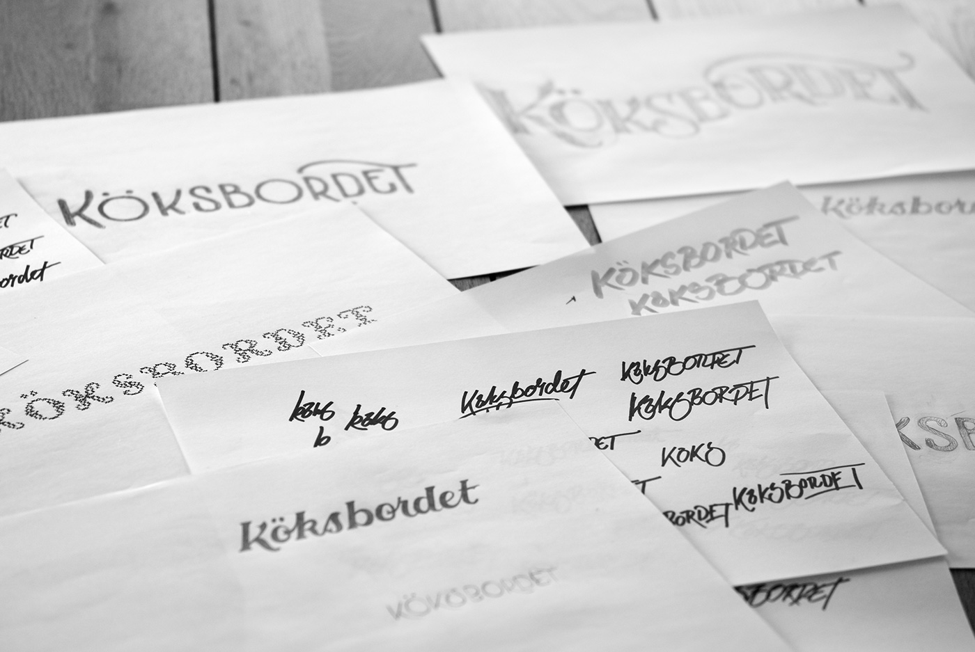
Above. Rough sketches for the logo of Köksbordet.
Above. Refined chosen lettering direction for the logo of Köksbordet.
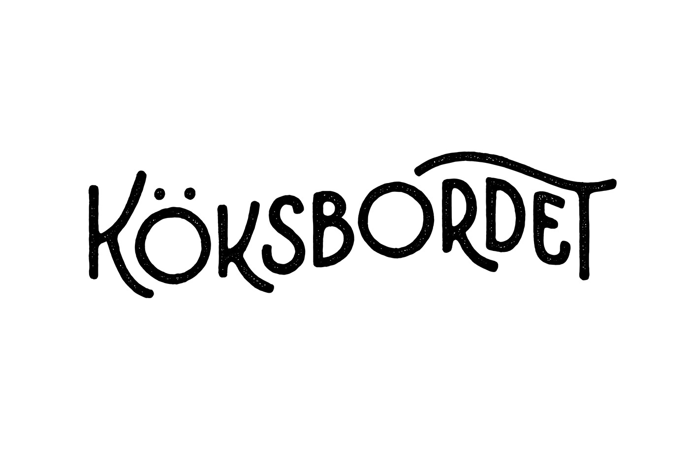
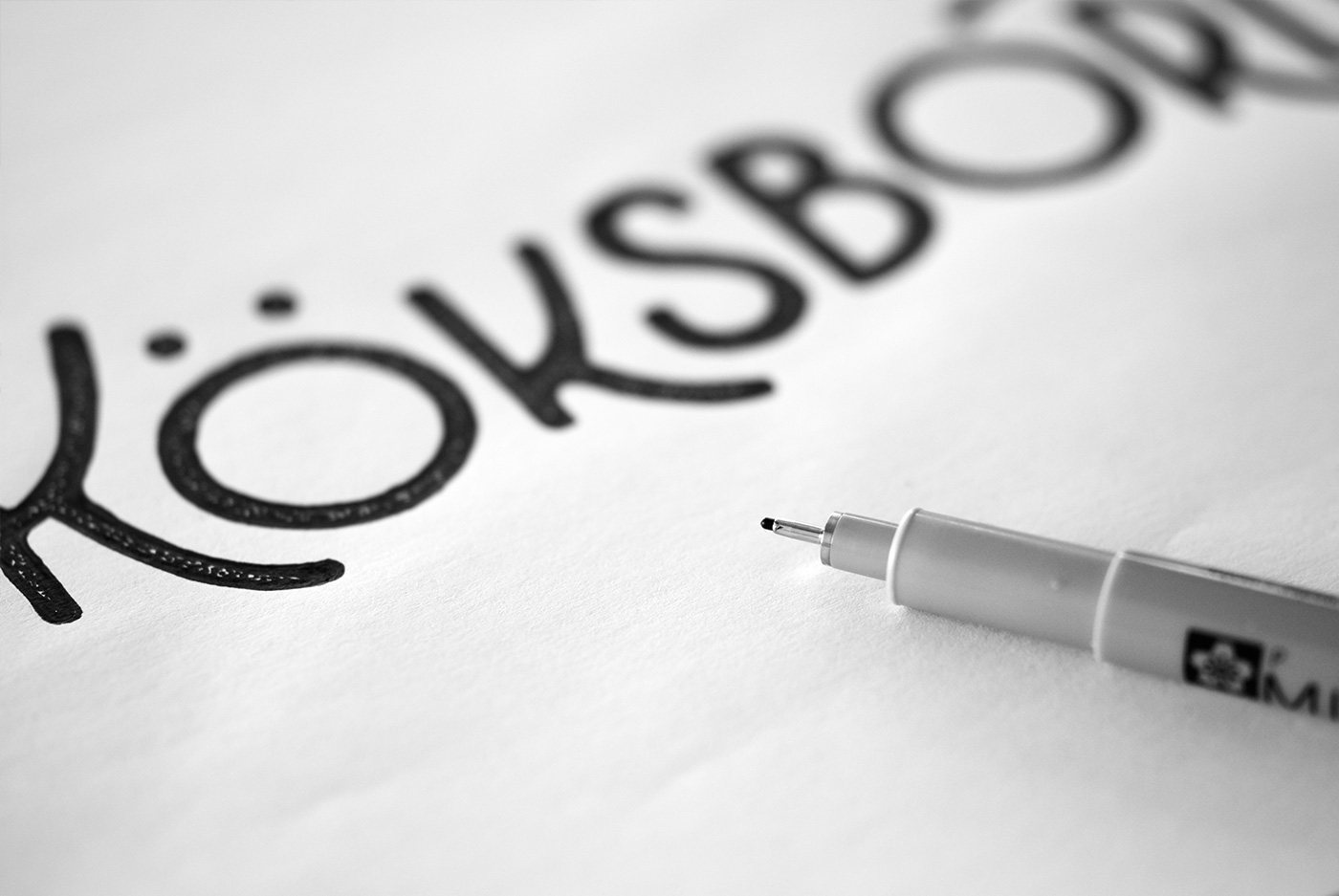
Above. Human-made. The logo is deliberately simple in its design, simply because it goes well with Emma & Martins approach to cooking. Though it is simple it has a lot of behind-the-scenes thoughts. The lettering has character, is playful and relaxing, and the restaurants´ location by the sea can be felt through the wavy baseline of the logotype. A bit of texture in the letters enhance the hand-made feeling.

Above. Mockup of business cards for Köksbordet.
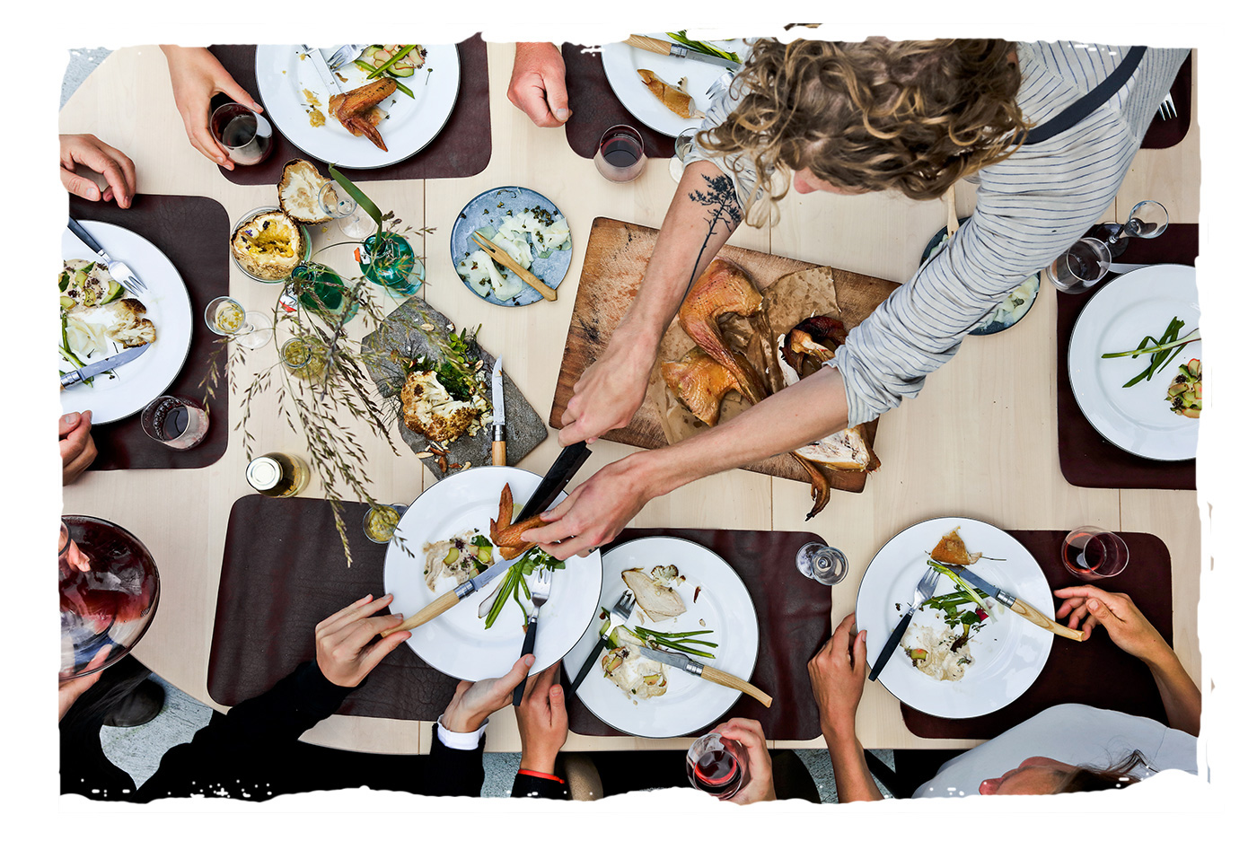
Above. In action at Köksbordet. Photography by Christian Gustavsson.
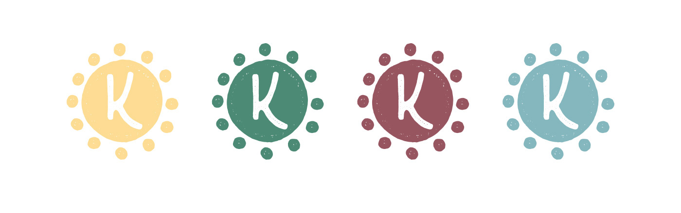
Above. The word Köksbordet means Kitchen table in English and every sitting has room for 12 people. Based on that I created a simplified logo version for social media e t c that uses the symbolism behind that. The idea is that the color can be shifted throughout the different seasons.
Above. The headline font called Quimby Gubernatorial goes well together with the logo – it appears to be monoline as the logo and it has that hand-crafted feeling. The font used for longer text amounts are Courier. This is a font used already by Hörte Brygga and is used to strengthen the relationship between the two identities.

Above. The colors are subdued and are all found in nature and in the locally produced ingredients that Emma & Martin use a lot in their cooking. The base sand color signals nature, sand and close-to-sea.
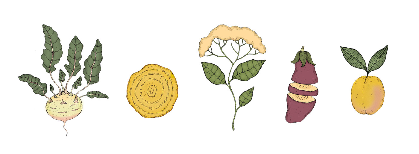
Above. Illustration style for Köksbordet. Illustrations by Fanny Schultz.

Above. The idea is to use subdued images that gives a pleasant, less selling and more artistic impression. It is a good idea to highlight natural textures in raw ingredients or materials like concrete, wood et c. And last, but not least, they should feel unplanned and taken at the speed of the moment.
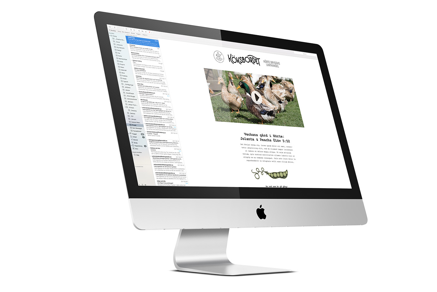
Above. Email newsletter for Köksbordet.

Thank you for watching!
Do you need help with your branding? Drop me an email at hello@bjornberglund.com with some short info about your challenge and I will get back to you soon. Visit my website for more of my works and how I work. You can also follow me on Twitter or Instagram.
Want to see more handmade type, logo design and other identity/branding work? Please click Follow. If you liked this particular project - hit the Appreciate button below. :-)
Cheers,
/Björn
/Björn


