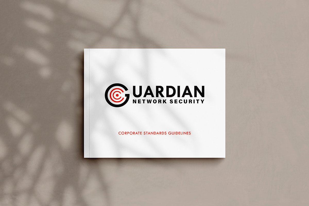
LOGO DESIGN & BRAND IDENTITY:
CLIENT: GUARDIAN NETWORK SECURITY
YEAR: 2017
CONCEPT: LOGO & BRANDING
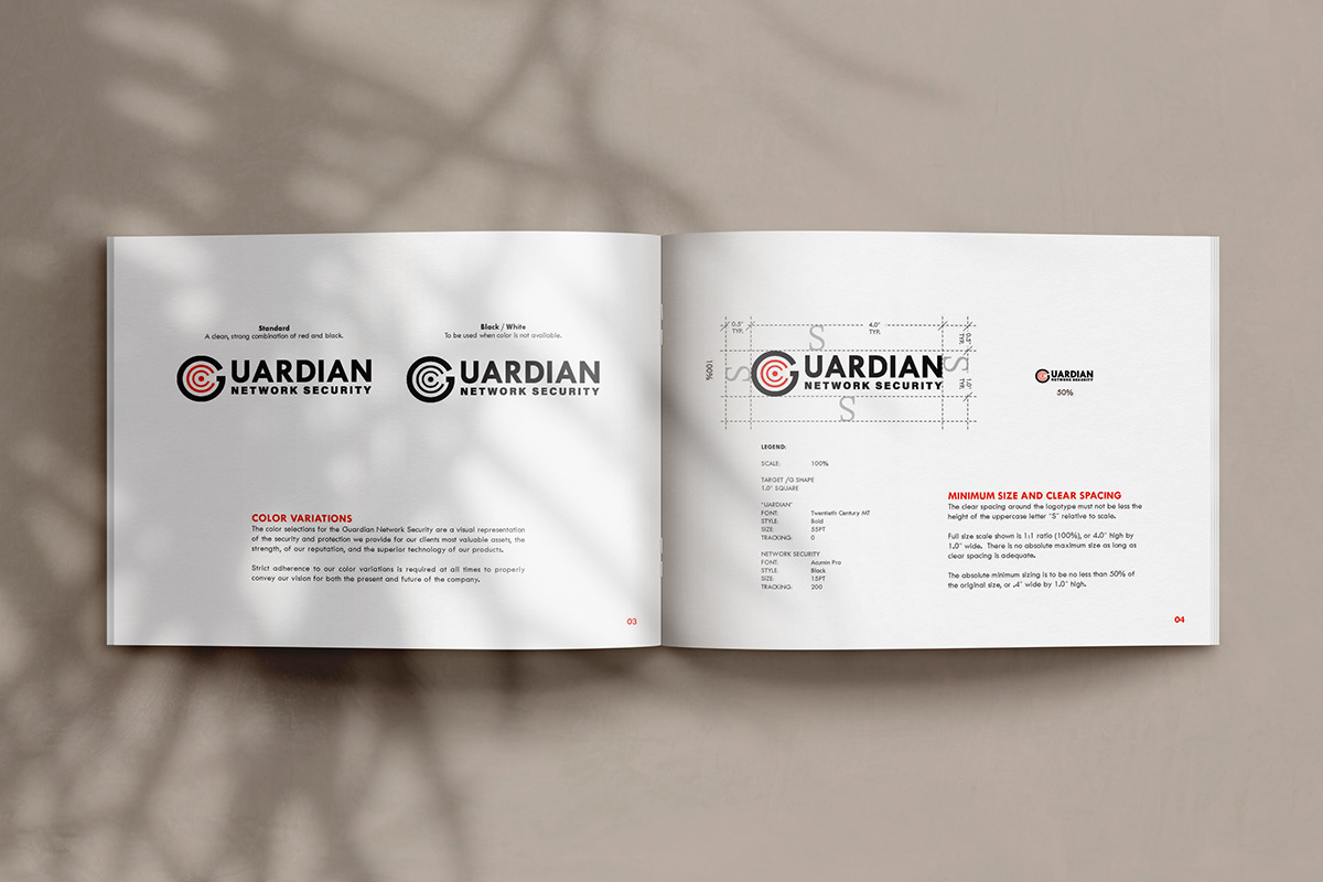
The inspiration behind the Guardian Network Security logo is the targeted security and protection for we provide for our clients most valuable assets, the strength, of our reputation, and the superior technology of our products.
The combination of geometric typefaces reinforce the impenetrable cyber security that Guardian Network Security is known for. The target in the center represents our proactive targeted approach to threats of your valuable data. The negative space within the target creates an arrowhead that points directly to the “bulls-eye” visually reinforces the message.
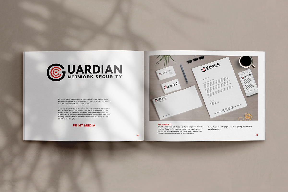
Likewise, these colors were selected to convey the vision of both the present and future of the company To maintain the consistency of the brand, these guidelines have been developed to define the specific elements and usage of their visual identity.