


This project is done while I was partner and UX/UI Designer at Frontwise
Project: Frontwise rebranding and webdesign visit the site here
My role in the project: Conceptual and Strategic work, Branding, Graphic Design, UI/UX Design, Icon Design & Animation, Logo Bumper animation
Branding
While working at Frontwise we thought it was time to rebrand our main website and our Brand Identity. The wordmark has been created in the first week of founding Frontwise (2011) and we were certainly still satisfied with it. However, Frontwise never actually had a proper Logo or at least a small mark that we could use when there was not a lot of space. When I created the wordmark we have come up with the characteristic rounding of certain corners while leaving others sharp. These features are used to create the Hexagon Icon with the characteristic F in the middle. The bright magenta helps to make it an eye-catcher and it is often used to guide the eye of the viewer, make it known who the Sender or Creator is.
-

-
The Frontwise Colours
The Frontwise colours have been pushed to more saturated colours to become bright beacons of the new identity. The brightness functions better on screen than on print which suits the company because we were always going to be Digital First.

-
Typography
For the typography the Rubik Font Family has been chosen as the one and only font for the Brand Identity. Specifically the Light version. The friendly roundness and openness of the font suited the brand very well and it gives the pages a fresh and clean look. Having only one font instead of a nice font-pairing made the idenity
-

-
Responsive Web Design
The website of Frontwise should be a clear reflection of what the company stands for. We aimed for a page Hero that would impress, reflect the values and explain what the company stands for. The cell-rendered hero animation in the background helps translating a lot of the hi-tech values and communicates that we are about interfaces where the user is central in the Design.
-


-
Stationary
For the business cards and invoicing we've chosen to use a lot of white space to convey a clear message. The F-hexagon logo has the function of being a quick identifier almost like the old seal used to close letters.
-

-
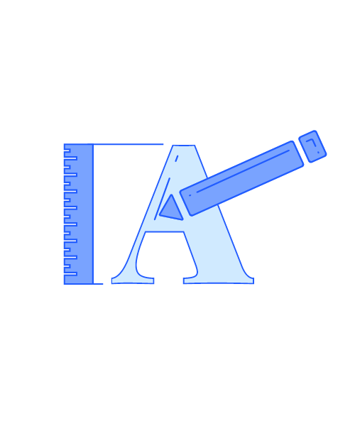
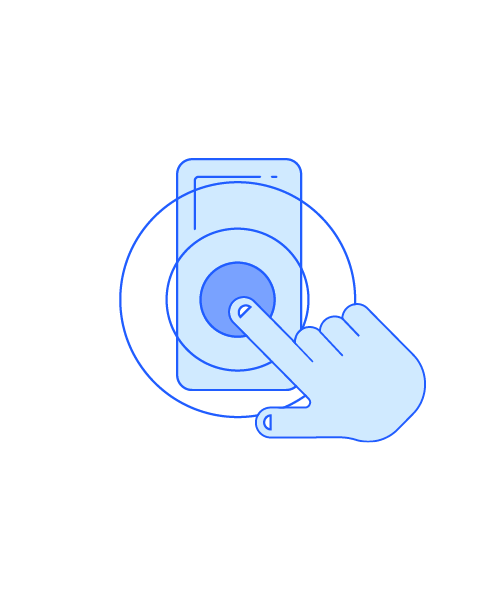
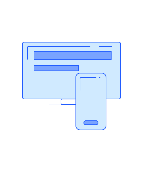
Logo Bumper & Icons
This logo bumper is created for using after a videoclip. The message here was Smart and Playfull. The Icons that are created for on the website are used in the Logo bumper to have this connection between the website and the video's. The Icons are all animated and playfully explaining the different elements of how Frontwise adds value.
-
-


-


