


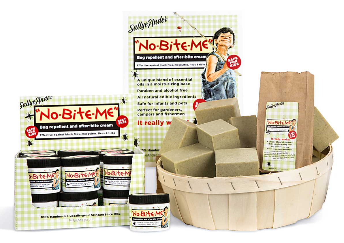
No Bite Me has been a top selling product for SallyeAnder years. An herbal blend that is proven to repel all sorts of insects, No Bite Me is safe enough for everyone in the family—including infants and pets. It is a fabulous product with a cult-like following.
However, it was time for a refresh. We needed to bring it in line with the new SallyeAnder branding, but we couldn't create something unfamiliar. We needed to take the elements that customers had grown to recognize and love and gently improve them.
We started by cleaning up the elements we wanted to keep. We knew young Sam had to stay. Redrawing him was out of the question. So we took the artwork and literally tidied him up—removing line work and darkness in his face, brightening his colors, whitening the background and generally adding impact.
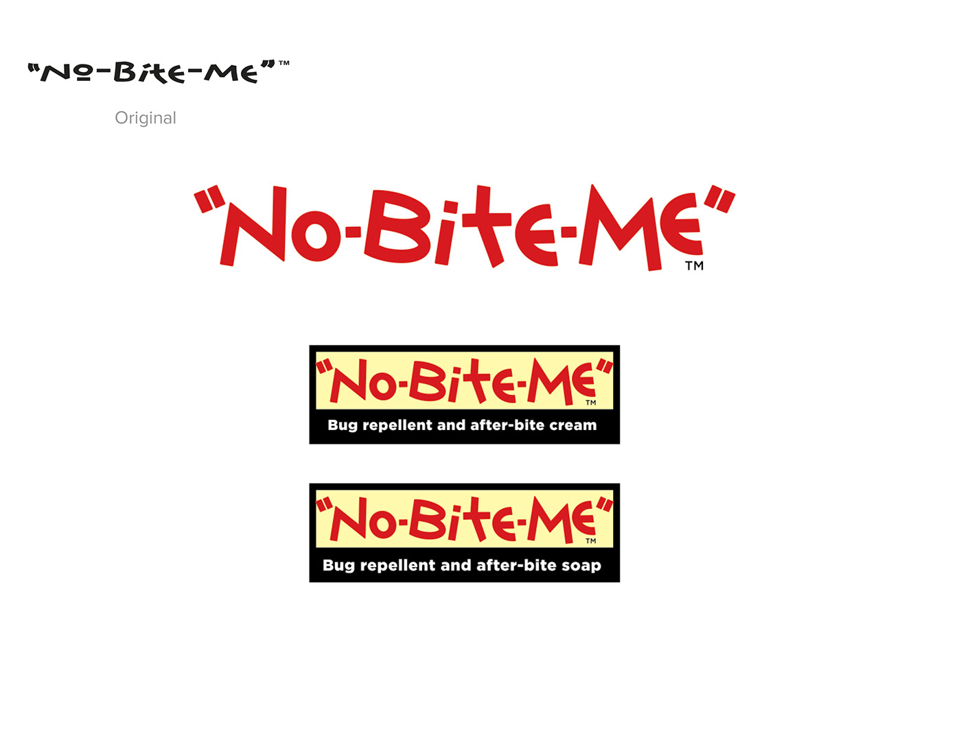
With Sam in good shape our focus turned towards the type. We explored setting the name in several commercial fonts and rejected them all. There was something about that weird type that resonated with the clients. So instead we redrew it. The new letters are more compact and easier to read while maintaining at least some of the child-like quality of the original.
Originally only used for the cream display, we expanded the green gingham pattern across the product line. And it now appears on every product in the line and on promotional materials.
With the elements assembled, the design became about simplification—extracting the key descriptors and creating a visual hierarchy that could work in the many formats we needed.
The proof will be in sales but the initial response has been very favorable.


