


2018
FA HOCKEY
BRANDING / ADVERTISING PROJECT BY JOHN BREEN
fuckingawesomestore.com
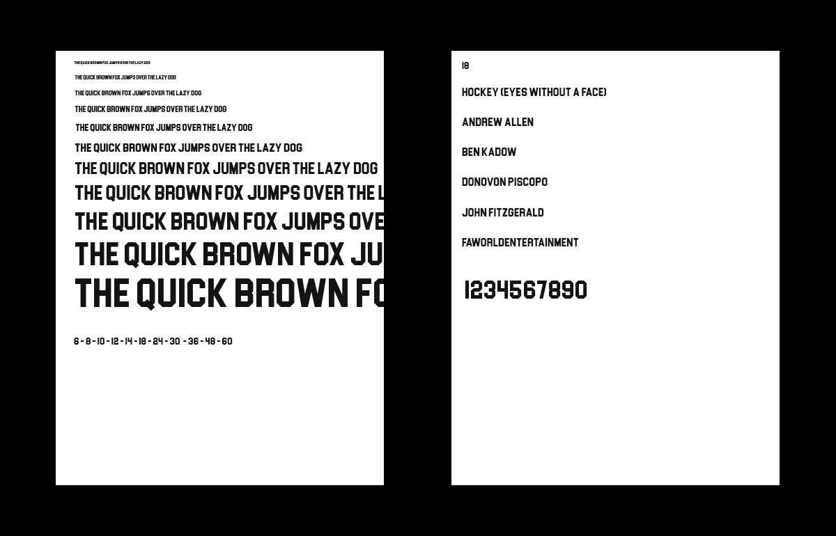
Typeface: Blockletter
Typeface: Blockletter
BACKGROUND
FA Hockey is a gritty, and raw skateboard brand that's building a bridge for new indie brands that are taking over the industry with commercial graphics, pop-culture, and excess riders. Jason Dill founded the company back in 2001 being accompanied with Anthony Van Engelen joining the brand back in 2015. The brand is technically two separate companies, although both share a similar history. FA has existed for over a decade, although when Jason Dill and Anthony Van Engelen left Alien Workshop in 2013 to rebuild FA, the brand just recently became a legitimate brand being approached by pop culture influencers such as models, and rappers. Hockey transitioned into FA after AVE tried recruiting Alien Workshop skaters after their downfall. The result was a small, exclusive brand pushing raw and stylish graphics and illustrations that create an aesthetic of beautiful destruction.
DISCOVERY
From my observation of FA Hockey, it offered many possibilities to venture into different areas of creative work. The challenge was to represent this visually in a brand identity that reflected Jason Dill's personality, values, and aesthetic, but stood as an entity of its own. The goal was to reflect the brand in a modernist New-York style that also carried values of the pop style movement. An important aspect of the personality of the brand was a sense of rawness, allowing the brand to be political, and very graphic in terms of design.


DESIGN
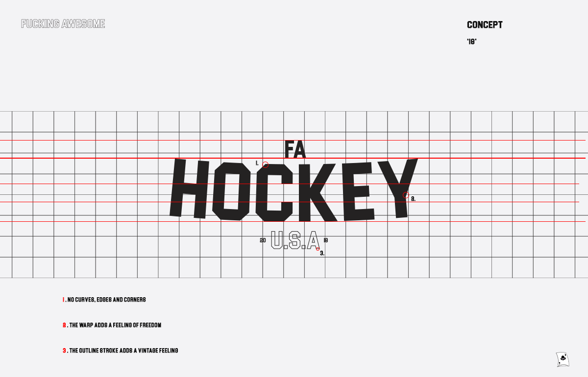
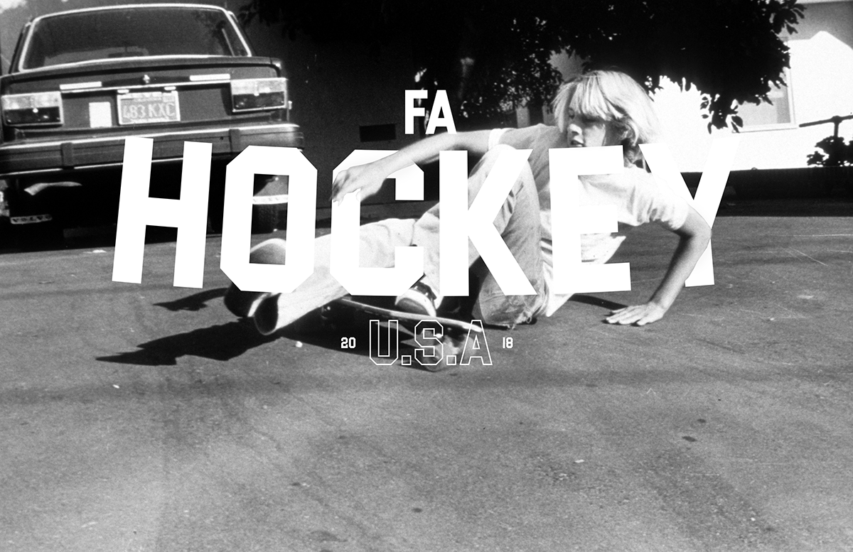
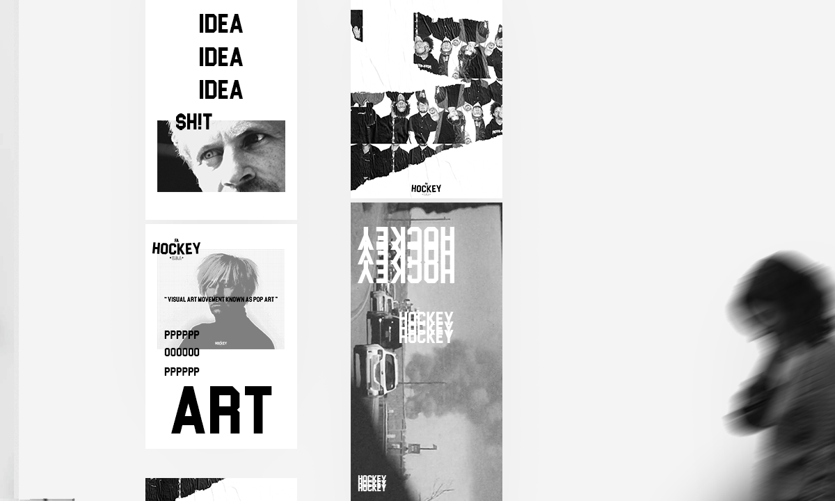
In regards to visuals, I thought it would be more effective to capture the brand through the use of typography. The look and feel of the brand needed to feel raw, and dominant carrying a certain message across to the common bystander, although I still wanted it to feel contemporary and have an "indie" vibe. I decided to work with Blockletter, designed by Dennis Ludlow (Personal Type). Blockletter achieved the common requirements of being a font with a very mature, bold typeface. With such a simple treatment of wordmark, the details became important. Warping the typeface (Arc) achieved visual interest, along with the outline text of "U.S.A" contrasting between bold detail and sharp detail.

BRAND SYSTEM
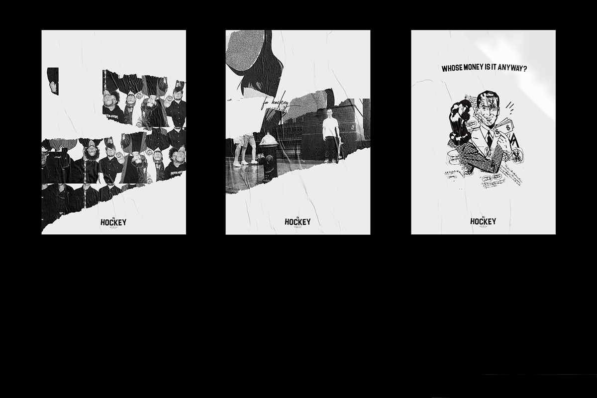
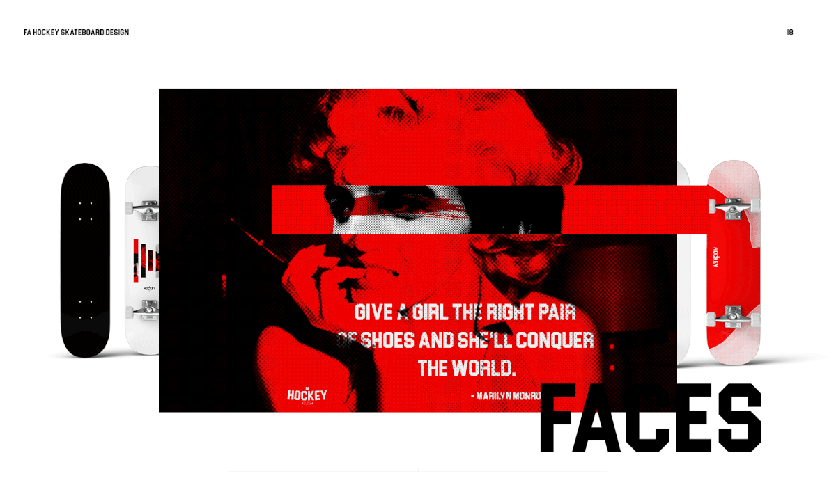
For the branding process, I wanted to keep it minimal, but also something that you would not forget. Consisting the colour scheme with black and white to keep the brand aged, but also incorporate splashes of the colour red to implement dominance and visually contrast the black and white schematics. I also wanted to tie Andy Warhol's, and Roy Lichtenstein "Pop Art" style into my own visual creations, I showcased these designs through a variety of branding outlets including; posters, business cards, memos, magazines, packaging, and finally incorporating the design to skateboards.


POP ART
Pop art is an abbreviation for Popular Art, the main focus of the movement was to separate the boundaries between high art and the popular culture. The movement presented a visual twist on fine art by including imagery from popular and mass cultures such as; Hollywood movies, advertising, product packaging, pop music and comic books.
" Popular (designed for a mass audience), Transient (short-term solution), Expendable (easily forgotten), Low cost, Mass produced, Young (aimed at youth), Witty, Sexy, Gimmicky, Glamorous, Big business " - Richard Hamilton


Thank you
If you enjoyed please appreciate
Contact me: Johnbreenbusiness@gmail.com
Twitter: Johnnybdesign
Special thanks
Skate team: Andrew Allen Ben Kadow Donovon Piscopo John Fitzgerald
Photographer: Glen E. Friedman
Mockups: Creative Market
FAWORLDENTERTAINMENT is a registered trademark. 2017-2018 - All Rights Reserved ®


