

Typographic Brand: Bottoms Up! Vodka


What is Bottoms up Vodka?
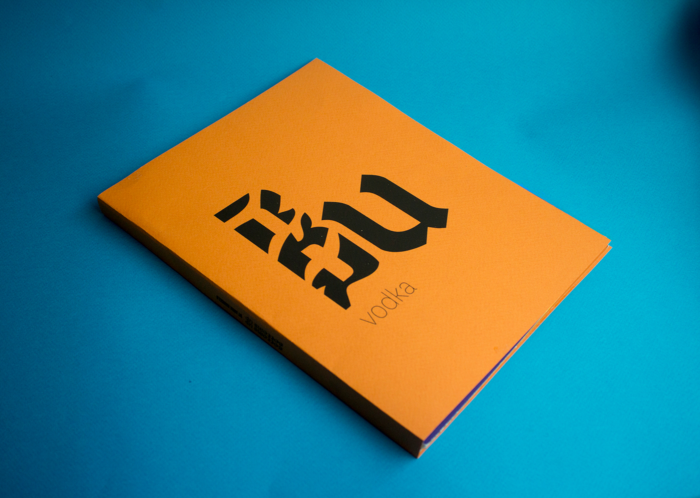
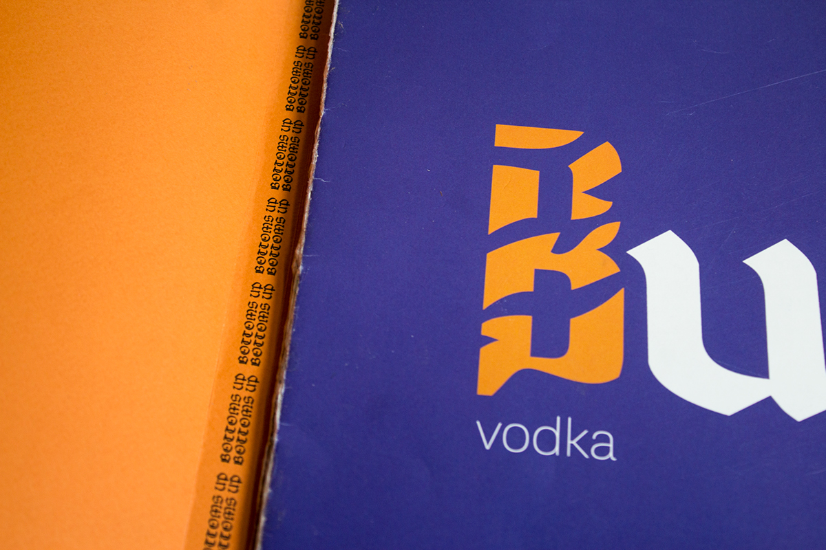
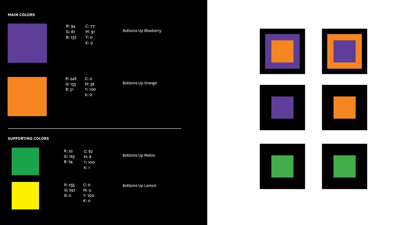
The Brand Design

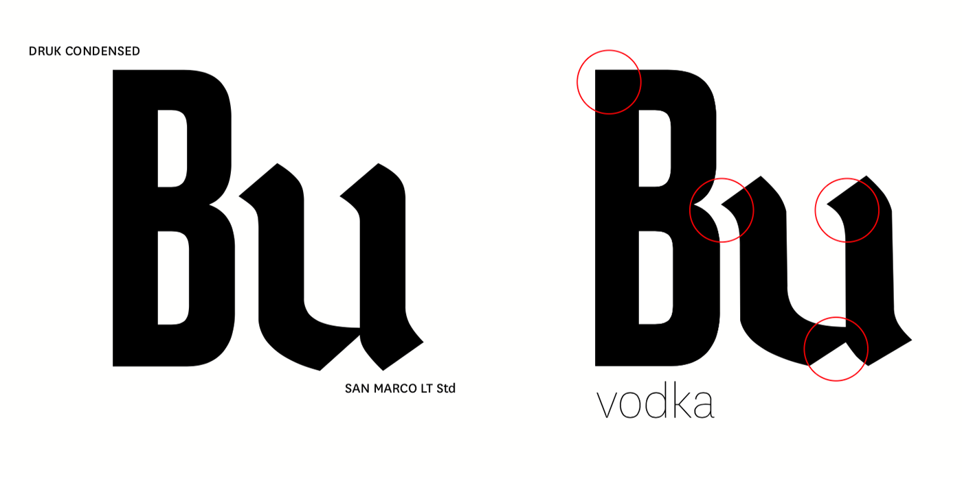
The biggest challenge was manipulating the logo's characters without taking away the integrity of the lettershape. As so the two letters could merge, the letter "B" was made less condensed and the top of the small "u" to sync with the inner curve of the "B". For the sake of readability, the small "u" was thickened as so it would not be confused for "li".


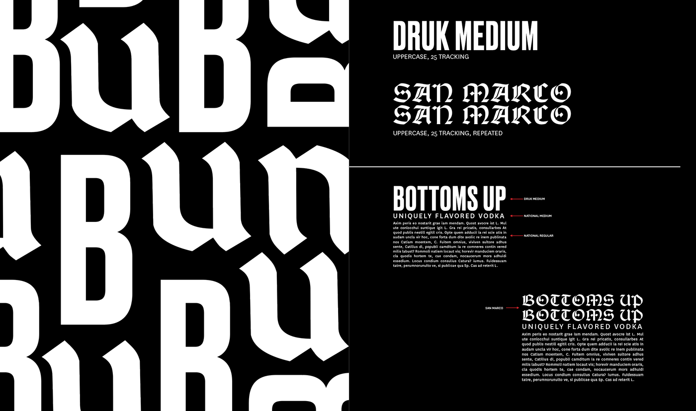
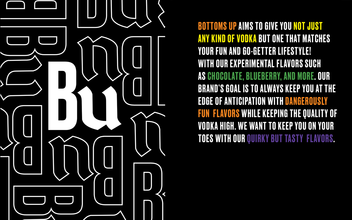
To emphasize the uniqueness and personalization of Bottoms Up Vodka, two header formats are used. Both Druk and San Marco can be used in the type system as header fonts. San Marco should be then repeated as to match the x-height of Druk's font.
*All materials and production is by Anna Marcelo including the hand-done perfect bind, assembling, photography, and content inside the brandbook.


