


As the brand concept and positioning of SUER had changed, the company’s management decided to update the corporate identity as well, keeping all valuable essentials of the existing style and maintaining brand continuity. The main tasks set before the studio were: avoid colorfulness to focus on safety; remove the focus on the shape of the device to make the style more adjustable; convey the idea of a company that configures systems of energy management with a new brand identity.
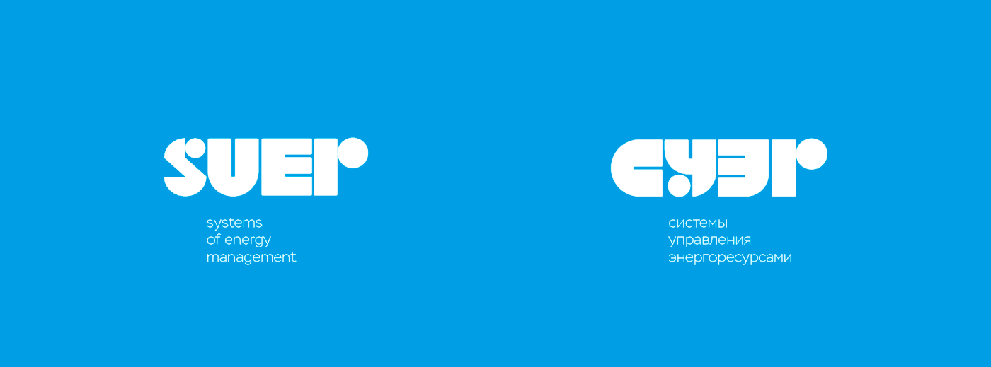
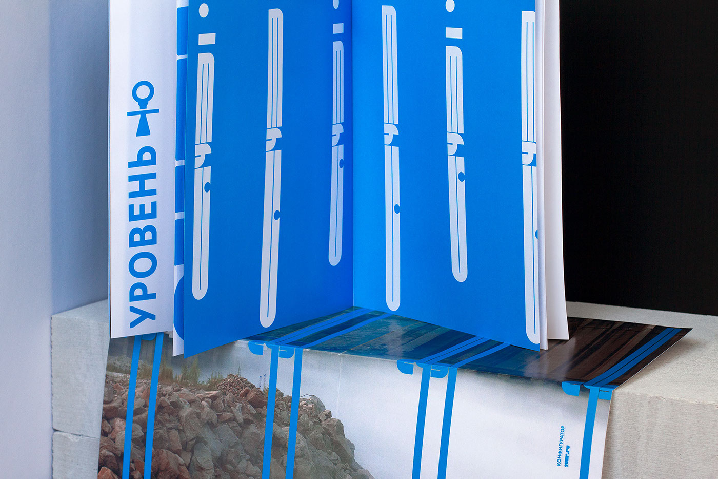
The key idea of the new style is a configurator where every single letter is a part of the system: the letters can be used separately or transformed into other shapes. Since we used the alternative version of ‘R’, both Latin and Cyrillic versions come across as perfectly identical. We have made letters rounder and the color scheme simpler and calmer to soothe the style, making it less tech and aggressive. The simple color code has enhanced and strengthened the brand identity.
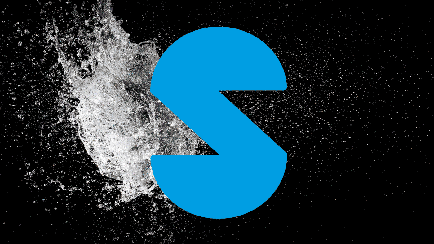
To maintain the brand consistency, we used powerful background characters animated with the elements of nature that calm down and refer to safety
The key idea of the new style is a configurator where every single letter is a part of the system: the letters can be used separately or transformed into other shapes. Since we used the alternative version of ‘R’, both Latin and Cyrillic versions come across as perfectly identical. We have made letters rounder and the color scheme simpler and calmer to soothe the style, making it less tech and aggressive. The simple color code has enhanced and strengthened the brand identity.
To maintain the brand consistency, we used powerful background characters animated with the elements of nature that calm down and refer to safety


