HealthSparq Enterprise Pattern Library II
The HealthSparq Pattern Library II (PL2) was an internal product platform that empowered designers, product owners, researchers, QA testers and front-end developers with production tools and documentation.
It was composed of an Ember web-app built by the HealthSparq UI team (architects Evan Rowe and Rocky Neurock, who is now on the core Ember team). I developed and drove the concept, managed it like an internal product, worked with researchers and product managers to find out what they needed, ran sprints with the UI team for technical work and alignment, surveyed the UX team's work for new patterns and fed those back into the design process loop. My ultimate goal was to create a design system and platform that broke down silo walls that were built around these groups.
As of this writing, you can view the pattern library app here; you can also view some of the early CodePen prototypes for exploring new patterns.
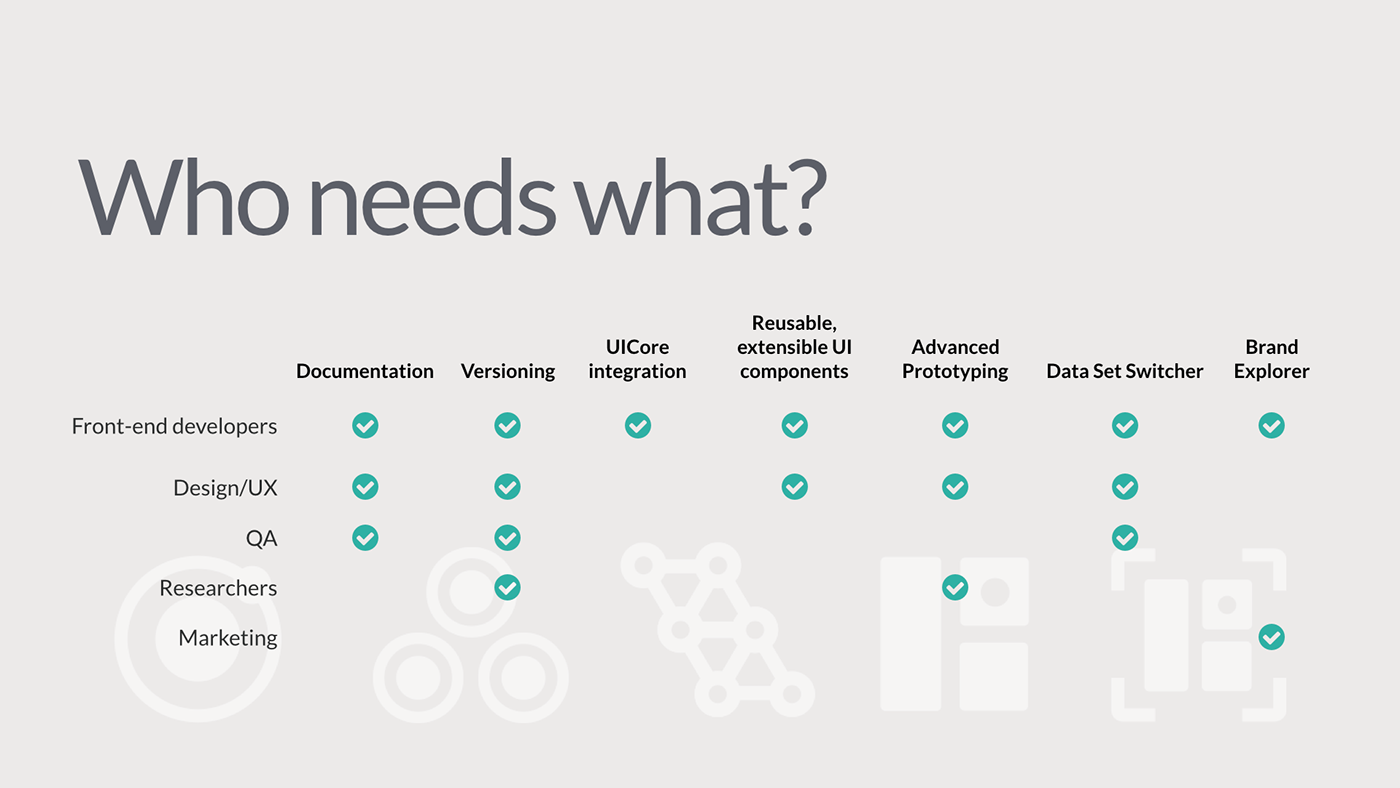
Pattern Library Product Features
We also laid the foundation for advanced design tools that were to follow: rapid prototyping with actual, production ember components; integrating live datasets (which varied greatly per customer, and often had massive gaps or surprises within), and theming tools (which would let us explore various white-label scenarios and develop theming tools for customers). The intent was to create a platform for constructing production-ready Ember components that would, when moved to the main product (called UICore), be re-consumed by the pattern library. This would let us shorten or collapse the gap between prototyping and production—accelerating product development and improving alignment across teams.
I wrote and designed this product's roadmap and gave regular presentations to the company on how the pattern library project could help each constituency.
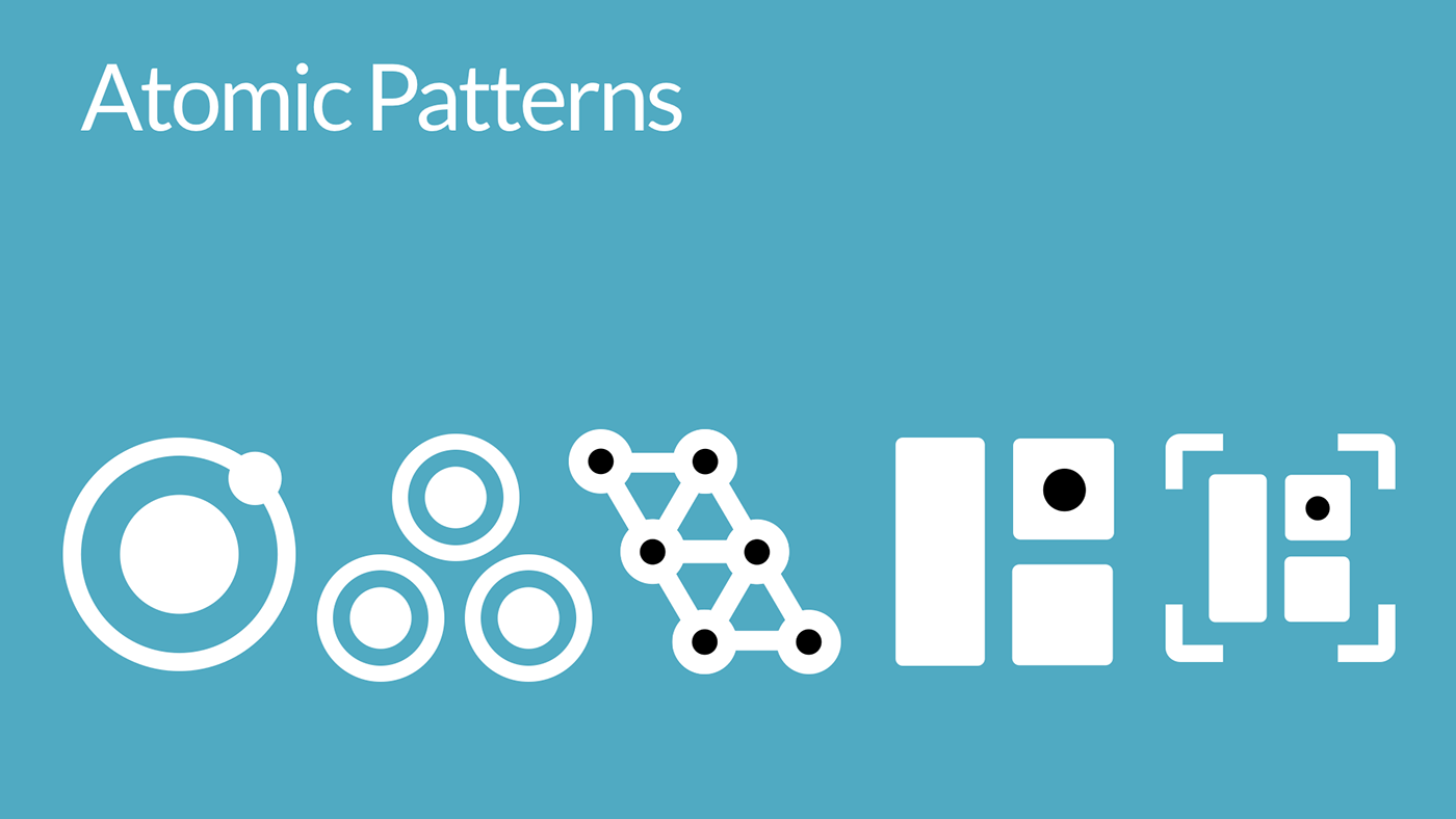


The organizational concept was built upon Brad Frosts' Atomic Design concept, with elements broken into atoms, molecules, organisms, templates, and pages. We changed the meaning of some of the larger terms for internal use.
We also found that, while developers easily grasped the object-oriented concepts of Atomic Design, the nontechnical UX and UI designers struggled to communicate in the same language. One response to this was to tag and create larger categories of components around their purpose, such as navigation, content, iconography, color, etc.
In partnership with the UI team, I developed the CSS styles and architecture and usually worked directly in code, rather than layout tools like Sketch or Illustrator.


Aligning the company around a pattern-based workflow
To help the various product teams and activities align and work coherently together, I helped the director of UX and other teams leads visualize the process and workflows. This is a key activity of any enterprise pattern library. It exists to support and define the current consensus around any product direction.
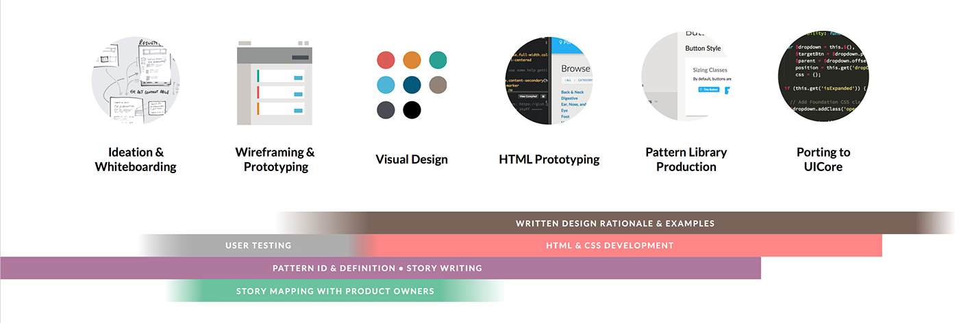
This decision tree was helpful when working with the UI & UX teams to encourage them to find and use existing design patterns where possible, and a process for defining and developing new, non-standard ones where absolutely necessary.


Example Patterns and Prototypes
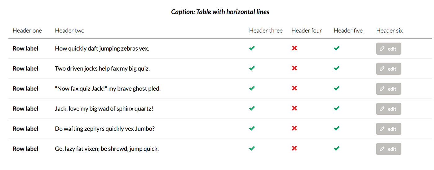
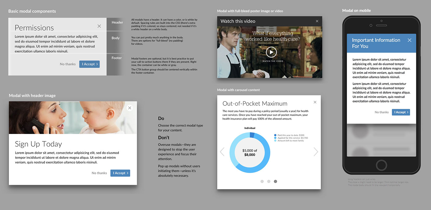
Below are a few examples that were mocked up with the pattern library—from individual components to complete layouts that leveraged real datasets.
Building components in this fashion helped us create an enterprise design system that was flexible, worked at any viewport size from desktop to mobile, let us design for the "gaps" in customer data, and create design rules and rationales for both UX and UI teams.
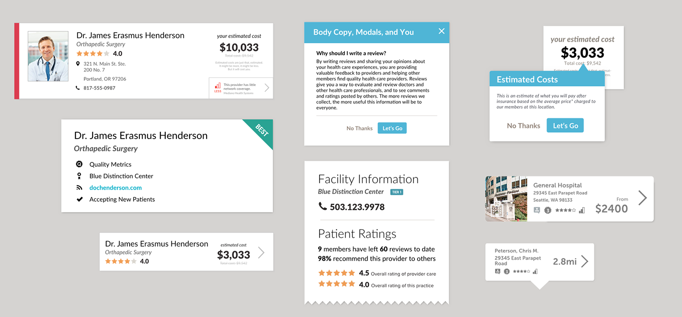


Example components with design rules and explanations. Often I would just grab a screen cap of a live web component, and throw these into presentations with additional explanation for other audiences, like leadership or product managers.

