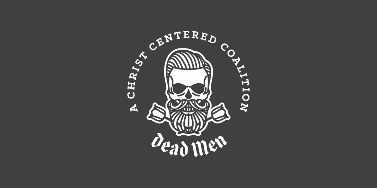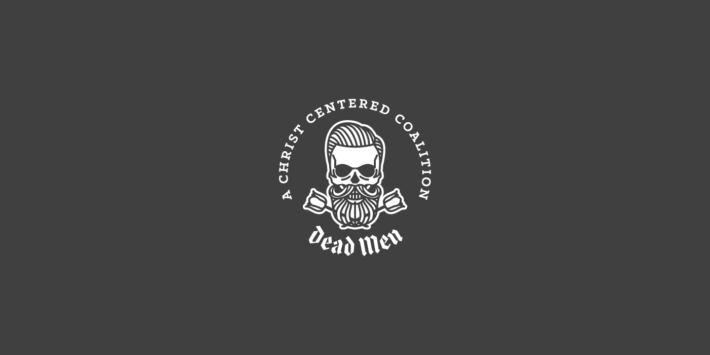
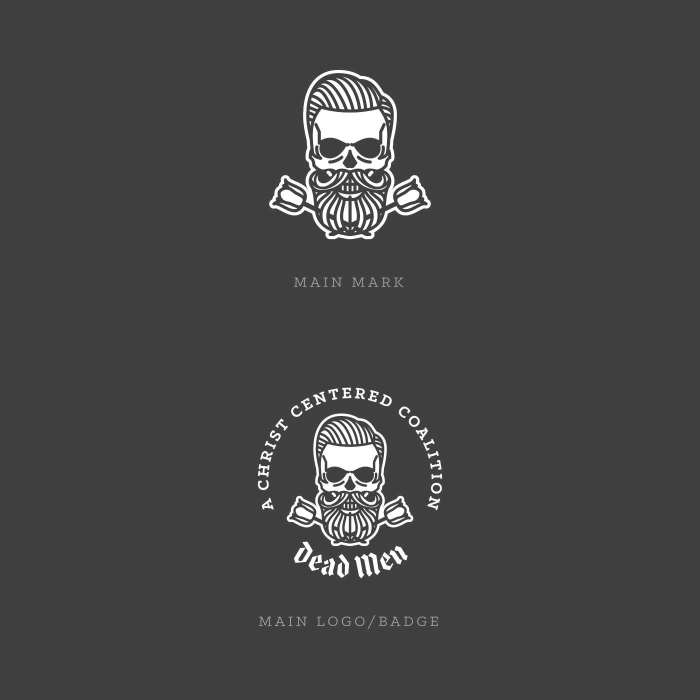
A NEW SKULL
DEAD MEN exists to bring glory to God by proclaiming the glorious truths of the gospel in straight forward, intentional, and often times – raw – ways. This original online-initiative requested me to redesign their main iconic trademark – the skull. In addition to the main mark I designed some responsive versions for various uses.
THE SKULL CHALLENGE
Skulls are often used these times and therefore the main challenge was to create a unique and recognizable design, that really communicate what the brand is all about. I achieved this goal through simple, smooth lines, a unique hair and beard style and of course the tulips. The Tulip is a symbol for the reformed theology of the brand.
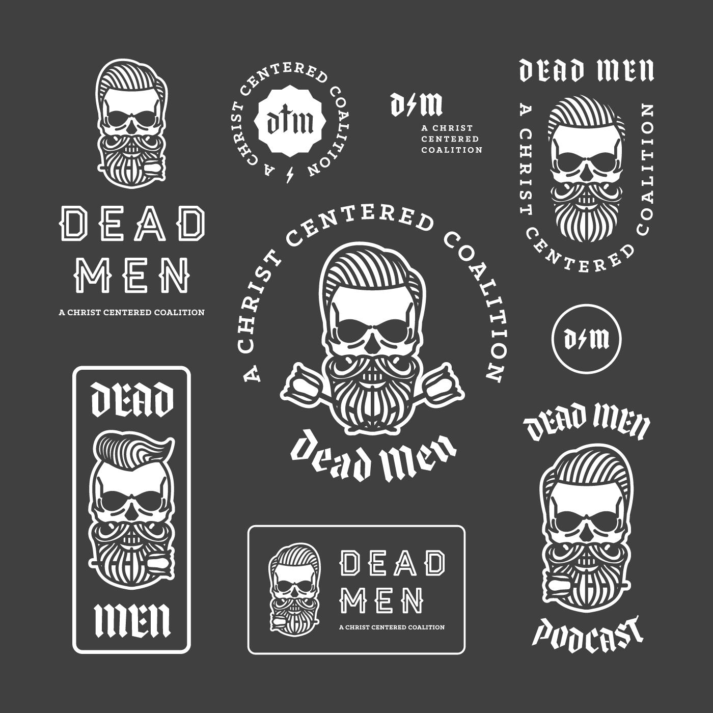
THE RESPONSIVE SKULL
Making a Logo or a Brand responsive is really fun yet not so easy to achieve. Being still recognizable and different at the same time is a big challenge for the designer but will bring new dimensions and possibilities to the brand.


CREDIT THE SKULL
Special thanks to DEAD MEN for letting me work on this rebrand.
Make sure to visit their website: deadmenstuff.com
More of this project on dribbble.
Typeface Credits
Klinic Slab by Joe Prince
Me elswhere
© 2017 Dead Men • All Artworks created by Peter Voth