


S E C U R R E N T
The Problem
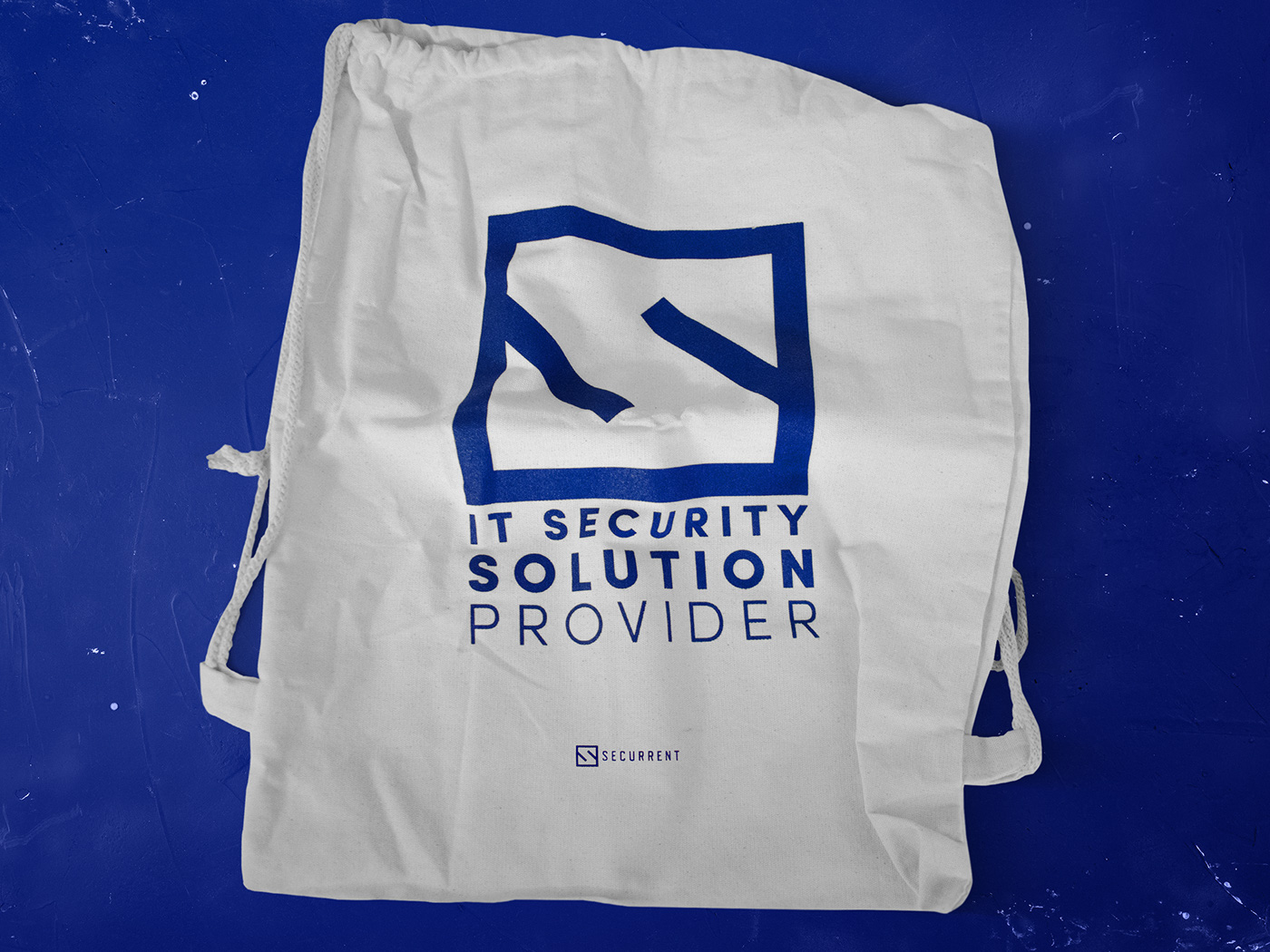
To redesign of corporate identity of Securrent. IT security provider in The Middle East, needed a makeup for their brand to better communicate across Europe. Securrent is Trusted Expert Source for Information Security in Turkey. %100 focused on information security, they provide security consultancy, technical services and managed security services by cooperating with leading vendors.
The Solution
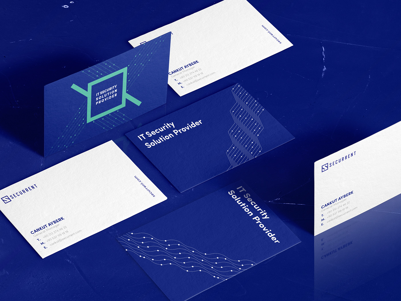
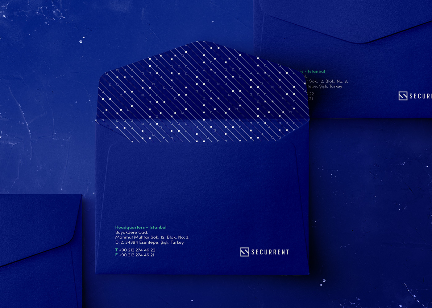
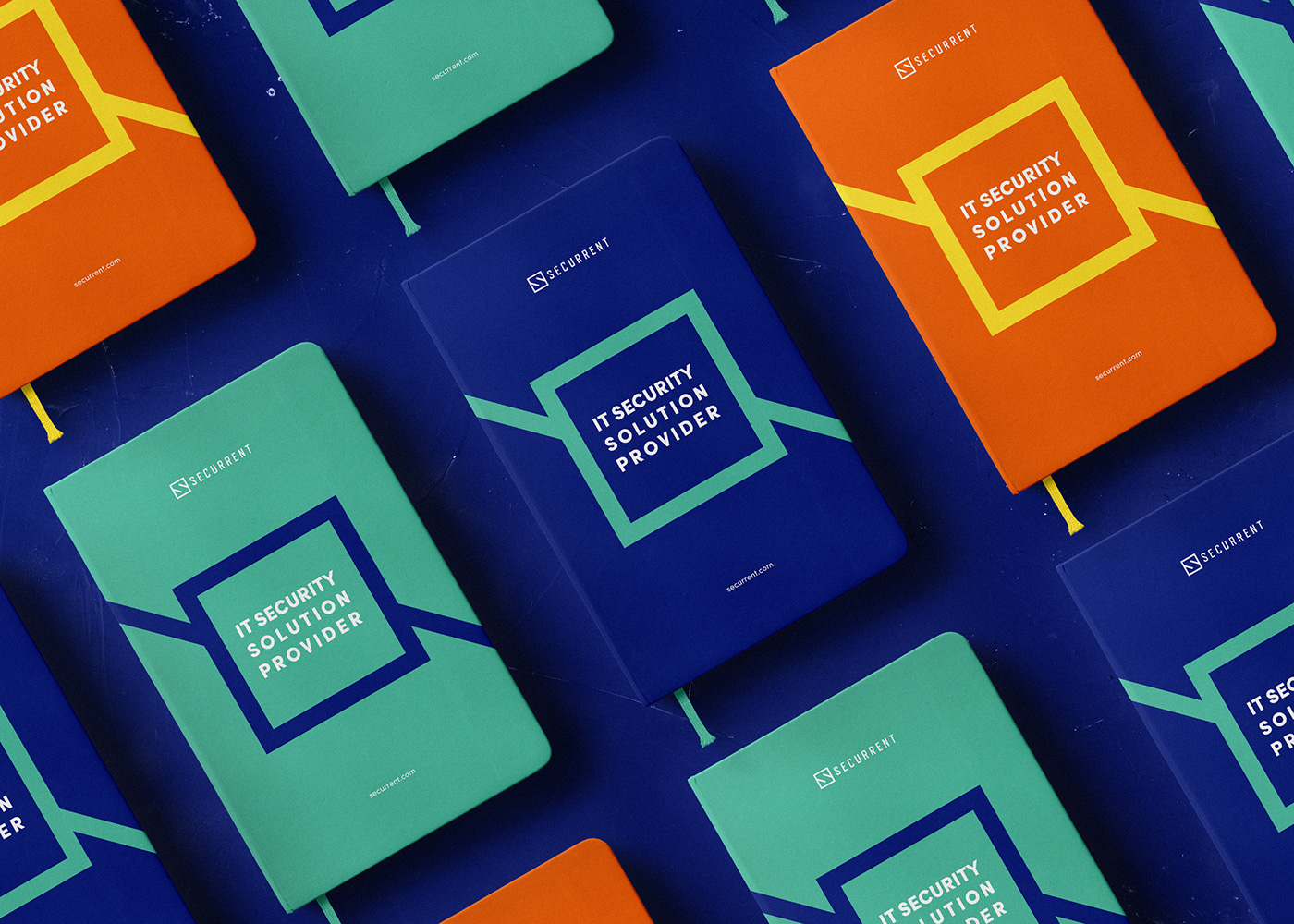
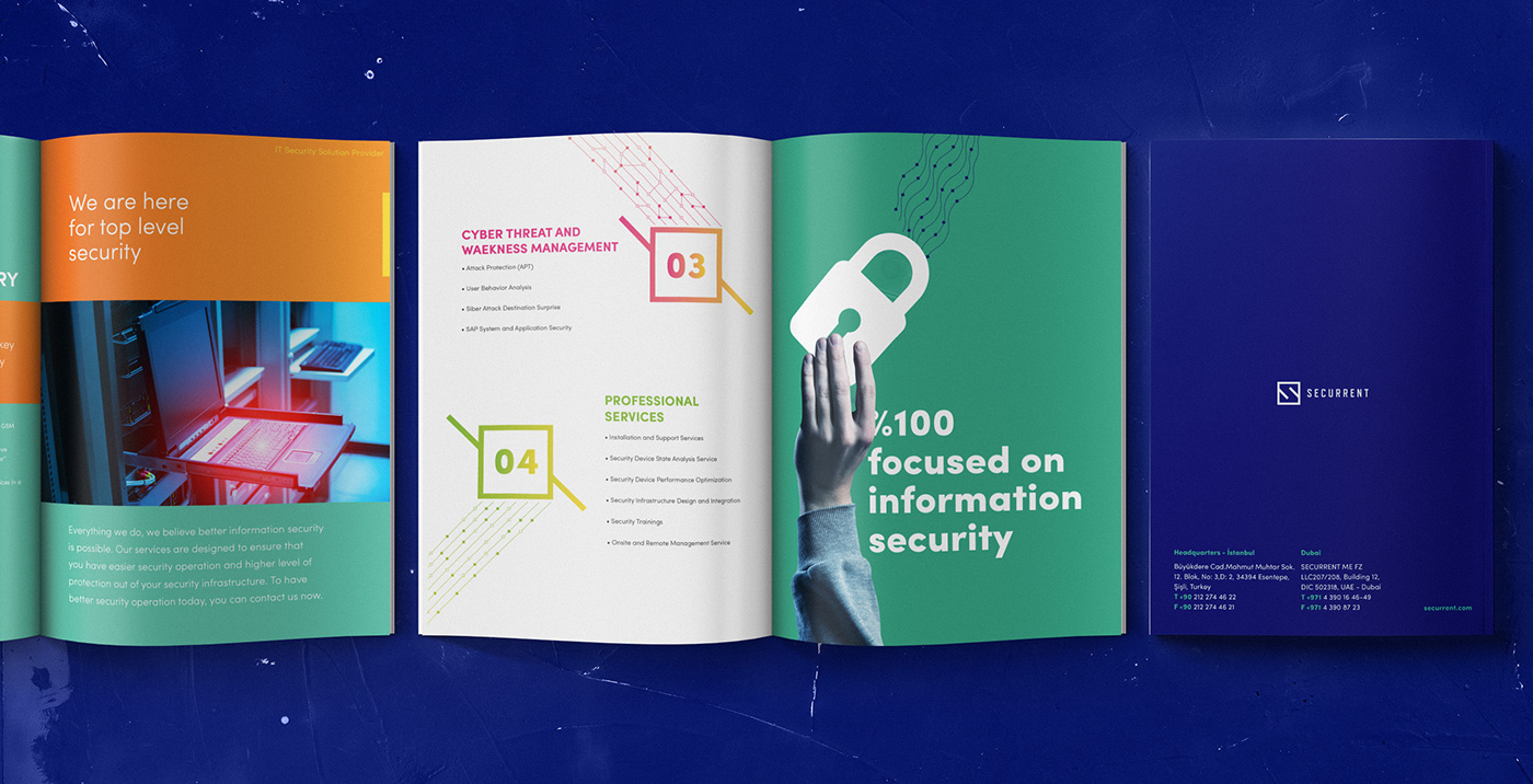
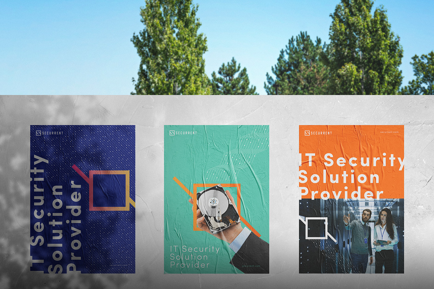
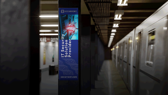
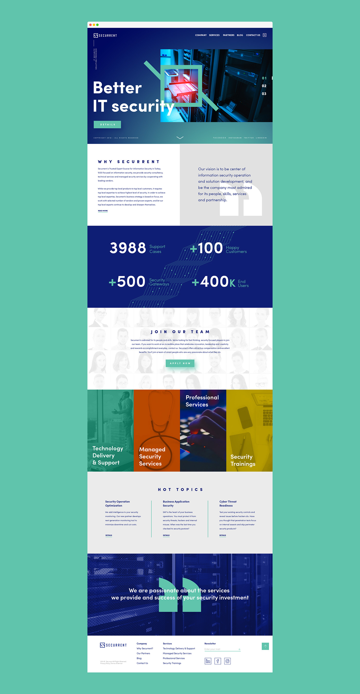
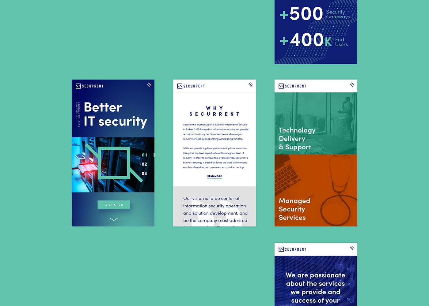
We carried out corporate identity and branding activities for the Securrent, which operates in the field of Internet and information security solutions since 2009. We developed designs that match up with the brand's corporate identity by giving particular importance to the customer's needs and target mass. We provided plain, dynamic and genuine solutions for the company which underlines that measures can only be taken by combining good technology and expertise against cyber attacks which become more and more developed and target-oriented each passing day. In the corporate identity and branding designs that we shaped by examining the sector, competitors and products, we focused on reflecting the customer's branding and brand positioning needs in the best way as a team. Thus, we developed a visually powerful and different work that demonstrates the constantly improving robust structure of Securrent.


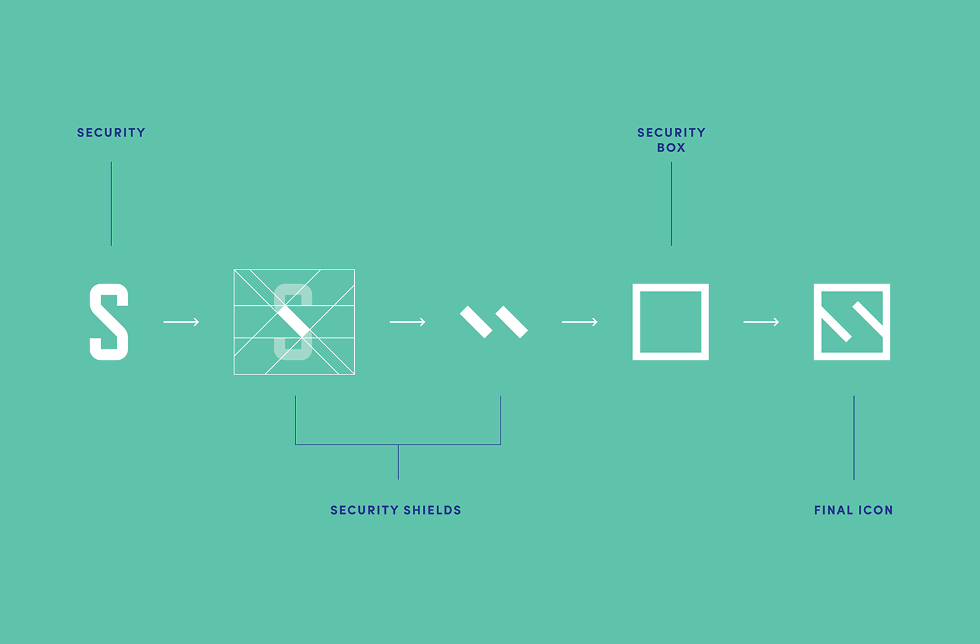
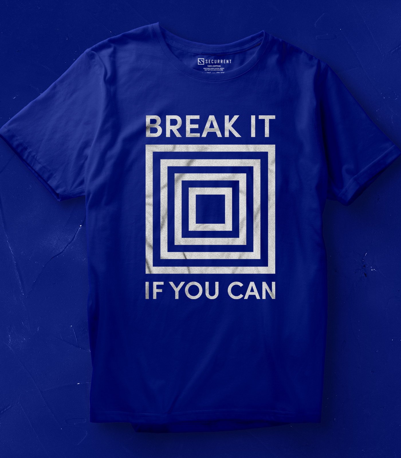
While creating the visual language of the brand, we emphasized the information security, which is the main service of the brand. The "data" concept, which forms the basis of information security, became our starting point. Then we made a lot of trials to define the shape of a shield/closed box that would give us the feeling that we're keeping our data in safe. We discussed on this trials with our team for days and determined the latest logo and graphic shapes.

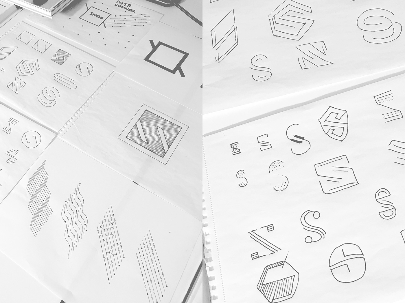


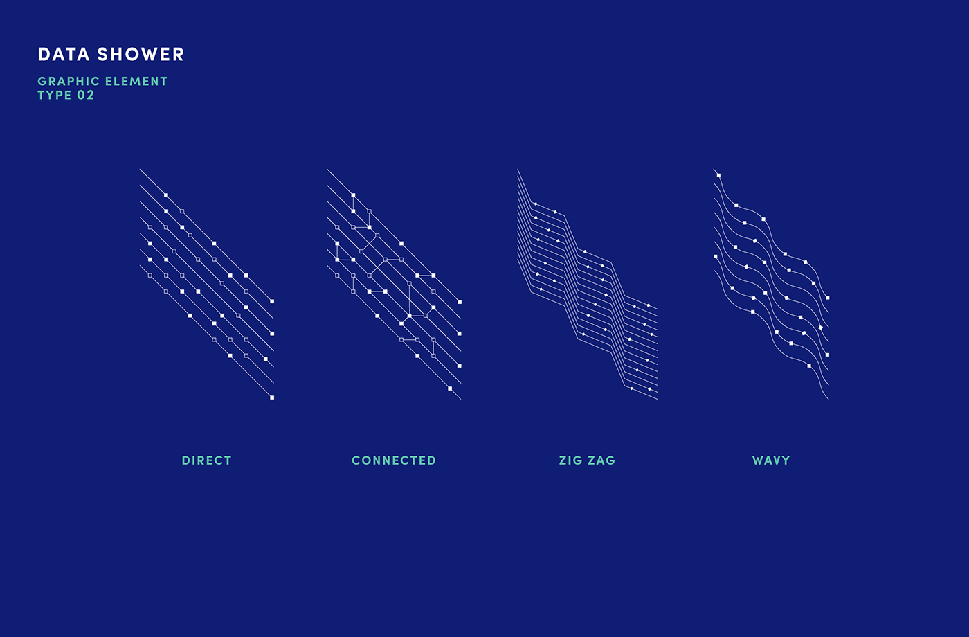
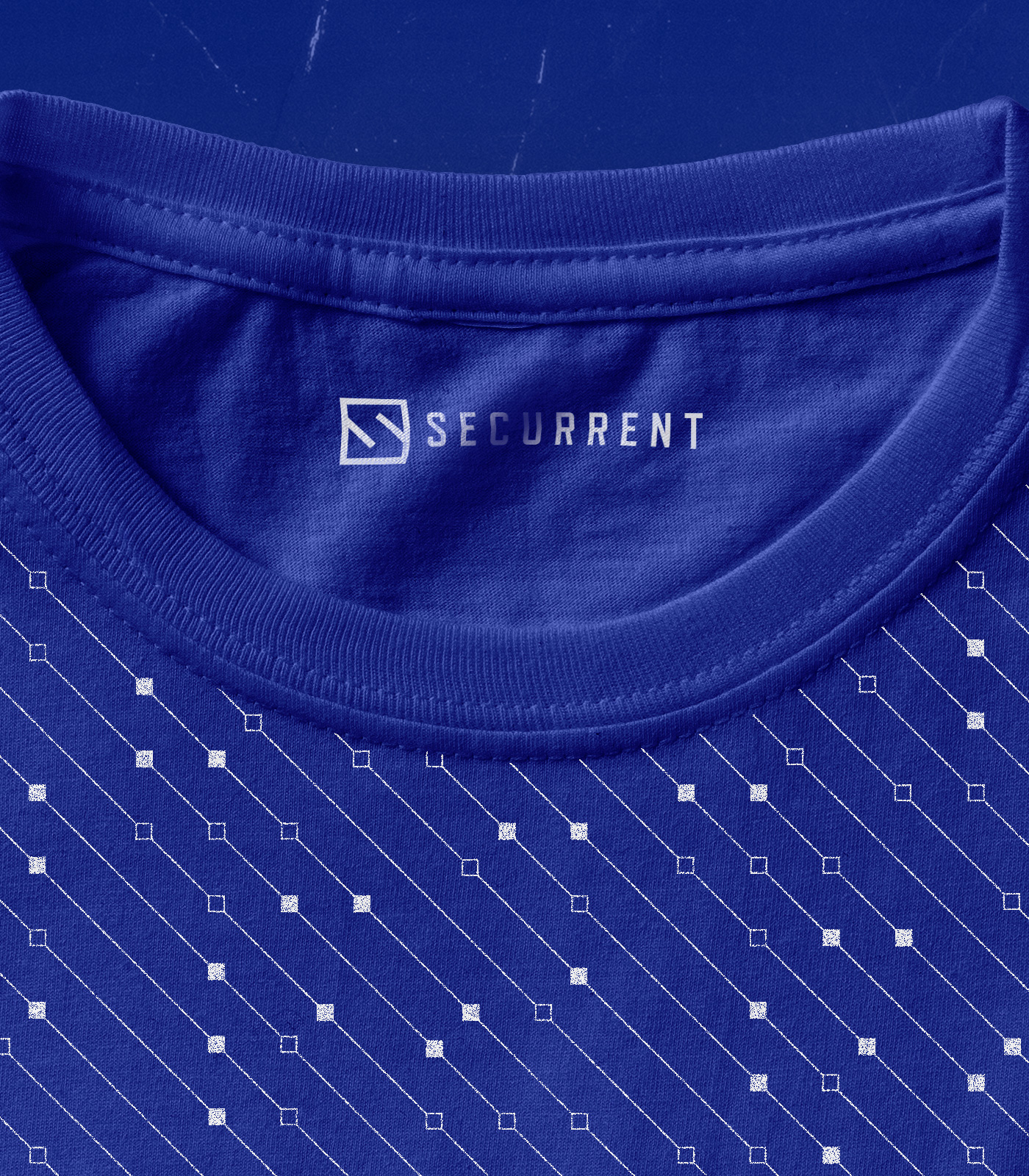
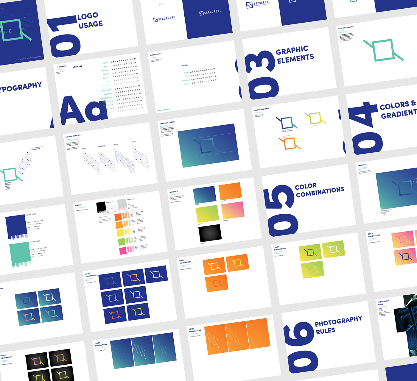
GRAPHIC ELEMENTS
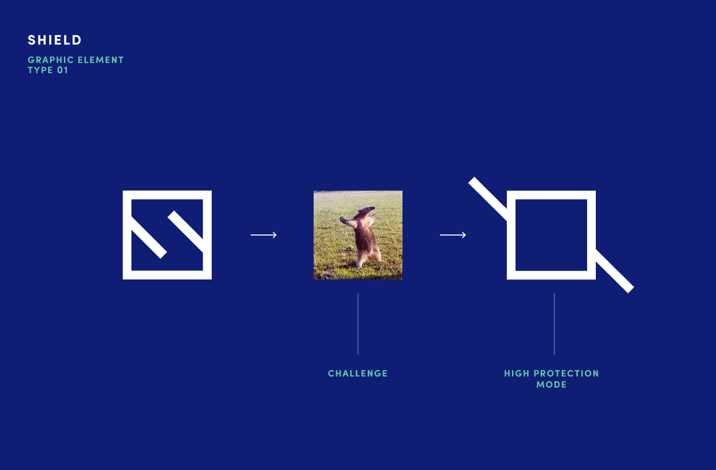
While visualizing the graphic elements that will bring the brand to mind, we turned two concepts into focal point. First one is the security shield and the second one is the harmful data streams. We described the shape of a closed box/security shield that represents in fact a challenge, and emphasizes the confidence and experience of the brand itself. Likewise, we visualized various kinds of data rains. Essentially, these definitions formed the graphic elements of the brand.


Client → Securrent
Agency → Studio Recode
Art Direction - Brand Identity Design → Cihangir Öziş
Brand Design & Strategy → Seçkin Uysal
Project Manager → Tuba Totama
Front End Development → Çağın Topkaya,
Egemen Ünüvar
Back End Development → Alican Kemikoğlu
Thank you for your time!
↓


