rob for ohio—digital identity design
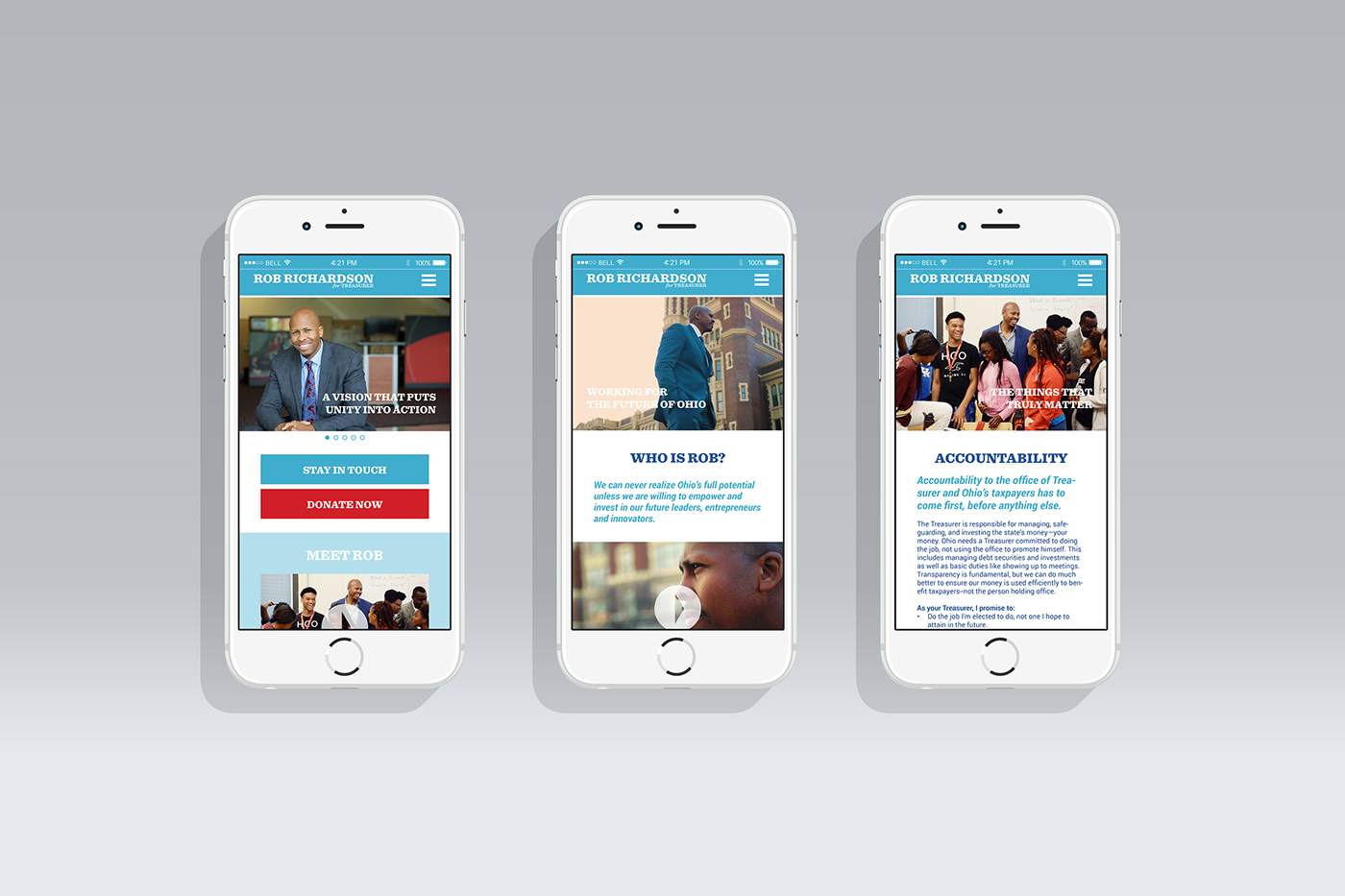
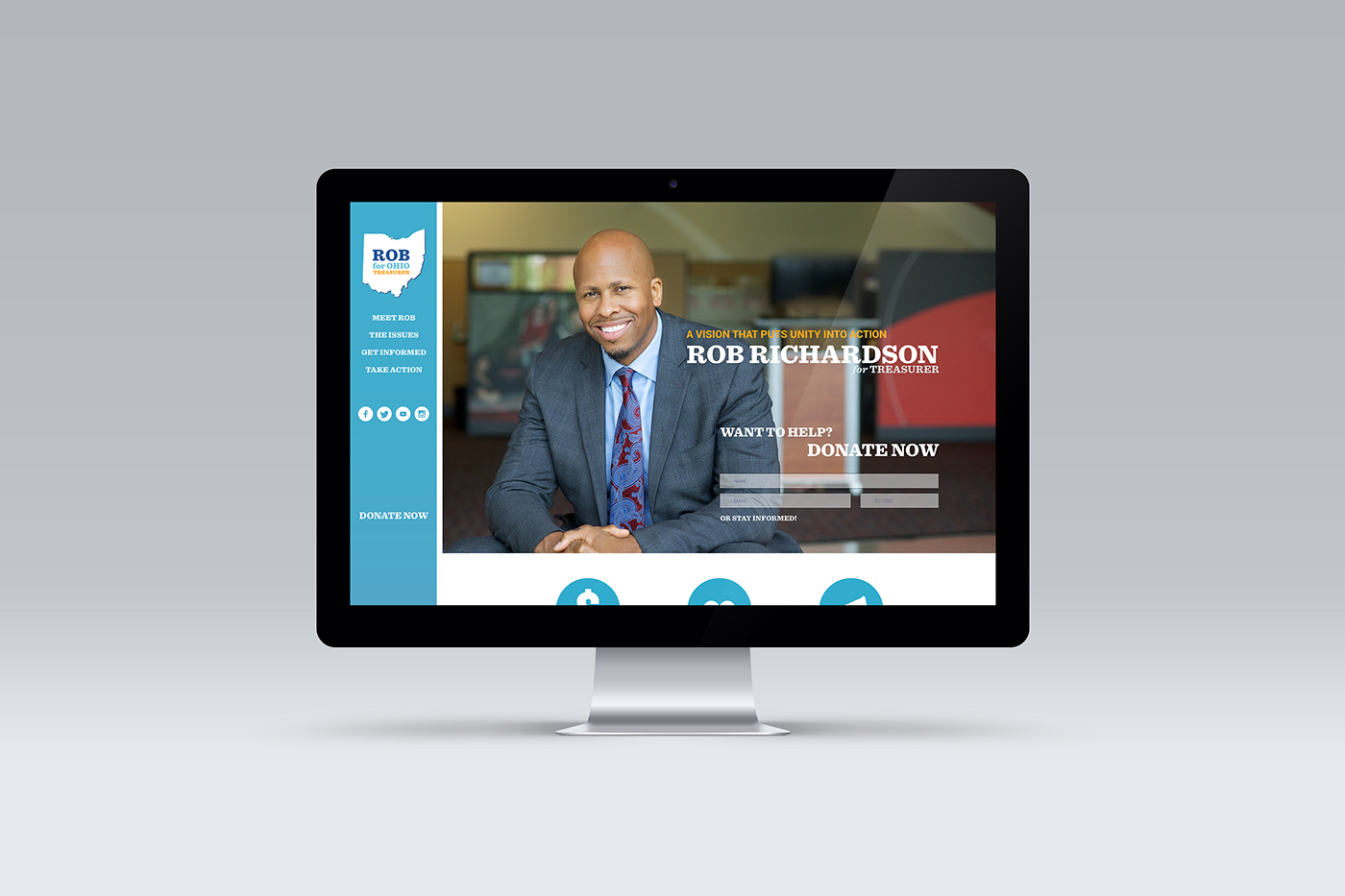
This project began as a website design and, as can occasionally happen, morphed into something bigger—a political campaign identity complete with logos, identity systems, a mobile site, and the original desktop site.
Rob Richardson, Ohio Treasurer candidate, realized that he needed to make a name for himself in the minds of the Ohio voters. He further realized that a simple template website built using default fonts and color options would not do that for him. Instead, he contracted the design of a website, which opened into a larger study of potential identity designs, new color schemes, and a friendlier attitude aimed at earning the trust of those voters.
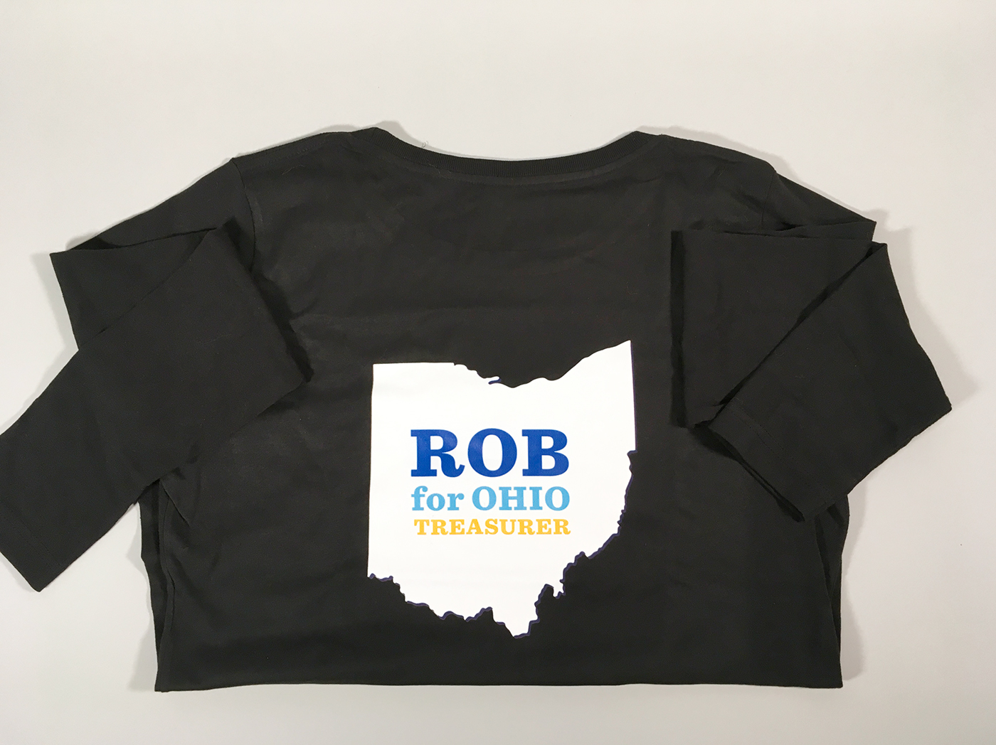
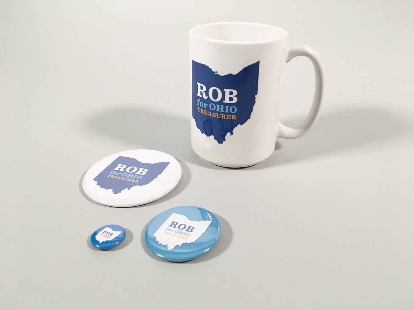
While the initial client charge only included website and mobile layouts, the client's previous identity proved somewhat limiting to work within. As a result, the original color palette (seen in the above Colors as "medium blue" and "yellow") was expanded to include warmer tones and hues that would provide a more welcoming, less "political candidate" aesthetic. Additional typeface combinations were explored, and a new logo was developed. All of these could be combined and applied as a design system to physical artifacts, as well as the originally requested digital applications.