


Credits
Abillity icon was provided by SYBO games.
Test task from SYBO games:
Imagine you’re working on a F2P cute, appealing game for women 18-35 y.o. It’s bright, colorful and juicy. The Style is simple and round.
You should not challenge the UX and arrangement of the elements, but demonstrate that you are able to re-create screen in a super cute bubbly style which will fit the target audience.
Focus on rendering and making appealing graphic assets.
Process


All the graphics was completed in Adobe Illustrator. No raster elements was used.
Style research
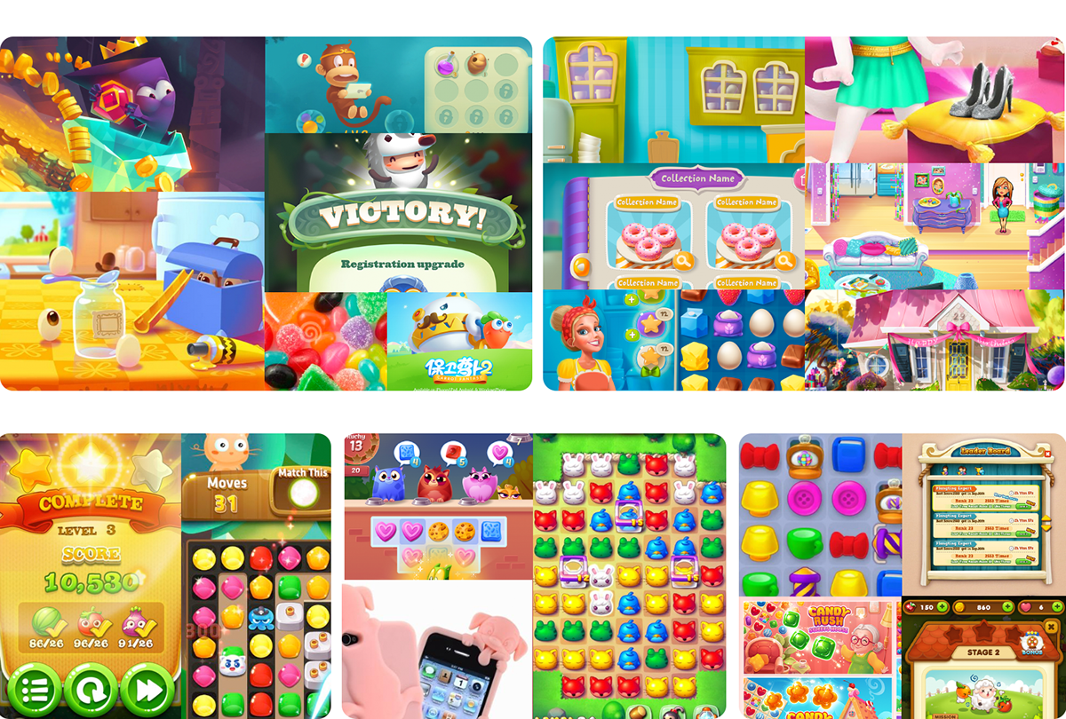
Client provided references to a general match 3 game, but the message was about juicy games for ladies. I researched many modern match 3 games and games for ladies to create a moodboard and choose a direction.
Client provided references to a general match 3 game, but the message was about juicy games for ladies. I researched many modern match 3 games and games for ladies to create a moodboard and choose a direction.
Also, I have a personal vision of how the game can look like: what make it more modern and memorable. I picked bright, clean and simple style with tight shapes and realistic light instead of typical match3-asian style with contours and crumpled shapes.
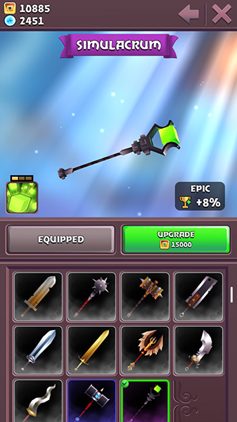
Pet setting
A game should have an exact setting to tell a story. General bubble-style windows and buttons won't tell to the player about new stories and creators feelings. Consequently, no memorable images and forms, no recognizability, no new experience, no retention.
The SYBO team didn't give exact setting, so I picked pets because the BRIM game (the window from that game I used as wireframe reference) has pets gameplay.
Solid environment and UI layer
Perfect UI is the UI that doesn't exist, but a player still can interact with a game.
In my projects I try to make a solid environment on the screen space.
I try not to separate a UI layer from environment space, in opposite I try to immerse the UI layer to the environment. I focus on detailed environment instead of decorated UI because the environment is the place where things happens and player lives, while the UI is the place where player operate the game items and ways to interact.
The environment always have more potential to tell a story and contain eye catching graphic, so I try to keep the UI simple and make environment rich and comprehensive.
UX Care
Btw, read an awesome report about UX focused task for SYBO games.
Look at the initial wireframe that I had to recreate for this task. Although I shouldn't change the wireframe, but I changed some behavior of elements and visual perception mistakes:
Window instead of bar
Initial wireframe suggest to imagine the equipment list as a bar that separate the screen on two halfs: the item view and the list.
Following the principles of "environment first" I start from the solid space and add there additional elements trying to keep this space solid. In this case the window is located in the environment while the bar divides the space in two separate parts so each of them leaves it personal life.
Scroll area should have borders
As you can see in the wireframe references the items list cropped by a canvas border. It looks the same as web page cropped by a browser window. That's why the player expects to scroll all the screen instead of scroll the little area.
To avoid this expectation I show the borders of the scroll area.
Disabled button
The "Equipped" button shouldn't be accessible. However, if you'll play the game, it still can be pressed. I enforced the button disability using graphic.
Timing
Research references: 1h
Composition: 10h
Color scheme: 11.5h
Rendering: 29h
Total: 51.5h
Composition: 10h
Color scheme: 11.5h
Rendering: 29h
Total: 51.5h
Thanks for watching!


