


Brief
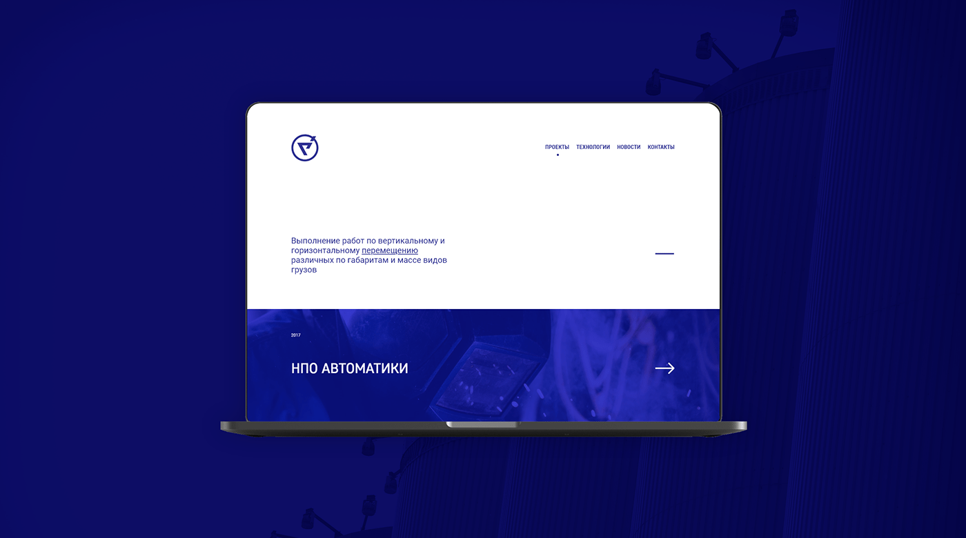
For a small local company from the Ural region, Yekaterinburg, Russia needs to create complete new branding and visual system. This company working in equipment set up a sphere and create unique technical solutions for different sizes of companies and production organizations.
Approach
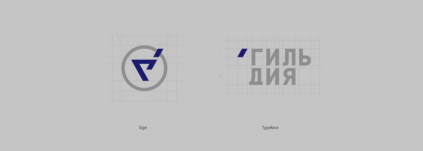
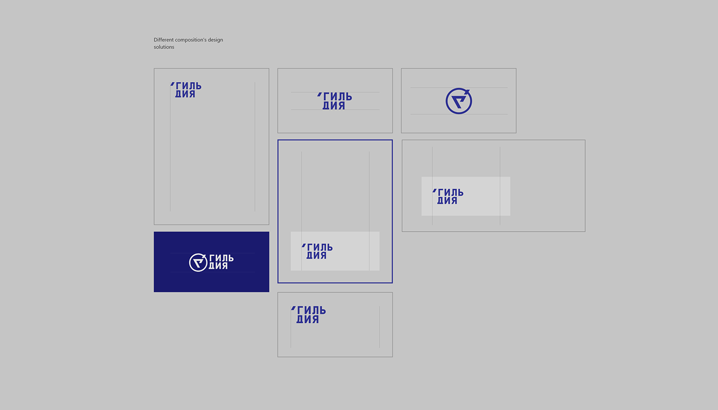
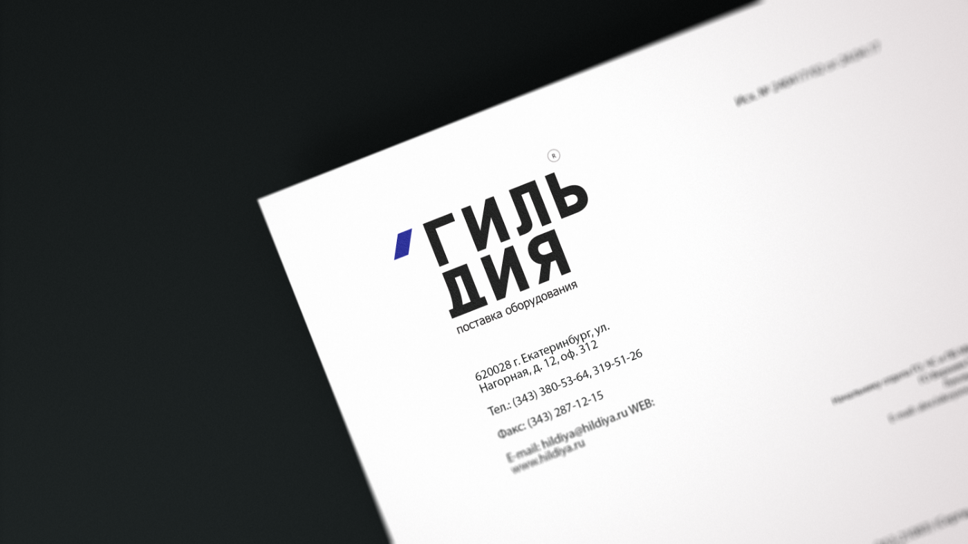
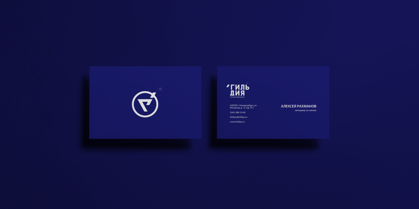
Bring new identity standards, connect and reinforce previous meanings and brand philosophy. Have created three different versions of logotype one of them is the only symbol, using in some cases this version, second on typography version with branding element and last one but not least is full version symbol plus branding font. Symbol form from first later of the company's name - "G", rounded by circle and lines like details with evolving meaning and diagonal motion.
Impact
After some time of rebranding to this company coming new clients and these guys create and set up much interesting equipment, different systems for production lines of some factory. For company, this branding became visual basement for promotion and development company and increasing as well.