Course Planning & Registration Portal Redesign
As a junior at UC Berkeley, I use the course planning and registration portal multiple times a year to plan my schedule and at least twice a year to sign up for classes. Although this system is a major step up from what we used during my freshman year (Telebears), and they added many features that we did not have before, the abundance of features and poorly designed flow and navigation make it incredibly difficult to learn and confusing to use. I decided to take this opportunity to challenge myself to redesign a more intuitive experience for the course planning and registration portal.

Problems:
1) Separate components and inconsistencies between schedule planning and registration
The fact that the schedule planner and enrollment system were entirely separate and had completely different looks was a major source of confusion and frustration for me. Instead of being able to easily move between the course planner and official registration, they were two separate components. This meant that after moving classes around in the schedule planner and deciding what classes I wanted to take, I had to exit out of it and go to the separate portal for registration. Furthermore, the layout, navigation, and UI were drastically different between the two apps, which was confusing and created an unpleasant user experience.


Schedule Planner (left), Enrollment (right)
2) Too many steps
The main feature that I liked about the schedule planner was being able to visualize the classes in calendar form, allowing me to see what each day of the week would look like. From the Main Academics page, however, once the user clicks on the schedule planner link, it takes 5 clicks to reach the page where the user can actually view the calendar schedule. Similarly, for the enrollment process, it would ask the user to select the term, search for the class, then add to the cart, enroll, confirm, etc., each of which was a separate page. There were so many steps throughout the navigation that made the process much longer than it had to be.
3) Unclear distinction between shopping cart and enrolled classes
After searching for a class, selecting the class I want, clicking through the pages that confirm the addition of this class, and reaching the final notification that says the class has been added, it seemed to me that I have finished enrolling in the class. I thought I was done! This however, was not the case, since I had only added the class to my shopping cart. Upon realizing this, I had to then go to class in the shopping cart, add the class, and go through what seems like the same confirmation steps to finally officially register for the class. Imagine if I had stopped after adding the class to my shopping cart, only to realize weeks later that I had never actually signed up for the class! That would indeed be tragic.
4) Can't view schedules with overlapping class times
The point of using the schedule planner's calendar view is to see which classes can work together and which will not. This purpose is somewhat defeated, however, if I am unable to add classes that have overlapping times. Sure, maybe I shouldn't take two classes that are happening at the same time. But there are most certainly cases in which I can take two classes with time conflicts, for instance when a class is webcasted, and I don't need to be physically present in lecture, or when I have the freedom to attend whichever discussion time works for me, which is often the case for Computer Science classes. Even then, it is still helpful to see what classes overlap and be able to select and deselect classes to plan accordingly.

5) Cluttered UI and poor alignment
The overall look of the portal is disorganized and cluttered, and the visual design could have significant improvements as well.

With these issues in mind, I brainstormed some features and possible improvements to the portal.
Features and Improvements Brainstorm:
• Improved search
◦ Big search bar instead of 20 dropdown menus
◦ Advanced search (I looked to Google Images for inspiration) to narrow down search results.
I identified the most important search criteria for students by asking students:
◦ Subject
◦ Class number
◦ Requirements fulfilled
◦ Days/Times
◦ Instructor Name
◦ Units
◦ Location
◦ Status (Open/Closed/Wait List)
◦ Mode of Instruction
◦ Class career (Undergrad/Grad/Law)
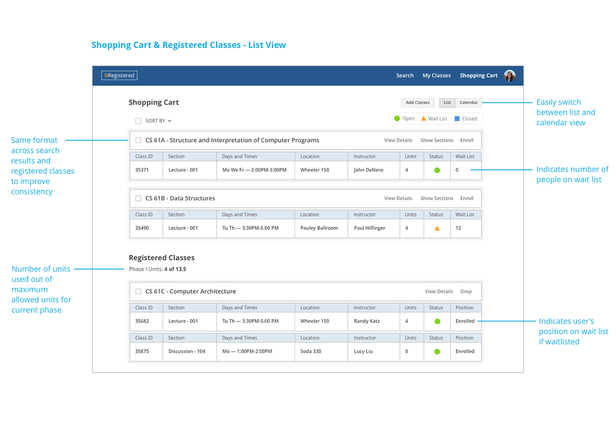
• Quick switch between Schedule Planner and Enrollment
◦ Easily move from one to the other
◦ Easily move classes from one to the other
• Include reminders about unit cap
◦ Know how many units you have used up
• Allow time conflicts in schedule planner
• Easy access to calendar view of schedule
• See number of students on wait list
◦ After enrolling, see position on wait list
• Include class details: webcast, attendance mandatory, etc.
◦ As a student, I want to know if a class on the opposite side of campus held at 6:30pm is webcasted so I can know if I have to physically be there or not :)
Based on these features, I sketched out wireframes for the application.
Wireframes:

Finally, I filled in the visual elements and details to create mockups.
High-Fidelity Mockups:


Here is the final prototype:
Next Steps:
Usability Testing:
In order to see how users react to my designs as well as discover their expectations and potential gaps in understanding, I've conducted several usability tests. Some feedback I've received from fellow students and random users is that the UI is clean and the navigation easy to understand, "if you know what you're looking for." One thing I plan to improve on is making the experience as intuitive as possible even for first-time users. A suggestion I've gotten was perhaps including a landing page to explain how the site is used.
I plan to conduct more user testing, specifically with audiences of the following demographic:
• UC Berkeley students
◦ Freshmen, sophomores, juniors, seniors, and super-seniors
◦ Comparing the responses from each category of students may allow me to better understand what a new student or returning student is looking for and where each of their priorities lie
◦ Students across different majors
◦ The expectations I have and the way in which I enroll for CS classes may be different from how one enrolls in Biology classes or Women Studies classes.
◦ Undergrad vs. Grad students
◦ Online/remote students
• Non UC Berkeley students
◦ Although the registration and planning portal is intended for UC Berkeley students, there may be biases, such as tendencies to conform to previous systems' designs or maybe assumptions that I've made about other students that I let subconsciously influence and restrict my designs. I would love to see how students from other schools might introduce fresh ideas and perspectives.
Additional Features:
In an effort to keep my designs simple, I started with the most bare minimum features to ensure that the portal had the basic necessary functions. Once I have been able to lock down the basic features, I would consider implementing additional features that improve the utility of the portal. Some of these features include:
• Customization based on user's profile
◦ Integrate major prerequisites and requirements
◦ E.g. I'm a CS Major, and thus it shows an indication for which classes count towards my major requirements
◦ Show which classes are popular among other students of the same major
• Display suggested classes based on previously enrolled classes through the use of machine learning
• Include a rating system to display a class's effectiveness, popularity, difficulty, instructor quality, etc.
• Track the enrollment data (number enrolled, number waitlisted, etc.) of classes over time and allow students to view these graphs and make changes to their plans for enrollment accordingly
• Integration with Google Calendar for Schedule Planner
• Allow students to contact professors/administrators regarding class information
• Implement the professors/administrators' side of the portal, where professors/admin can post their classes, change enrollment capacity, location, time, and other class information
• Add subtle animations to enhance feedback and usability
Prototyping:
In addition to creating an interactive prototype on InVision, I plan to develop a prototype with HTML, CSS, and JavaScript. Even further steps would be to obtain access to the university's course enrollment APIs and implement the backend and connect it to the frontend to create a fully functional prototype.
Thank you for reading! Stay tuned and feel free to leave a comment and like.


