


An agile Branding for professional team of advisors to introduce Scrum agility in IT organizations.
Year: 2017
Creative fields: Logo Design, Branding
Creative fields: Logo Design, Branding
Brass Willow is a group of experienced trainers and consultants, who provide support and offer their know-how in complex Agile transformation projects. They implement Scrum methodology in both IT and non-IT related organisations. Moreover, Brass Willow is a certified Scrum.org partner and can provide training as a form of additional support.
The client’s requirements were focused around building a strong visual connection with both the brand and Scrum itself. The key point for the client was to emphasise their professionalism, deep knowledge and understanding of agile values and principles.
Lastly, the new corporate identity ought to be built on top of the previous branding. This meant that the main theme shall remain the same and should be based on rowing and other water sports. This had to be achieved in a way to communicate a far more modern, professional and agile approach.
Logo
The original logo of the brand was a black weeping willow with naked branches. In our opinion, this logo did not match the new corporate vision the client was trying to emphasise.
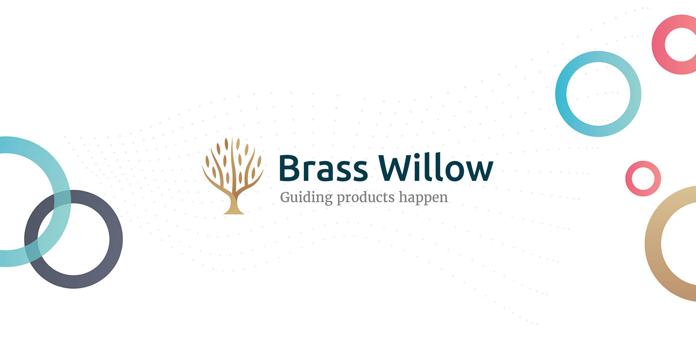
During the multiple workshops with the client we had proposed a new logo which would be more in-line with the modern look of the company. We had succeeded. The new logotype spoke more than a thousand words and it did not take long to convince the Client to sign it off.
The main narrative behind the new logo was to communicate the growth, development, support and professionalism that Brass Willow customers can expect.


Key Visual Elements
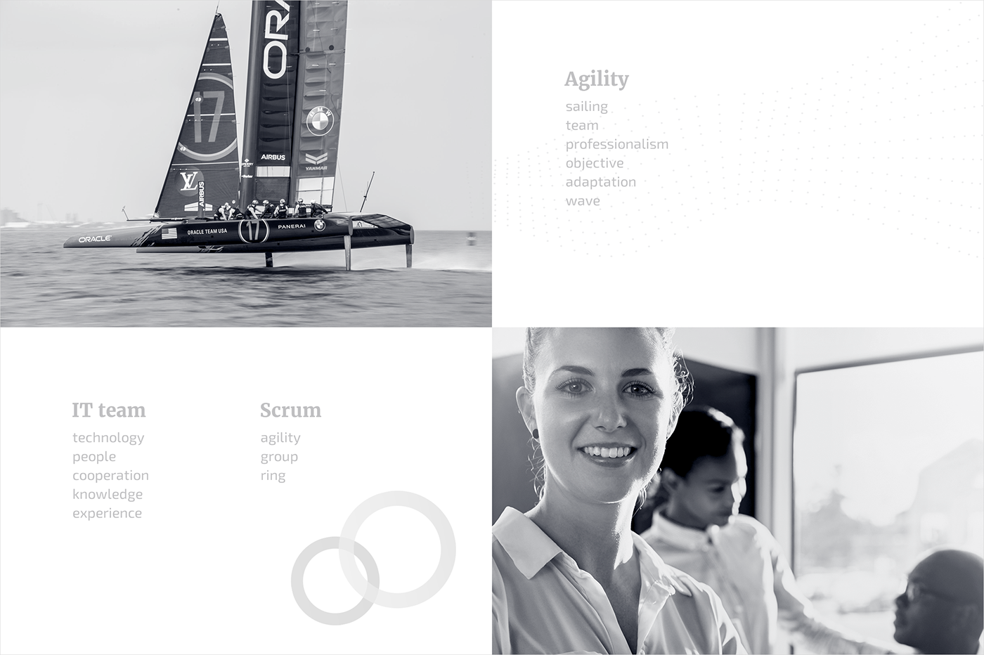
In line with the multiple conversations we had with the Client, we have created a new brand colour palette. The main goal was not only to make it look interesting, modern and professional, but also light and cool. The main component of the key visual is a double exposure photo presenting a yacht during the race and the team working on the project. This motif is not only related to the previous brand theme, but also shows how teamwork and cooperation can overcome difficulties faced on the rough seas of project delivery.
We wanted to create a professional outlook but at the same time we wanted to ensure the brand is associated with positive feelings and gives the impression of being customer-friendly and outgoing. In order to achieve that, we have introduced, a rather informal, motif of complementary colour circles that also builds a connection with Scrum.org. The dynamic wave in the background made of small and modern dots crowns the design, sending a message about flexibility, agility and strength.


Additional Materials
Our last task was to design an educational pack and promotional materials pack the company could proudly use and distribute to its customers in courses or conferences.
The pack consists of a special version of the Scrum Guide, a dotted notebook, a training or lecture ID card holder, and a goodies bag.


Please Note : Some imagery is used for brand proposal only.
Copyright of original images belong to their respective owners.
Credits:
Art Direction: Marcin Wiśniewski
Art Direction: Marcin Wiśniewski
Logo Design: Dawid Noculak
Brand Design: Marcin Wiśniewski
Copyrighting: Marcin Wiśniewski
Key Visual: Marcin Wiśniewski
Project Management: Krzysztof Kościukiewicz / Marcin Wiśniewski
Project Management: Krzysztof Kościukiewicz / Marcin Wiśniewski