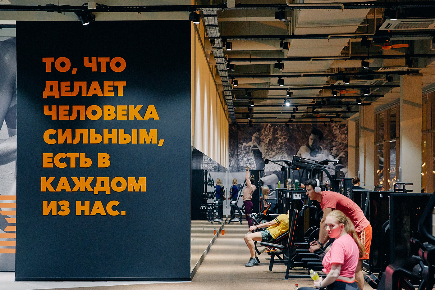
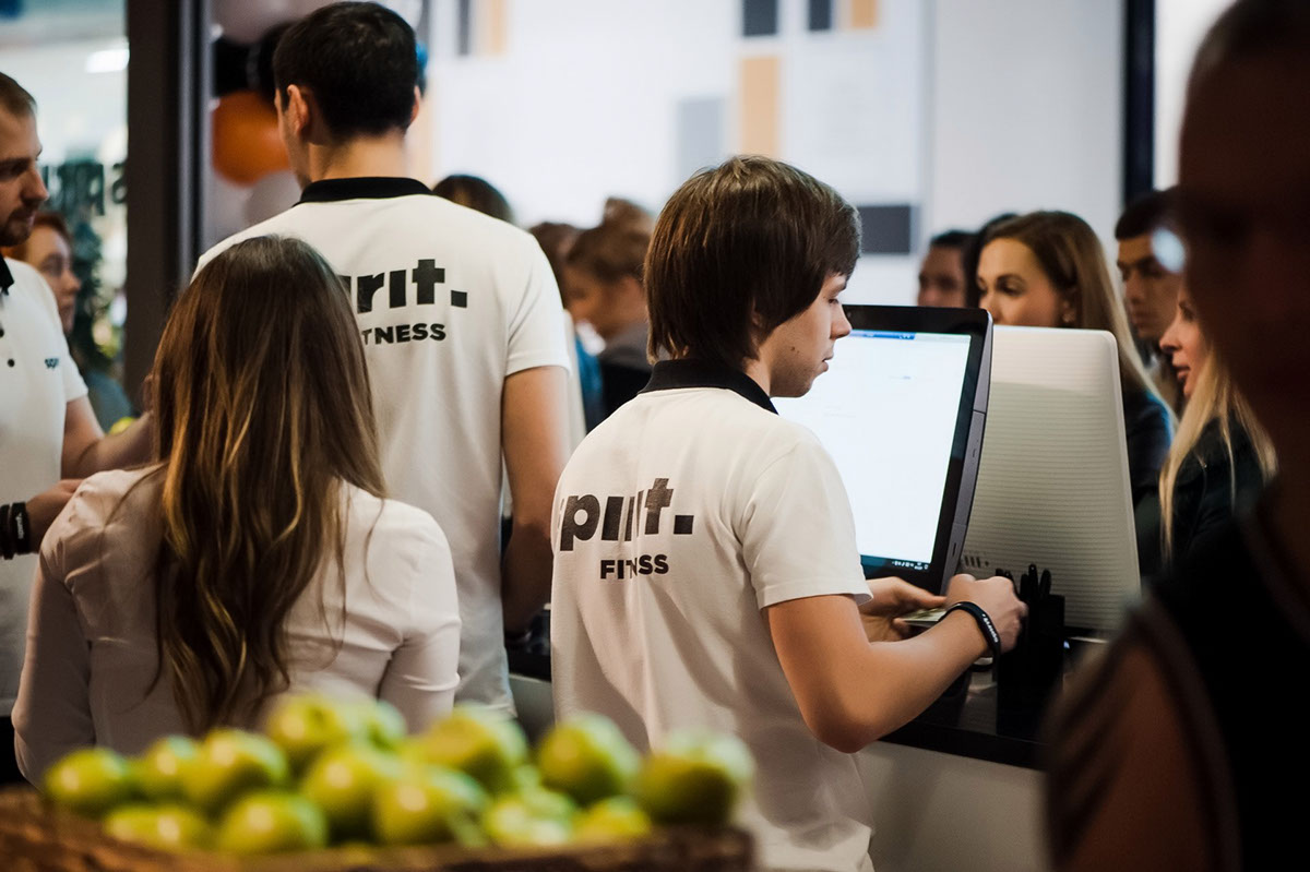
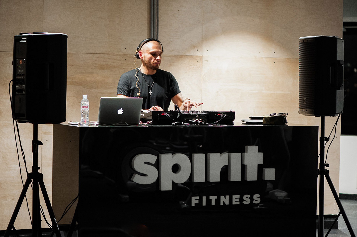
Spirit is a new fitness club in Moscow. It’s not just a sport club, it’s a community of people, united by the sport spirit. It’s a place for confident, decisive and strong people, who have goals and dreams and they are ready to work hard to achieve them.
The main element of the visual identity has become the typography and logotype. Solid and strong letters symbolize a person’s spirit, the power which is inside of us, determination, stamina and self-belief.
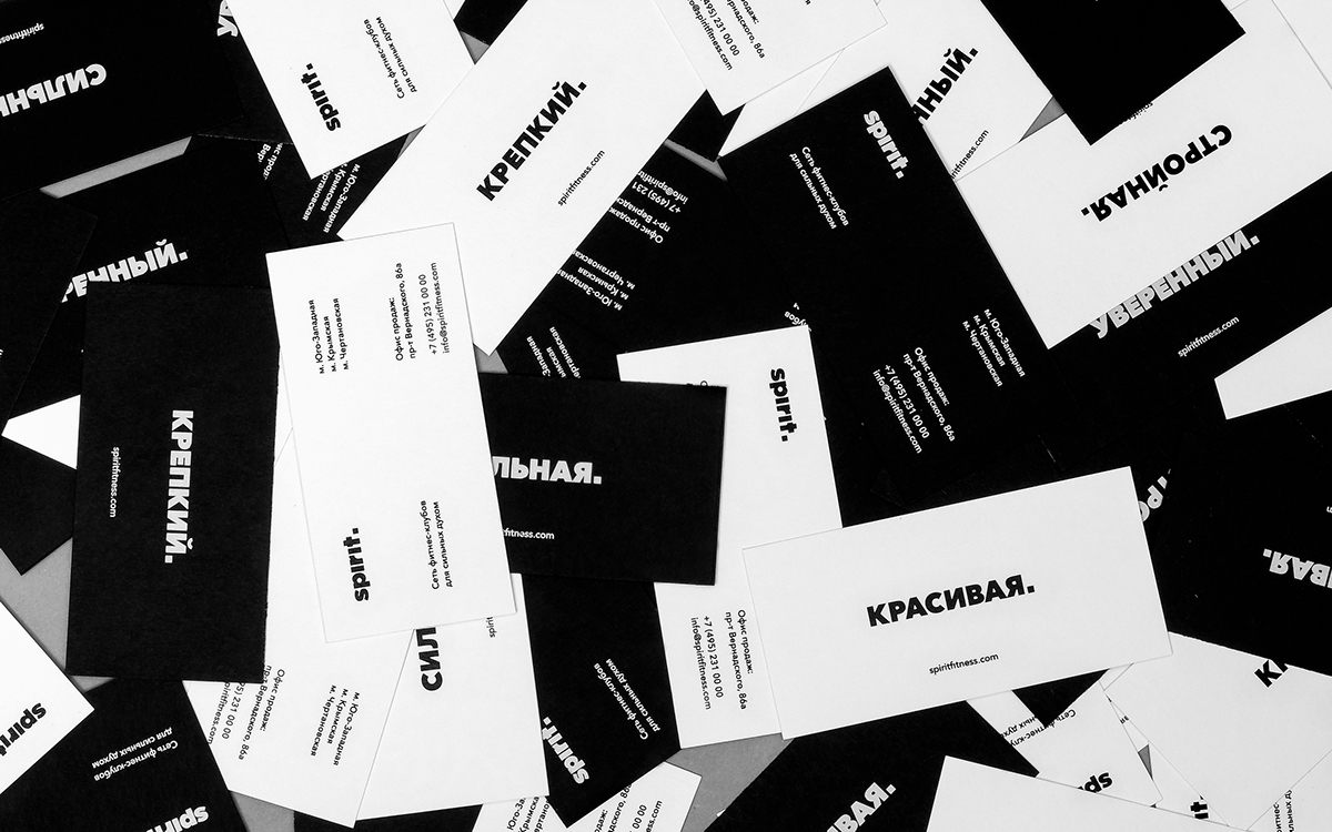
The square dot at the end of the logotype is a visual accent and one of the most important elements, which can make any slogan strong, true and definite like the final word.
Why is the point square, not circled? Because it’s a more stable geometric shape, which symbolizes strong arbitrary decision. If a man decided to be athletic, he will achieve his goal.


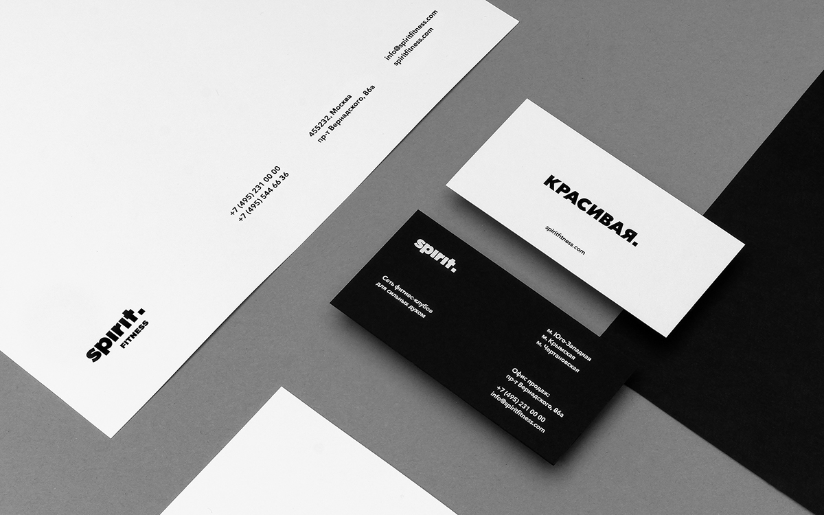
On the business cards we have placed different motivating slogans for everyone to choose one for themselves. Some want to be pretty and slender, some — strong and confident. Every time you look at the business cards, you recall your goals.