


Branding for motion studio
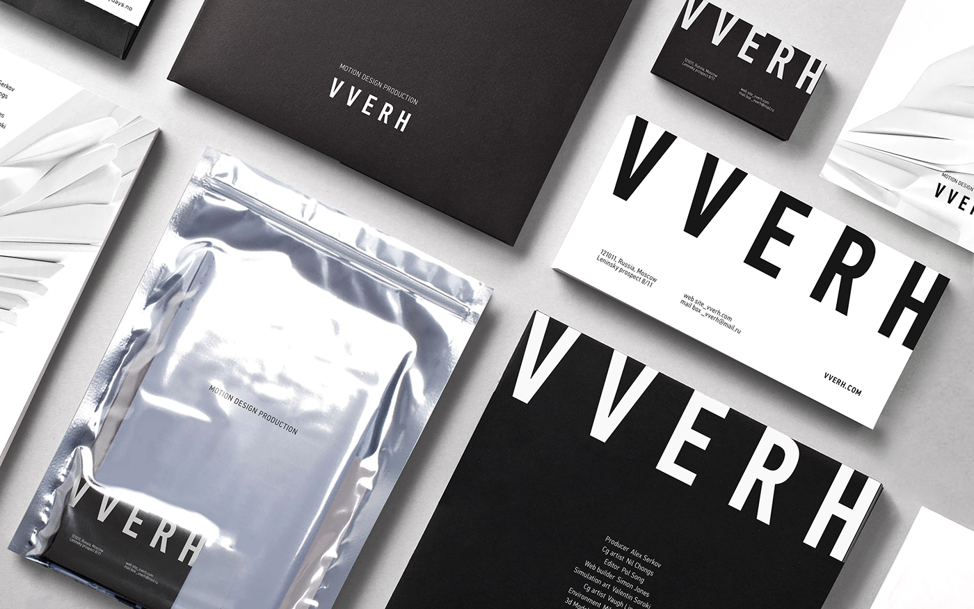
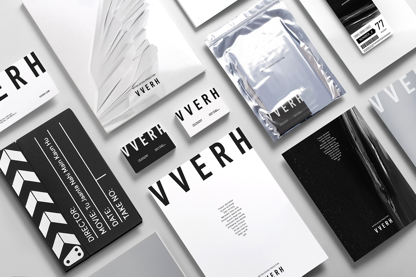
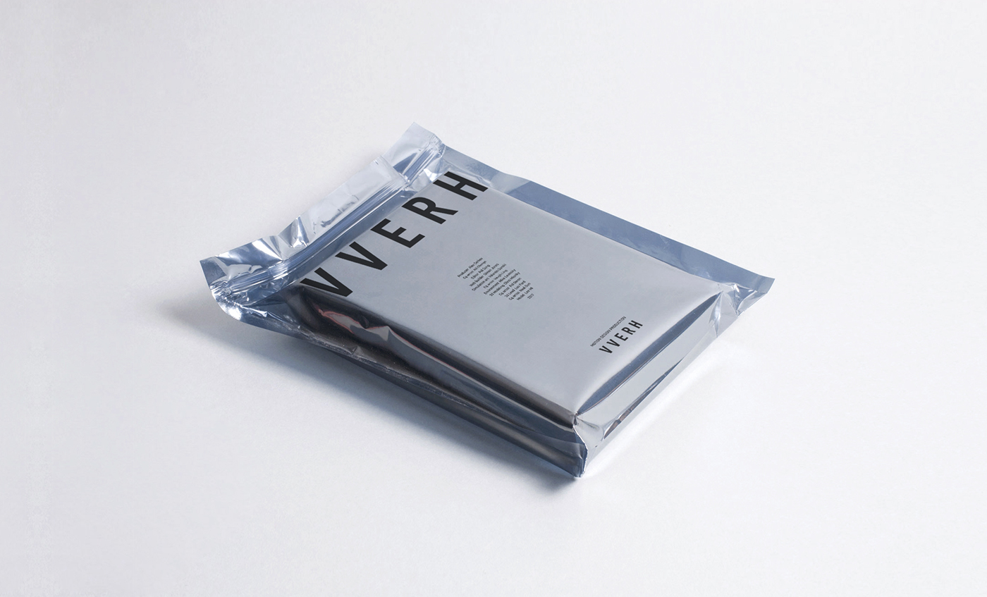
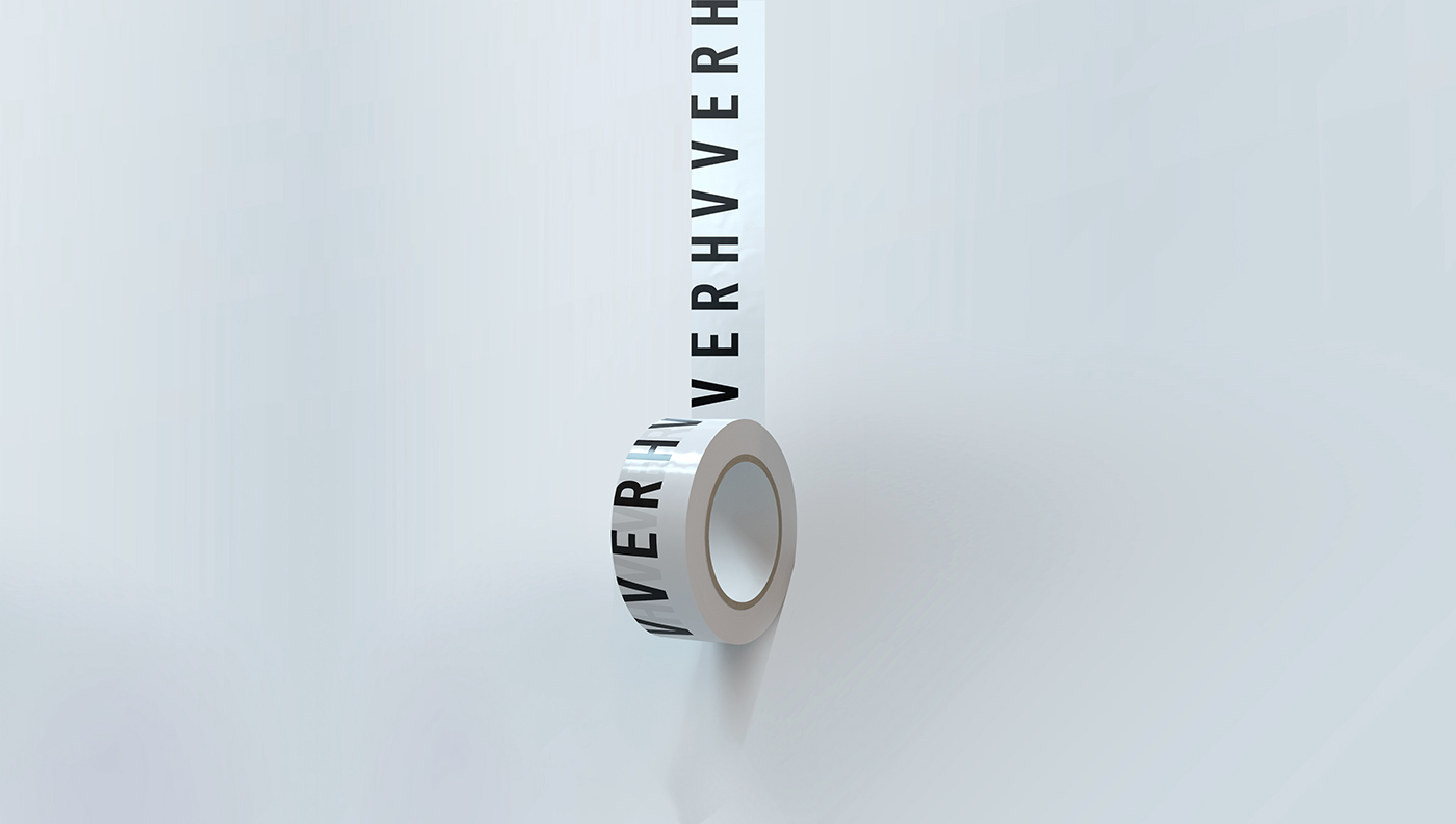
V V E R H
V V E R H
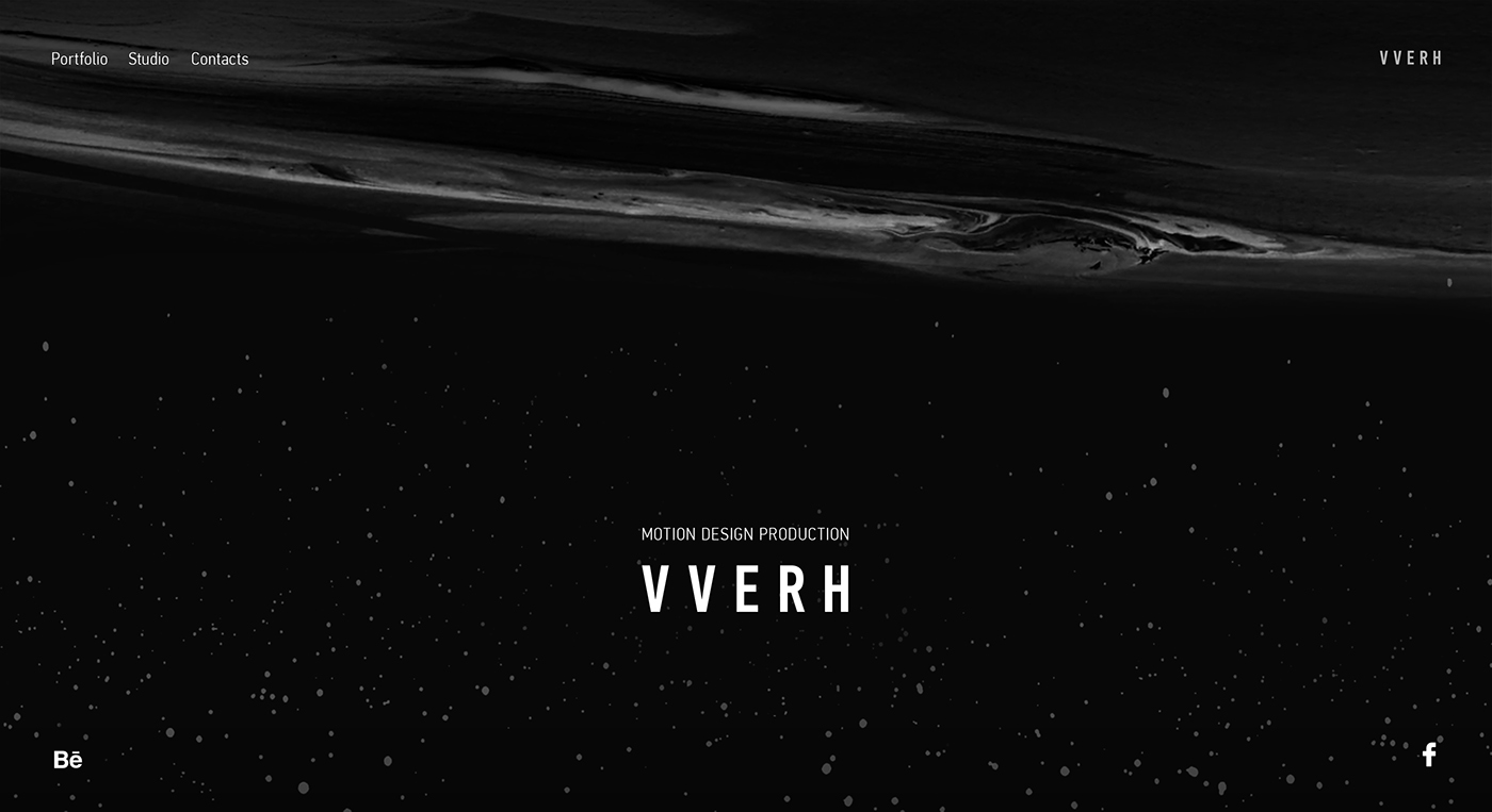
The name of the studio means "up", upward movement.
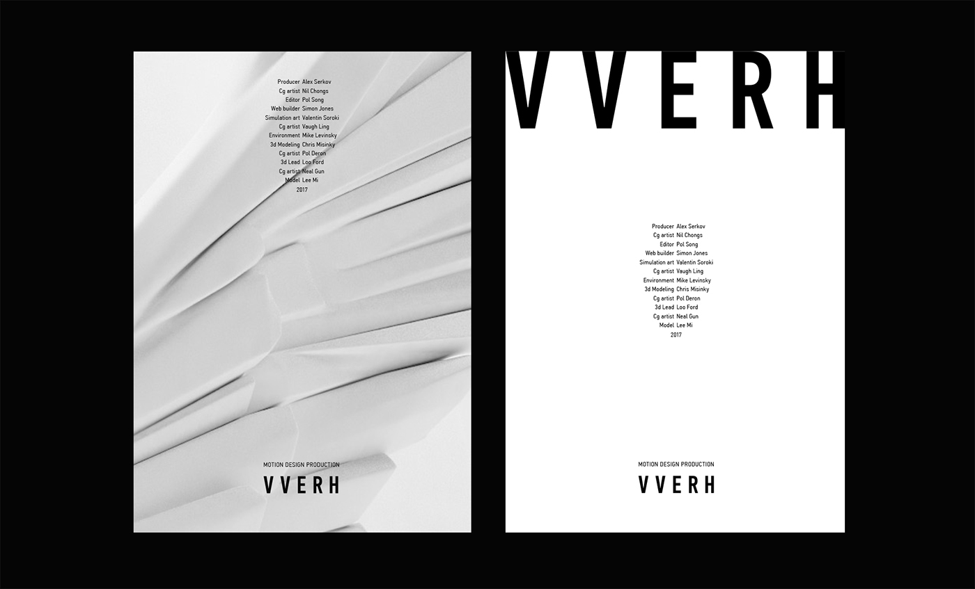
Thus, in most situations the logo is placed on the top of the layout.
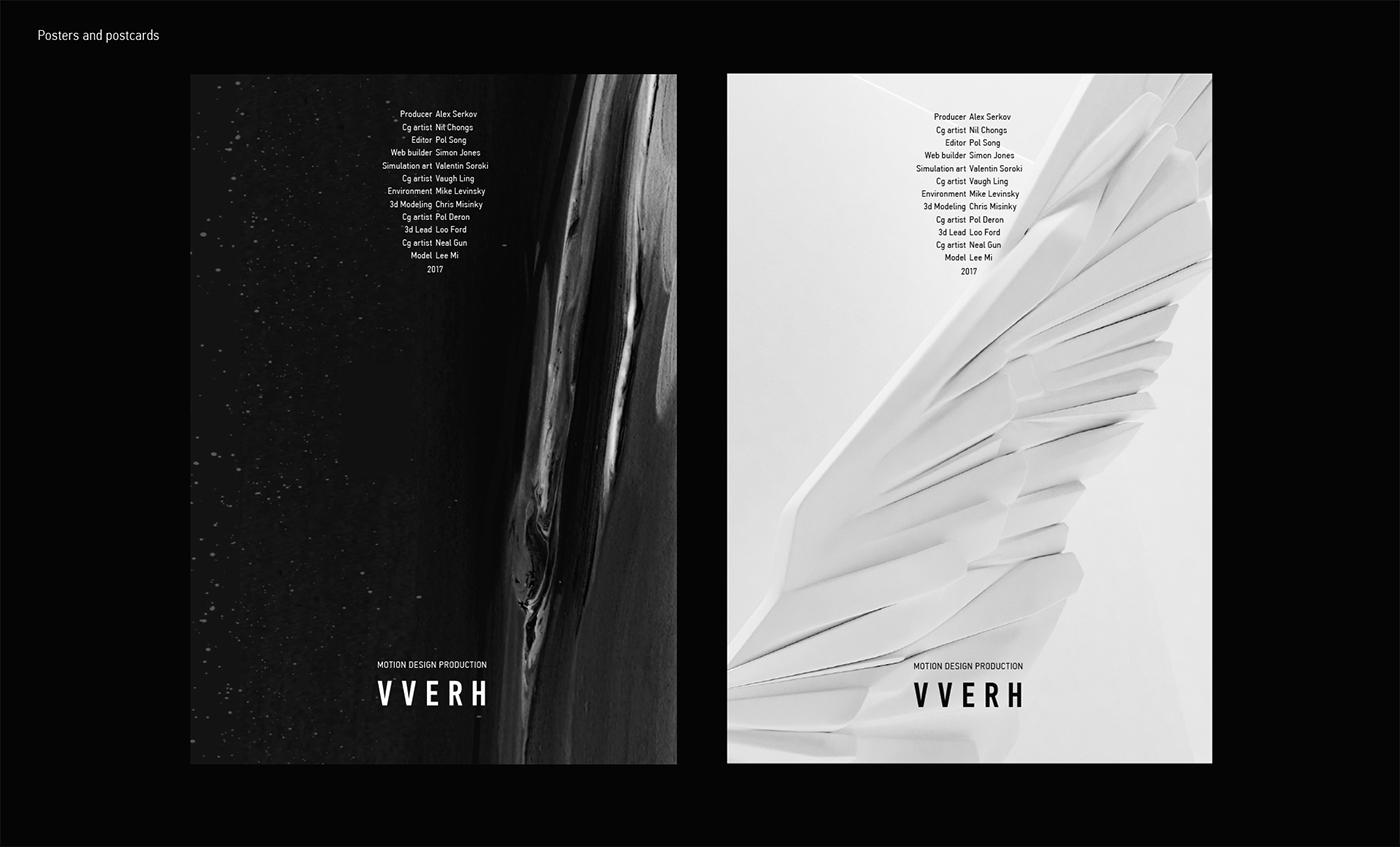
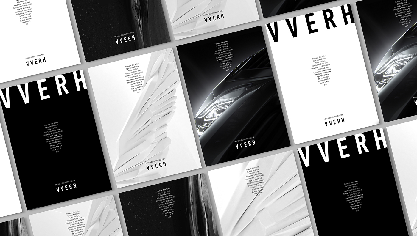
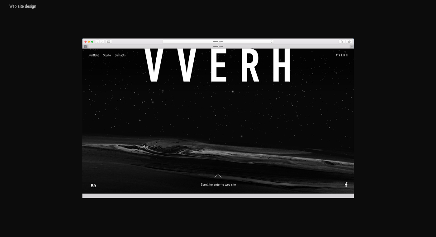
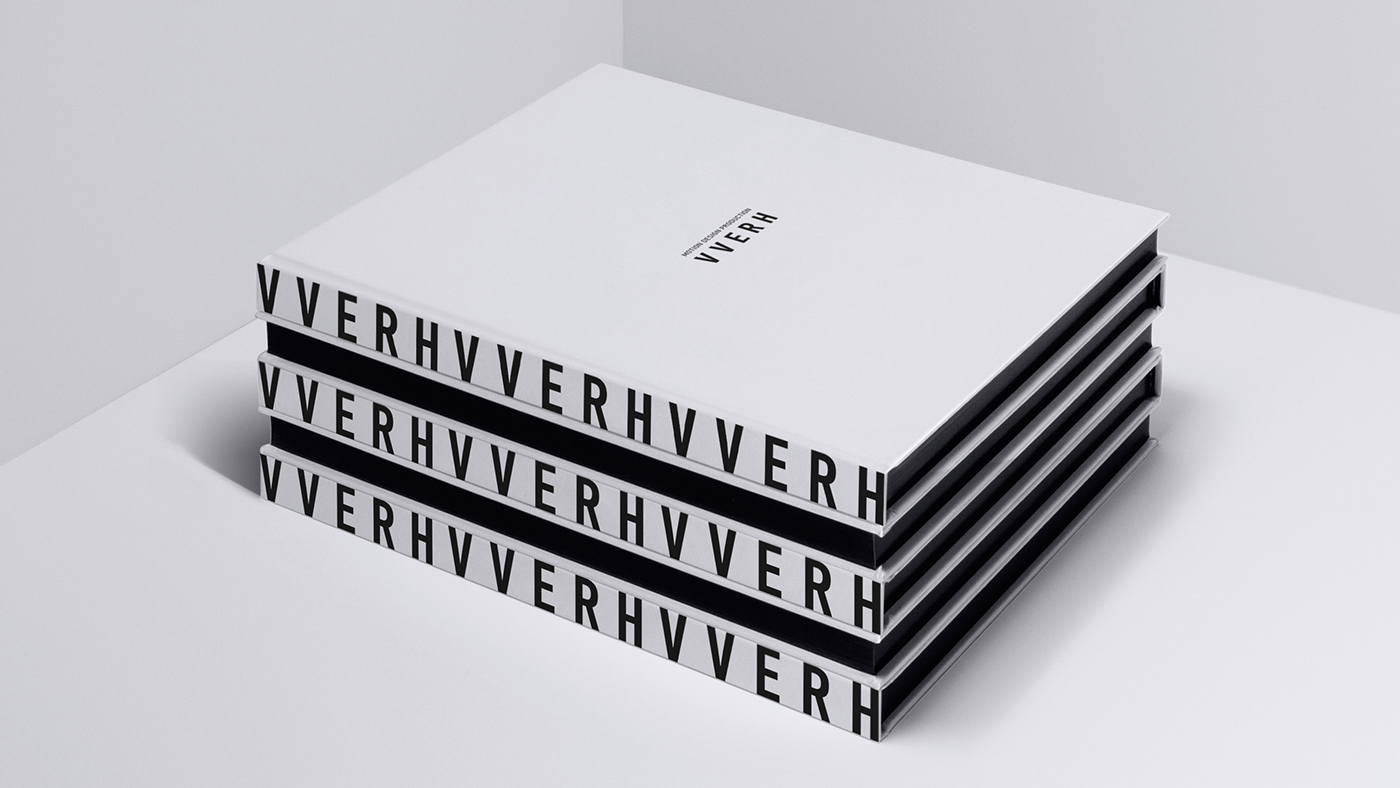
The logo is designed with a large letter space like movie titles.
In the brand identity is also actively used central text
alignment by analogy with the final titles. Brand posters created
in a cinematic style and resemble posters with films.
in a cinematic style and resemble posters with films.
_
Брендинг моушен студии
V V E R H
Название студии означает устремление ввысь.
Таким образом, основным принципом использования логотипа
является то, что в большинстве ситуаций он помещается в верхний край макета.
Логотип спроектирован с большим межбуквенным пространством
подобно титрам фильма. А так же в фирменном стиле активно
используется центральная выключка текста по аналогии
с финальными титрами. Фирменные постеры студии созданы
в кинематографическом стиле и напоминают афиши кино.

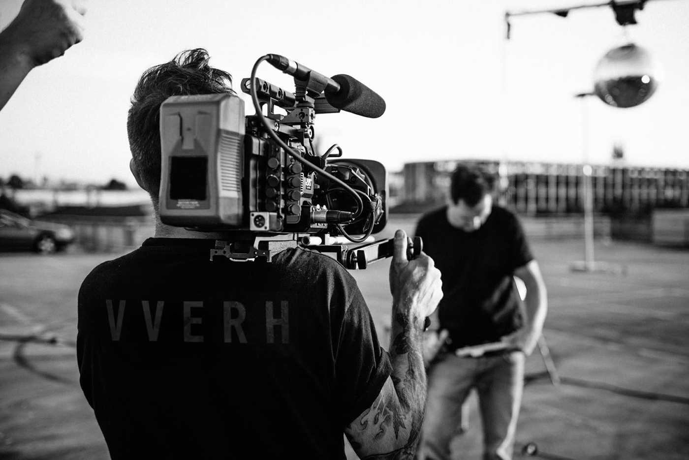
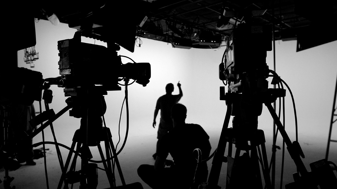
ABOUT STUDIO
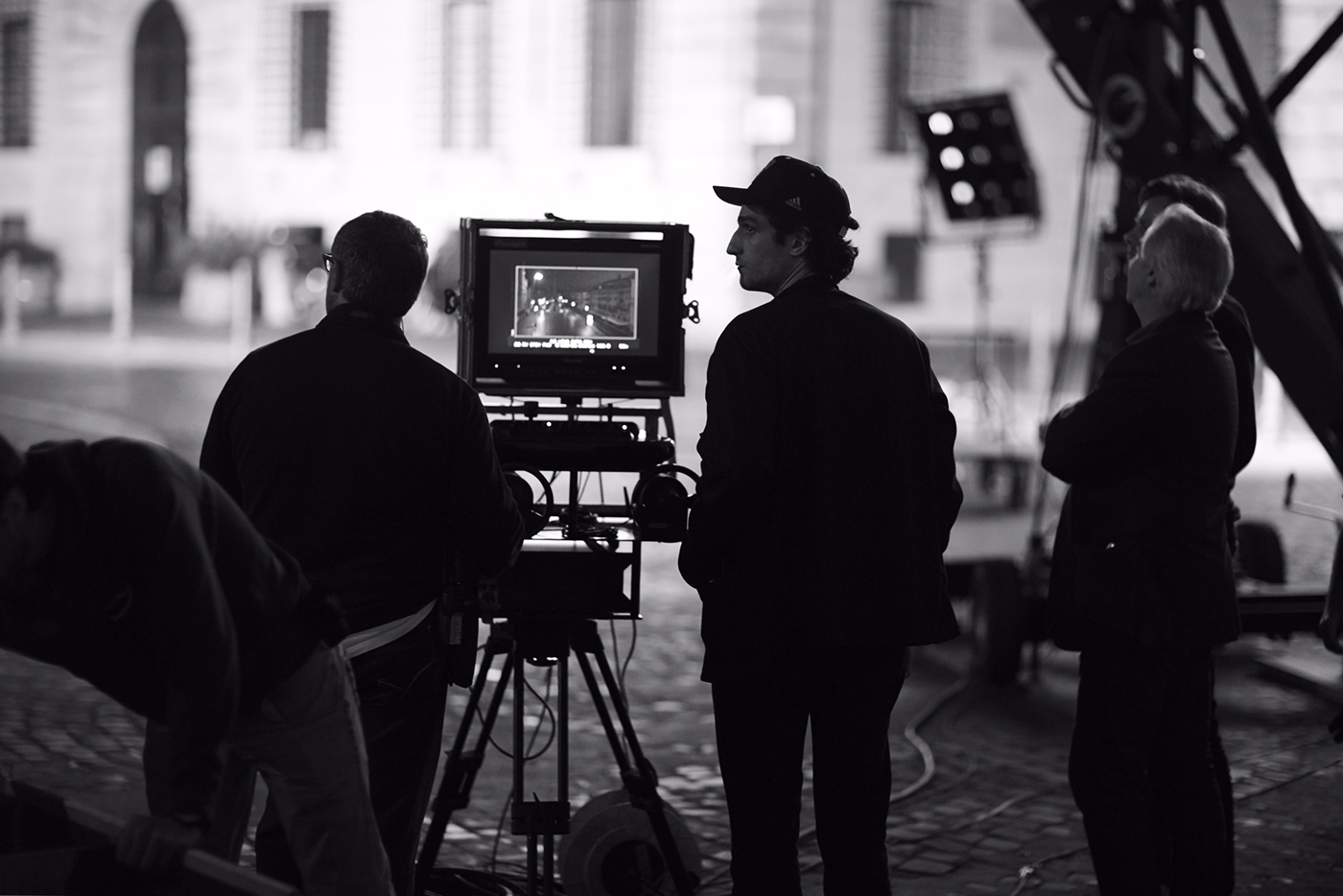
VVERH – motion design and postproduction studio from Moscow.
They work on the creation films by Konchalovsky
and many other russian and foreign projects.


