

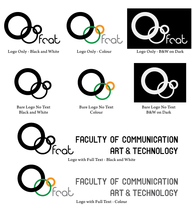
This logo incorporates a trio of overlapping rings. The three rings represent the three main schools of FCAT, as well as the fact that the Faculty is a multi-campus body that spans across all three SFU campuses. The linked rings represents the cooperation and coordination across the many disciplines of FCAT and embody the spirit seen in those currently involved in making our new Faculty great. Logo characters are rounded to match the curvature of the circles, but also to not and compete with the main SFU logo. No comma is used as it is less visually distracting, the line break separates 'Communication' from 'Art'.

This logo is a square block style geometric creation. The three small squares represent the three main schools of FCAT, as well as the fact that the Faculty is a multi-campus body that spans across all three SFU campuses. This is more prevalent with the colour version of the logo as the squares are more visible.


Because cats.


