


Organization
Totokan is a Taiwanese company that makes portable baby monitors for the international market. The monitors are designed for flexible usage and on-the-go parents.
Challenge
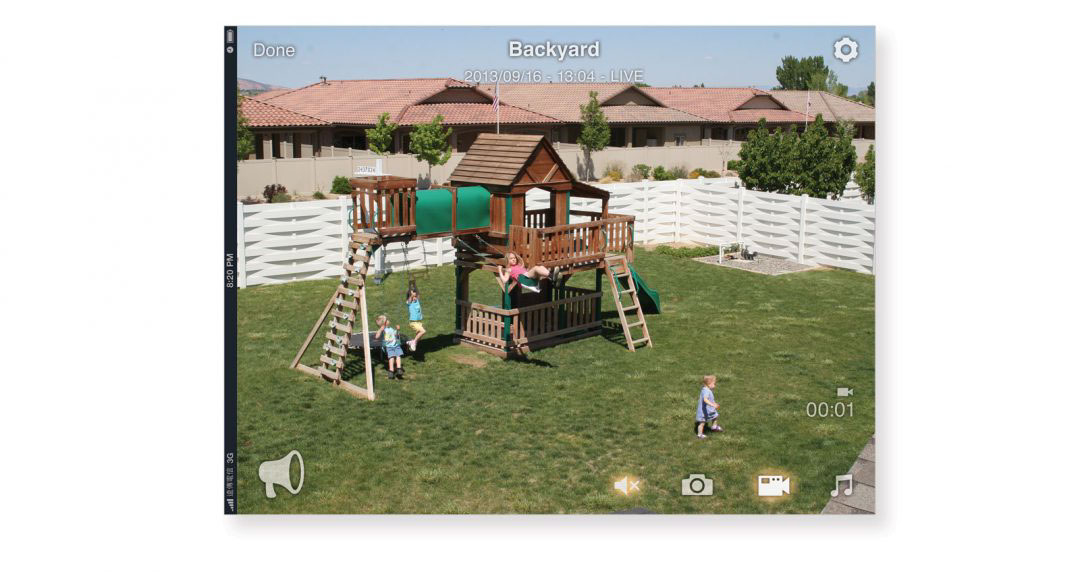
My design direction was to use the brand’s existing logo and colours to layout an intuitive and user-friendly mobile experience that a team of developers could implement in building the mobile app. The project included the user flow, screen mockup, iconography, and user interface elements for iOS and Android phones and tablets (completed in December 2013). The features of the app included such things as audio playback, baby talkback, audio and video recording, as well as split-screen video feeds.
Solution
I chose to use a skeuomorphic design style because it’s more intuitive for users who are unfamiliar with such apps. The toggle switches use both green/red colours and check/x indicators. The buttons are slightly larger than normal and there is a glow effect to indicate that a button is active. When the video feed is in landscape orientation, the buttons become translucent to maximize the viewing area. All of the icons, sliders, buttons, etc. are custom designed.


“We would work with Robert again in a heartbeat!”
– Shelley Lin, Director of Business Development, Totokan (Taiwan)

“Robert understood our needs right away by asking insightful questions and pointing out problems that we didn’t even think of.”
– Shelley Lin


