Organization
A super cool company specializing in social and competitive music game products — keeping communities active.
Challenge
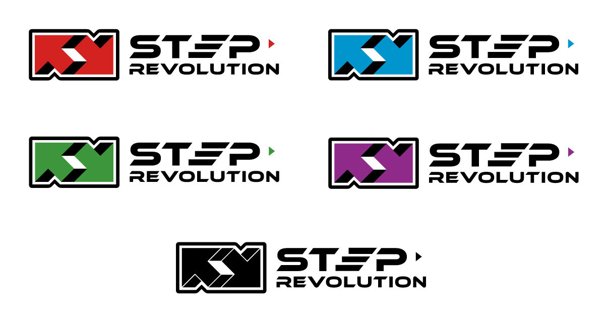
Clean up and to modernize and existing logo for more impact. Explore multiple colours and develop additional variations of the approved logo for a cohesive look across multiple applications.
Solution
I made the logo simpler, cleaner, and bolder, while showing the company name more prominently. In the icon, I removed the gradients and small details, and added a background circle and thick black outlines. The E in "STEP" was also redesigned to embody the meaning and have more forward movement. The palette is bold and colourful, taking from every side of the colour wheel — except for yellow, due to its lower contrast. Altogether, the new mark is more modern, legible, versatile, and definitely has more impact.