
“I was amazed, and felt like I had a person who was really trying to build me an amazing brand!”
– Allen Higbee, Founder and CEO of Laxlee Sports (USA)
Organization
Laxlee Sports is a local business in the US that provides a variety of intramural sports and social activities. The aim is to bring communities together for friendly competitions and positive social enjoyment.
Challenge
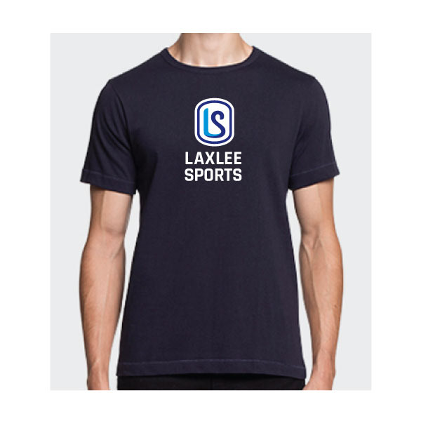
Design a logo and colour palette to work across multiple mediums — most importantly, shirts, hats, and merchandise.
Solution
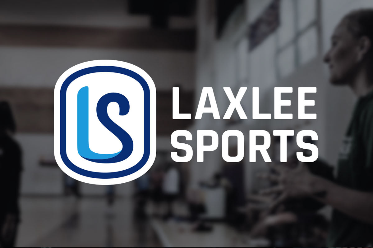
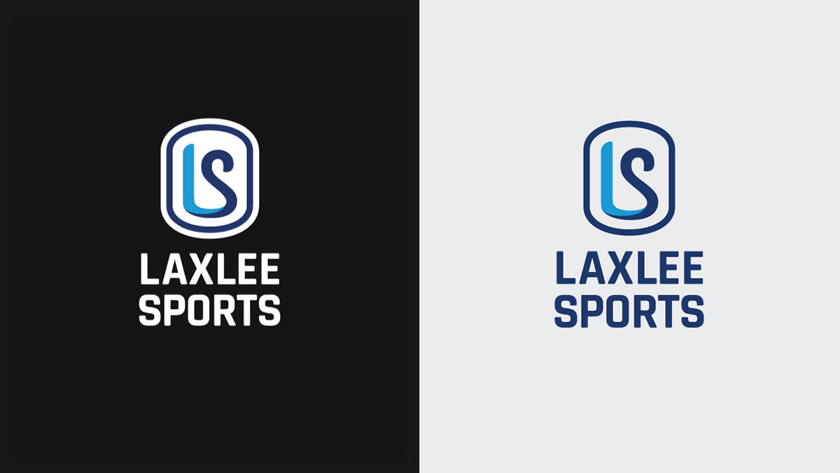
I knew I wanted to turn the L and S from Laxlee Sports into a simple and impactful badge or crest logo. This would give the feeling of a sports league and look extra sharp on uniforms, even from a distance.
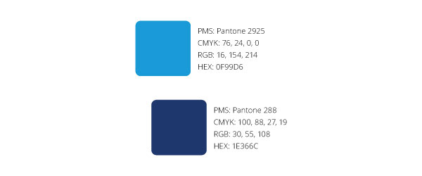
After exploring different ways of combining the L and S, the best looking option was to have them join at the bottom. And to do that, I had to work with two complimentary colours that had enough contrast for the letters to be discernible. I chose two shades of blue to embody the friendly, social sports brand.
I made the letters twist around each other at the bottom for a 3D look, and I flattened the bottom to make sure the L still looked like an L. This new flattened arc inspired the shape of the outer container, and I rounded the tips of the letters to maintain the same flow.
The bold and boxy typeface, Rajdhani, nods to a college football style. However, using a common varsity font with cut corners or slab serifs would be way too cliché. The rounded corners of Rajdhani give this logo a more friendly feel — for welcoming the community members to join in the action.

“Robert explained the meanings of the imagery, fonts, and colors, while presenting them all in context. The whole project was a great experience.”
– Allen Higbee


